Finding the perfect color palette for your home can completely transform the atmosphere of every room, turning a basic living space into a curated sanctuary. Whether you are looking for a calming retreat or a vibrant, energetic hub for entertaining, the right combination of hues sets the foundational mood for your entire interior design journey. Many homeowners feel overwhelmed by the sheer number of paint swatches and fabric samples available today, but selecting a cohesive scheme is easier when you focus on how colors interact with light and texture. From moody, sophisticated dark tones to airy and light neutrals, these carefully selected combinations offer something for every aesthetic preference and architectural style.
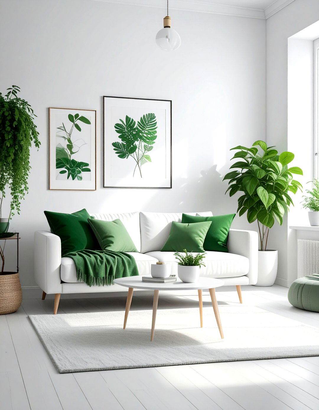
1. Sage Green Cream Living Room Palette
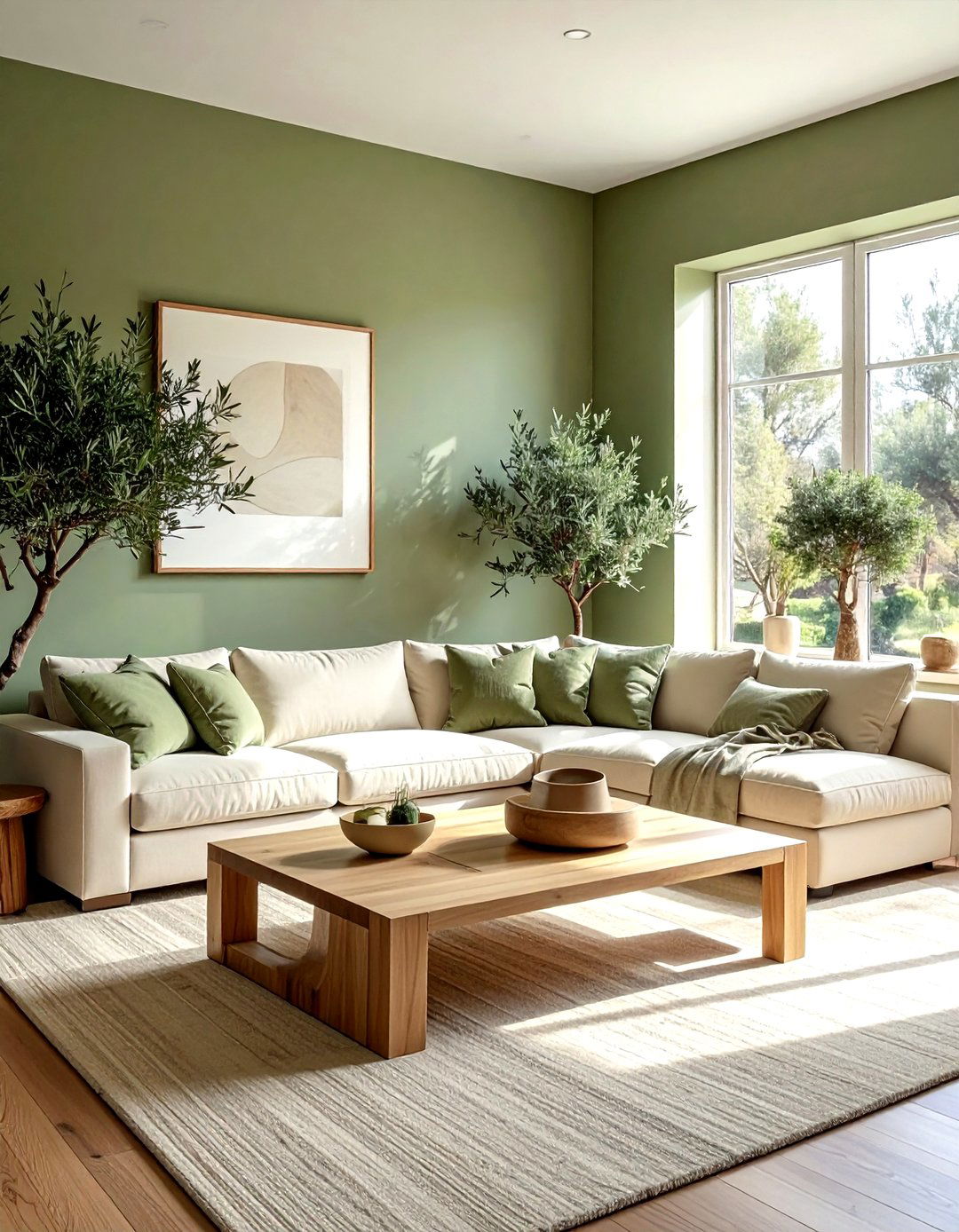
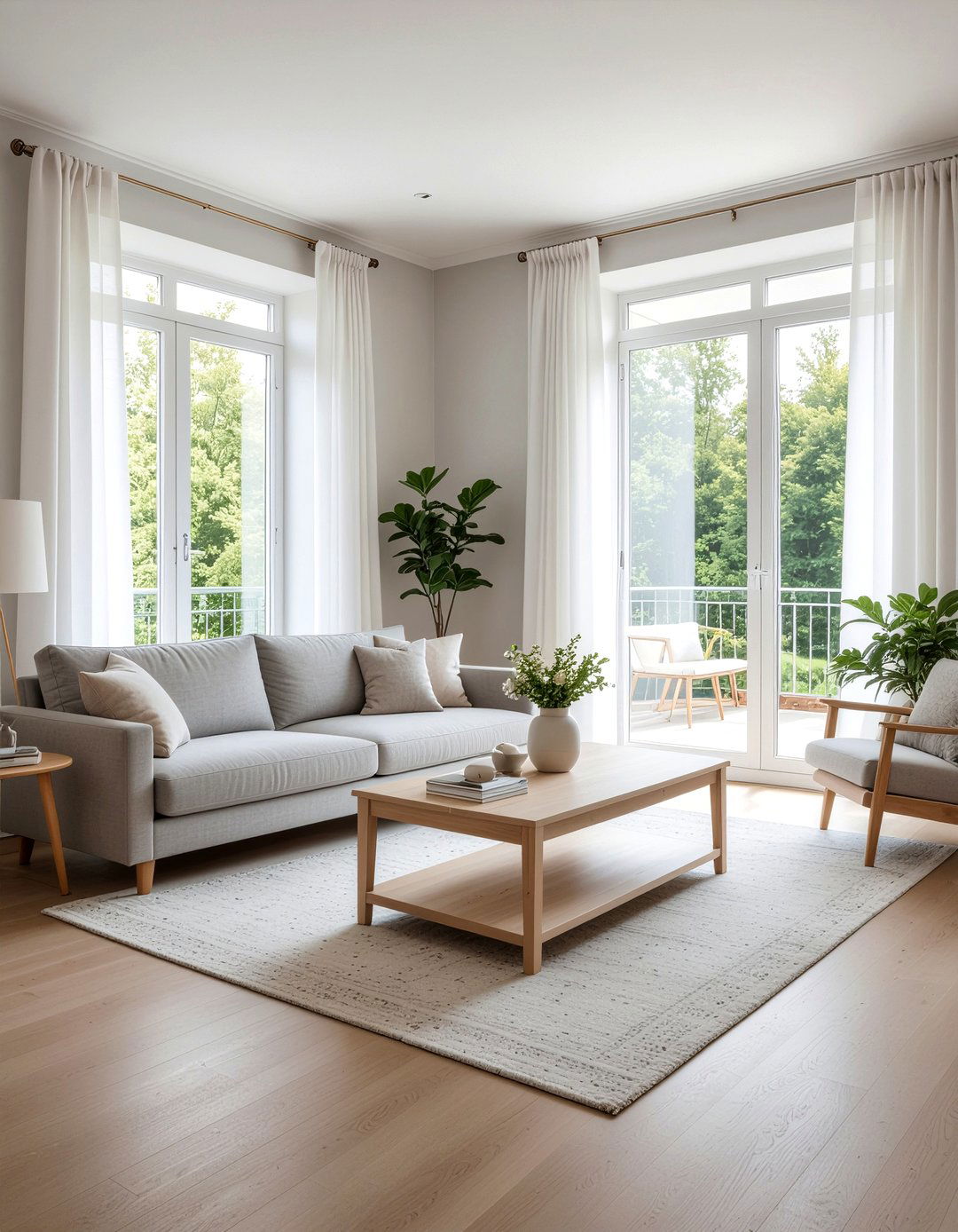
Have you ever walked into a room and immediately felt a sense of peace and natural harmony? A sage green and cream color scheme offers exactly that by bringing the soft, muted tones of the outdoors directly into your primary living area. This combination works exceptionally well when you use sage as the dominant wall color, providing a grounded backdrop for plush cream sofas and light-colored wooden furniture. The softness of the cream prevents the green from feeling too heavy, while the green adds a sophisticated depth that standard neutrals often lack. You can enhance this look with linen textiles, potted plants, and light oak accents for a modern organic feel.
2. Navy Blue Gold Bedroom Palette
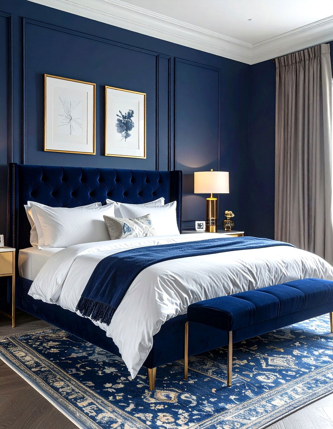
Imagine a sleeping space that feels both incredibly regal and deeply comforting at the same time. Navy blue and gold is a classic high-contrast pairing that brings an air of luxury to any master suite or guest bedroom. By painting the walls a deep, matte navy, you create a cocoon-like environment that is perfect for restful sleep and relaxation. The addition of metallic gold through light fixtures, picture frames, and drawer pulls provides a necessary brightness that keeps the room from feeling too dark or oppressive. Layering in white bedding and velvet textures further elevates the sophisticated aesthetic, making the entire room feel like a high-end hotel.
3. Terracotta Teal Modern Living Room
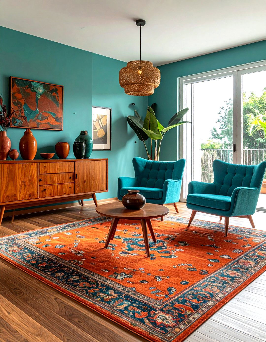
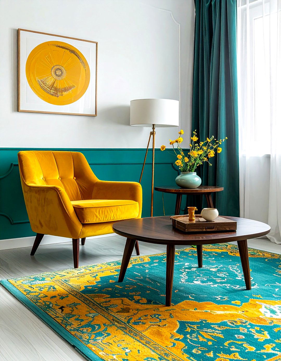
Is there anything more striking than the balance between warm earth tones and cool, vibrant jewel colors? A terracotta and teal color scheme creates a dynamic and energetic living room that feels globally inspired and deeply artistic. The warmth of the reddish-orange terracotta provides a cozy, sun-drenched foundation, while the teal acts as a refreshing counterpoint that adds visual interest. This palette is perfect for those who love mid-century modern furniture or eclectic decor styles. Try using terracotta on larger surfaces like rugs or accent walls, then introduce teal through upholstered armchairs, decorative pillows, or ceramic vases to achieve a perfectly balanced and inviting social space.
4. Charcoal Grey Coral Accent Room
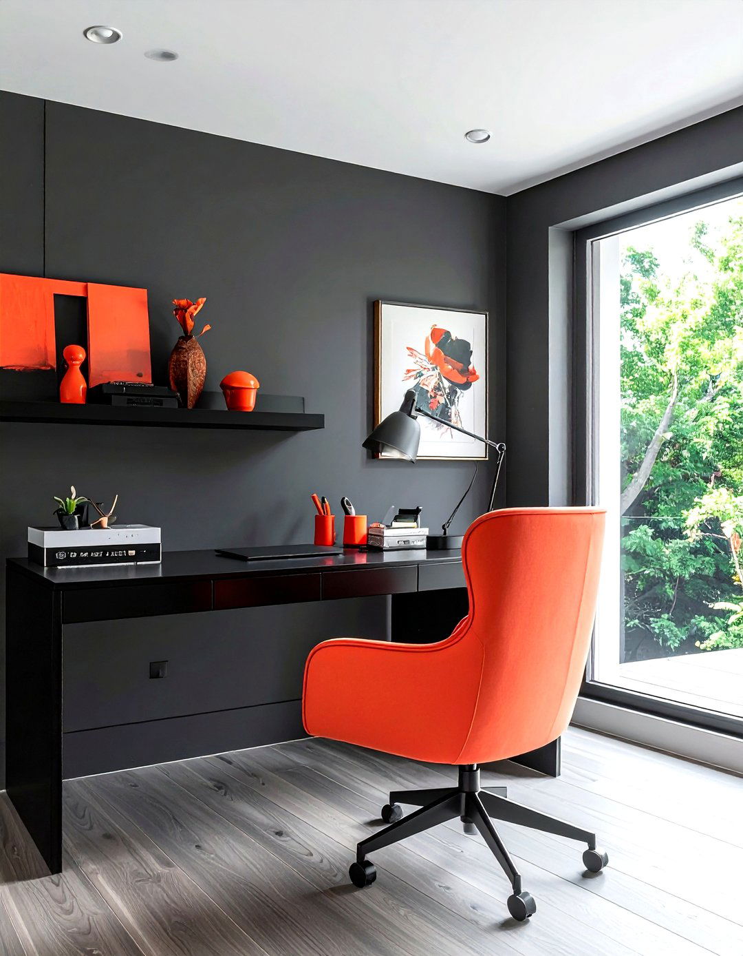
Creating a modern and trendy look often requires a bold move with dark neutrals paired with a surprising pop of color. Charcoal grey and coral is a sophisticated duo that works beautifully in home offices or contemporary dining rooms where you want to make a statement. The deep, moody grey provides a sleek and professional foundation that allows the vibrant coral accents to truly shine without overwhelming the senses. This combination is particularly effective when you use charcoal for the walls and large furniture pieces, then sprinkle coral through artwork, floral arrangements, or small decorative objects to breathe life and energy into the functional space.
5. Dusty Rose Olive Green Bedroom
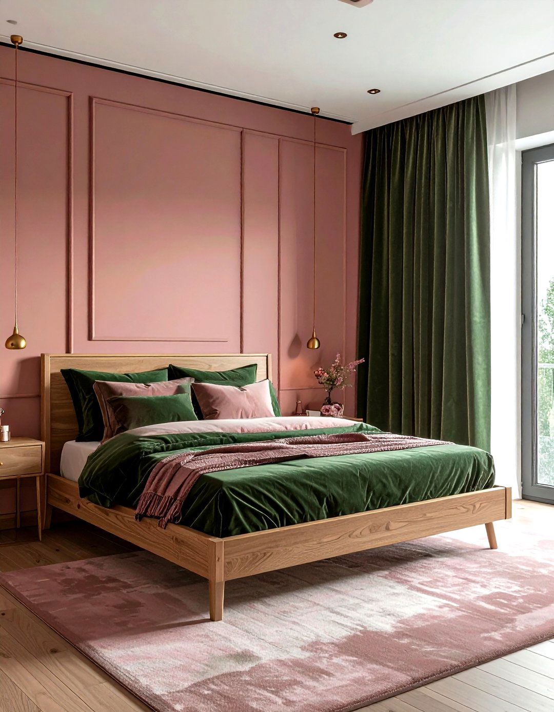
Can a bedroom be both romantic and grounded in a natural, earthy aesthetic? Using a dusty rose and olive green palette achieves this delicate balance by mixing soft, feminine pinks with the rugged, organic feel of deep green. This scheme feels incredibly modern yet timeless, especially when you use a muted pink for the walls and incorporate olive green through velvet curtains or a heavy bedspread. The olive green prevents the pink from feeling too sugary or youthful, adding a layer of maturity and sophistication. Natural wood elements and brass hardware complement this pairing beautifully, creating a serene and stylish environment for resting after a long day.
6. Lavender Soft Grey Nursery Palette
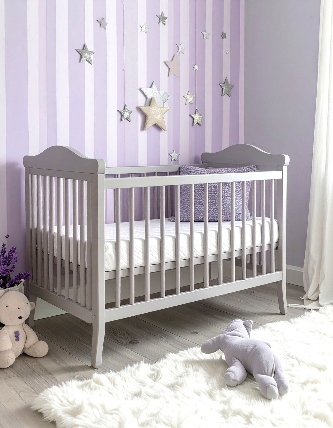
Soft lavender paired with a gentle grey creates a tranquil and dreamy environment that is ideal for a nursery or a peaceful guest room. This color scheme avoids the typical cliches of bright purple by opting for desaturated, chalky tones that feel sophisticated and calming. The grey acts as a stabilizing neutral that keeps the lavender feeling light and airy rather than heavy or dated. You can incorporate these colors through striped wallpaper, soft wool rugs, and painted furniture pieces. This palette also allows for easy transitions as a child grows, as it pairs naturally with white, silver, and even dark wood finishes for a versatile look.
7. Mustard Yellow Charcoal Kitchen Palette
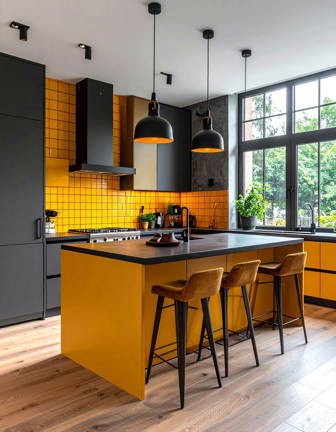
Does your kitchen feel a bit dull and in need of a serious personality boost? A mustard yellow and charcoal grey color scheme provides a bold, industrial-inspired look that is both cheerful and incredibly modern. The dark grey provides a clean, professional backdrop for cabinets or flooring, while the mustard yellow adds a sunny, energetic vibe through backsplashes, bar stools, or small kitchen appliances. This high-contrast pairing is excellent for making a small kitchen feel more defined and intentional. The warmth of the yellow balances the coolness of the charcoal, ensuring the heart of your home feels welcoming and full of creative energy.
8. Emerald Green Blush Pink Lounge
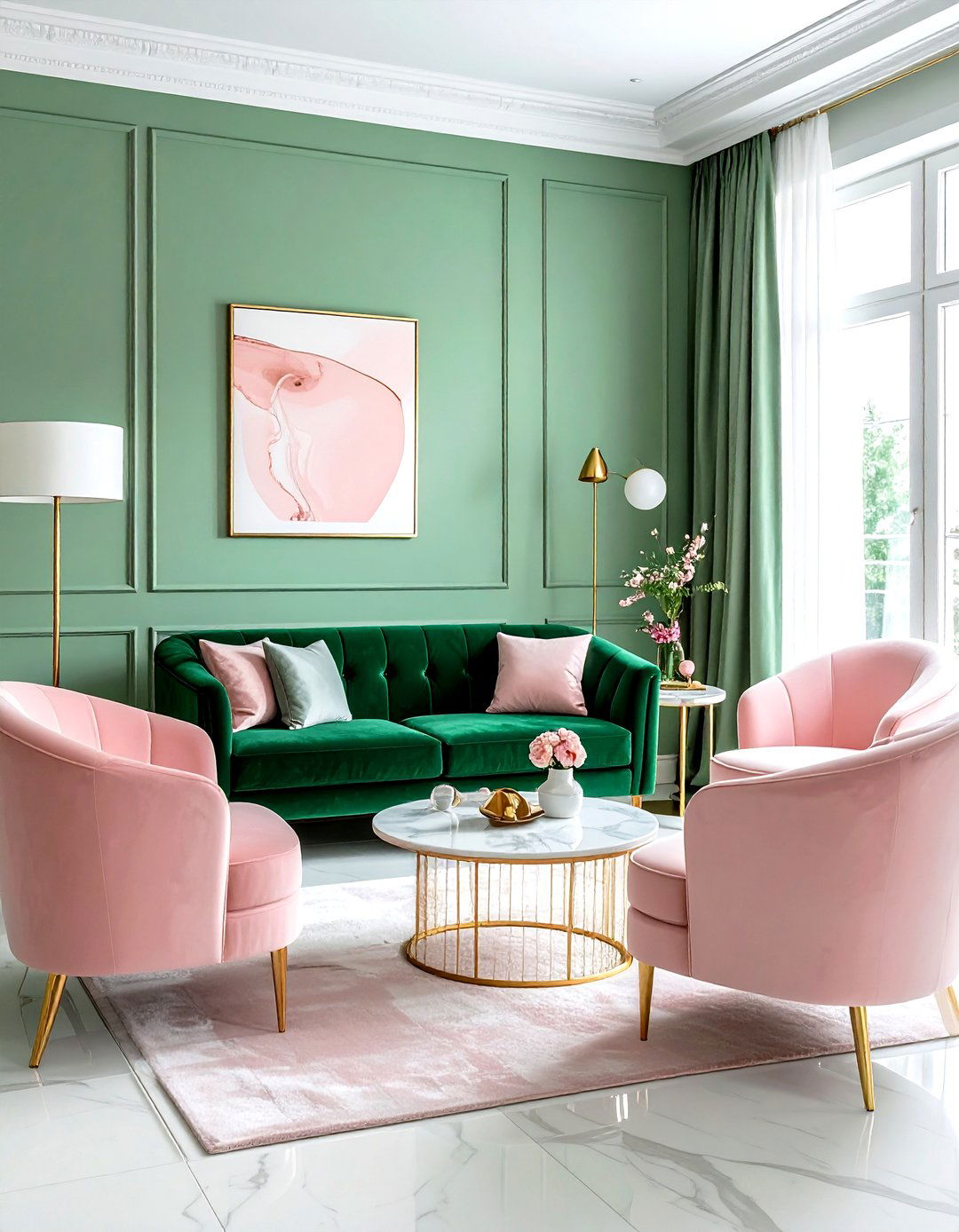
If you are looking to create a space that exudes "moody maximalism" and high-end style, look no further than emerald green and blush pink. This combination is a favorite among interior designers for its ability to feel both lush and approachable. The deep, saturated emerald green creates a sense of drama and opulence, while the soft blush pink provides a gentle, lightening effect that keeps the room feeling balanced. This palette works wonders in a lounge or formal sitting room, especially when paired with metallic accents and rich textures like velvet and marble. It is a bold choice that results in a truly memorable and photogenic interior.
9. Burnt Orange Navy Blue Dining
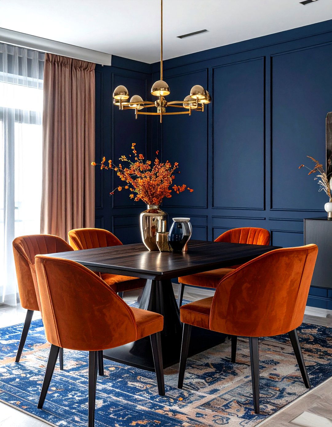
How do you create a dining room that feels both sophisticated for evening parties and cozy for morning coffee? A burnt orange and navy blue color scheme offers a perfect blend of warmth and depth that stimulates conversation and comfort. The deep navy provides a formal, grounded atmosphere, while the burnt orange adds a spicy, autumnal heat that makes the space feel vibrant and alive. This pairing is especially effective when using navy on the walls and burnt orange for the dining chairs or a large area rug. The contrast between these complementary colors creates a visual tension that is both exciting and aesthetically pleasing.
10. Sky Blue Sand Coastal Living
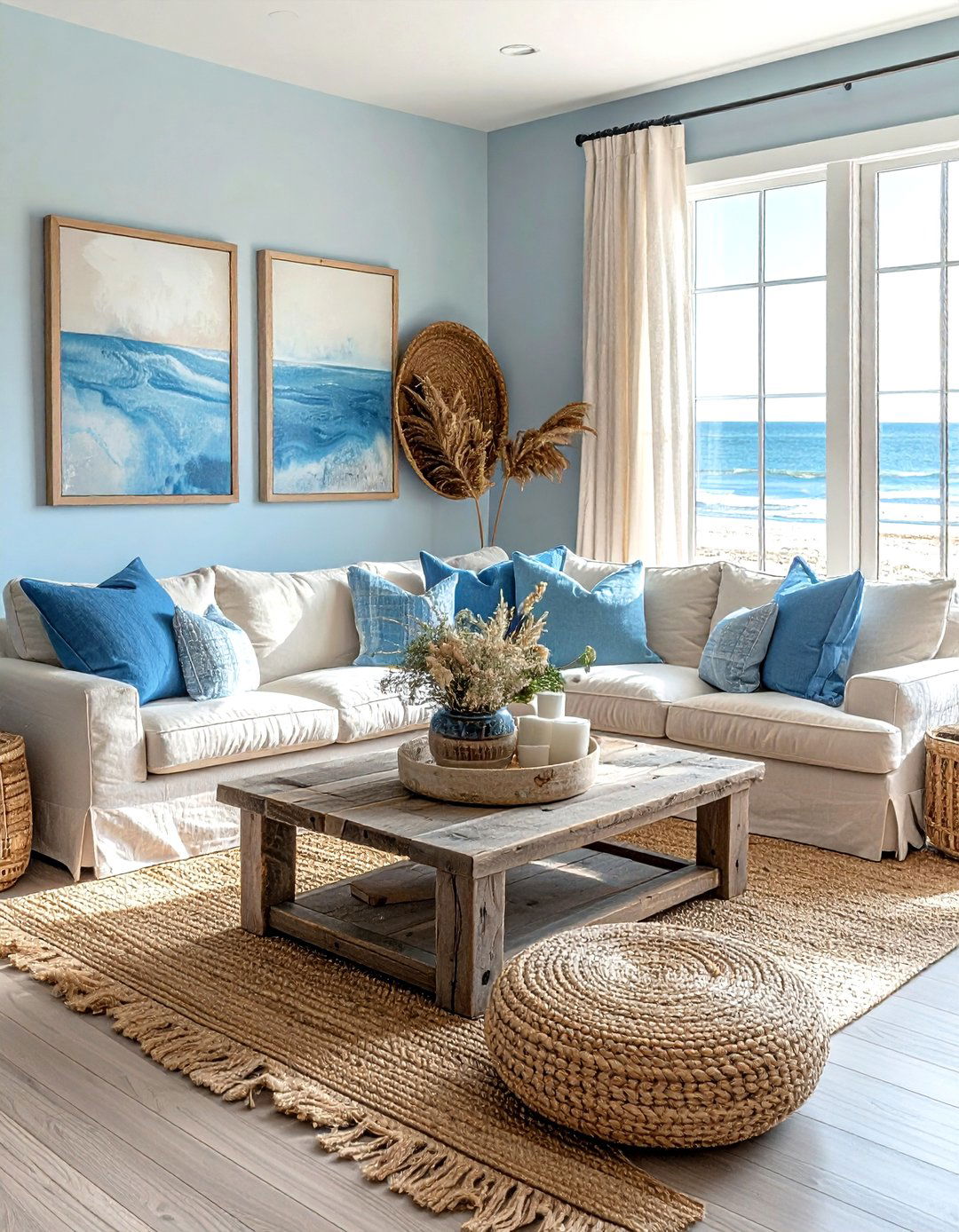
Bringing the serene feeling of a beach vacation into your home is easy with a sky blue and sand color palette. This classic coastal combination focuses on light, airy tones that maximize natural light and make any room feel more spacious. The soft blue mimics the clear sky or ocean water, while the sandy beige tones represent the warmth of the shore. This scheme is perfect for living rooms or sunrooms where you want to encourage relaxation and mindfulness. Use weathered wood furniture, woven jute rugs, and crisp white linens to enhance the organic, breezy feel of this timeless and incredibly popular color combination.
11. Plum Warm Wood Library Palette
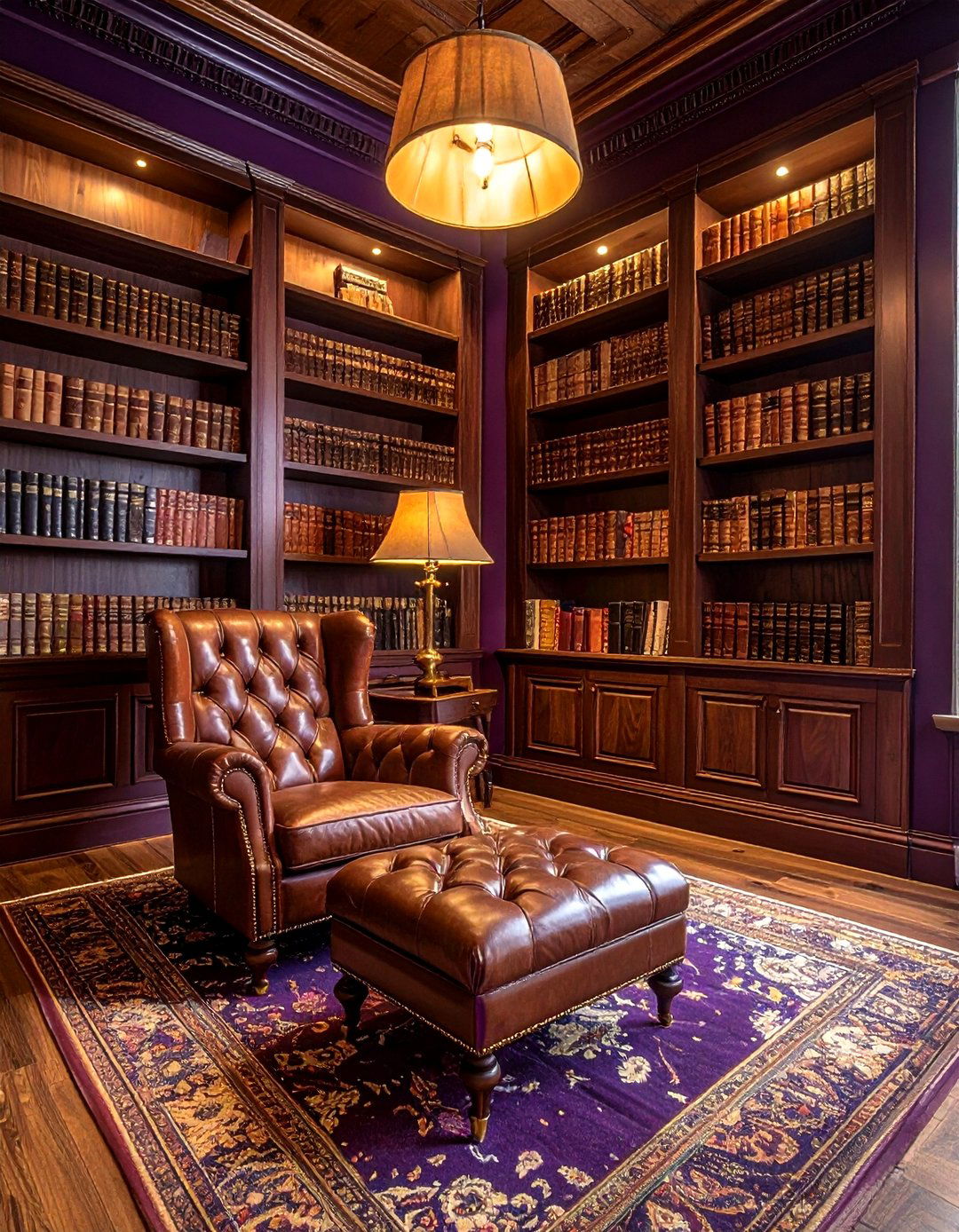
Imagine a cozy reading nook or a home library that feels like a hidden sanctuary away from the world. A deep plum and warm wood color scheme creates a moody, intellectual atmosphere that is perfect for focus and quiet contemplation. The rich purple tones of the plum provide a sense of luxury and mystery, while the natural grains and reddish undertones of warm wood furniture bring a grounded, historic feel to the room. This palette works best in spaces with plenty of bookshelves and soft, ambient lighting. Adding leather armchairs and brass lamps will further enhance the sophisticated, old-world charm of this stunningly dark and cozy interior.
12. Mint Green White Bathroom Palette
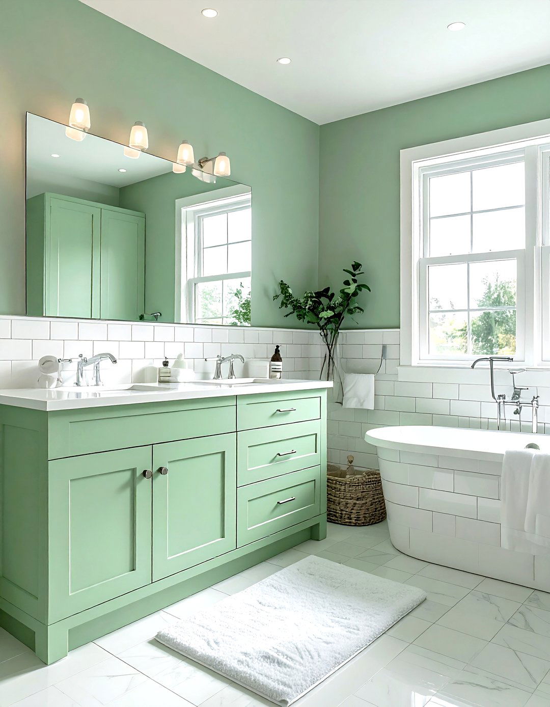
Refreshing your bathroom doesn't always require a full renovation; sometimes, a mint green and white color scheme is all you need for a total transformation. This combination feels incredibly clean, crisp, and revitalizing, making it the perfect choice for a space where you start and end your day. The mint green provides a soft hint of color that feels more modern than traditional blue, while the bright white keeps the room feeling sterile and bright. This palette works beautifully with chrome or matte black fixtures, and the addition of some indoor greenery can further emphasize the fresh, spa-like atmosphere you are trying to create.
13. Black White Minimalist Entryway Palette
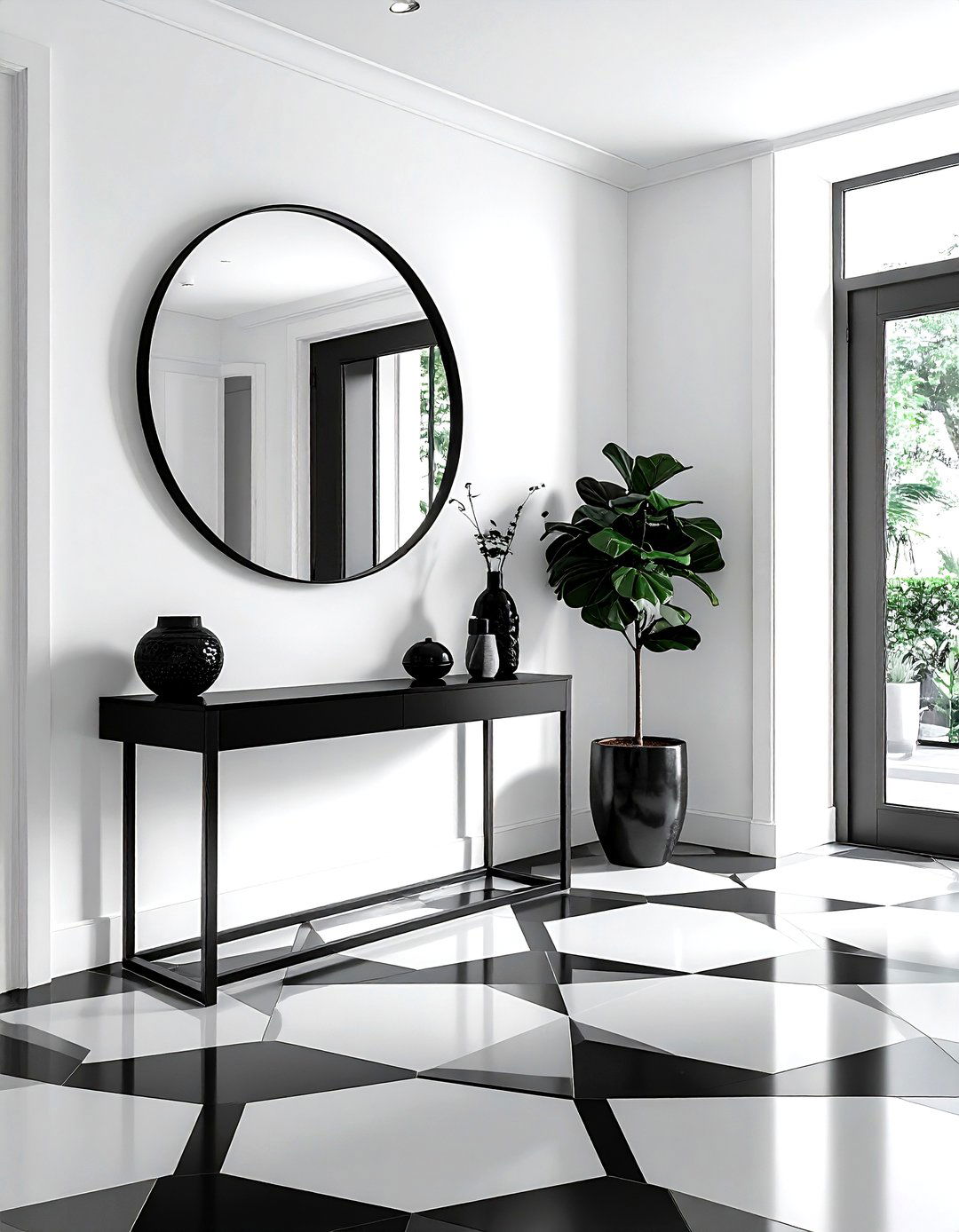
Creating a strong first impression starts at the front door, and a black and white minimalist palette is the ultimate way to achieve a high-impact look. This timeless combination relies on sharp contrasts and clean lines to create a sense of order and sophistication. By using white for the walls to maximize light and black for architectural details like railings, door frames, or floor tiles, you create a graphic and modern aesthetic. This scheme is incredibly versatile, allowing you to easily swap out seasonal decor or colorful artwork without clashing. It is a foolproof way to ensure your home feels organized, stylish, and contemporary from the moment guests arrive.
14. Peach Sage Green Sunroom Palette
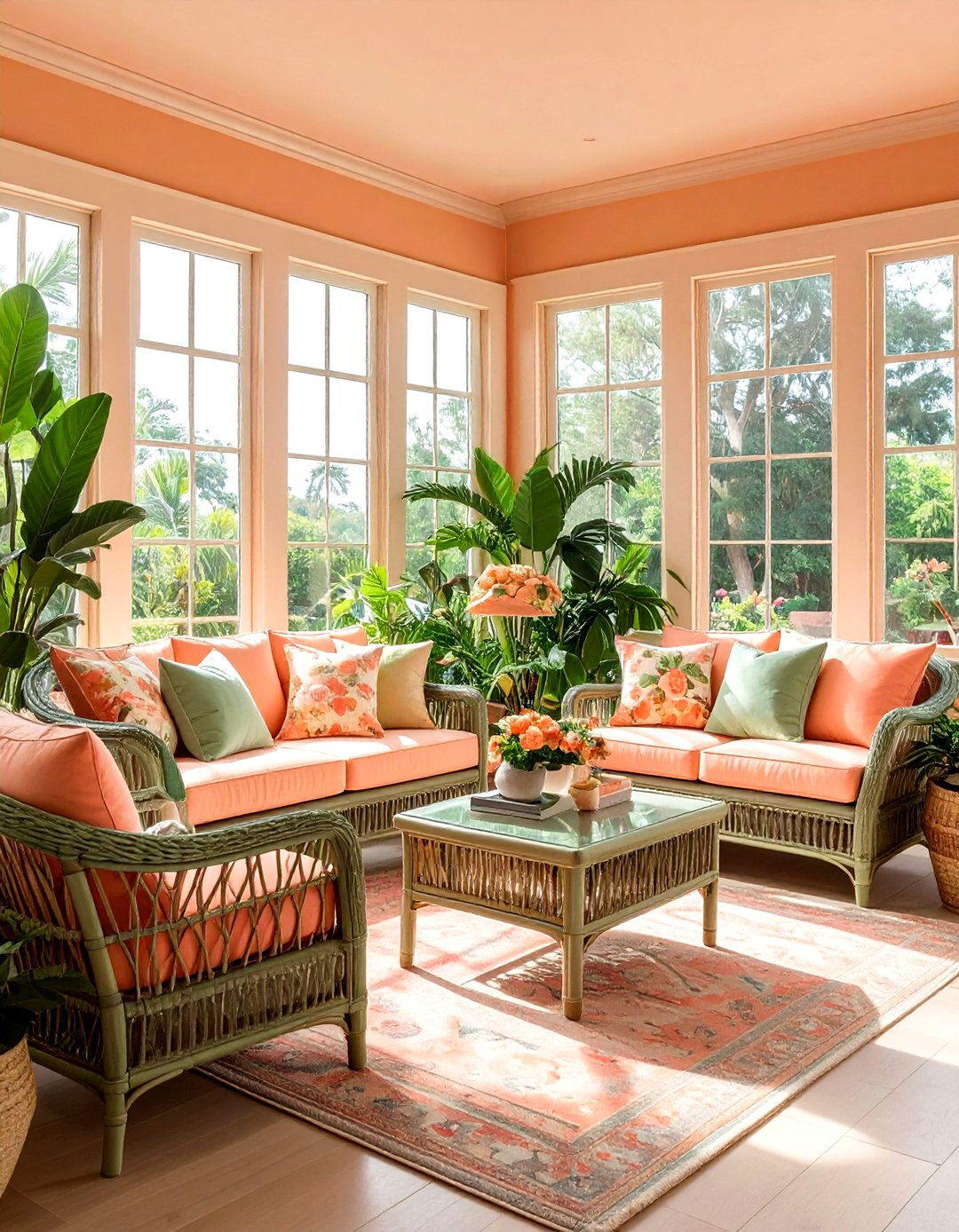
Sunrooms are meant to be bright and cheerful, and a peach and sage green color scheme captures the essence of a spring garden perfectly. The warm, soft orange of the peach provides a glow that mimics golden hour light, while the sage green adds a cooling, botanical element that keeps the room feeling fresh. This palette is ideal for spaces filled with large windows and indoor plants. You can use peach for upholstery or decorative pillows and sage for the window frames or accent furniture. The result is a harmonious and inviting space that feels like an extension of the outdoor garden, perfect for relaxing with a book.
15. Chocolate Brown Cream Bedroom Palette
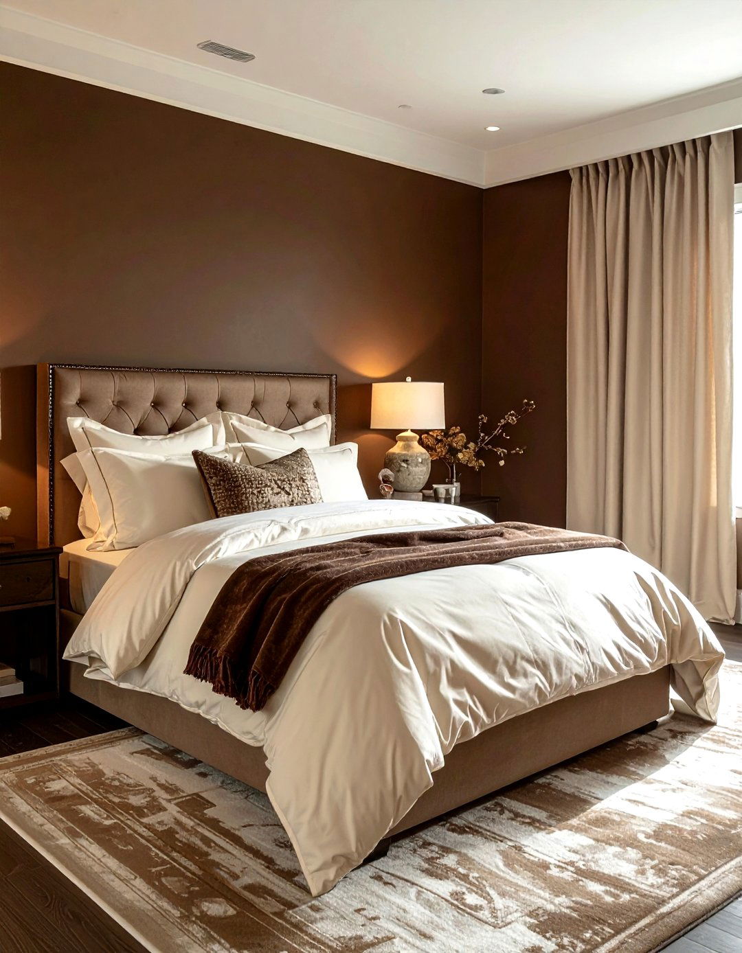
Are you tired of cold, sterile bedrooms and looking for something that feels like a warm hug? A chocolate brown and cream color scheme is the pinnacle of "cocooning" design, offering a rich and comforting environment. The deep brown walls or furniture pieces provide a sense of security and depth, while the cream textiles and accents prevent the room from feeling too heavy or dark. This palette relies heavily on texture, so consider using bouclé fabrics, wool throws, and silk pillows to add dimension. This combination is sophisticated, timeless, and perfect for creating a high-end, restful retreat that feels both grounded and incredibly luxurious.
16. Forest Green Gold Dining Palette
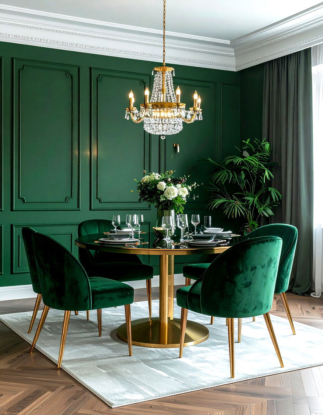
For those who love traditional elegance with a modern twist, a forest green and gold color scheme is a magnificent choice for a formal dining room. The dark, verdant green creates a stately and dramatic backdrop that feels intimate during evening meals. The addition of gold through a statement chandelier, metallic cutlery, or gilded mirror frames adds a touch of necessary sparkle and light. This palette feels incredibly festive and high-end, especially when paired with dark wood flooring and white crown molding. It is a color combination that commands respect and provides a beautiful setting for hosting memorable dinner parties and family gatherings throughout the year.
17. Pale Blue Yellow Guest Room
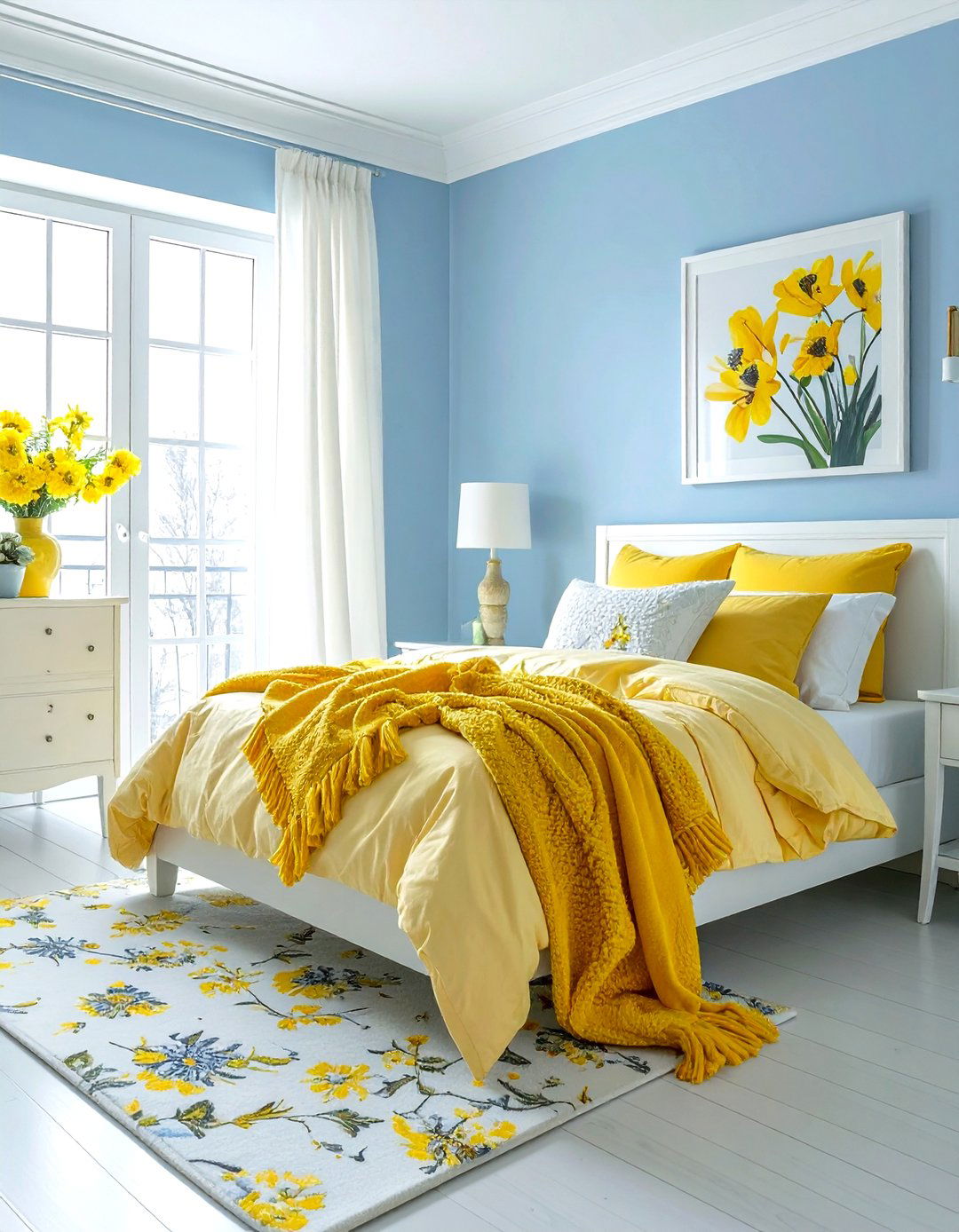
How do you make a guest room feel instantly welcoming and full of positive energy? A pale blue and buttercup yellow color scheme is a classic choice that never fails to brighten a visitor's mood. The soft blue provides a calming, serene foundation that encourages rest, while the cheerful yellow adds a "pop" of sunshine that makes the space feel vibrant. This combination is particularly effective in rooms that don't receive much natural light, as the yellow helps to bounce light around the space. Use blue for the walls and yellow for accent pieces like blankets, lamps, or artwork to create a balanced and happy environment for your guests.
18. Greige Soft Black Modern Kitchen
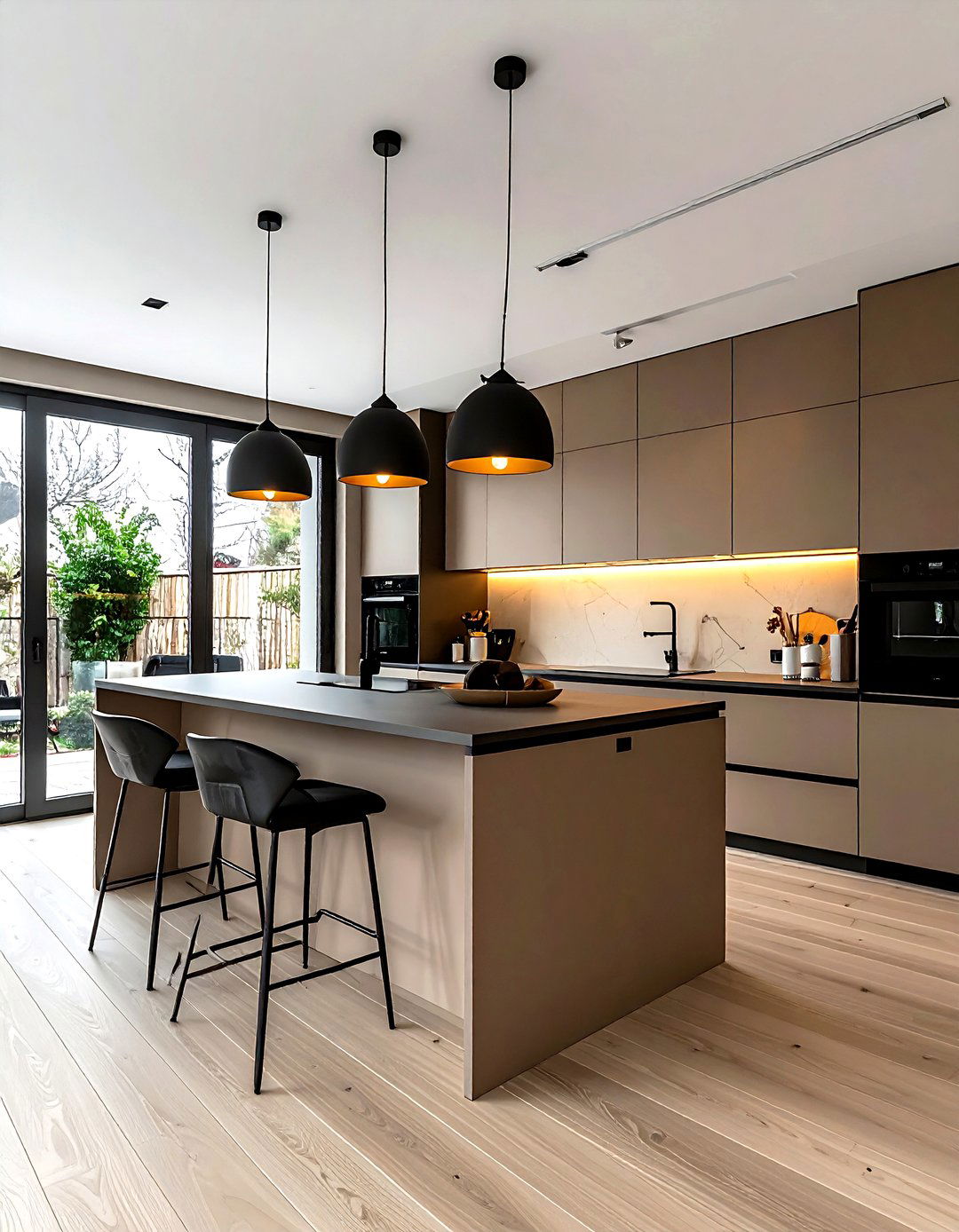
Achieving a "warm minimalist" look in the kitchen is easy when you use a palette of greige and soft black. Greige, a perfect blend of grey and beige, offers a neutral foundation that is much warmer than traditional grey but more modern than plain beige. Pairing this with soft black accents through hardware, light fixtures, or a kitchen island creates a sophisticated and high-contrast look that feels very current. This scheme is perfect for those who want a clean, uncluttered aesthetic without the coldness of an all-white kitchen. Natural stone countertops and light wood floors complete this look, making the heart of the home feel both functional and stylish.
19. Mauve Slate Blue Bedroom Palette
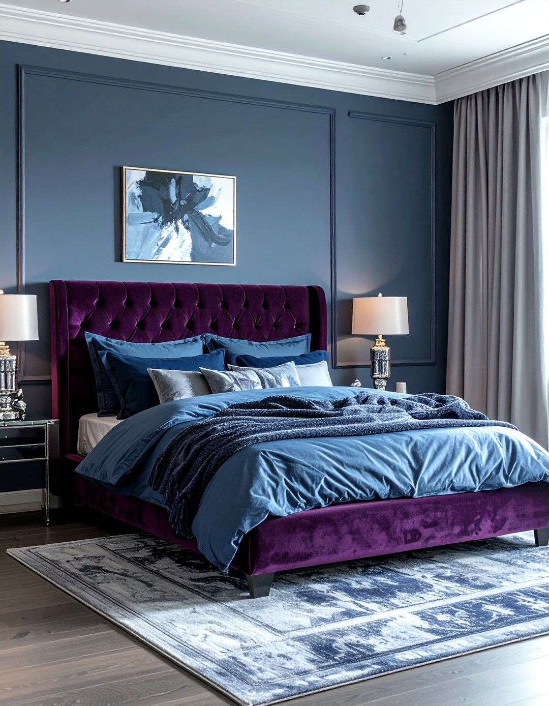
If you are looking for a unique and sophisticated color combination that feels both moody and soft, consider mauve and slate blue. This pairing is perfect for a master bedroom where you want a sense of romantic mystery without being overly feminine. The dusty, purple-pink tones of mauve blend beautifully with the cool, greyish-blue of the slate, creating a harmonious and balanced atmosphere. This palette works best when you layer different shades and textures, such as a mauve velvet headboard against slate blue walls. The result is a dreamy, sophisticated space that feels deeply personal and incredibly stylish, far removed from the more common neutral bedroom trends.
20. Ochre Deep Brown Living Room
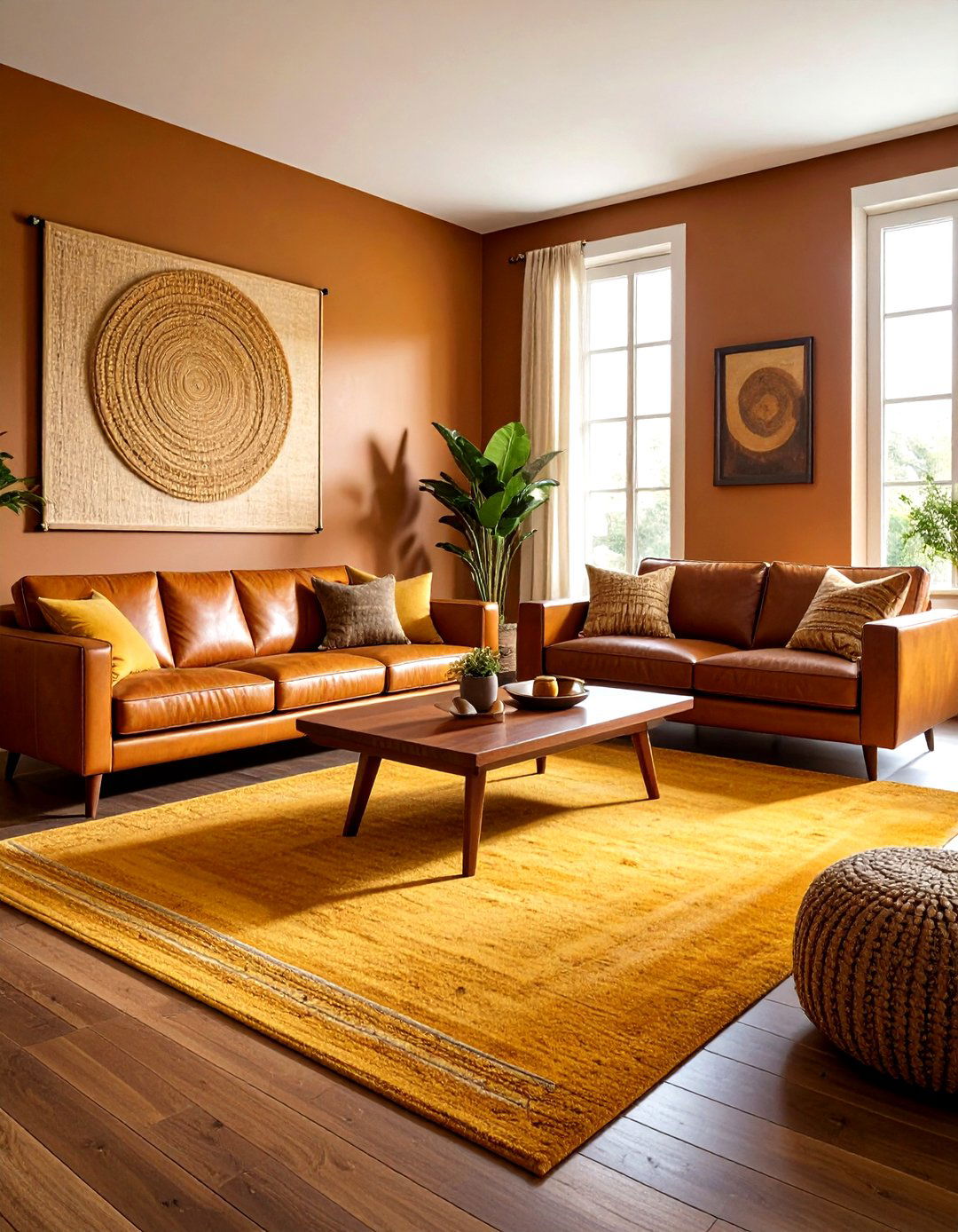
Do you love the look of a 1970s retro-inspired interior but want to keep it feeling modern and fresh? An ochre and deep brown color scheme provides a warm, earthy aesthetic that is currently trending in a big way. The golden, mustard-like tones of ochre bring a sense of history and warmth, while the deep chocolate brown adds a necessary grounding element. This palette is perfect for living rooms with mid-century modern furniture and plenty of natural textures like leather, jute, and wood. By keeping the walls a light neutral and using these bold colors for furniture and rugs, you create a space that is cozy, stylish, and full of character.
21. Lilac Pistachio Green Kitchen Palette
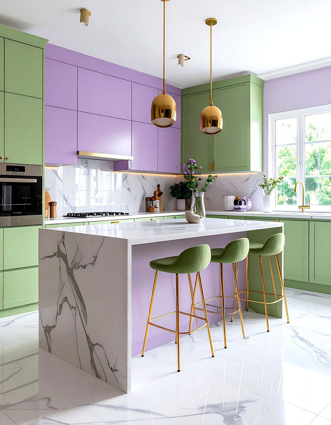
For a kitchen that feels playful, fresh, and completely unique, a lilac and pistachio green color scheme is a daring but rewarding choice. These "pastels with a twist" offer a refreshing alternative to standard white or grey kitchens. The soft, floral purple of the lilac pairs unexpectedly well with the light, nutty green of the pistachio, creating a space that feels like a permanent springtime. This palette works best in kitchens with plenty of natural light and modern, clean-lined cabinetry. You can use one color for the lower cabinets and the other for the backsplash or kitchen island, resulting in a whimsical and creative space that makes cooking feel like a joy.
22. Rust Slate Grey Industrial Office
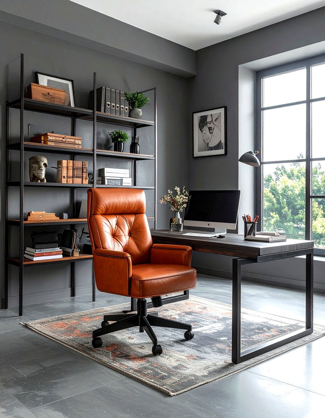
Creating a productive home office often requires a balance between stimulating energy and focused calm. A rust and slate grey color scheme offers an industrial-inspired aesthetic that is both masculine and sophisticated. The warm, metallic tones of the rust provide a sense of creative energy, while the cool, dark grey helps to ground the space and reduce visual distractions. This palette works exceptionally well with materials like exposed brick, metal shelving, and dark wood desks. By using slate grey for the walls and rust for an accent chair or decorative accessories, you create a professional environment that feels intentional, modern, and perfectly suited for deep work and creative thinking.
23. Indigo Crisp White Bedroom Palette
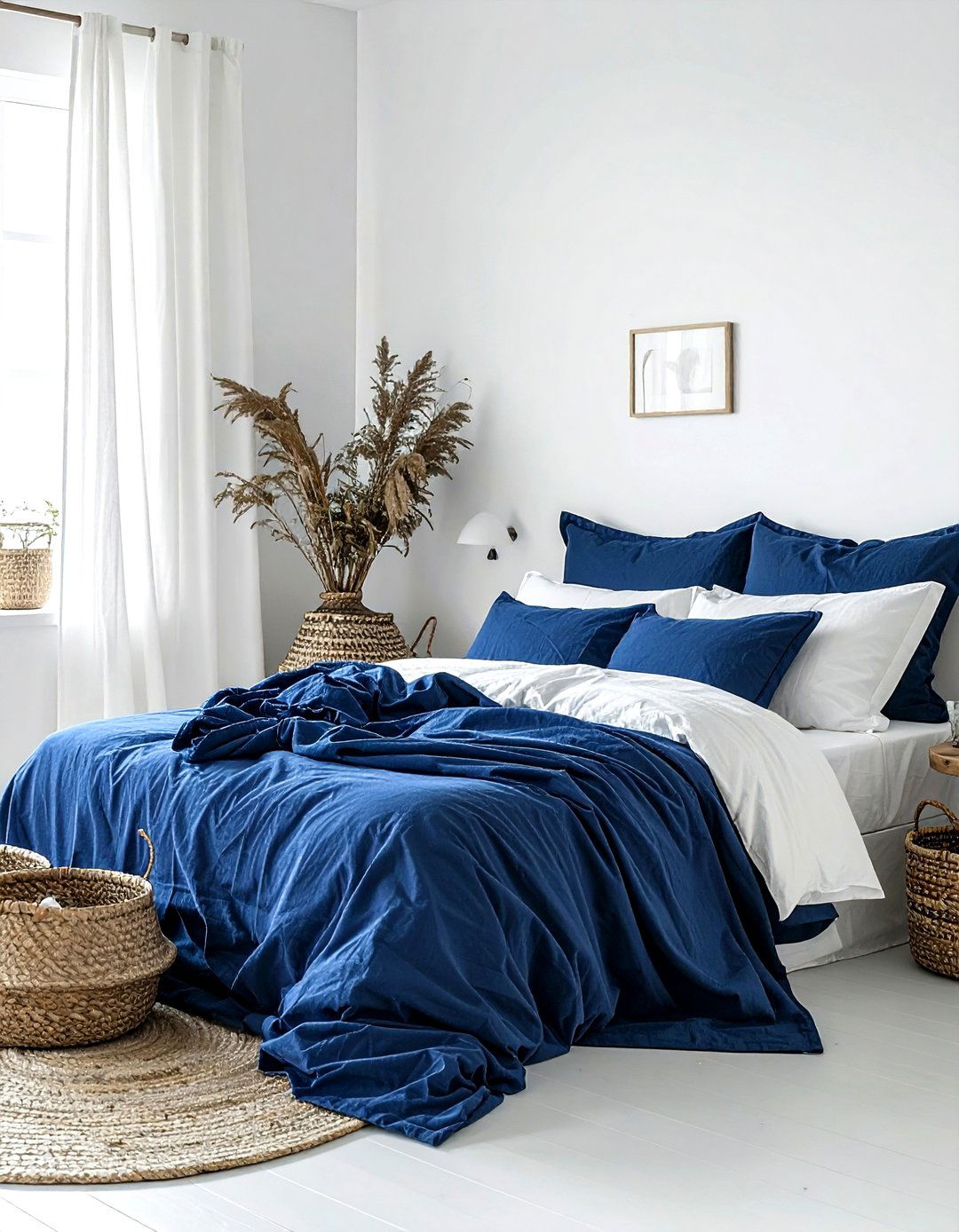
Is there any color combination more timeless and refreshing than indigo and crisp white? This high-contrast pairing is a favorite for bedrooms because it creates a clean, nautical-inspired look that always feels sophisticated. The deep, inky blue of the indigo provides a sense of calm and stability, while the bright white keeps the room feeling airy and spacious. This scheme is incredibly easy to pull off; simply use indigo for a statement wall or bedding and keep everything else a brilliant white. Adding natural textures like wicker baskets and linen curtains will prevent the room from feeling too stark, resulting in a classic and peaceful retreat you will love for years.
24. Champagne Charcoal Grey Dining Palette
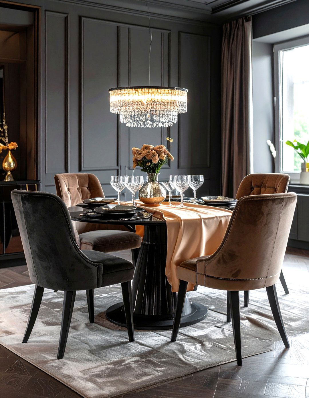
For a dining room that feels like the height of contemporary luxury, consider a palette of champagne and charcoal grey. This combination is all about subtle sophistication and the play of light against dark. The warm, metallic shimmer of champagne provides a soft and inviting glow, while the deep, matte charcoal adds a dramatic and modern edge. This scheme works beautifully when you use charcoal for the walls and champagne for upholstered chairs, curtains, and table linens. The contrast is sharp but elegant, making it the perfect backdrop for formal dinner parties where you want the lighting and the company to be the main focus of the evening.
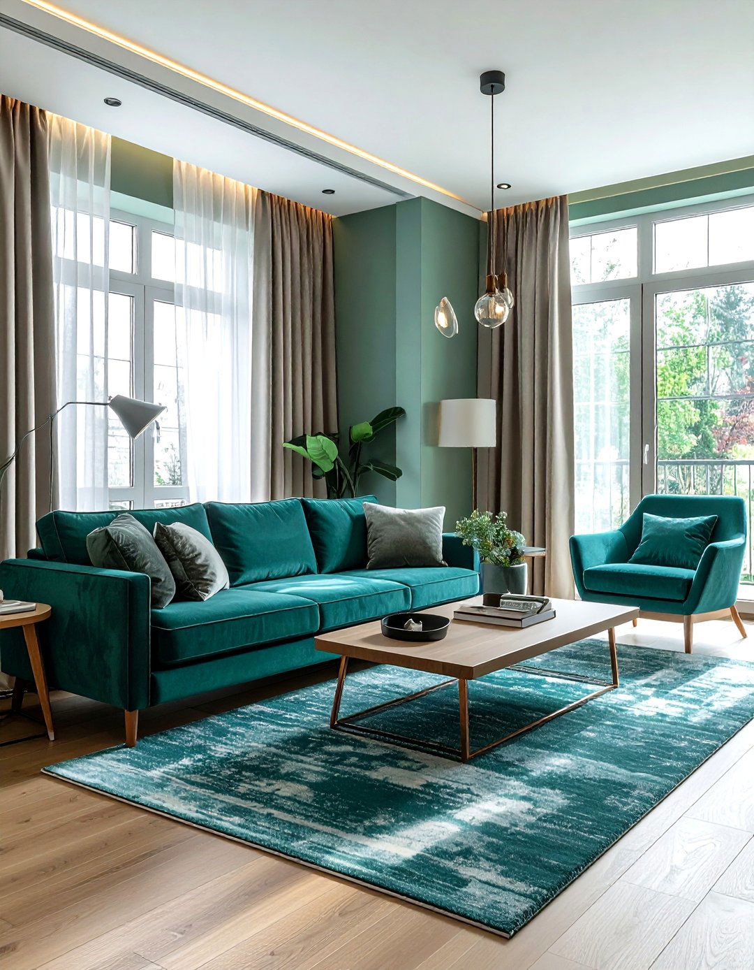
25. Copper Deep Teal Living Room
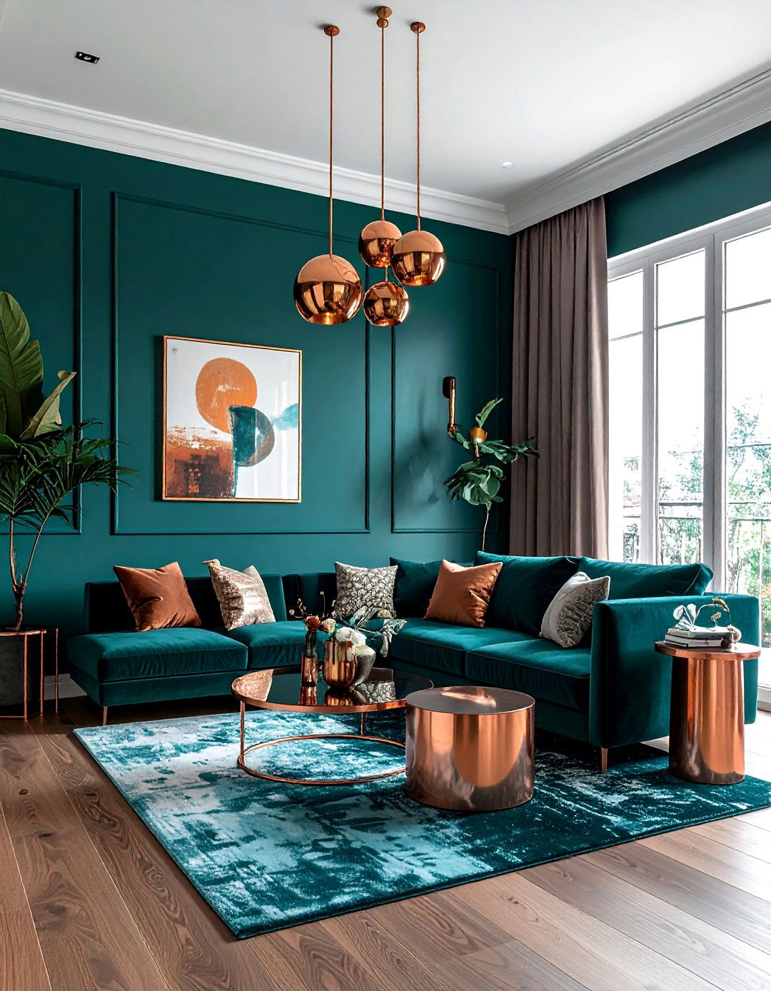
How do you add a sense of warmth and metallic shine to a moody, jewel-toned room? A copper and deep teal color scheme is a stunning solution that creates a rich and inviting living space. The cool, saturated teal provides a sophisticated and calming foundation, while the warm, orange-toned copper adds a touch of fire and brilliance. This palette is especially effective when you use teal for the walls or a large velvet sofa and introduce copper through light fixtures, side tables, and decorative bowls. The interaction between the cool blue-green and the warm metal creates a dynamic and luxurious atmosphere that feels both modern and deeply comfortable.
26. Pale Pink Emerald Green Office
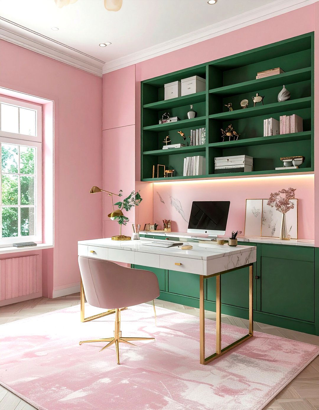
Can a home office be both professional and incredibly stylish? A pale pink and emerald green color scheme proves that you don't have to sacrifice personality for productivity. This combination is a favorite for creative professionals who want an inspiring and photogenic workspace. The soft, muted pink provides a gentle and calming backdrop that reduces stress, while the bold emerald green adds a sense of growth, energy, and focus. Use pink for the walls and emerald for a velvet desk chair or built-in shelving. This palette pairs beautifully with gold hardware and white marble accents, creating a workspace that is as beautiful as it is functional and inspiring.
27. Sandy Beige Seafoam Green Bathroom
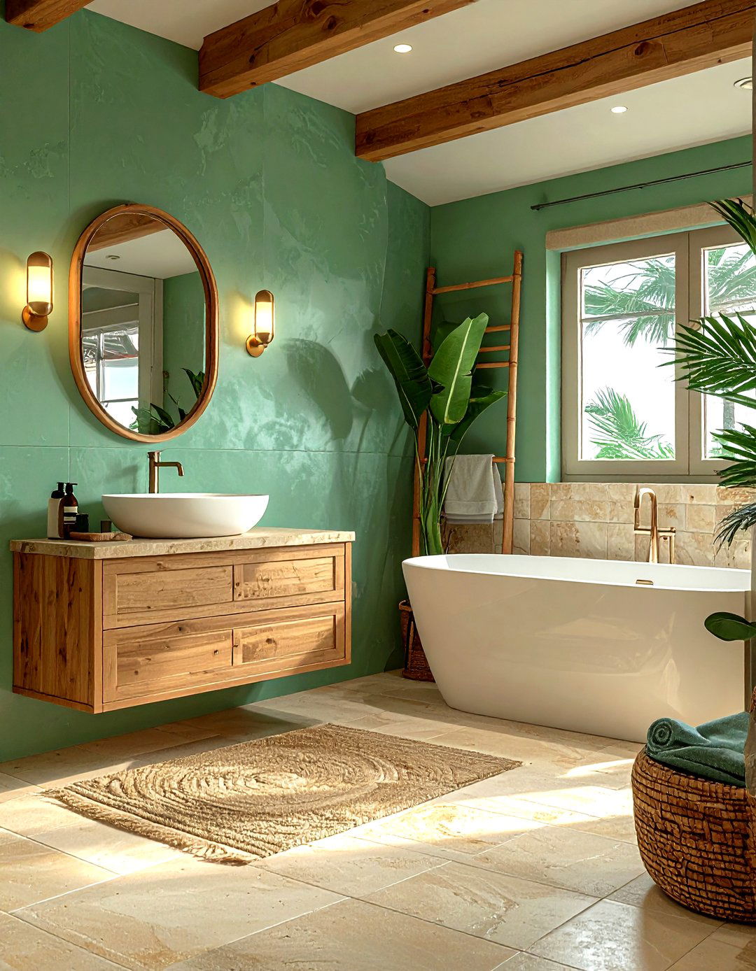
Bringing the "home spa" aesthetic to life is easy with a sandy beige and seafoam green color scheme. This palette is designed to evoke the feeling of a peaceful morning at the beach, focusing on light, watery tones and natural textures. The soft, muted green provides a refreshing and clean feel, while the sandy beige adds a sense of warmth and organic grounding. This combination works perfectly with light-colored stone tiles, bamboo accessories, and fluffy white towels. It is a foolproof way to ensure your bathroom feels like a tranquil sanctuary where you can truly relax and recharge after a long and busy day in the modern world.
28. Burgundy Warm Grey Living Room
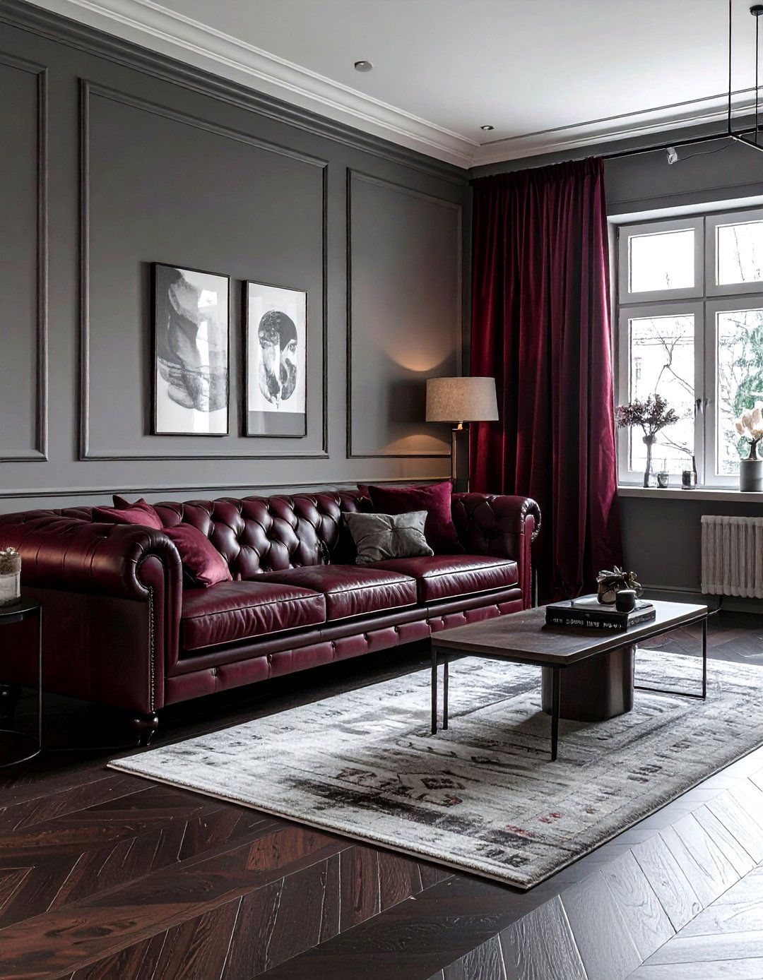
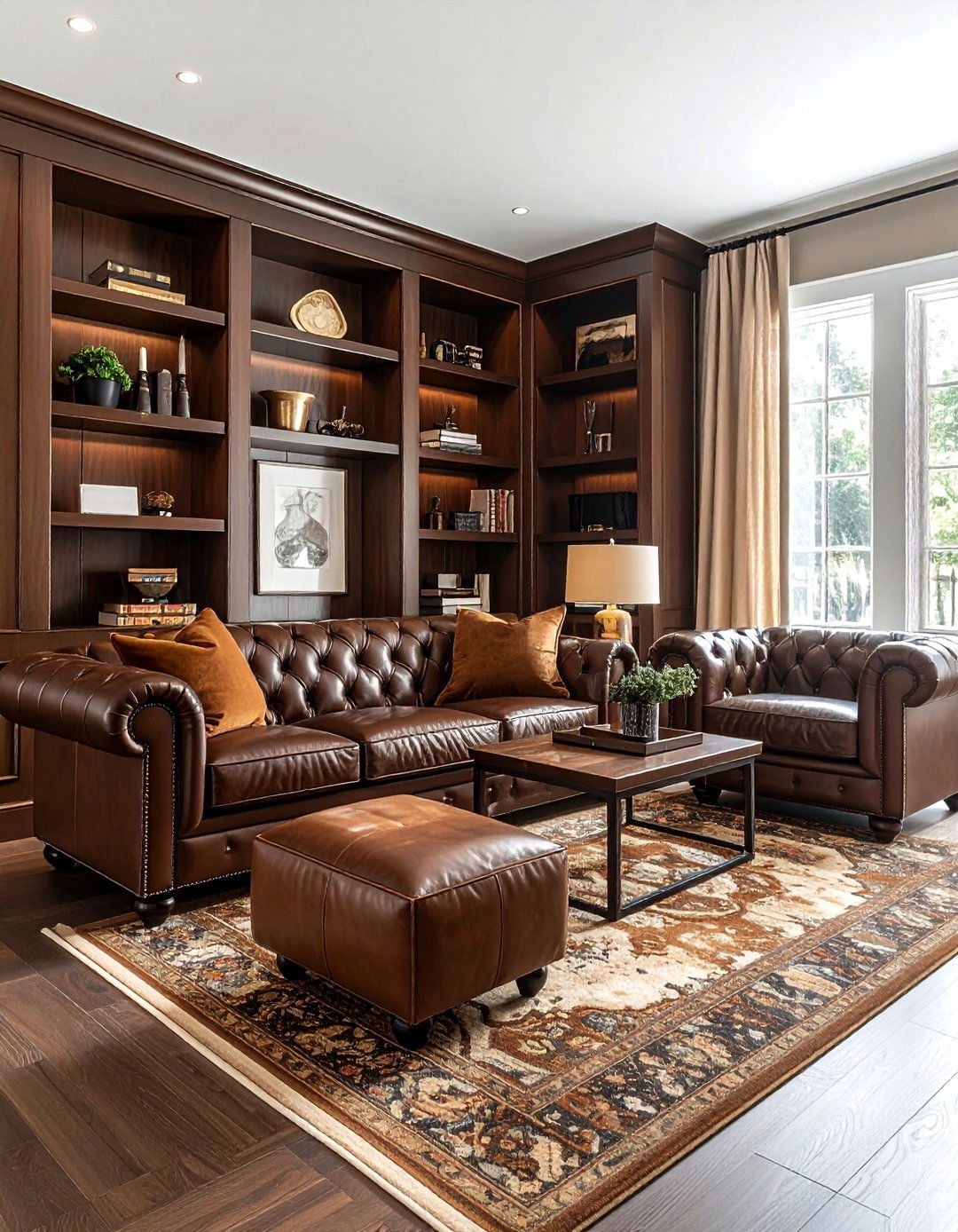
For a living room that feels moody, sophisticated, and deeply cozy, a burgundy and warm grey color scheme is an excellent choice. This combination is perfect for the colder months, as the rich, red tones of the burgundy provide a sense of warmth and opulence. The warm grey acts as a stabilizing neutral that prevents the red from feeling too aggressive or overwhelming. This palette works best when you use grey for the walls and burgundy for large furniture pieces like a leather sofa or heavy drapes. Adding wooden accents and soft, amber lighting will further enhance the intimate and luxurious feel of this stunningly elegant and timeless interior design.
29. Lemon Yellow Light Grey Kitchen
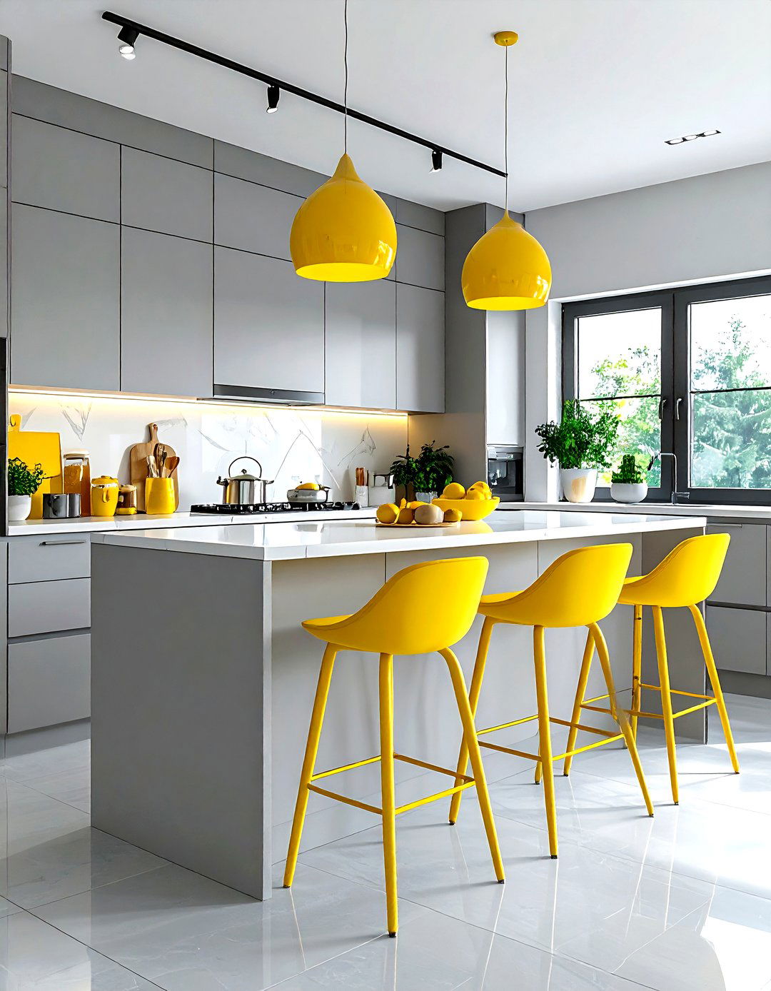
How do you make a modern kitchen feel cheerful and sunny without being overwhelming? A lemon yellow and light grey color scheme offers a perfect balance of energy and restraint. The light grey provides a sleek, clean, and professional foundation for cabinets and countertops, while the bright yellow adds a "pop" of happiness through a tiled backsplash or bar stools. This combination is excellent for making a kitchen feel more spacious and full of light. The coolness of the grey tempers the vibrancy of the yellow, ensuring the space feels balanced and sophisticated rather than childish. It is a refreshing and modern take on a classic cheerful color palette.
30. Dark Wood Sage Green Entryway
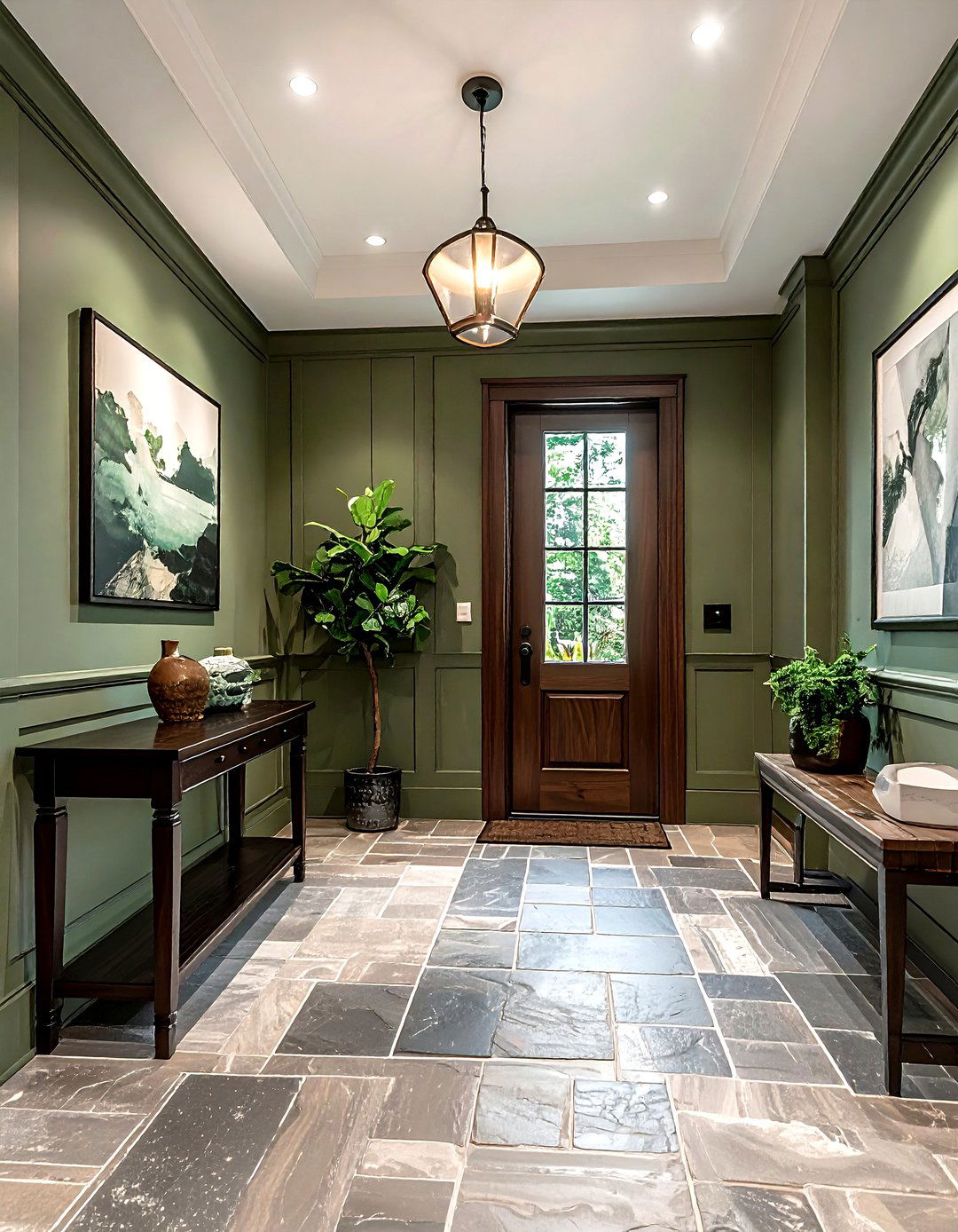
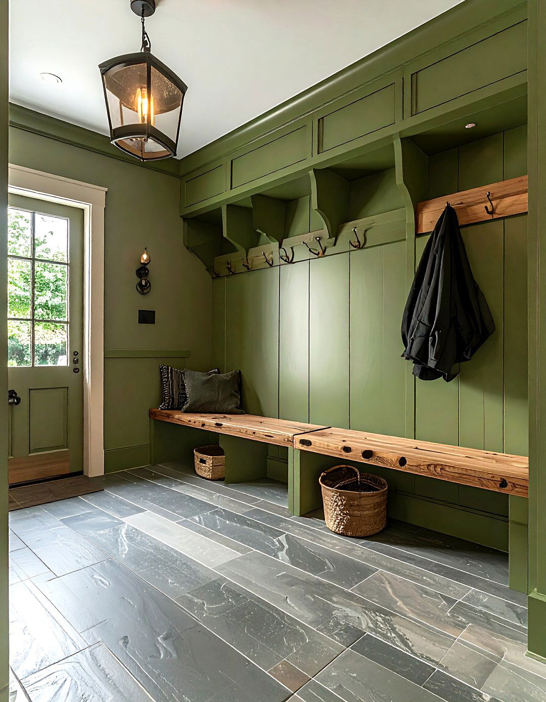
Creating an entryway that feels grounded and connected to nature is a great way to welcome people into your home. A dark wood and sage green color scheme provides a classic, craftsman-inspired look that feels both historic and modern. The deep, rich tones of the dark wood provide a sense of quality and stability, while the soft, muted sage green adds a breath of fresh air and a botanical touch. This palette works beautifully with vintage-inspired hardware and natural stone flooring. By using sage green for the walls and dark wood for the front door and console table, you create a timeless and inviting first impression for every guest.
Conclusion:
Selecting the right color scheme is one of the most impactful decisions you can make when designing your home, as it dictates the mood and energy of every single room. Whether you prefer the dramatic contrast of navy and gold or the peaceful harmony of sage green and cream, these thirty ideas provide a comprehensive guide to modern and viral interior trends. Remember that the key to a successful palette lies in the balance of light and dark, as well as the thoughtful integration of textures and natural materials. By choosing a scheme that reflects your personal style and enhances your architectural features, you can create a space that is not only beautiful and photogenic but also a true reflection of your personality. Take your time with samples, observe how the light changes throughout the day, and don't be afraid to experiment with bold combinations that make your home feel unique, inviting, and perfectly curated for your lifestyle.


Leave a Reply