Transforming your living space into a curated sanctuary often feels like a balancing act between personal expression and professional design principles. Whether you are moving into a brand-new home or simply refreshing a tired guest room, understanding the core "dos and don'ts" can save you from costly mistakes and aesthetic frustration. Many homeowners feel overwhelmed by the endless stream of trends on social media, yet the most successful interiors usually follow timeless rules regarding scale, light, and function. By focusing on how elements interact within a room, you can create a cohesive atmosphere that feels both intentional and inviting. This guide explores thirty essential strategies to elevate your home decor effortlessly.
1. Area rug size
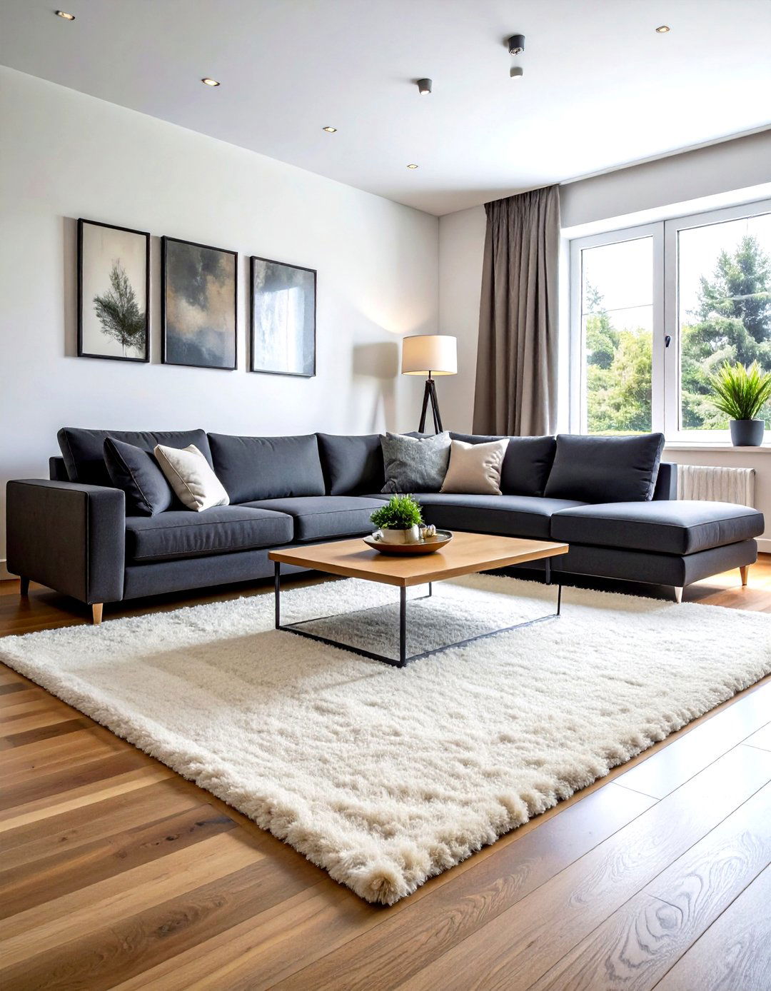
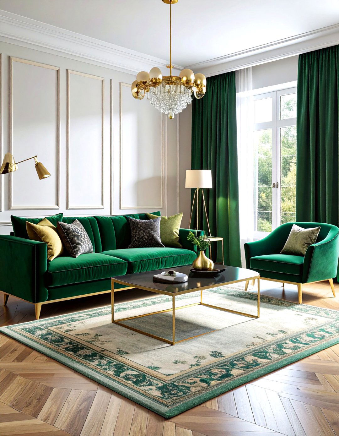
Have you ever noticed how a tiny rug can make a massive living room feel awkward and disjointed? One of the most critical "dos" in interior design is choosing an area rug that is large enough to ground your furniture. A common mistake is selecting a "postage stamp" rug that sits lonely in the center of the room. Instead, aim for a size that allows at least the front legs of all your seating pieces to rest comfortably on the fibers. This simple adjustment creates a unified "island" for conversation, making the entire space feel much more expansive, intentional, and professionally designed for comfort.
2. Curtain rod height
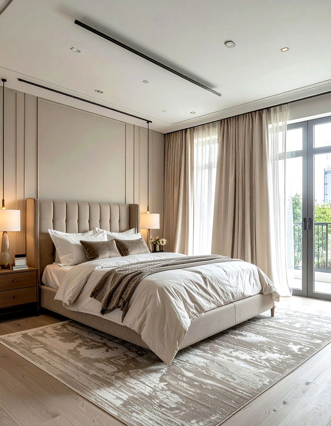
Are you looking for an easy way to make your ceilings look much higher than they actually are? The secret lies in your curtain rod placement. A major "don't" is hanging the rod directly on top of the window frame, which cuts off the visual height of the wall. Instead, do hang your drapery rods as close to the ceiling as possible and extend them several inches wider than the window itself. This technique allows the fabric to frame the glass without blocking natural light, creating a grand, airy feeling that mimics the architecture of a high-end luxury hotel suite or estate.
3. Layered living room lighting
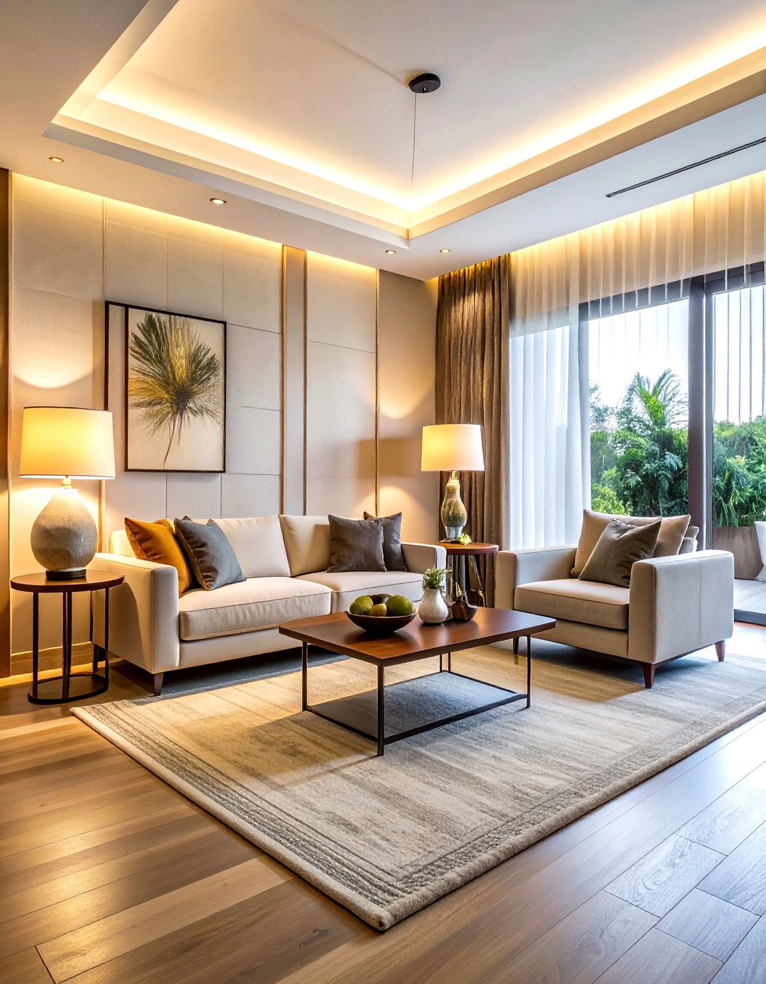
Does your living room feel flat or sterile when you flip on the main light switch? Relying solely on a single overhead fixture is a common decorating pitfall that creates harsh shadows. To achieve a warm and inviting atmosphere, you must layer your lighting using a mix of ambient, task, and accent sources. Incorporate floor lamps for reading nooks, table lamps for soft evening glows, and perhaps even picture lights to highlight your favorite artwork. Using bulbs with a warm temperature below 3000 Kelvin ensures your home feels cozy and welcoming rather than like a cold, bright commercial office space.
4. Gallery wall spacing
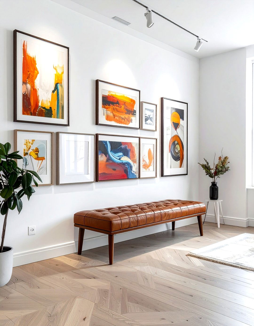
Creating a gallery wall is a fantastic way to showcase your personality, but improper spacing can quickly turn art into clutter. A frequent "don't" is hanging frames too far apart or too high on the wall, which makes the collection feel scattered and disconnected. Instead, do keep a consistent gap of about two to three inches between each frame to create a sense of rhythm. Aim to have the center of the entire arrangement sit at eye level, roughly sixty inches from the floor. This creates a focal point that feels anchored to the room’s furniture rather than floating aimlessly.
5. Floating furniture layout
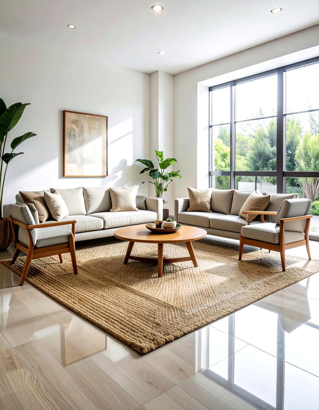
Many people instinctively push every piece of furniture directly against the walls, thinking it saves space, but this often creates a "waiting room" vibe. A professional "do" is to pull your sofas and chairs away from the perimeter to create an intimate conversation area. Even leaving just a few inches of "breathing room" between the back of a couch and the wall can make a layout feel more sophisticated and airy. This "floating" technique improves the flow of traffic and makes large rooms feel more filled out and cozy, while also highlighting your home's unique architectural details.
6. Room color balance
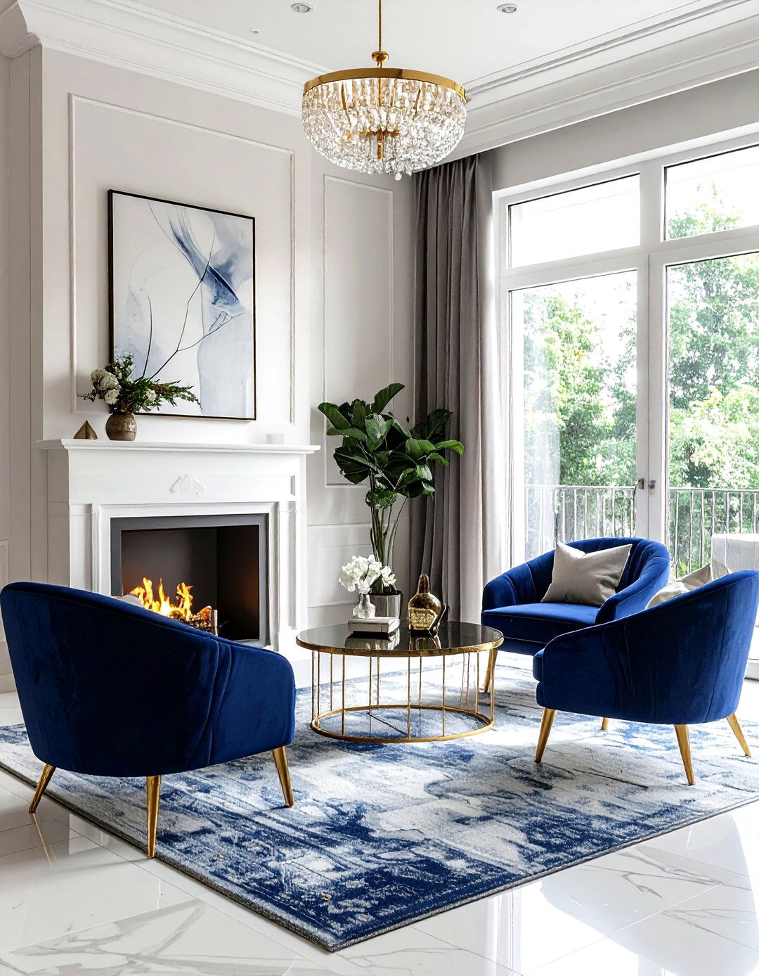
Achieving a perfectly balanced room often comes down to the classic 60-30-10 rule for color distribution. A common decorating mistake is using too many bold colors in equal amounts, which can overwhelm the senses and feel chaotic. Instead, do use a dominant neutral color for sixty percent of the space, a secondary color for thirty percent, and a bold accent for the final ten percent. This creates a visual hierarchy that guides the eye naturally through the room. By sticking to this ratio, you can experiment with trendy hues without making your home feel like a mismatched or disorganized rainbow.
7. Indoor plant styling
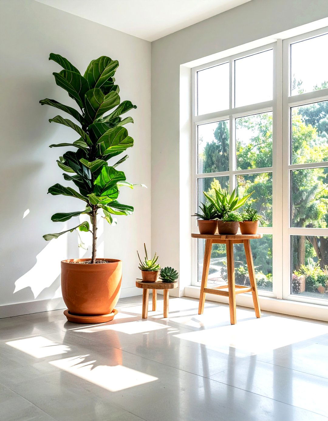
Are you struggling to make your indoor garden look like the lush photos you see in design magazines? A common "don't" is scattered groups of tiny, mismatched pots that look cluttered rather than curated. Instead, do focus on variety in height and leaf texture to create a more dynamic display. Use a large statement plant, like a Fiddle Leaf Fig or a Bird of Paradise, to fill an empty corner and add vertical interest. Grouping smaller plants in odd numbers on different levels, such as on a plant stand or bookshelf, creates a more natural and organic aesthetic.
8. Decorative pillow arrangement
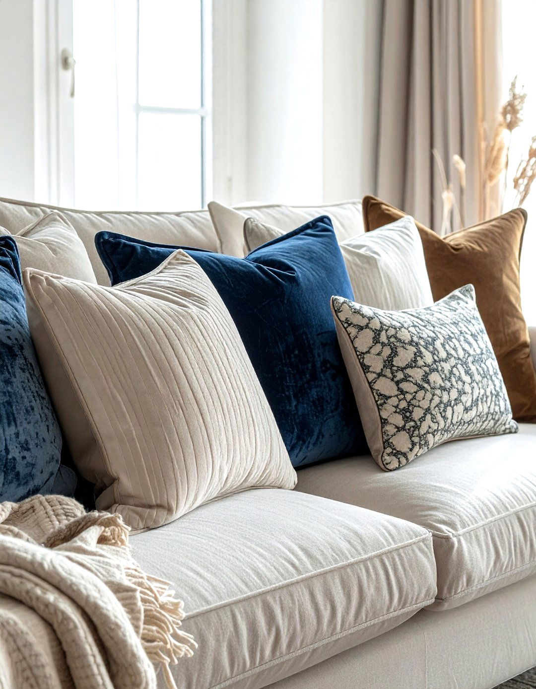
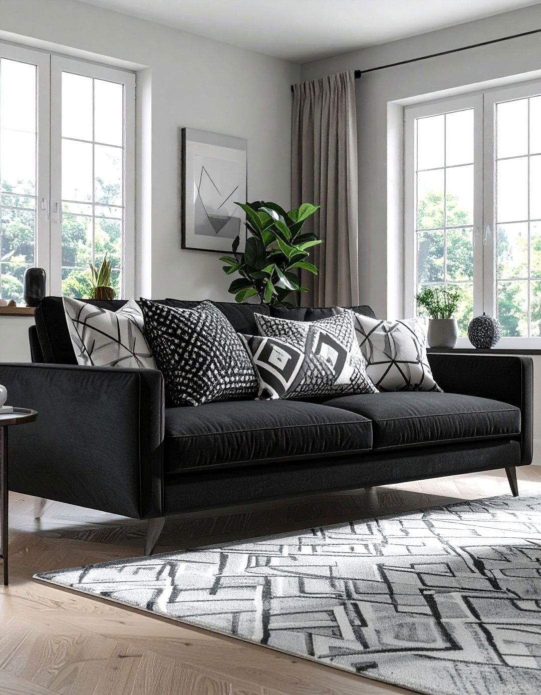
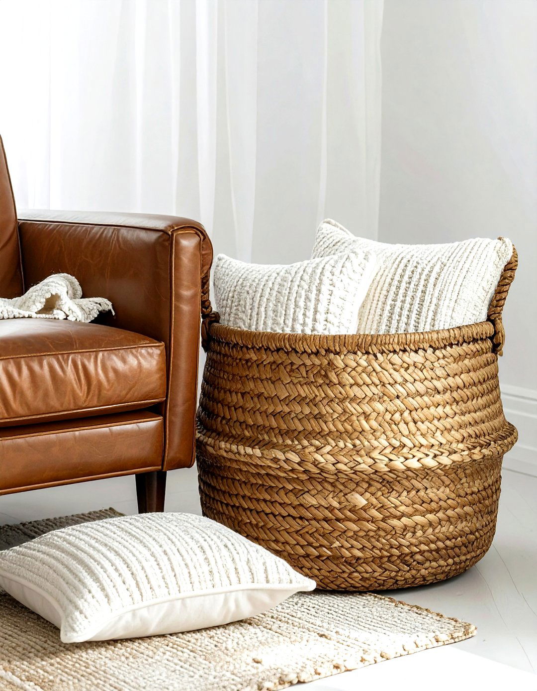
Throw pillows are the ultimate accessory for adding comfort and style, but there is a fine line between "cozy" and "too much." A major "don't" is covering your sofa with so many pillows that guests have nowhere to sit. Instead, do use a mix of sizes, textures, and patterns to create depth. A classic arrangement involves two large square pillows in the corners, followed by slightly smaller ones, and a single lumbar pillow in the center. This layered look provides a professional finish while remaining functional, ensuring your living room stays comfortable for actual living and daily relaxation.
9. Large wall art
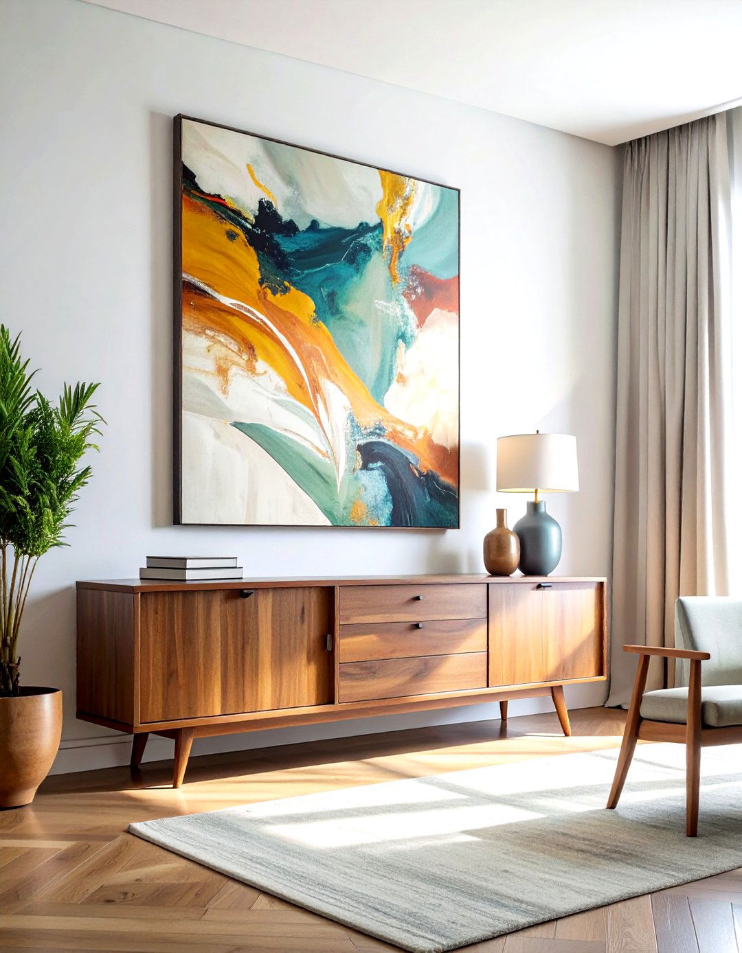
When it comes to decorating a large, empty wall, scale is absolutely everything for a successful design. A common mistake is hanging a single, tiny piece of art on a massive expanse of drywall, which makes the artwork look lost and insignificant. Instead, do choose a statement piece that covers about two-thirds to three-quarters of the available wall space above a furniture item. If you cannot afford a giant canvas, you can achieve the same effect by grouping smaller pieces together in a tight grid. This creates a bold visual impact that grounds the room and feels very high-end.
10. Entryway mudroom storage
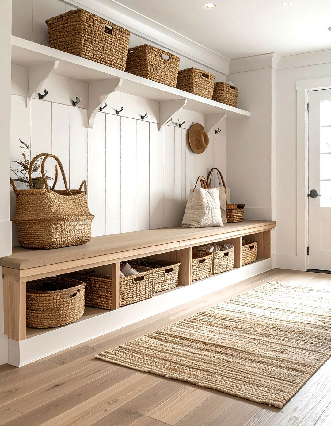
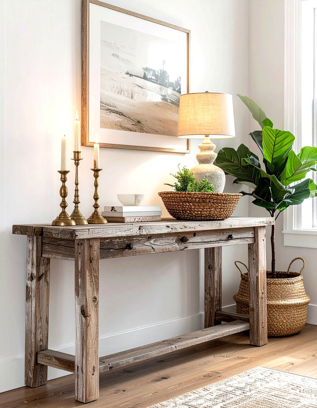
The entryway is the first thing guests see, so keeping it organized is a vital "do" for a great first impression. Avoid the "don't" of letting shoes, bags, and mail pile up in a messy heap near the front door. Instead, do incorporate functional storage solutions that match your home's style, such as a sleek console table with drawers or a bench with hidden cubbies. Adding a dedicated spot for keys and a stylish mirror not only helps with daily routines but also reflects light, making even a small foyer feel much more bright, spacious, and welcoming.
11. Wall mirror placement
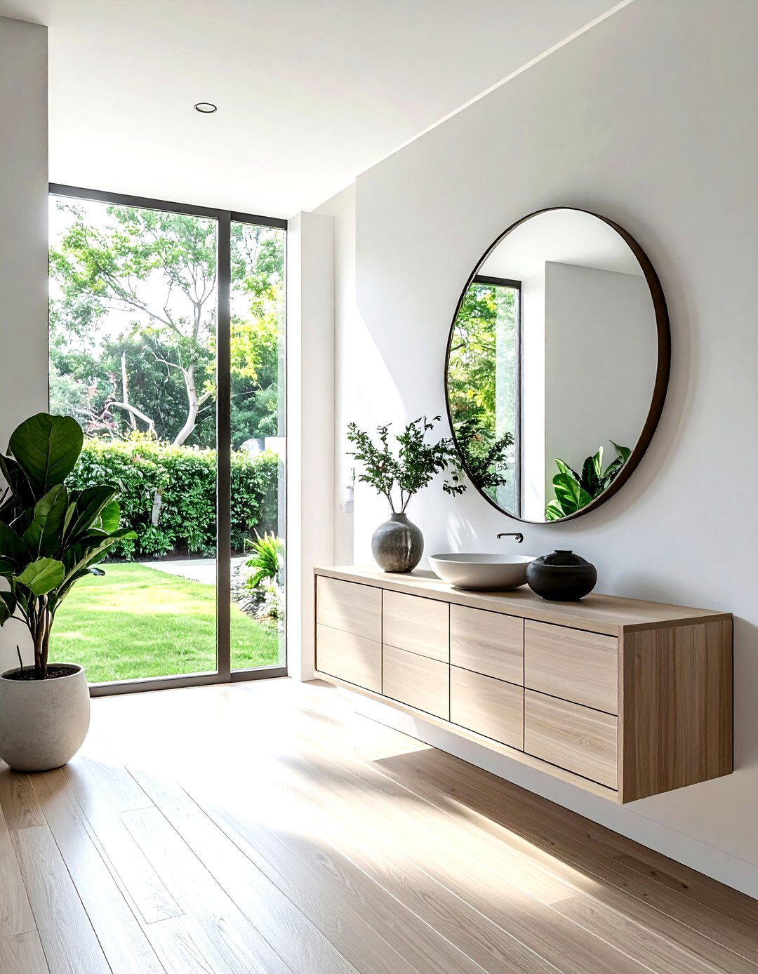
Mirrors are powerful tools for making a room feel larger, but their placement should be strategic rather than random. A frequent mistake is hanging a mirror where it reflects something unattractive, like a cluttered corner or a bathroom door. Instead, do place mirrors opposite windows to bounce natural light around the room and "bring the outdoors in." You can also use a large floor-length mirror to add a sense of depth to a narrow hallway. By carefully choosing what the mirror reflects, you can double the visual beauty of your favorite design elements and improve overall brightness.
12. Mixing home textures
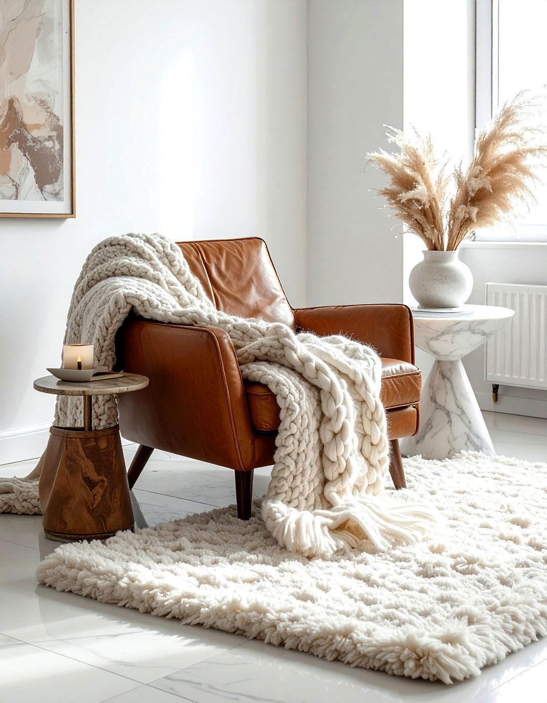
Does your room feel "flat" even though the colors are perfect? This often happens when there isn't enough variety in materials. A major "don't" is buying a matching furniture set where everything is the exact same fabric and finish. Instead, do layer different textures like smooth leather, chunky wool knits, sleek metals, and natural wood. The contrast between soft and hard surfaces adds "visual weight" and makes a space feel much more sophisticated and lived-in. This tactile variety is the secret to creating a room that feels warm, interesting, and luxurious to the touch and eye.
13. Cabinet hardware finishes
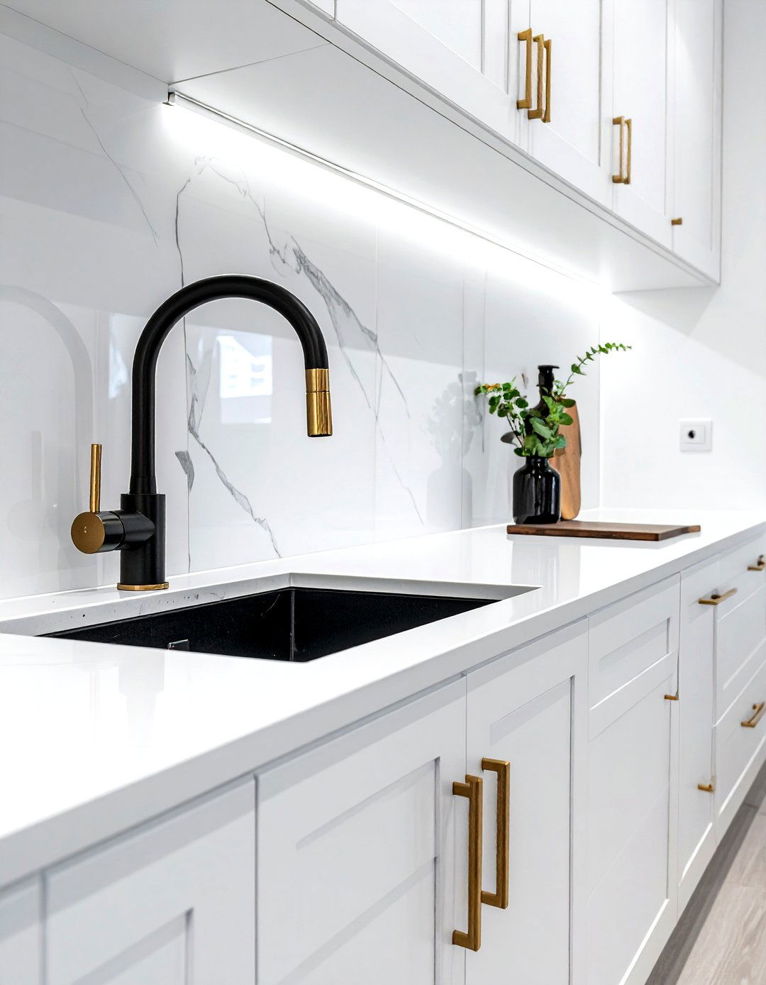
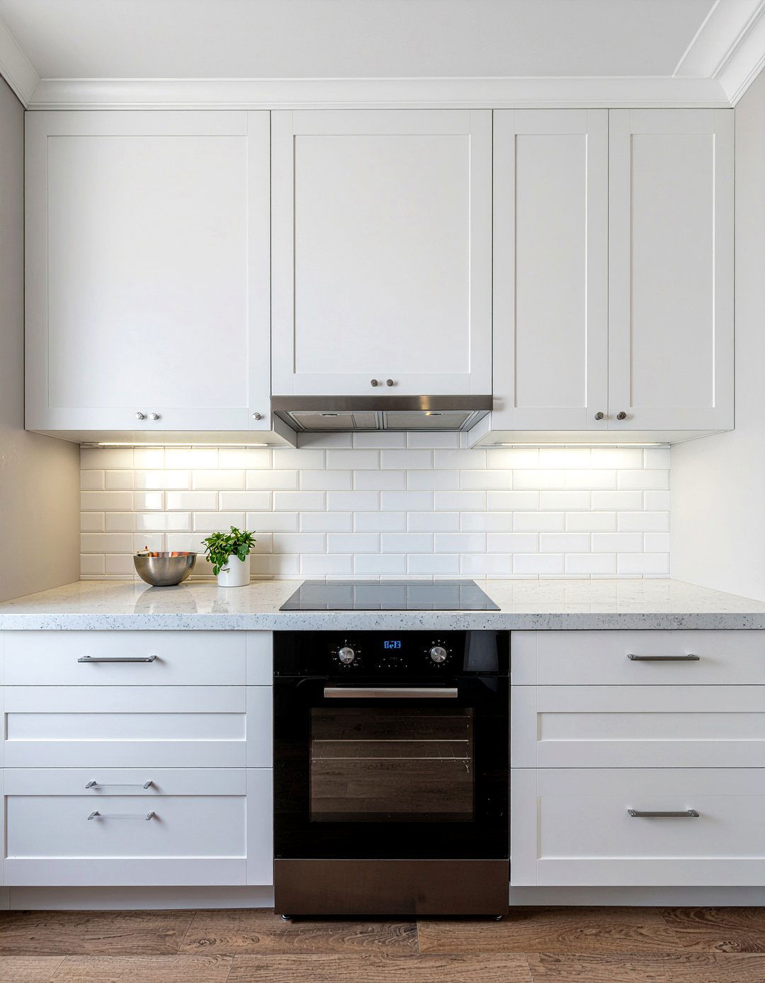
Updating your kitchen or bathroom hardware is one of the fastest ways to modernize a space, but you don't have to match everything perfectly. A common misconception is that all metals in a room must be the same finish, which can look a bit dated. Instead, do feel free to mix metals, such as pairing matte black faucets with brushed brass cabinet pulls. The key is to keep the undertones consistent or use one metal as a dominant theme while the other acts as an accent. This creates a custom, curated look that feels much more high-end and designer-inspired.
14. Bookshelf decor styling
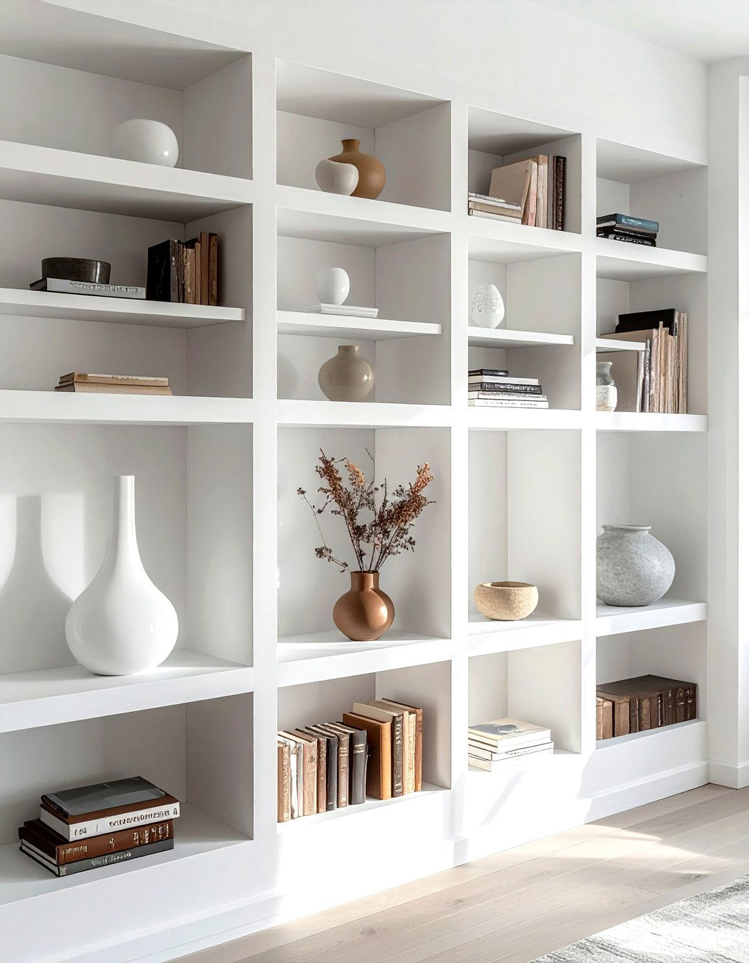
A bookshelf should tell a story about who you are, rather than just being a place to store dusty paperbacks. A common "don't" is cramming every inch of a shelf with books, which creates a heavy and cluttered look. Instead, do mix vertical and horizontal book stacks with decorative objects like vases, small sculptures, or framed photos. Leaving some "white space" or "negative space" allows the eye to rest and makes each individual item stand out more. This curated approach transforms a functional storage unit into a beautiful, personalized work of art that enhances the room.
15. Rug under bed
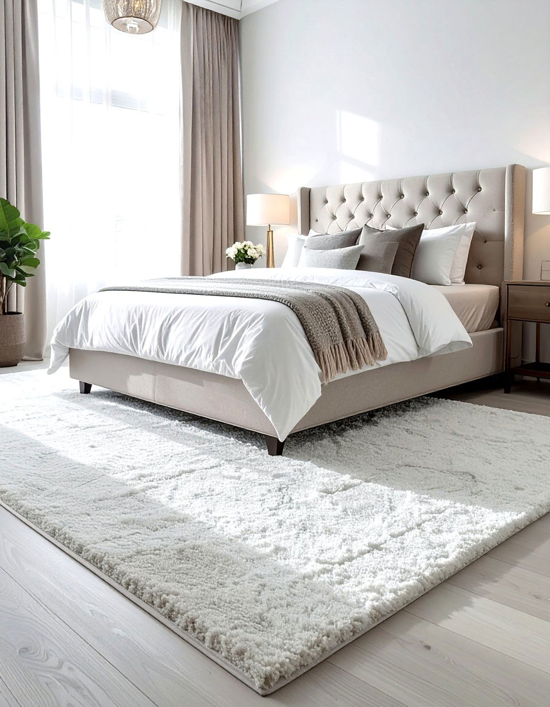
In a bedroom, the placement of your rug can completely change the feeling of the space. A major "don't" is placing a small rug only at the foot of the bed, which can look like an afterthought. Instead, do choose a large rug that sits under the bottom two-thirds of the bed, extending at least eighteen to twenty-four inches on either side. This ensures that when you step out of bed in the morning, your feet land on a soft, warm surface. This layout grounds the bed as the focal point and makes the entire bedroom feel more luxurious.
16. Dining light height
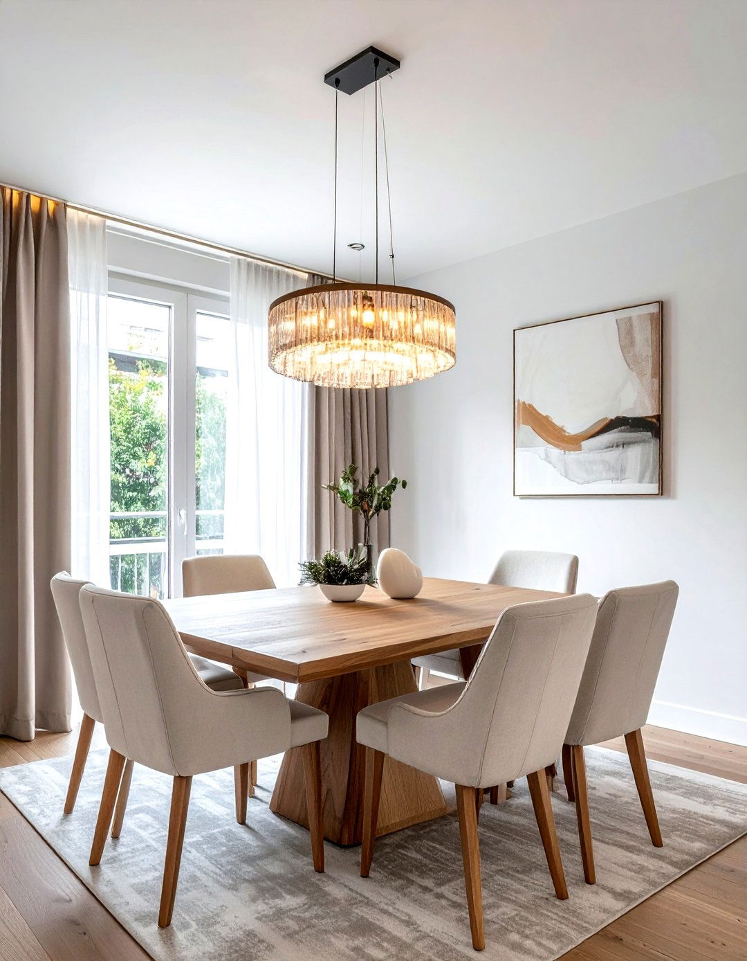
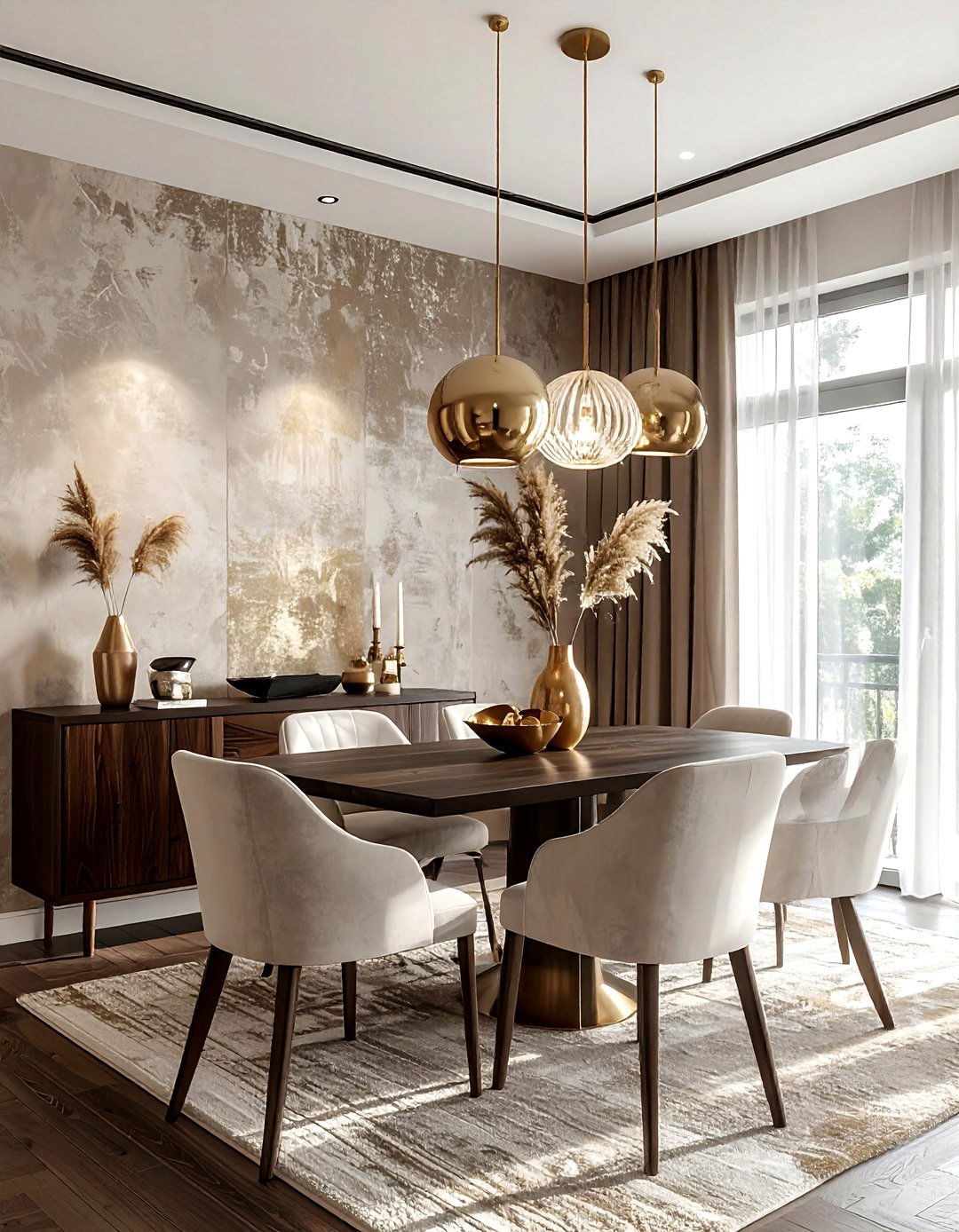
Hanging a chandelier or pendant light at the wrong height can ruin the proportions of your dining room. A common mistake is hanging the fixture too high, which disconnects it from the table and makes the room feel cold. Instead, do aim to hang your dining light roughly thirty to thirty-six inches above the tabletop. This height is low enough to create an intimate atmosphere for meals while remaining high enough to avoid blocking views across the table. Getting this measurement right creates a professional, polished look that anchors the dining area and makes it feel incredibly cozy.
17. Neutral room styling
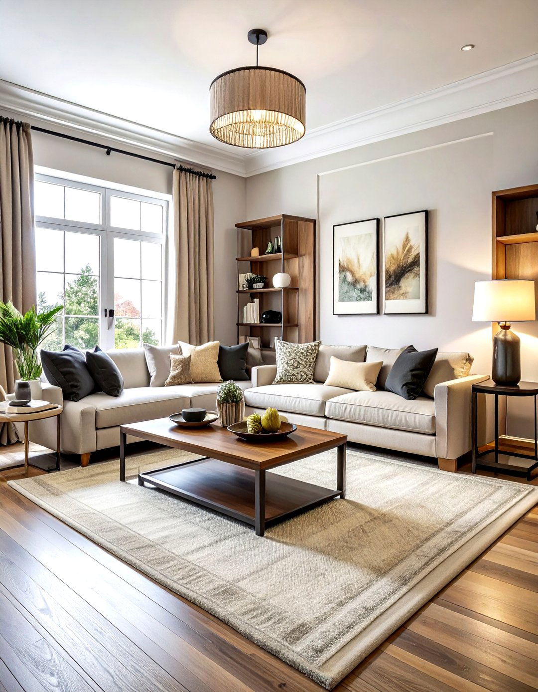
Neutral rooms are timeless and serene, but without proper execution, they can easily become boring or "blah." A frequent "don't" is using only one shade of beige or gray for every single item in the room. Instead, do layer various shades of the same color family, from deep taupe to light cream, to create depth. Incorporate plenty of different textures and a few high-contrast elements, like a black metal lamp or a dark wood coffee table. This prevents the space from looking flat and ensures your neutral palette feels sophisticated, intentional, and full of life and character.
18. Paint color samples

Choosing a paint color based solely on a small paper swatch at the store is a risky move that often leads to disappointment. A major "do" is to test your top choices directly on your walls using large samples. Paint colors change drastically depending on the time of day and the direction of natural light in your specific room. Observe the samples in the morning, afternoon, and under artificial light at night. This extra step ensures the color you choose truly complements your furniture and flooring, preventing you from ending up with a room that feels too dark or "off."
19. Small apartment furniture
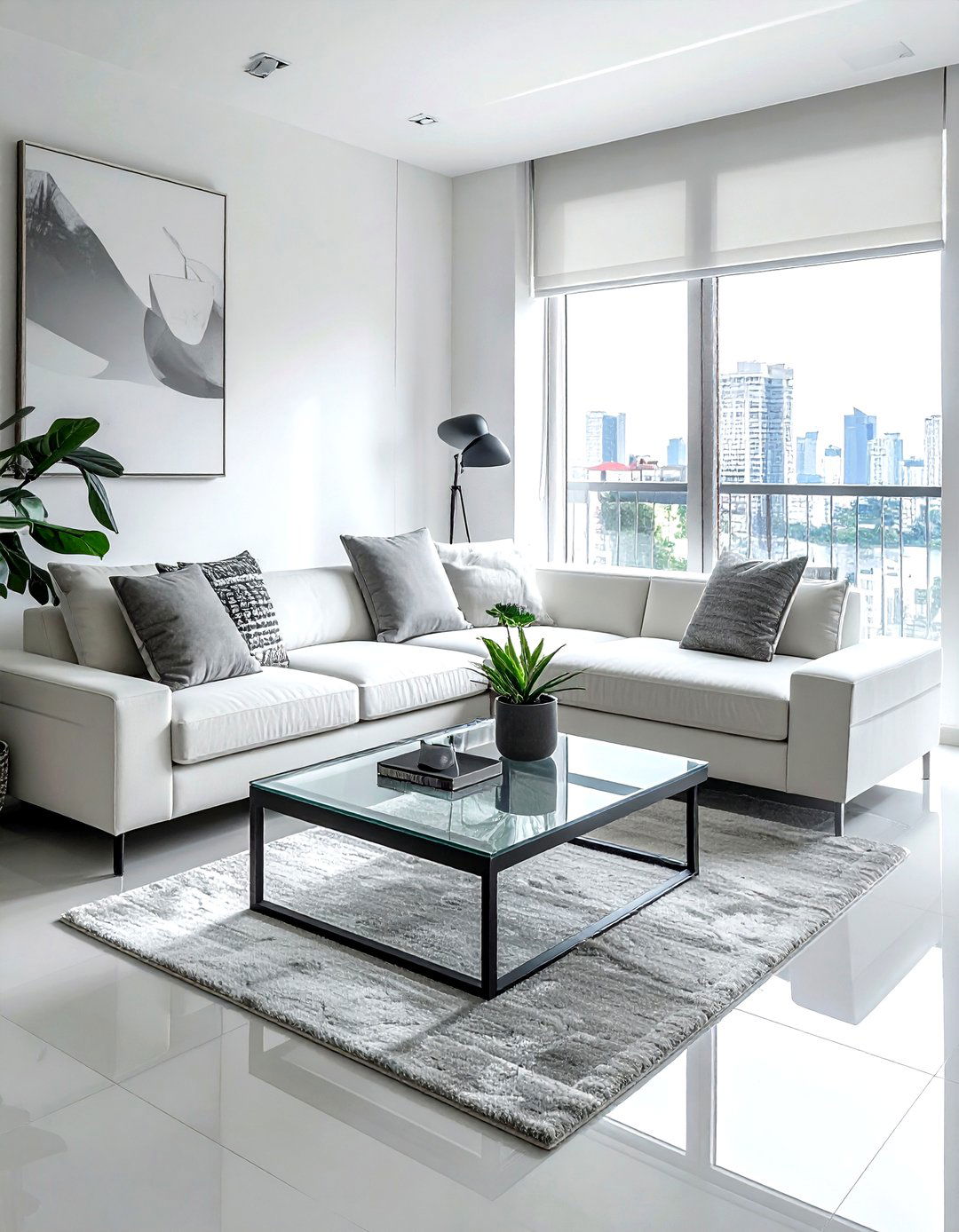
When decorating a small apartment, the scale of your furniture is the most important factor for success. A common "don't" is choosing heavy, bulky pieces that overwhelm the floor plan and make the space feel cramped. Instead, do opt for "leggy" furniture that sits off the ground, allowing you to see the floor underneath. This creates a sense of openness and makes the room feel much larger. Pieces with dual functions, such as an ottoman with storage or a drop-leaf table, are also essential for maintaining a clutter-free environment while maximizing the utility of every single square inch.
20. Painted ceiling color
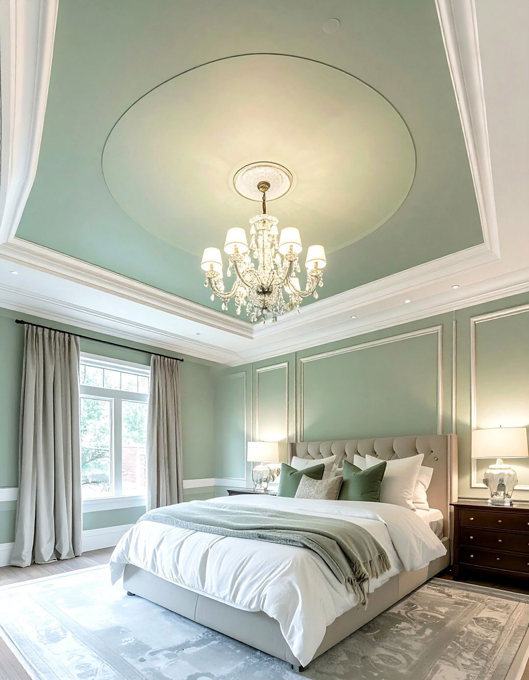
The ceiling is often referred to as the "fifth wall," yet it is frequently ignored in home decor. A common "don't" is always defaulting to a basic flat white, which can sometimes look unfinished or stark. Instead, do consider painting the ceiling a soft, complementary color or even a bold, dark hue to create a "cocoon" effect. If you have low ceilings, using a very light shade can help them feel more expansive. Adding wallpaper or architectural details like beams to the ceiling can also draw the eye upward, adding an unexpected layer of luxury and sophistication to any room.
21. Long window curtains
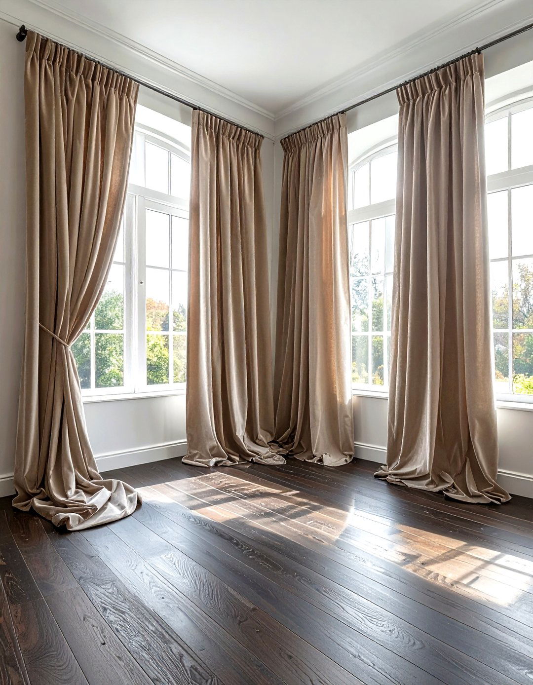
One of the most frequent mistakes in window treatments is choosing curtains that are too short for the space. A major "don't" is having fabric that stops right at the window sill or hovers several inches above the floor, which looks awkward and unfinished. Instead, do ensure your curtains are long enough to "kiss" the floor or even puddle slightly for a more formal look. This creates a continuous vertical line that makes your windows look larger and your ceilings feel much higher. It is a simple detail that instantly elevates the room from "basic" to "custom-designed."
22. Coffee table tray

Styling a coffee table can be tricky, but using a tray is a "do" that designers swear by for organization. A common "don't" is scattering small remotes, coasters, and magazines across the entire surface, which looks messy. Instead, do group these smaller items inside a beautiful tray to create a "contained" look. You can then add a few decorative elements of varying heights, such as a stack of books, a small candle, and a vase of fresh flowers. This method keeps the table functional while making it look like a professionally styled vignette that adds personality to the room.
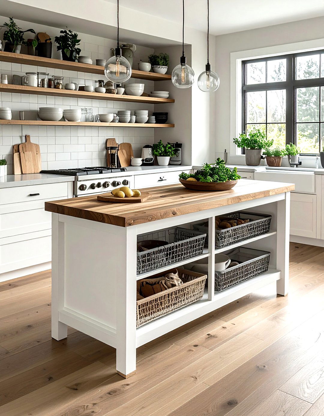
23. Open kitchen shelves
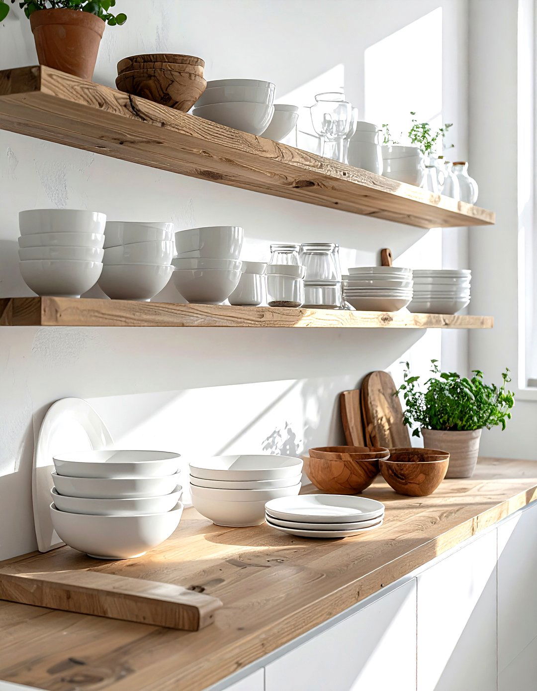
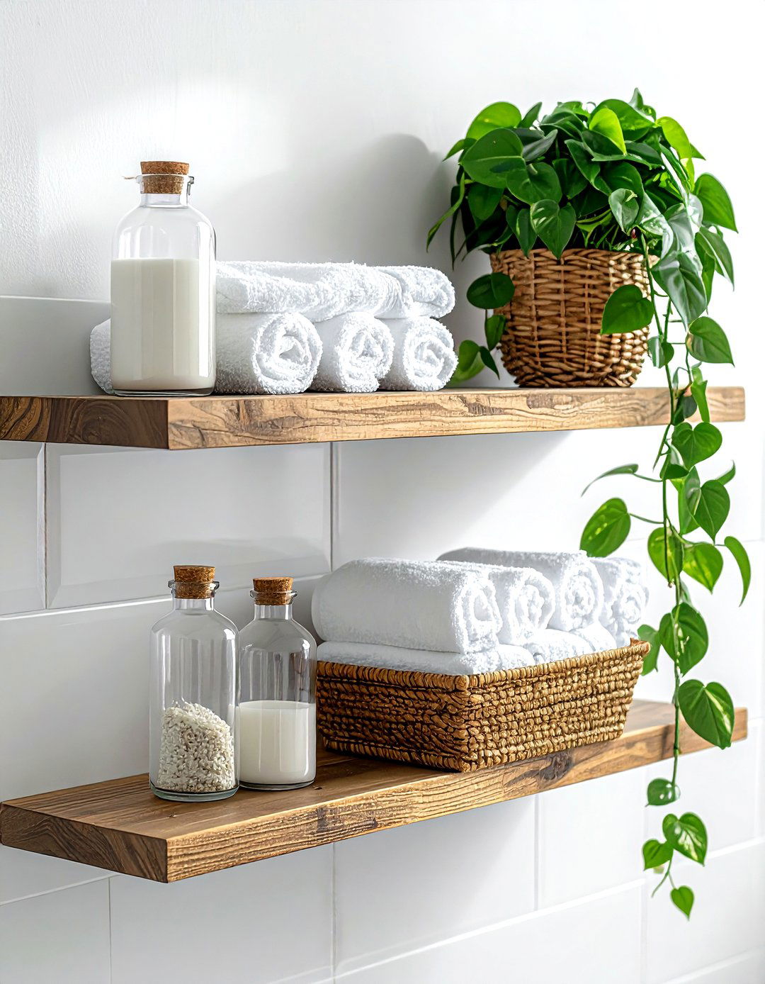
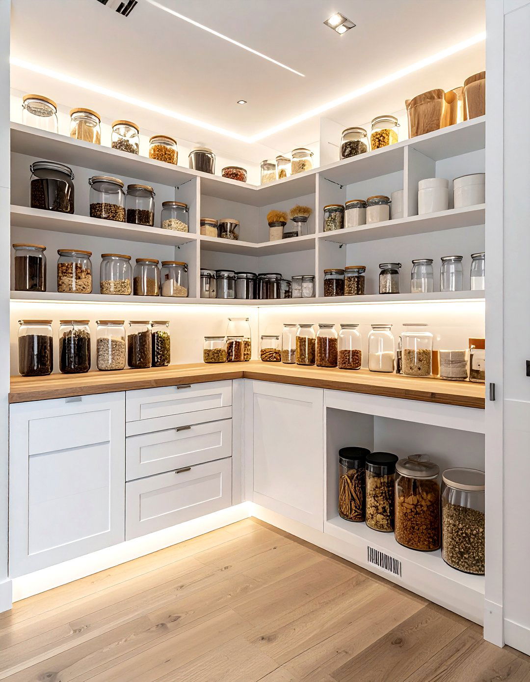
Open shelving is a popular trend, but it requires a disciplined approach to avoid looking like a cluttered mess. A major "don't" is using open shelves to store every mismatched plastic container and daily cereal box you own. Instead, do curate your shelves with a mix of functional items and decorative pieces that follow a similar color palette. Stack your best ceramic plates, group pretty glassware, and add a small potted herb or a piece of art. This creates a bright, airy feeling in the kitchen while allowing you to display items that bring you joy every day.
24. Warm bedroom lighting
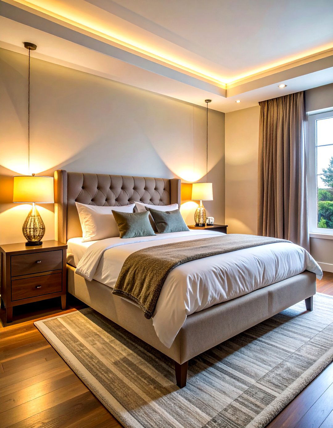
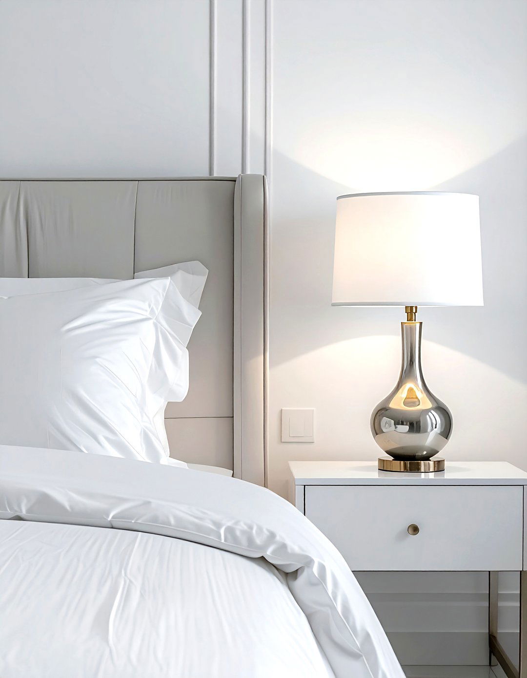
The bedroom should be a sanctuary for rest, which means your lighting choices are incredibly important for the mood. A common "don't" is using bright, cool-toned white light bulbs that mimic daylight and interfere with your sleep cycle. Instead, do opt for warm-toned bulbs and incorporate dimmable switches to control the ambiance. Using bedside sconces or stylish table lamps instead of harsh overhead lights creates a soft, relaxing glow perfect for winding down. Layering your lighting in this way ensures your bedroom feels like a cozy retreat where you can truly relax at the end of a long day.
25. Narrow hallway rug
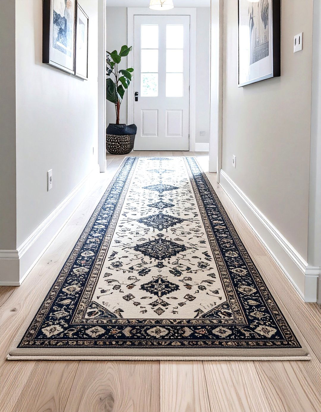
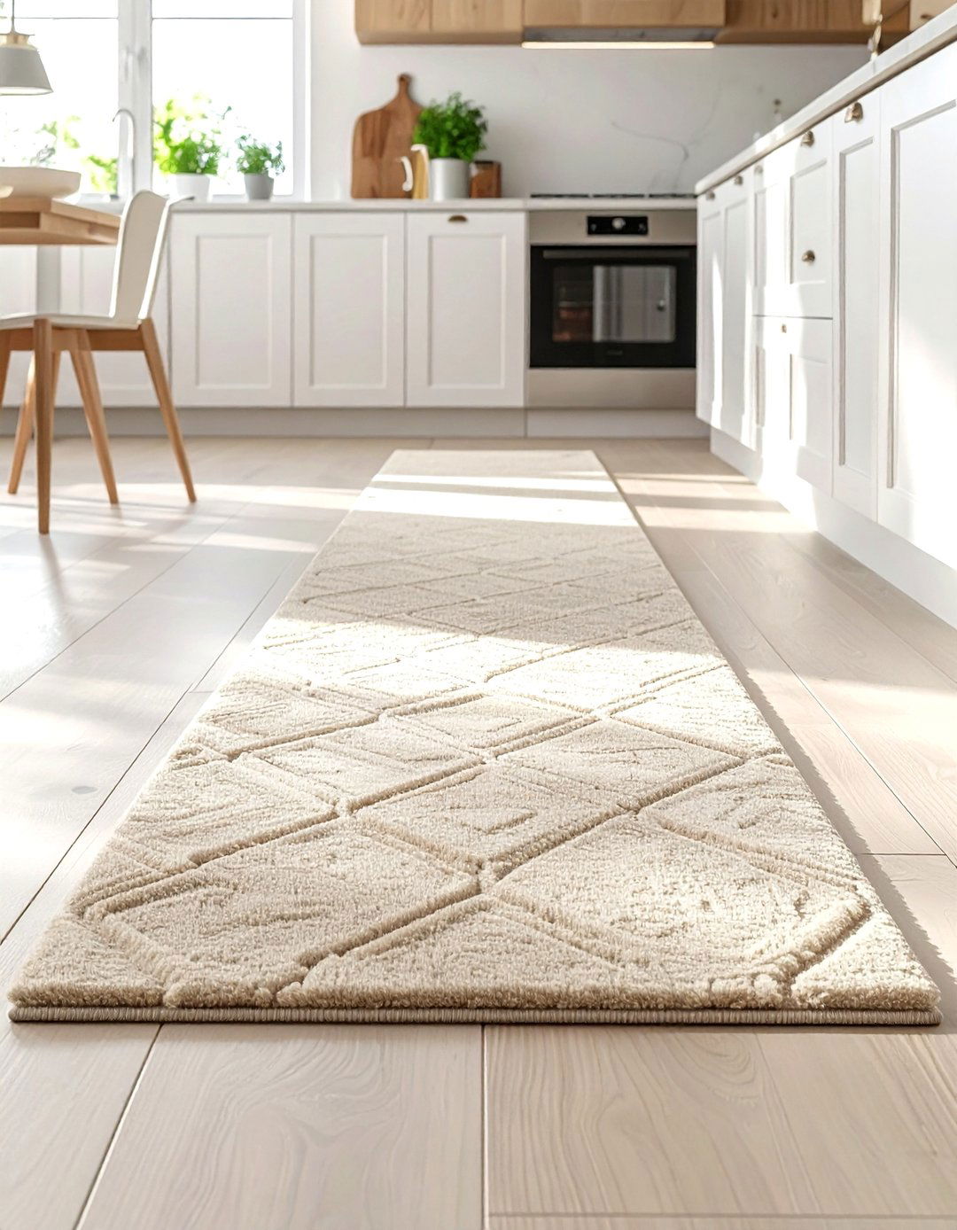
Hallways are often the most neglected spaces in a home, yet they offer a great opportunity for a design "do." A frequent mistake is leaving a long, narrow hallway completely empty, which can feel cold and like a tunnel. Instead, do add a runner rug to introduce color, pattern, and warmth to the transition area. A high-quality runner not only protects your floors in high-traffic zones but also provides a soft surface underfoot. Choosing a rug with a bold pattern can also make a plain hallway feel like a destination in itself, adding character to every corner of your home.
26. Modern minimalist decor
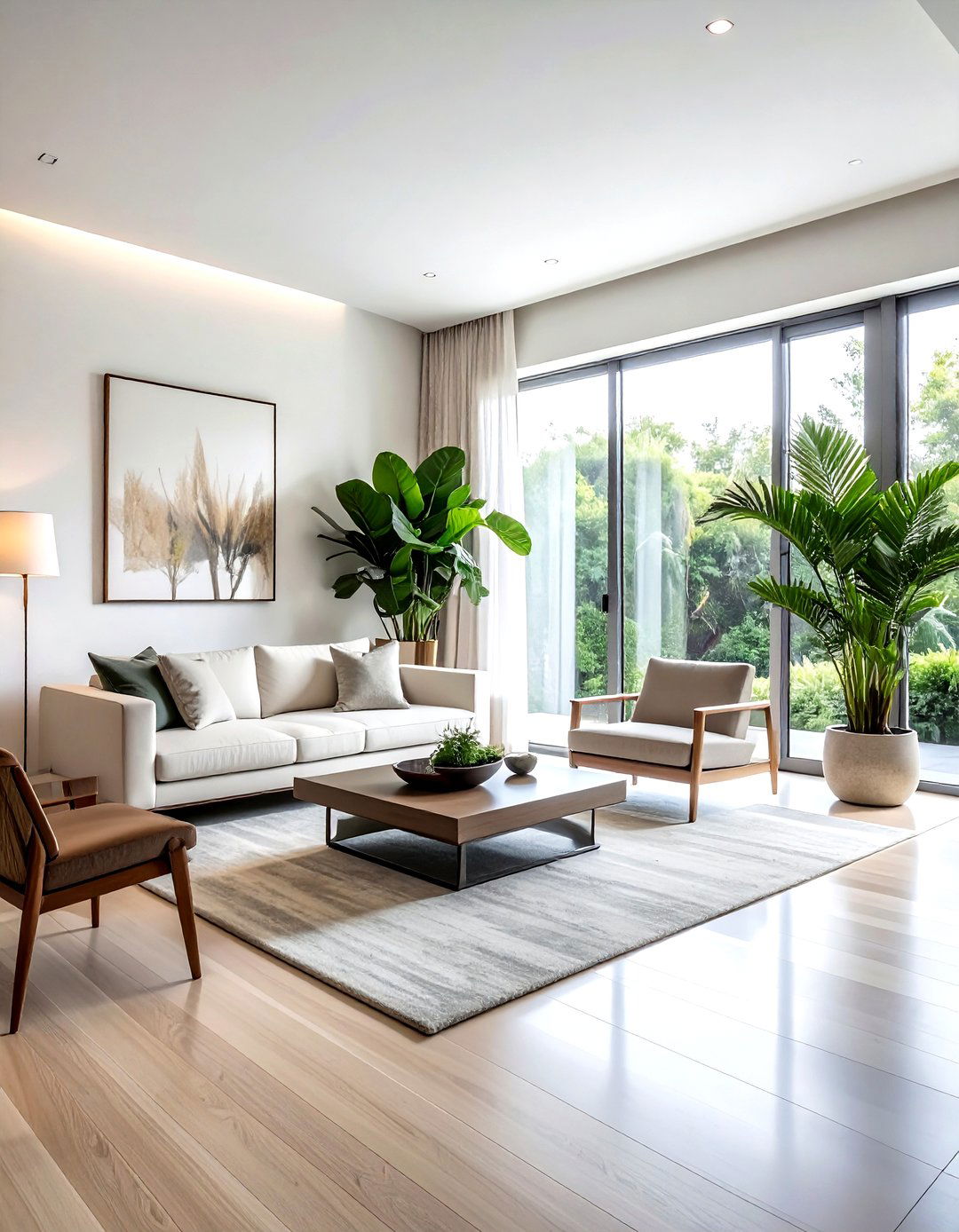
Minimalism is about intentionality, but it is easy to accidentally create a space that feels cold and uninviting. A major "don't" is removing so many items that the room loses all its personality and warmth. Instead, do focus on "warm minimalism" by choosing a few high-quality, meaningful pieces and layering in soft textures like linen and wood. Use a neutral but varied color palette to add depth without clutter. By being selective about what you keep, you allow the architecture and the beauty of each individual piece to shine, resulting in a home that feels calm, clean, and curated.
27. Bold accent wall
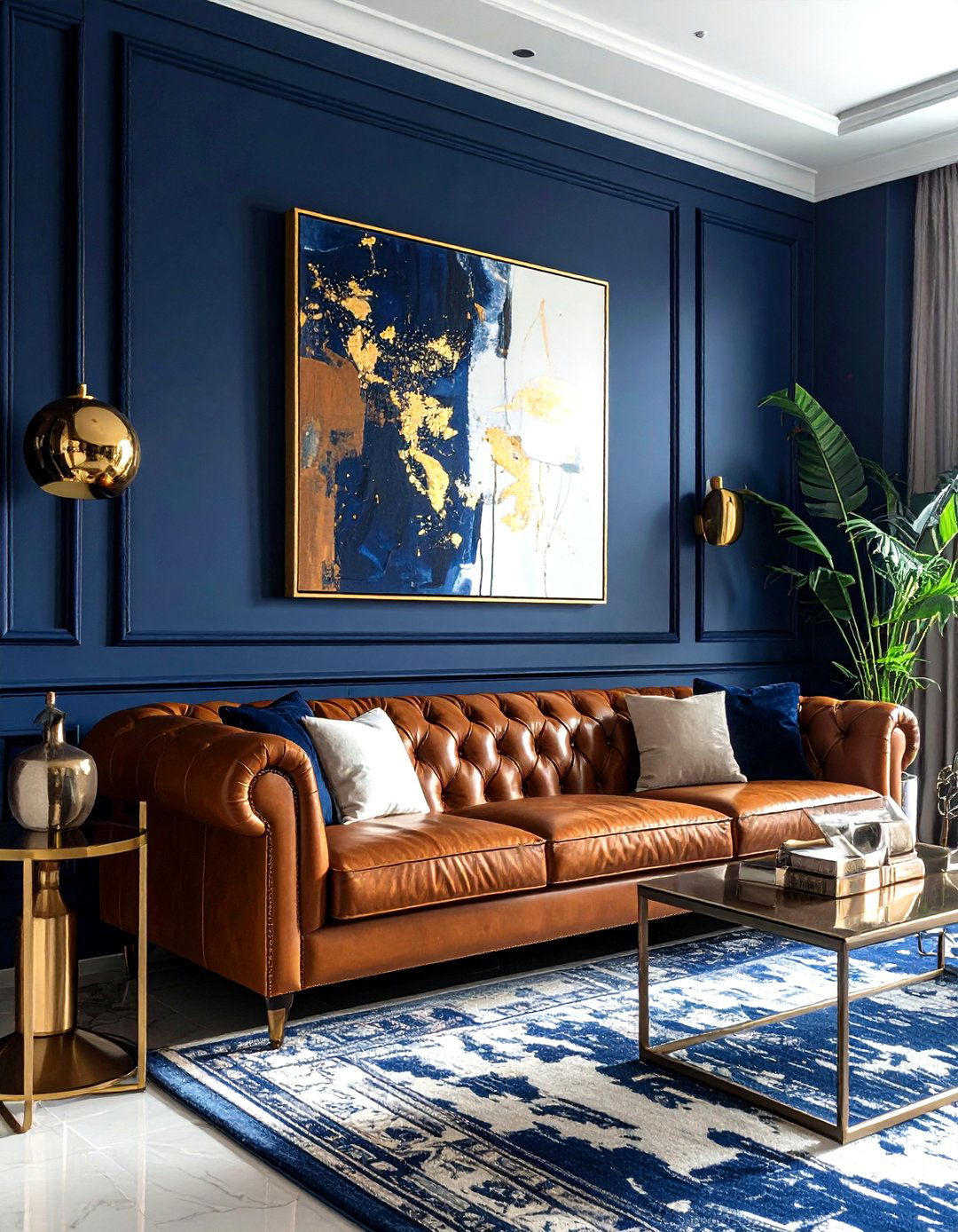
Accent walls are a great way to experiment with color, but choosing the wrong wall can throw off the entire room's balance. A common "don't" is picking a random wall without any architectural significance, which can look disjointed. Instead, do choose a wall that serves as a natural focal point, such as the one behind your bed's headboard or the living room fireplace. Using a bold paint color, textured wallpaper, or wood paneling on this specific wall draws the eye and adds architectural interest. This intentional choice makes the room feel more dynamic and professionally planned rather than accidental.
28. Bathroom counter organization
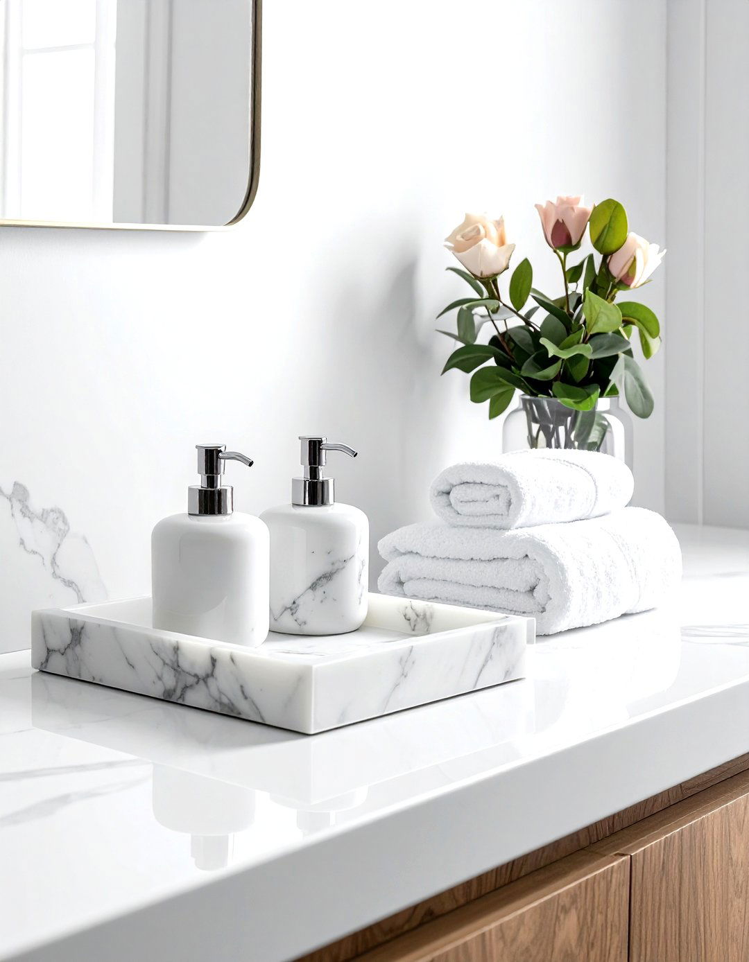
A cluttered bathroom counter can make even the most beautiful vanity look cheap and disorganized. A major "don't" is leaving all your daily toiletries, toothbrushes, and hair tools out in the open. Instead, do use stylish containers, trays, and jars to corral your essentials. A marble tray for your perfumes or a ceramic jar for cotton swabs adds a spa-like touch to the space. Keeping the majority of your items tucked away in drawers or cabinets allows your beautiful fixtures and clean surfaces to take center stage, making your morning routine feel much more luxurious and stress-free.
29. Family photo display
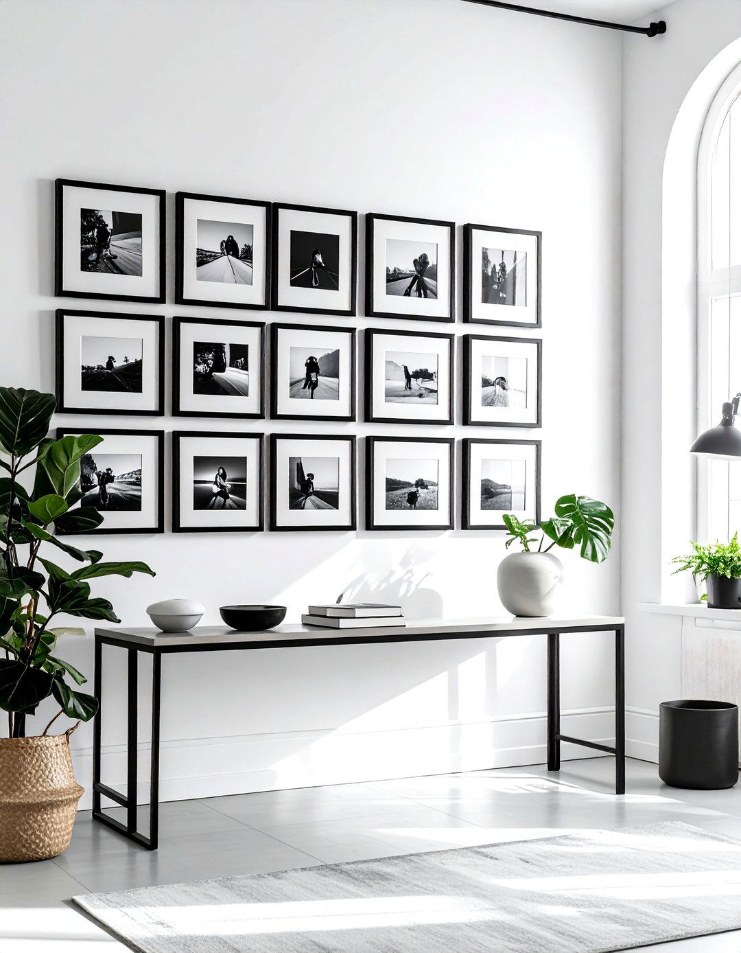
Displaying family photos is a wonderful way to make a house feel like a home, but the execution is key. A frequent "don't" is placing small, mismatched frames randomly on every available surface, which can look cluttered. Instead, do create a dedicated photo gallery or use consistent frames to create a cohesive look. Black and white photos in uniform frames can make a personal collection look like a sophisticated art installation. By grouping your memories together intentionally, you honor the people you love while maintaining a clean and stylish aesthetic that enhances your overall interior design theme.
30. Mixed wood furniture
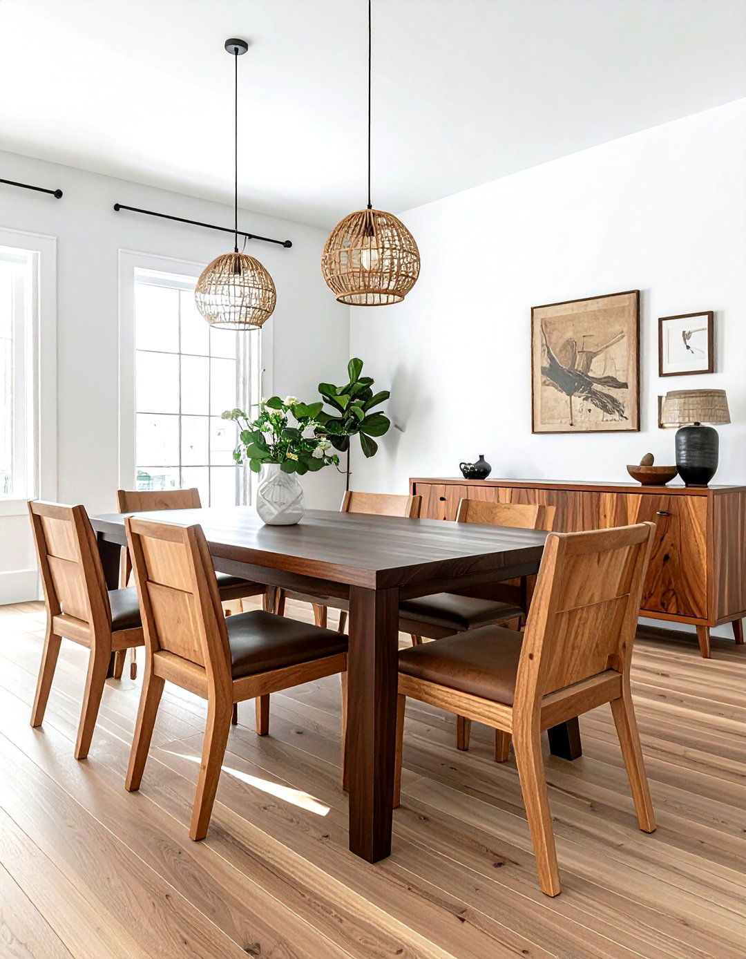
One of the biggest "don'ts" in modern interior design is buying a matching bedroom or dining room set where every piece of wood is the exact same stain. This can make a room feel flat and "catalog-bought." Instead, do mix different wood tones to create a more curated and high-end look. The trick is to identify the "undertone" of your primary wood piece—whether it is warm, cool, or neutral—and choose other woods that complement it. Mixing a dark walnut table with lighter oak chairs adds visual interest and a sense of history, making your home feel unique and thoughtfully assembled.
Conclusion:
Mastering the art of home decor is less about following rigid rules and more about understanding how to create harmony and balance within your unique space. By implementing these thirty "dos and don'ts," you can avoid the common pitfalls that make a room feel cluttered, small, or uninviting. Remember that a home should always reflect the personality of the people living in it, so use these principles as a foundation rather than a limitation. Whether you are adjusting your rug size or layering your lighting, these small changes will lead to a more functional, beautiful, and timeless sanctuary that you can truly enjoy for years.


Leave a Reply