Designing a home that feels both professional and personal requires a careful balance of creativity and structure. Many people struggle with where to start when decorating a room, often feeling overwhelmed by the endless choices of furniture, colors, and layouts. By following established interior design rules, you can create a cohesive and harmonious environment that reflects your unique style while maintaining functional integrity. These guidelines serve as a roadmap, helping you avoid common mistakes like improper furniture scaling or clashing color palettes. Whether you are refreshing a single corner or renovating an entire house, understanding these fundamental principles will elevate your space and ensure a polished, viral-worthy aesthetic throughout your living areas.
1. 60-30-10 Color Rule
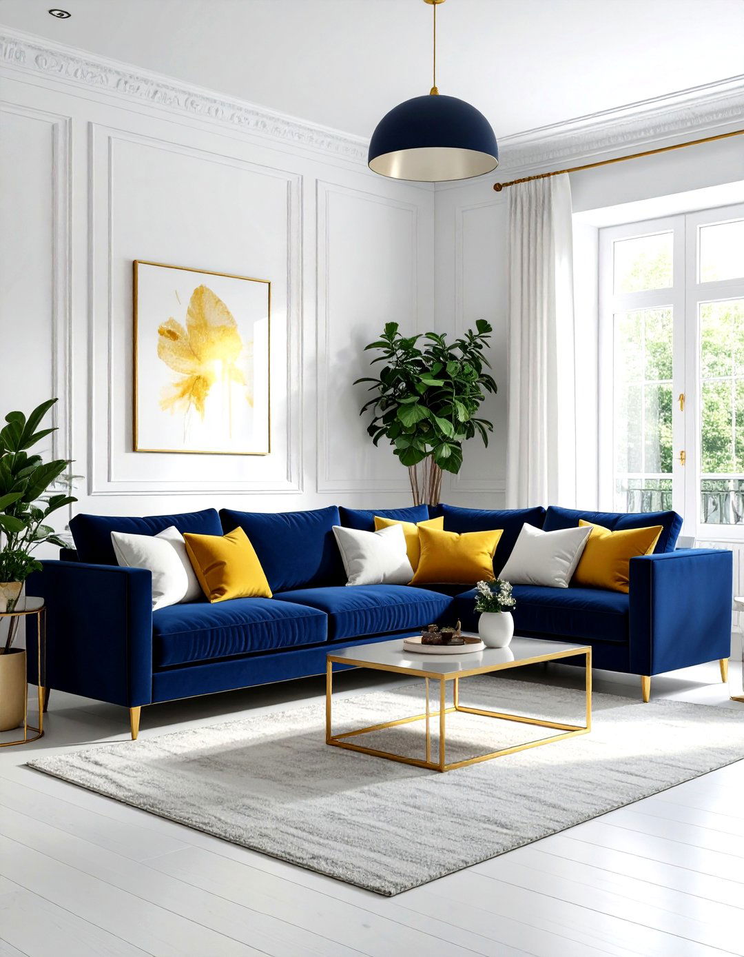
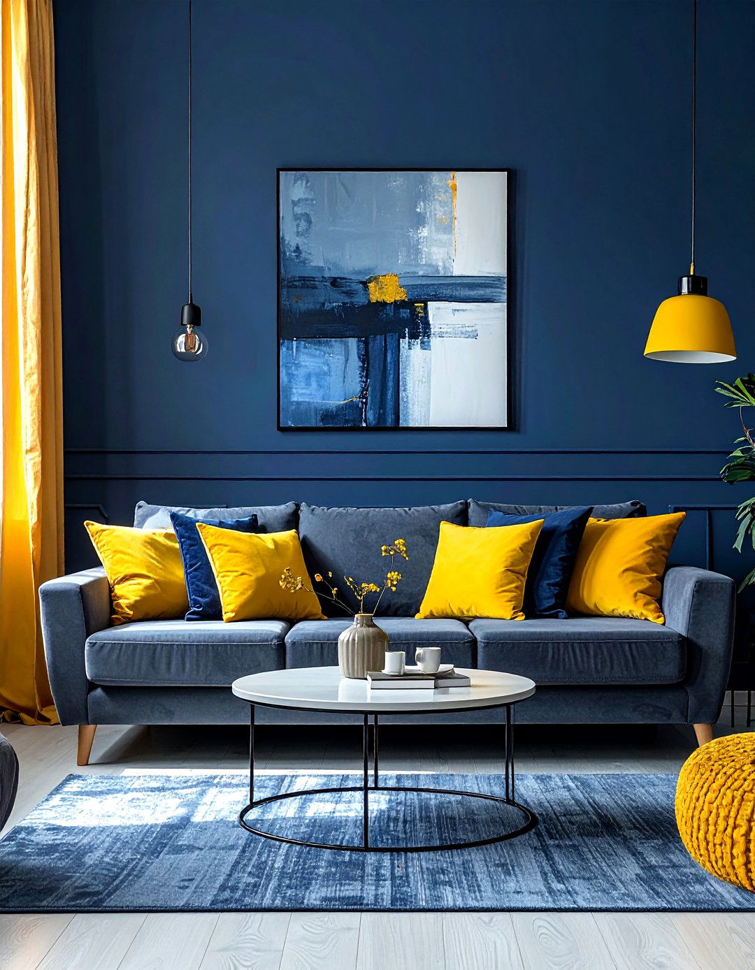
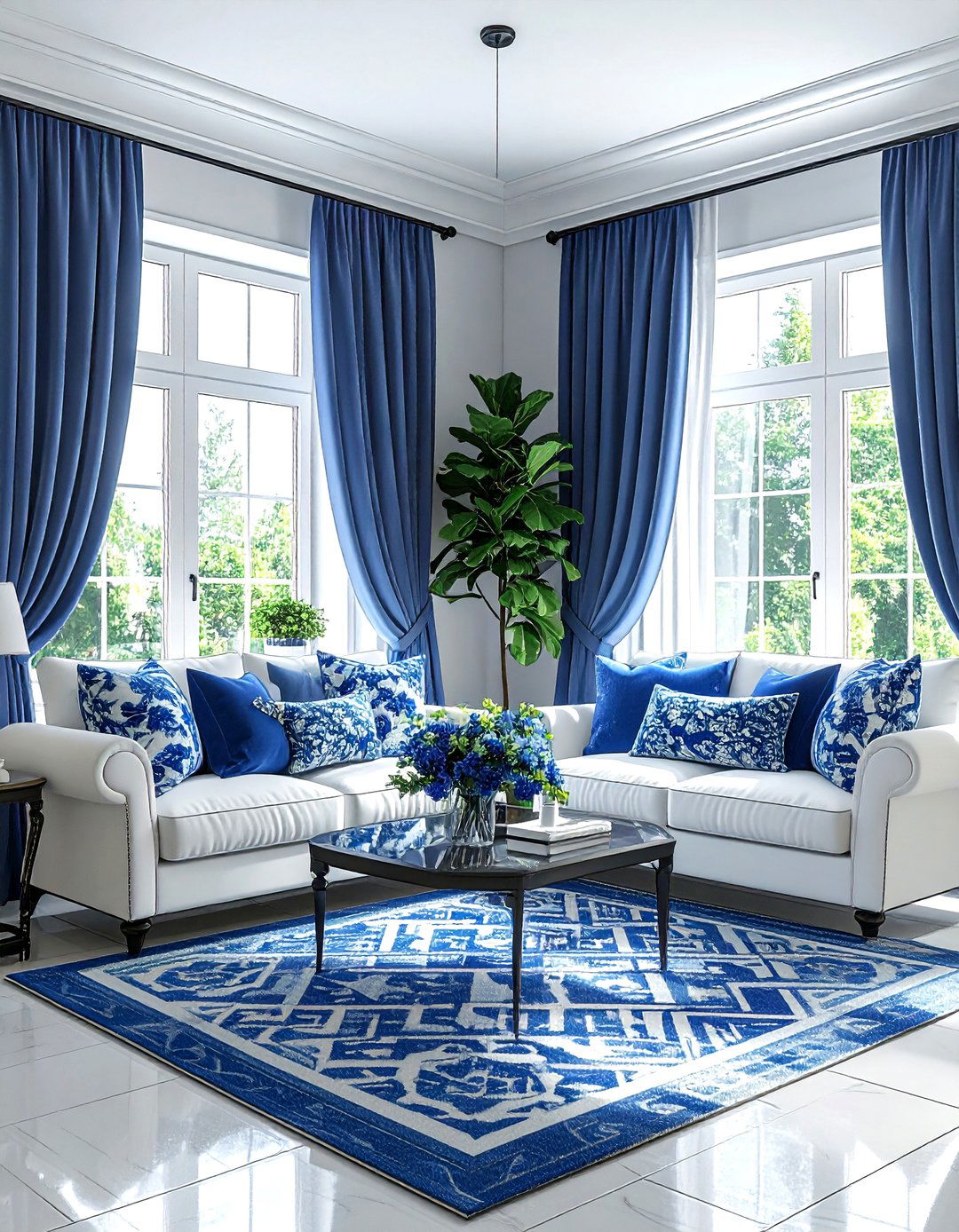
Have you ever wondered why some professional rooms feel perfectly balanced while others feel a bit chaotic? The 60-30-10 color rule is a classic guideline that helps you achieve a professional look without much effort. This rule suggests that sixty percent of your room should be a dominant color, usually applied to the walls or large rugs. Thirty percent should be a secondary color, often found in upholstery, curtains, or accent furniture. The final ten percent is for your accent color, which pops in pillows, art, or small accessories. This simple ratio ensures that your space feels cohesive and visually interesting without becoming overwhelming for the eyes.
2. Rule Of Three

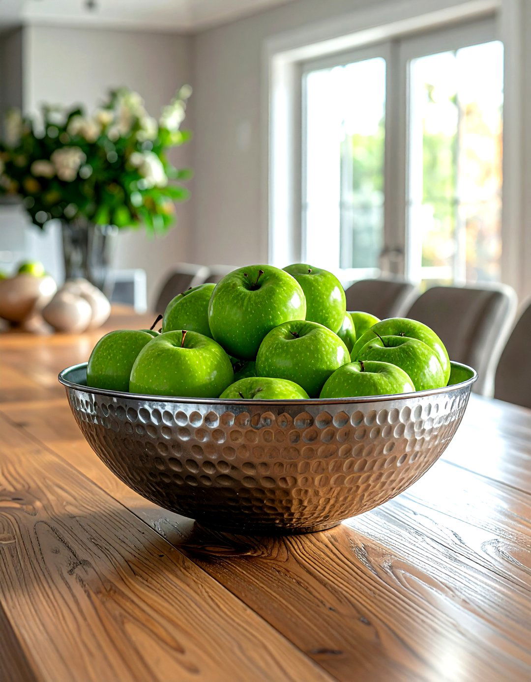
Creating a visually appealing vignette on a coffee table or mantel often comes down to the simple rule of three. This design principle suggests that objects arranged in odd numbers are more memorable and attractive to the human eye than even groupings. When you style a surface, try grouping three items of varying heights, such as a tall vase, a medium-sized candle, and a small decorative bowl. This arrangement creates a sense of balance and rhythm that feels natural rather than forced. Using odd numbers prevents the setup from looking too symmetrical or stiff, giving your home a more curated and lived-in professional atmosphere.
3. Hanging Art Height
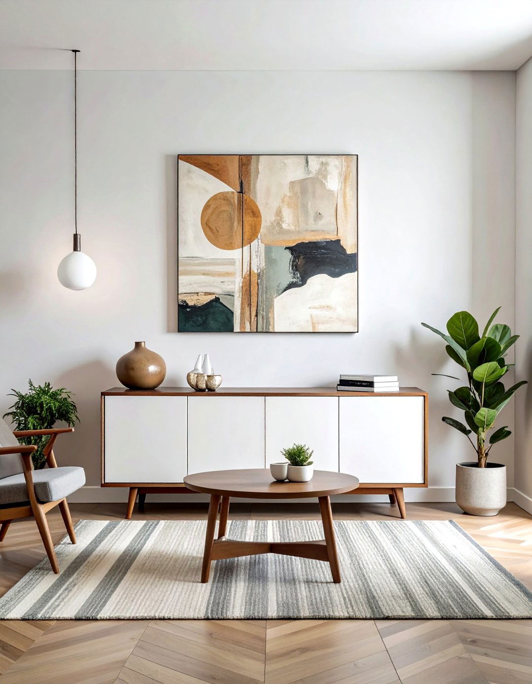
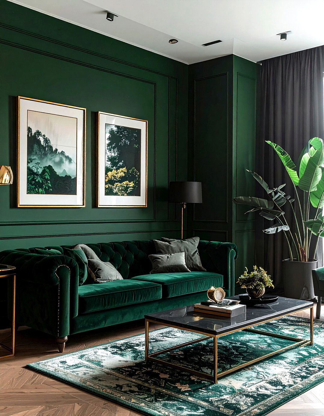
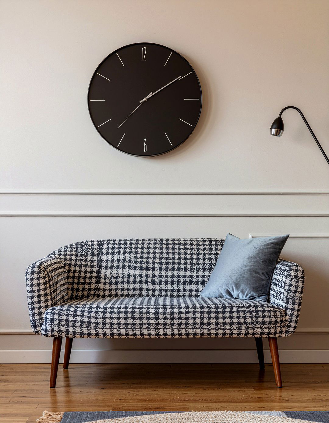
One of the most frequent mistakes homeowners make is hanging their wall decor too high, which can disconnect the art from the furniture. A standard interior design rule is to hang artwork so that the center point is at eye level, which is typically about fifty-seven to sixty inches from the floor. This placement ensures that the art is easily viewable and feels anchored within the room's overall composition. If you are hanging art above a sofa or console, leave about six to eight inches of space between the bottom of the frame and the top of the furniture to maintain a strong visual connection.
4. Living Room Rug Size
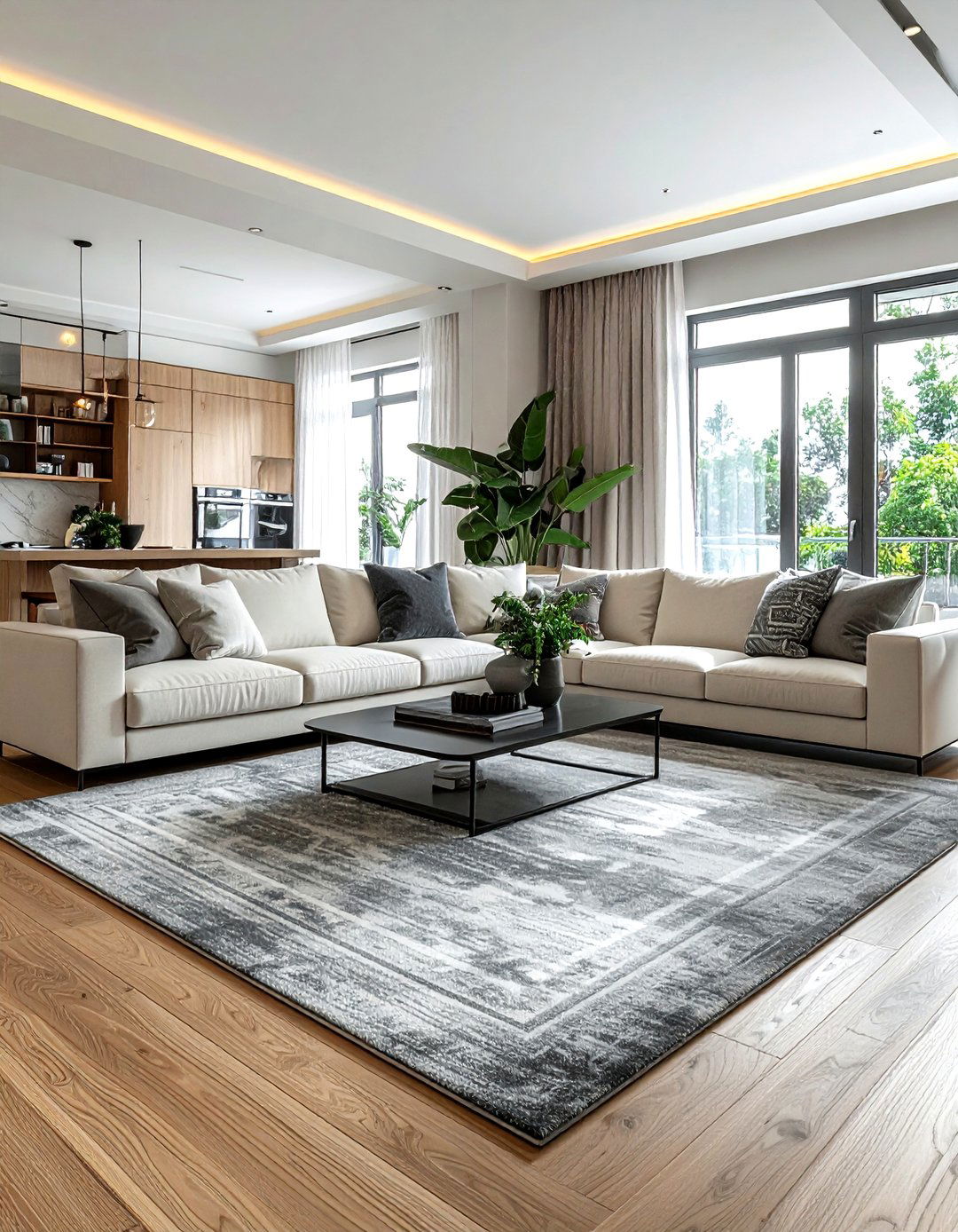
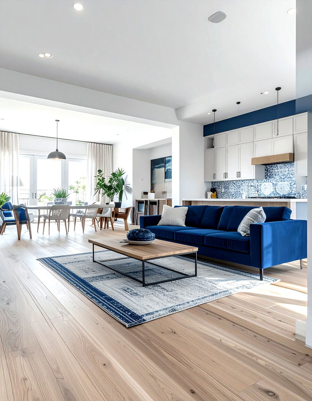
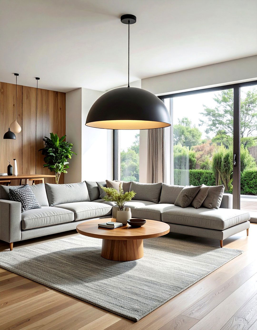
Choosing the right rug size is essential for defining a seating area and making a living room feel spacious and grounded. A common rule is that all furniture legs should sit on the rug, or at the very least, the front legs of every major piece should be placed on it. A rug that is too small can make a large room feel disjointed and cramped, as if the furniture is floating aimlessly. By selecting a larger rug that extends under the sofa and chairs, you create a unified zone that feels cozy and intentional. This simple adjustment can instantly transform the professional look of your space.
5. Layered Lighting
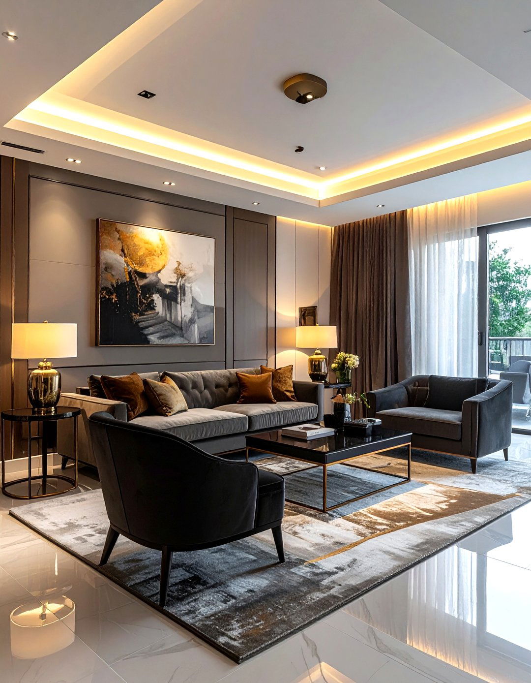
Relying on a single overhead light source can make a room feel flat, harsh, and uninviting during the evening hours. To create a professional and cozy atmosphere, you should always implement layered lighting, which includes ambient, task, and accent light sources. Ambient lighting provides the general illumination, while task lighting helps with specific activities like reading or cooking. Accent lighting adds depth by highlighting architectural features or artwork. By using a mix of floor lamps, table lamps, and wall sconces, you can control the mood of the room and ensure that every corner is functional and visually appealing throughout the entire day.
6. Scale And Proportion
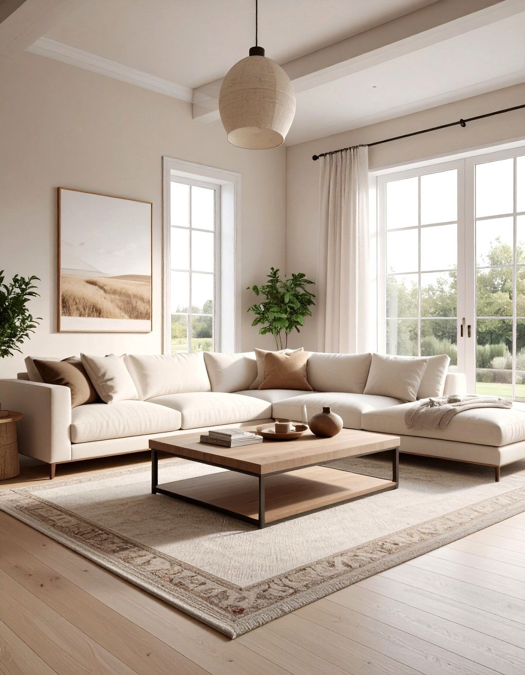
Understanding the relationship between the size of your furniture and the dimensions of your room is crucial for a balanced design. Scale refers to how an item fits into the space, while proportion relates to how items look next to one another. For example, a massive sectional sofa will overwhelm a tiny apartment living room, just as a small coffee table will look lost in a grand, vaulted space. To follow this rule effectively, always measure your room before buying furniture and ensure that there is enough "breathing room" around each piece so the layout doesn't feel cluttered or restricted for daily movement.
7. Room Focal Point
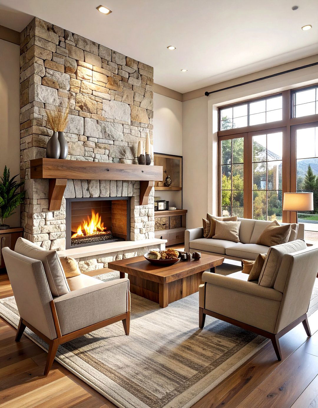
Every well-designed room needs a clear focal point that draws the eye and provides a sense of purpose to the layout. A focal point can be a natural architectural feature, such as a large fireplace or a stunning bay window, or it can be created through decor. If your room lacks a natural centerpiece, you can establish one with a large piece of art, a bold accent wall, or a unique piece of furniture. Once the focal point is identified, arrange your seating and other decor to complement it, ensuring the room feels organized and anchored around a central theme or visual interest.
8. Negative Space

It can be tempting to fill every empty corner with furniture or decor, but professional designers know the importance of negative space. Negative space, or the "white space" of a room, allows the eye to rest and prevents the environment from feeling overstuffed and claustrophobic. By leaving some wall space bare or keeping a few surfaces clear, you allow your hero pieces to truly shine and be appreciated. This rule is especially important in small rooms, where a bit of emptiness can actually make the space feel larger and more airy. Balance is key to achieving a sophisticated and high-end interior look.
9. Mixing Metal Finishes
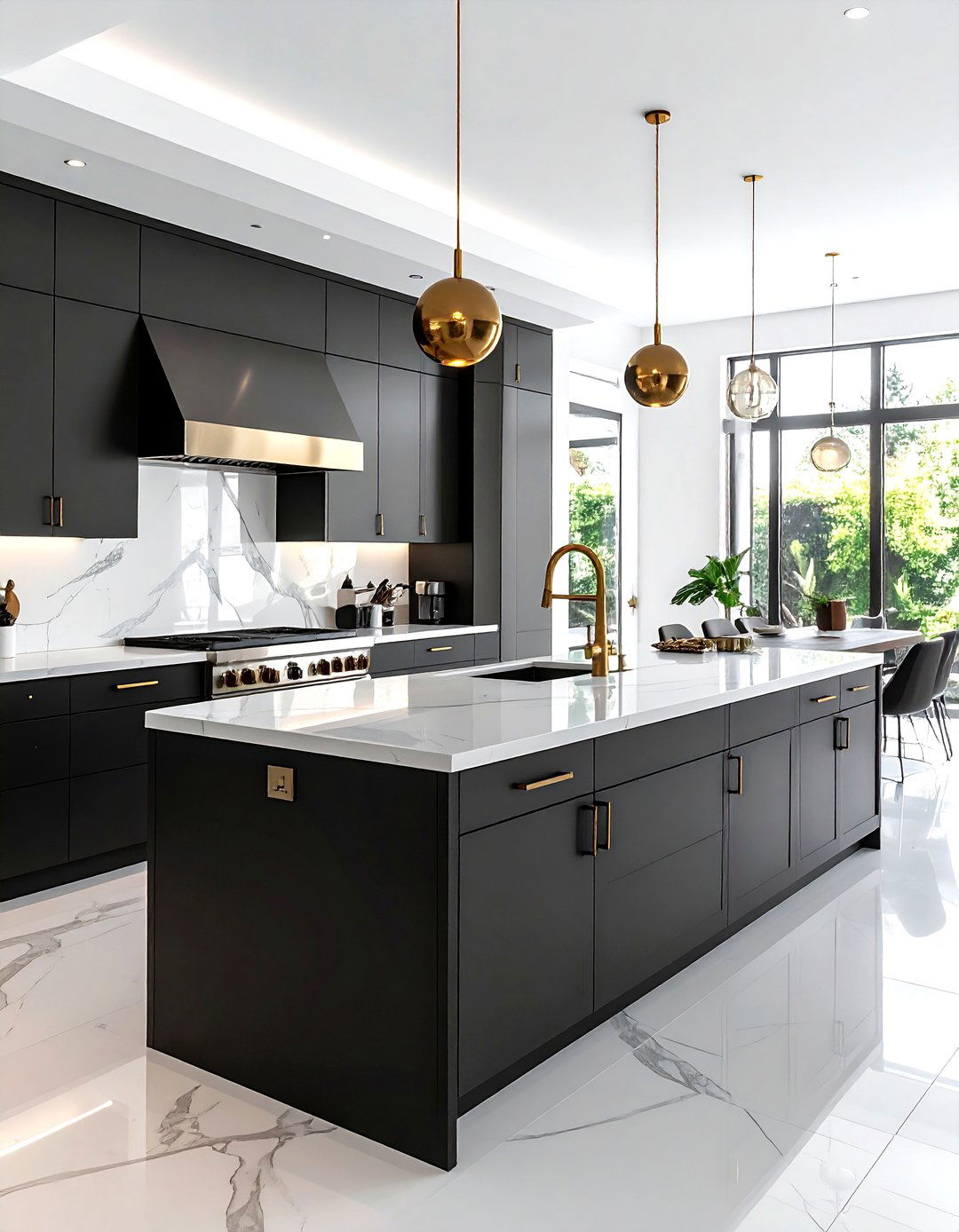
Gone are the days when every faucet, handle, and light fixture in a house had to be the exact same metal finish. Modern interior design rules encourage mixing metals to add depth, character, and a curated feel to your home. To do this successfully, choose one dominant metal, such as matte black or polished nickel, and use it for about seventy percent of the fixtures. Then, introduce one or two accent metals, like brass or copper, for the remaining thirty percent. This combination creates a layered and sophisticated look that feels like it was collected over time rather than purchased as a matching set.
10. Curtain Rod Placement
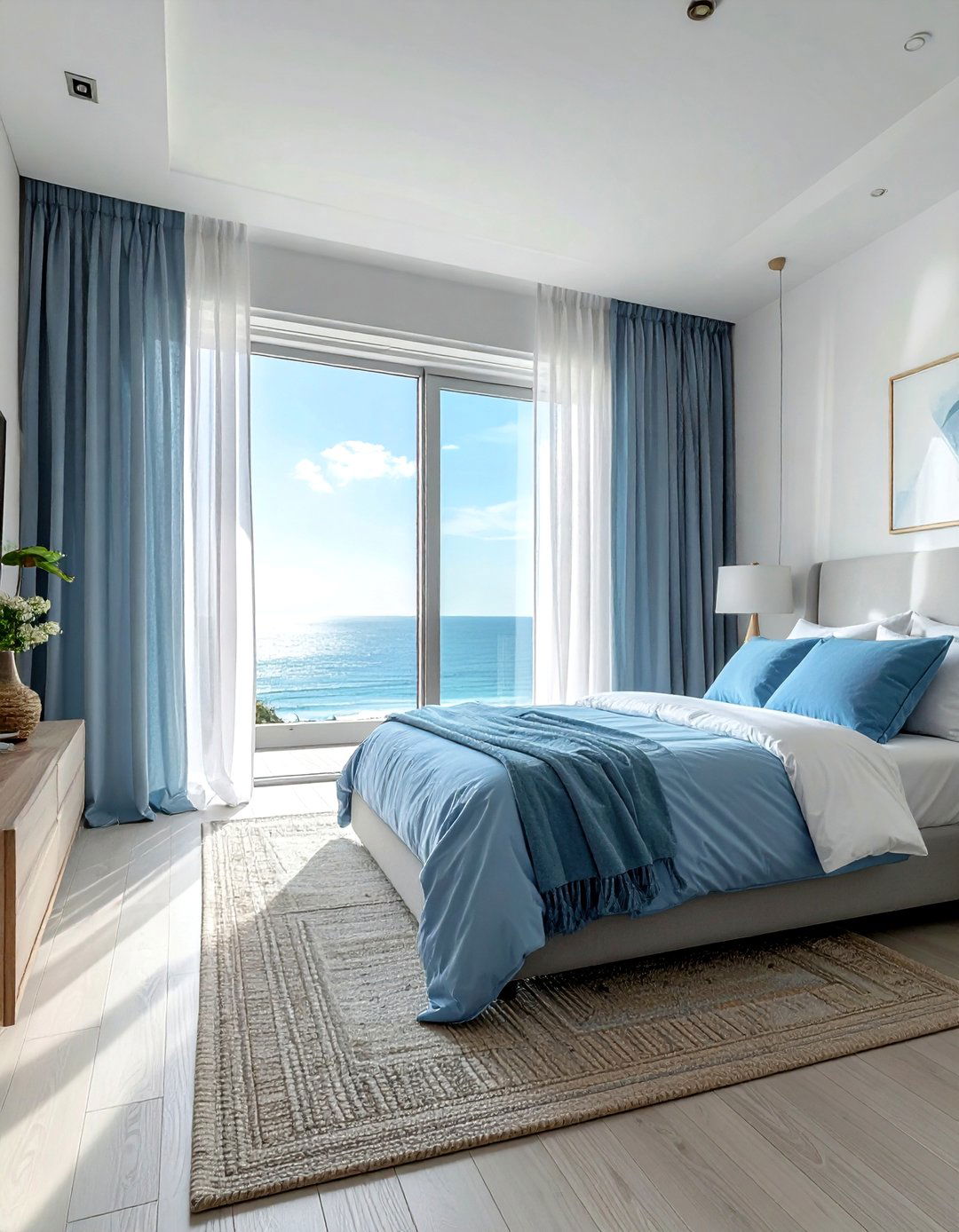
The way you hang your curtains can significantly impact how large and bright your room feels to anyone who enters. To create the illusion of higher ceilings and wider windows, hang your curtain rod higher and wider than the actual window frame. Aim for about four to six inches above the window trim, or even closer to the ceiling for a dramatic effect. Additionally, extend the rod several inches past the sides of the window so that when the curtains are open, they don't block the glass. This allows maximum natural light to enter while making the entire wall appear much more expansive and elegant.
11. Mixing Wood Tones
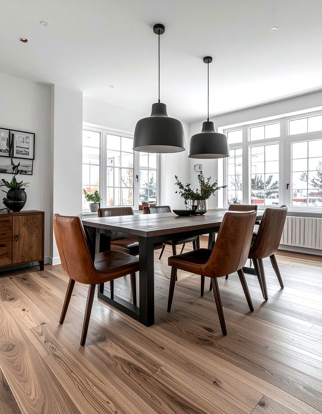
Matching all your wood furniture to the exact same stain can often result in a room that feels flat and dated. Instead, follow the rule of mixing wood tones to create a more dynamic and interesting interior environment. The key to successful mixing is identifying the undertone of the wood—whether it is warm, cool, or neutral. You can mix different grains and colors as long as the undertones are consistent across the room. For example, pairing a light oak floor with a dark walnut dining table works beautifully if both have a neutral undertone, adding a professional layer of sophisticated contrast to the space.
12. Room Traffic Flow

A beautiful room is only successful if it is also functional and easy to navigate for the people living there. When planning your furniture layout, always consider the traffic flow, which is the path people take to move through the space. Ensure there are clear walkways that are at least thirty to thirty-six inches wide between major pieces of furniture. Avoid blocking doorways or creating awkward bottlenecks that force people to squeeze past obstacles. A well-planned layout feels intuitive and comfortable, allowing the room to function efficiently while maintaining a sense of openness and professional organization in your home design.
13. Texture Contrast
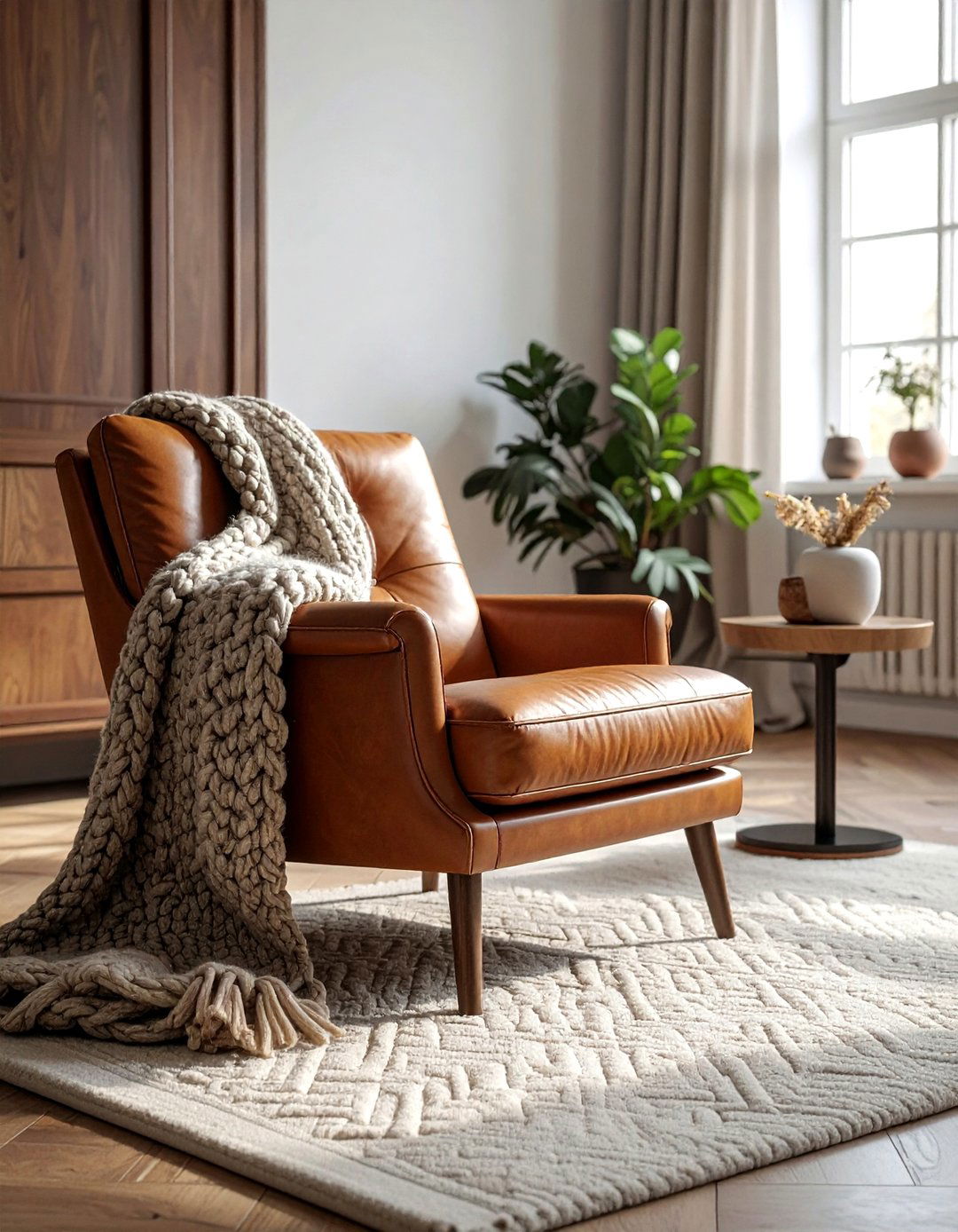
If a room feels "boring" despite having a great color palette, it might be lacking a variety of different textures. Texture contrast is the secret to making a monochromatic or neutral space feel rich and inviting to the touch. Try to mix different materials, such as a smooth leather sofa with a chunky wool throw blanket and a sleek marble coffee table. The interplay between soft and hard, rough and smooth, and shiny and matte surfaces adds visual weight and complexity to the design. This rule ensures that your home feels tactile and cozy, providing a high-end look that is visually stimulating.
14. Ceiling Paint Color
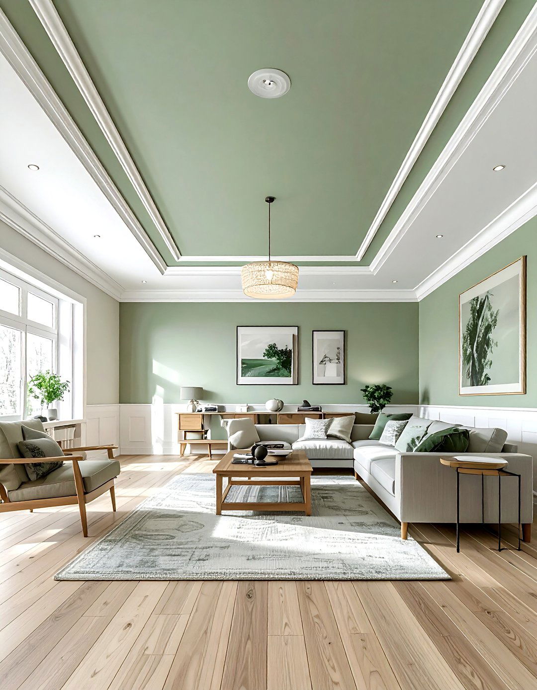
Often referred to as the "fifth wall," the ceiling is a frequently overlooked area that can dramatically change the vibe of a room. While standard white is a safe choice, painting the ceiling a different color or the same color as the walls can create a unique atmosphere. In a small room, painting the ceiling and walls the same dark shade can blur the boundaries and make the space feel more expansive and intimate. Conversely, using a lighter shade on the ceiling can lift the room and make it feel airier. This rule encourages you to think beyond the floor and walls for design.
15. Mirror Placement
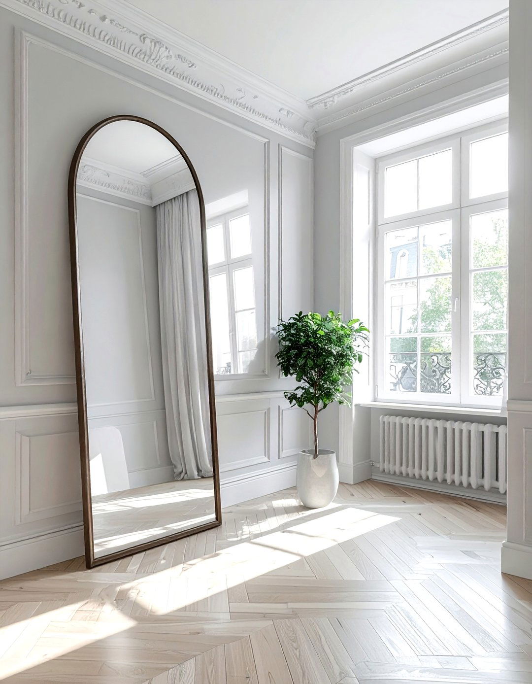
Mirrors are powerful tools in interior design because they can reflect light and create the illusion of more space in any room. To maximize their impact, place mirrors opposite a window so they can catch the natural light and bounce it back into the darker corners of the space. This simple trick can make a small or dim room feel much brighter and more open. Additionally, using a large floor-length mirror can add a sense of grandeur and height to a bedroom or entryway. Always consider what the mirror is reflecting; you want it to show a beautiful view or a clean area.
16. Coffee Table Height

Finding the right coffee table is about more than just style; it is also about ensuring the proportions work with your seating. A standard design rule is that the height of your coffee table should be roughly the same height as the seat cushions of your sofa, or perhaps one to two inches lower. This ensures that the table is comfortable to reach while sitting and maintains a clean horizontal line across the room. Additionally, leave about fourteen to eighteen inches of space between the edge of the sofa and the table to allow for comfortable legroom while still keeping the surface within easy reach.
17. Dining Chair Clearance
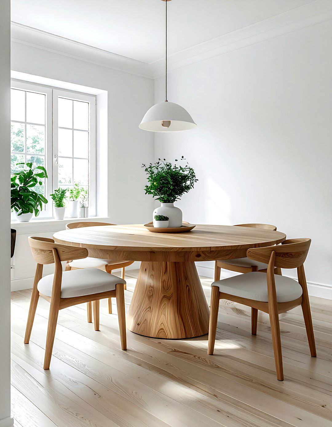
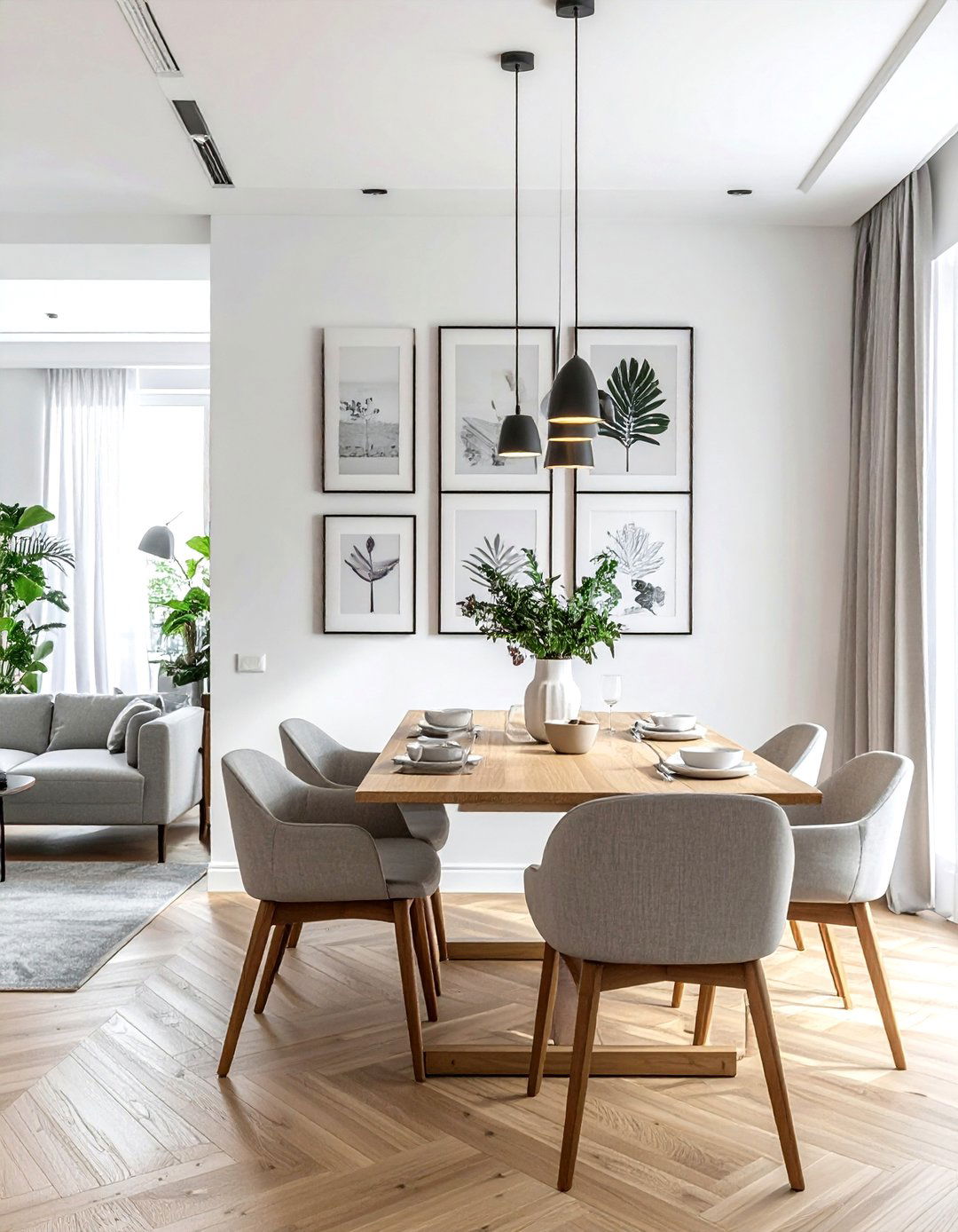
When designing a dining area, it is vital to ensure there is enough space for guests to move comfortably around the table. The rule for dining chair clearance suggests leaving at least thirty-six inches between the edge of the table and the nearest wall or piece of furniture. This allows enough room for someone to pull out their chair and sit down without bumping into anything behind them. If the dining area is a high-traffic zone, increasing that clearance to forty-eight inches is even better. Proper spacing ensures that your dinner parties feel relaxed and functional rather than cramped and awkward for everyone.
18. Kitchen Work Triangle
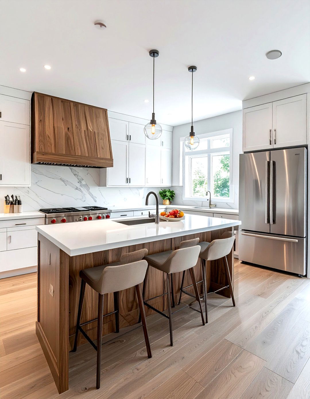
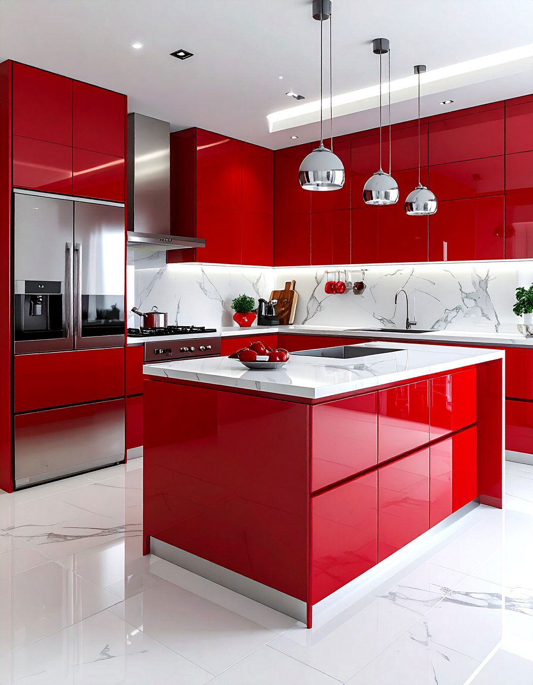
In kitchen design, the work triangle is a fundamental rule used to create an efficient and ergonomic cooking environment for the chef. This triangle connects the three main work areas: the sink, the stove, and the refrigerator. Ideally, the distance between these three points should be between four and nine feet, and the total of all three sides should be between twelve and twenty-six feet. This layout ensures that everything you need is within a few steps, minimizing unnecessary movement while you prepare meals. A well-executed work triangle makes a kitchen feel professional, organized, and much easier to use on a daily basis.
19. Entryway Functionality
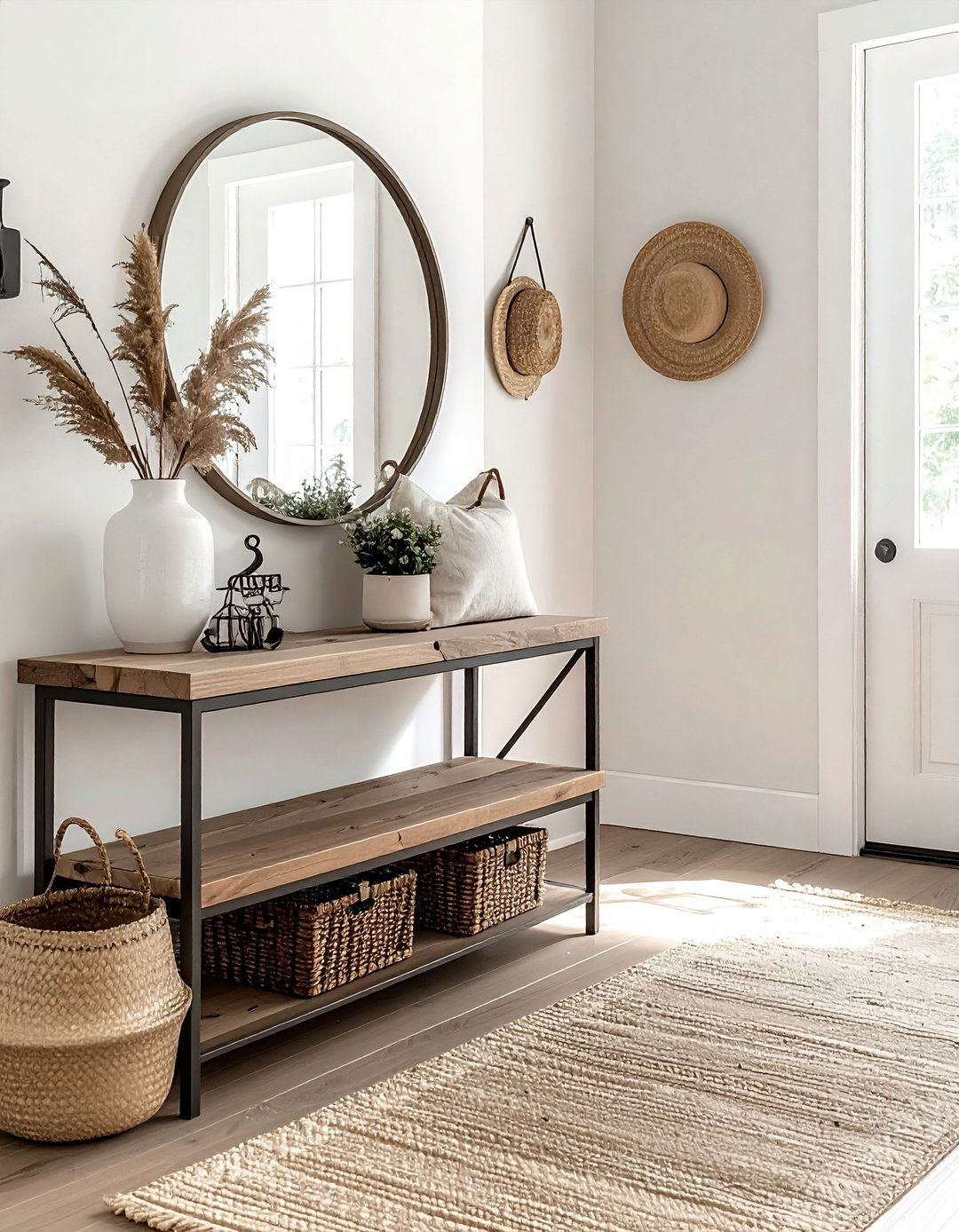
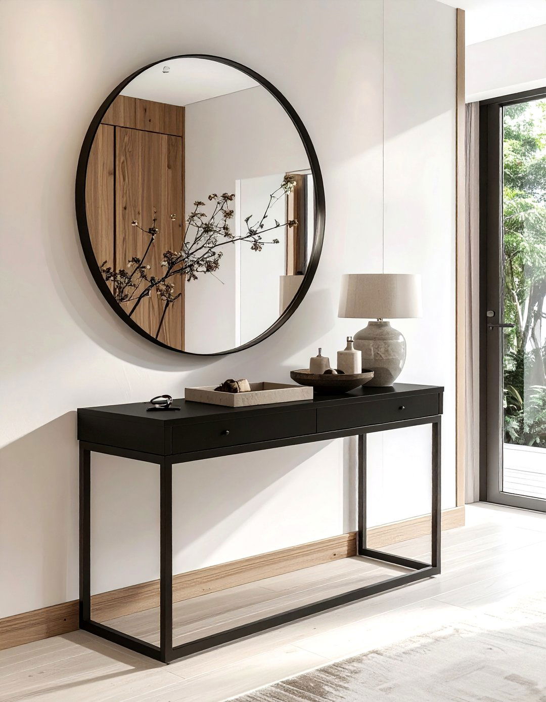
The entryway is the first impression guests have of your home, so it should be both beautiful and highly functional. A good rule for entryway design is to include a designated spot for everything you need when coming or going. This usually involves a console table or bench, a mirror for last-minute checks, and storage for keys, mail, and shoes. Even in a small hallway, adding a few wall hooks and a small basket can prevent clutter from spreading into the rest of the house. By prioritizing organization at the door, you create a welcoming and professional atmosphere that sets the tone for the home.
20. Pattern Mixing

Mixing different patterns can feel intimidating, but following a few simple guidelines can help you master this professional design technique with ease. Start by choosing a primary large-scale pattern, like a floral or a geometric rug, to serve as the foundation. Then, add a medium-scale pattern in a different style, such as stripes or a subtle print on the curtains. Finally, introduce a small-scale pattern, like a delicate texture on a throw pillow, to tie everything together. Ensure that all the patterns share at least one common color to maintain a sense of harmony and prevent the room from looking too busy or mismatched.
21. Indoor Plant Placement
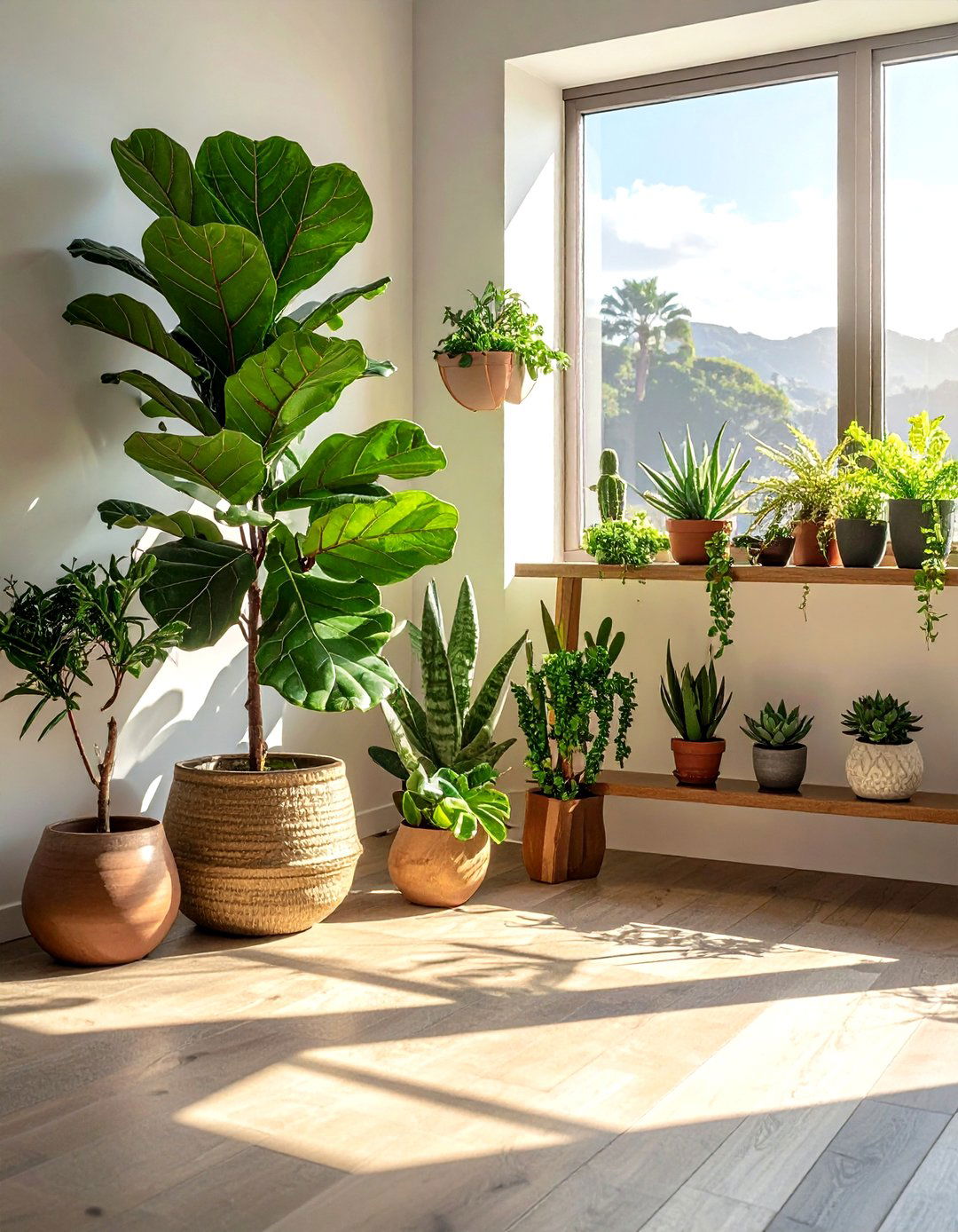
Incorporating greenery is a fantastic way to breathe life into a room, but plant placement should be intentional rather than random. Use large floor plants, like a fiddle leaf fig or a monstera, to fill empty corners and add vertical interest to your living areas. Smaller plants can be grouped together on shelves or windowsills using the rule of three to create a lush, curated look. Beyond aesthetics, consider the light requirements of each plant to ensure they thrive in their designated spots. Well-placed greenery adds a natural, organic element that softens hard lines and makes any professional interior feel more vibrant.
22. Statement Lighting
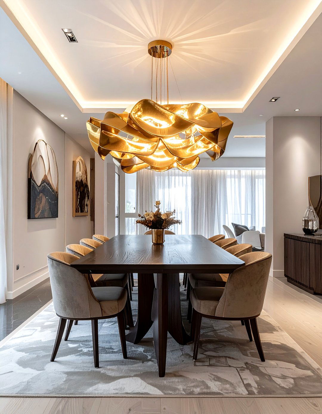
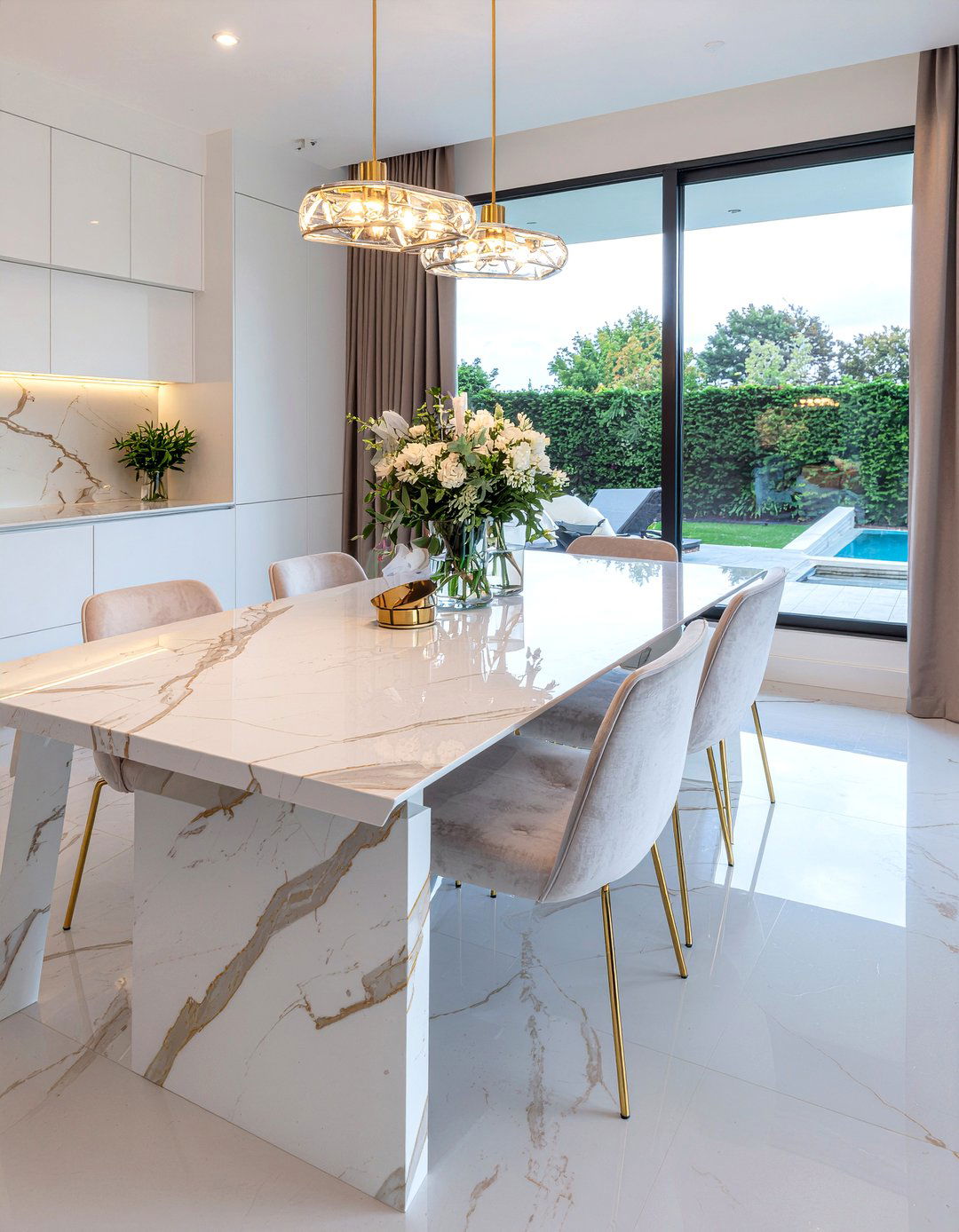
While layered lighting is important for function, every major room can benefit from one piece of statement lighting that acts as jewelry for the space. Whether it is a grand chandelier over the dining table or a sculptural pendant light in the entryway, a statement fixture draws the eye upward and adds a touch of luxury. The rule here is to ensure the scale of the light matches the size of the room and the furniture below it. A light that is too small will look insignificant, while one that is too large can feel oppressive. Bold lighting choices elevate the overall design.
23. Wall Molding
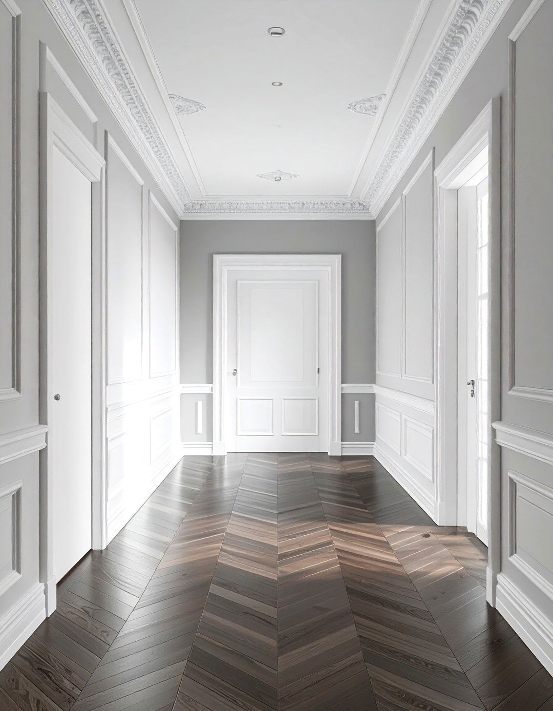
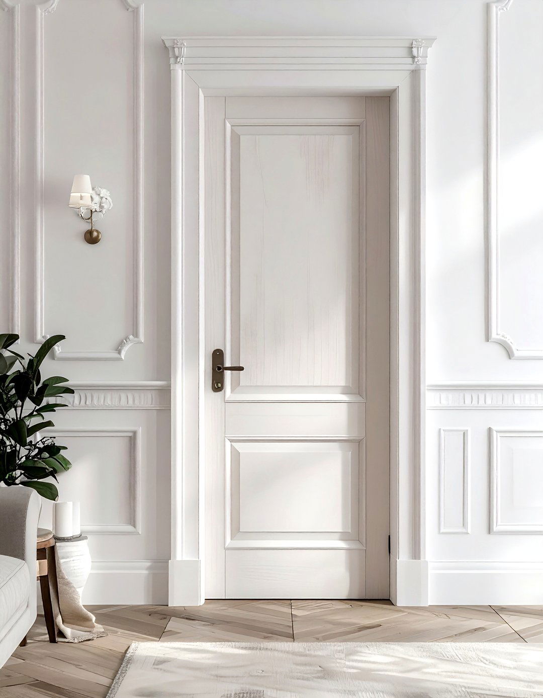
Adding architectural details like crown molding, wainscoting, or picture frame molding is a classic way to make a standard room feel more expensive and professional. These elements add depth and character to flat walls, creating a sense of history and craftsmanship. When installing molding, pay close attention to the proportions; for instance, wainscoting should typically cover the bottom third of the wall to look balanced. You can paint the molding the same color as the walls for a modern, subtle look or use a contrasting white for a more traditional feel. This design rule instantly upgrades the architectural integrity of any living space.
24. Bookshelf Styling
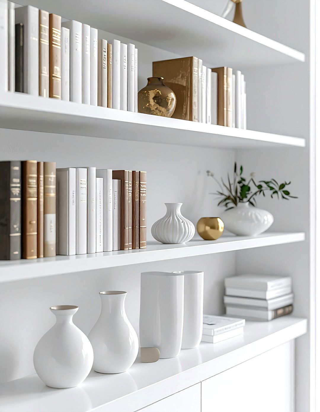
A bookshelf should be more than just a place to store books; it is an opportunity to showcase your personality and design style. Professional bookshelf styling involves a mix of books stacked both vertically and horizontally, interspersed with decorative objects like vases, frames, and small sculptures. Leave some empty space on the shelves to prevent them from looking cluttered and to allow the eye to focus on individual items. Mixing textures and heights within each shelf section creates a sense of rhythm. This approach transforms a functional storage unit into a beautiful, curated focal point that adds sophistication to your home office or lounge.
25. Bedroom Symmetry
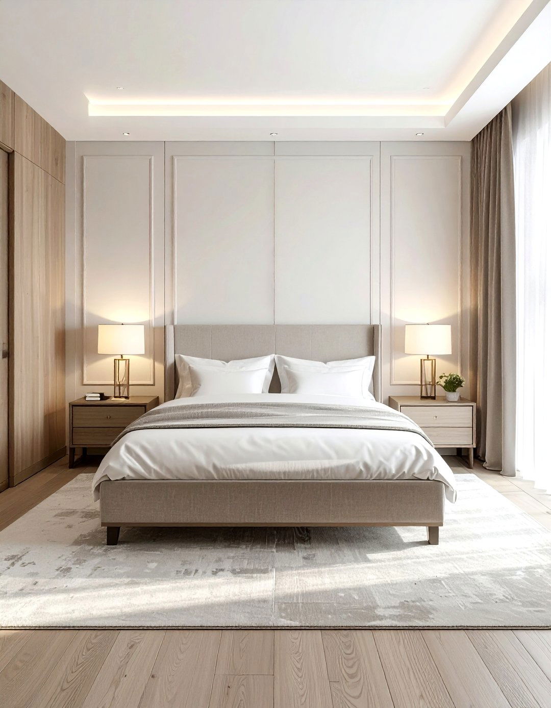
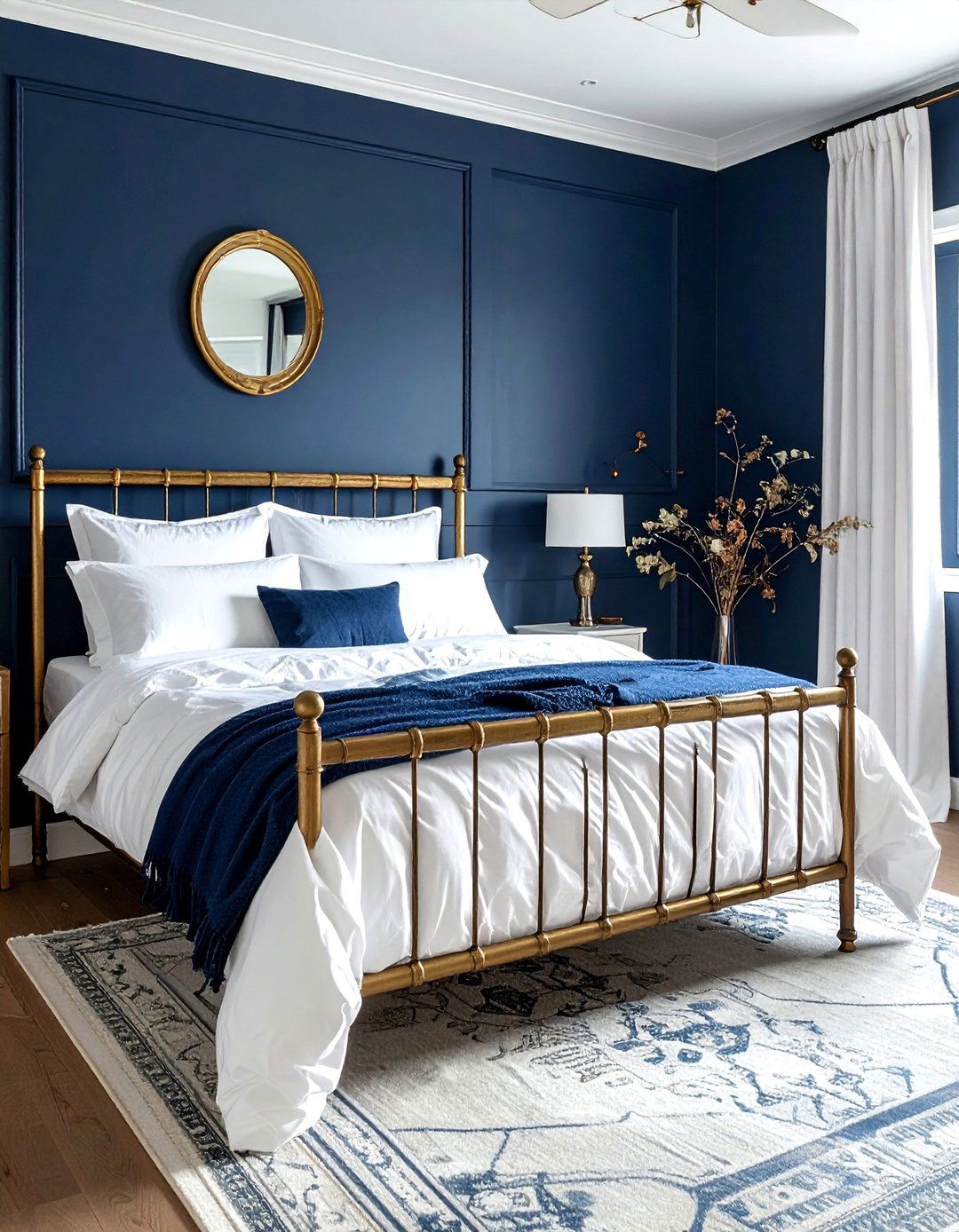
For a restful and professional-looking bedroom, symmetry is often the best rule to follow when arranging your furniture and decor. Placing matching nightstands and lamps on either side of the bed creates an immediate sense of balance and order that is naturally calming to the mind. You can further enhance this look by centering a large piece of art above the headboard or using a symmetrical arrangement of decorative pillows. While you can break symmetry with small accents, having a balanced foundation for the largest pieces ensures the bedroom feels like a cohesive sanctuary designed for relaxation and peaceful sleep every single night.
26. Bathroom Tile Scale

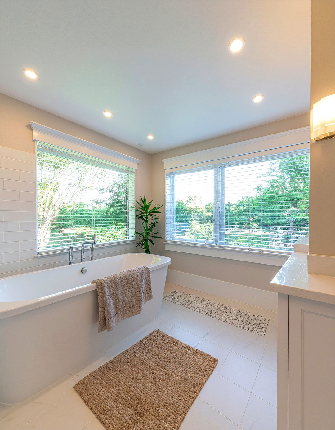
When designing a bathroom, the scale of your tiles can completely change the perception of the room's size and style. A common interior design rule is to use larger tiles in a small bathroom to minimize grout lines, which can make the floor or walls appear less busy and more expansive. Conversely, using small mosaic tiles in a shower area can add beautiful texture and provide better slip resistance. Mixing different tile sizes, such as large floor tiles with a smaller subway tile on the walls, adds visual interest without overwhelming the space. Proper tile scaling ensures a clean, professional, and modern bathroom aesthetic.
27. Cabinet Hardware
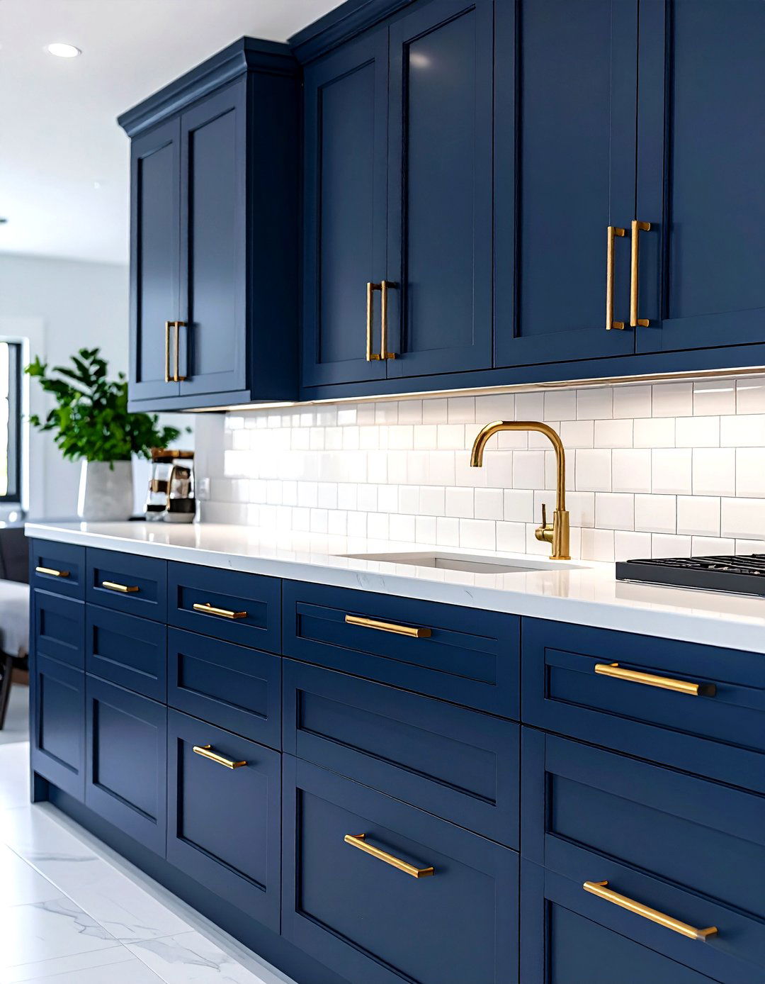
Updating your cabinet hardware is one of the easiest and most cost-effective ways to change the look of a kitchen or bathroom. The rule for hardware is to choose a style and finish that complements your cabinetry and the overall theme of the room. For a modern look, consider sleek, long pulls in a matte black or brushed gold finish. For a more traditional feel, classic round knobs or ornate bin pulls work beautifully. Ensure that the scale of the hardware is appropriate for the size of the doors and drawers; oversized pulls on small drawers can look clunky and out of place in design.
28. Gallery Wall Spacing
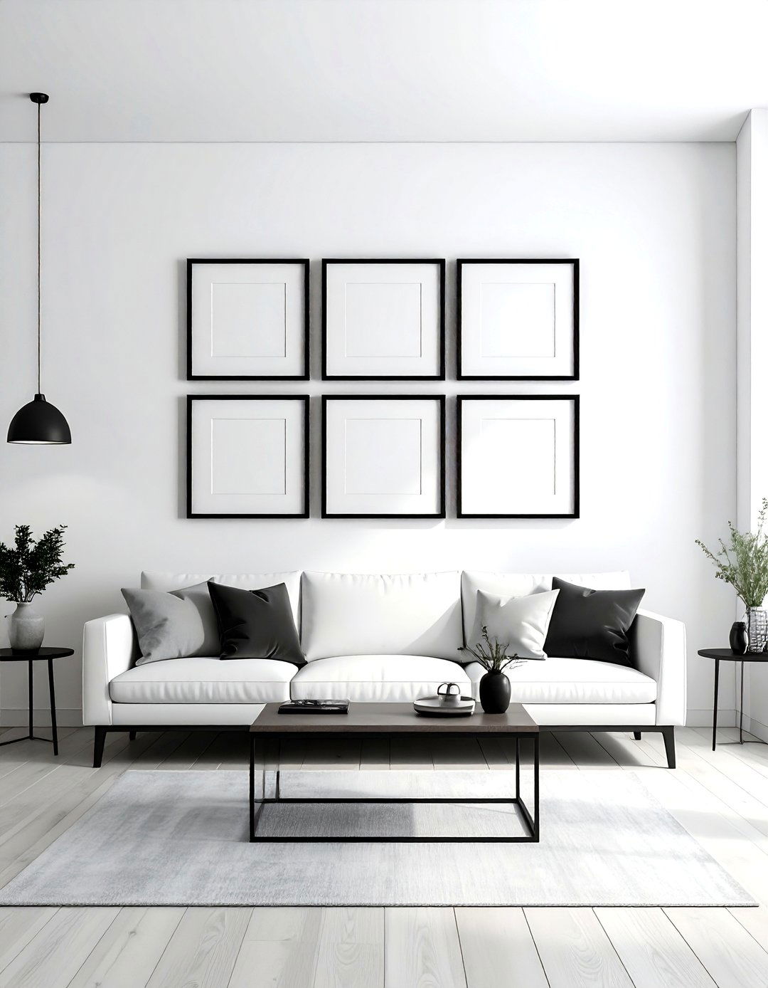
Creating a gallery wall is a popular way to display a collection of art, but consistent spacing is the key to making it look professional. A good rule of thumb is to keep about two to three inches of space between each frame. This creates a sense of unity, making the collection feel like one large piece of art rather than a scattered group of individual items. Before you start hammering nails, lay your arrangement out on the floor to test the composition. Using matching frames can create a clean, modern look, while mixing different frame styles offers a more eclectic and personal gallery feel.
29. Neutral Color Base
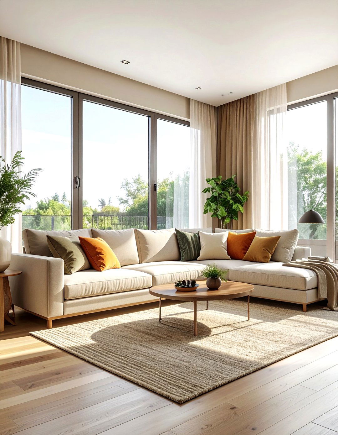
Starting with a neutral base for your large furniture and walls is a smart design rule that offers maximum flexibility over time. Neutrals like white, beige, grey, or taupe provide a calm backdrop that allows you to easily swap out accent colors through pillows, rugs, and art as seasons or trends change. This approach is especially helpful for expensive items like sofas or dining tables, which you likely want to keep for many years. A neutral foundation ensures your home feels timeless and sophisticated, providing a professional canvas that you can layer with personality and color whenever you feel like refreshing your style.
30. Vertical Space Utilization

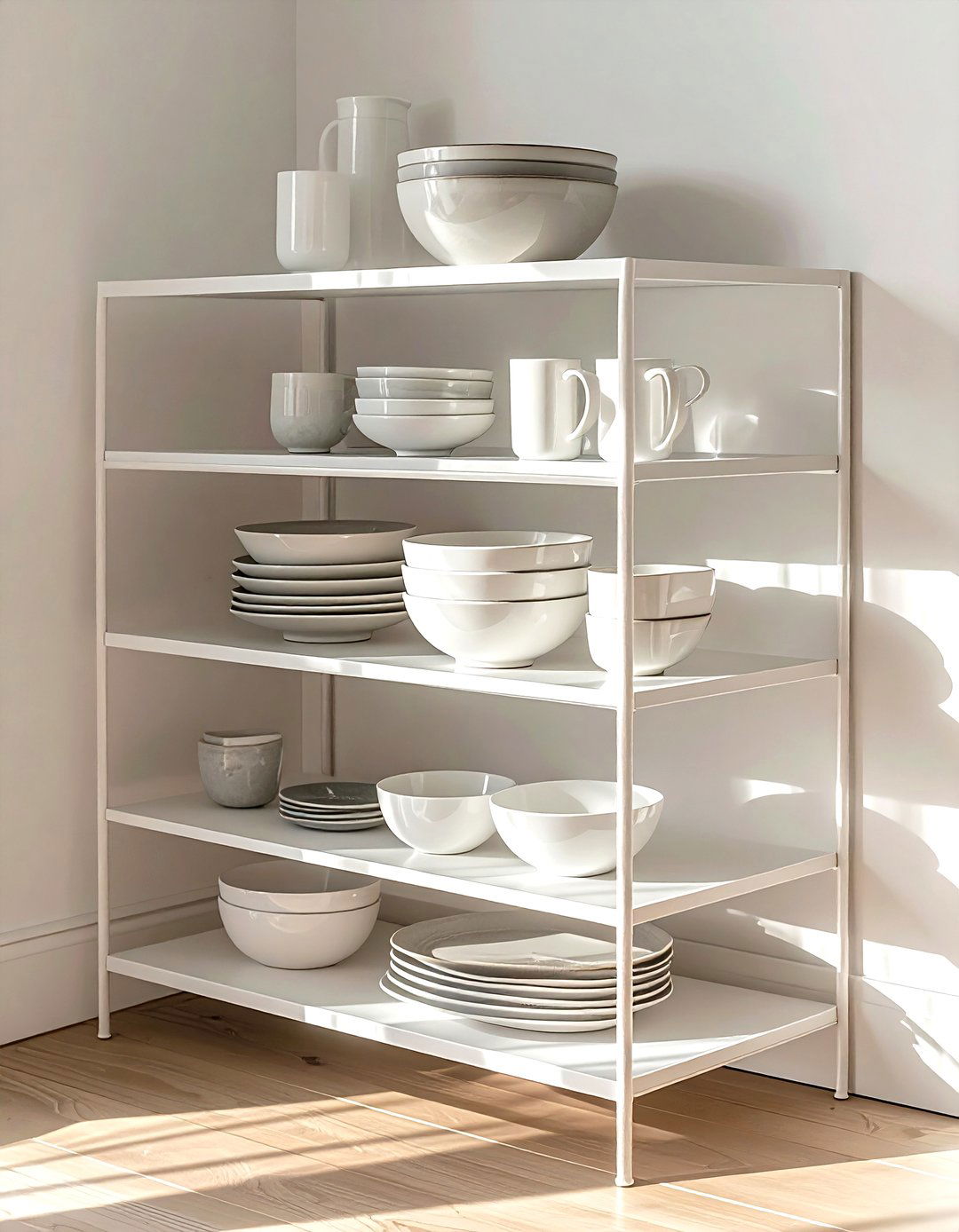
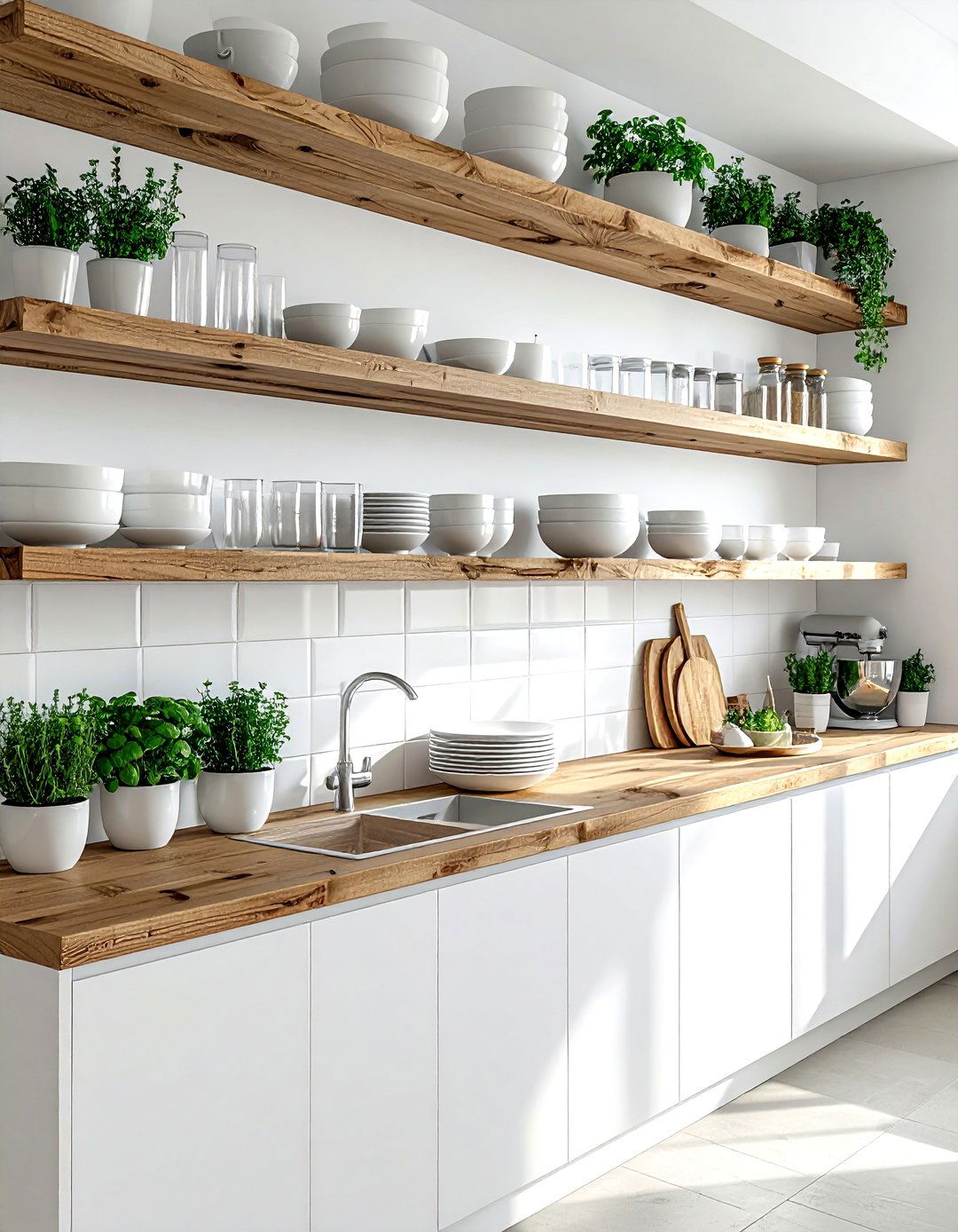
In many homes, the space above eye level goes completely unused, which is a missed opportunity for both storage and design. Utilizing your vertical space can make a room feel taller and more functional, especially in smaller living areas. Consider installing floor-to-ceiling bookshelves, hanging plants from the ceiling, or using tall cabinets that draw the eye upward. This rule encourages you to think about the entire volume of the room, not just the floor plan. By making use of high walls, you add a professional layer of depth and maximize every square inch of your home for a truly curated look.
Conclusion:
Mastering these thirty interior design rules provides you with a solid foundation to transform any house into a beautifully curated and professional home. While design is ultimately a personal journey of self-expression, these guidelines help ensure that your creative choices result in a space that is balanced, functional, and visually harmonious. By paying attention to details like scale, lighting, and color ratios, you can avoid common decorating pitfalls and achieve a high-end look that feels intentional and polished. Remember that these rules are meant to empower you, giving you the confidence to experiment with your style while maintaining a sense of professional structure.

Leave a Reply