Neutral palettes have evolved far beyond basic beige or simple white walls, becoming a cornerstone of sophisticated modern living. Creating a balanced home environment requires a deep understanding of how subtle undertones interact with natural light and varied textures. When you choose a neutral color scheme, you are investing in a timeless aesthetic that allows your furniture and architectural details to shine without overwhelming the senses. This approach provides a versatile backdrop that can easily adapt to changing seasons and personal style shifts over the years. By layering different shades of cream, gray, and tan, you can achieve a look that feels both expansive and incredibly cozy at the same time.
1. Warm Beige Living Room

A warm beige living room creates a welcoming atmosphere that feels both traditional and modern. By using a base of sandy beige on the walls, you can layer in deeper tan upholstery and light oak furniture to build visual depth. Incorporating soft textiles like wool rugs and linen curtains helps to soften the space, making it feel lived-in rather than sterile. This specific palette works exceptionally well in rooms with plenty of natural sunlight, as the golden undertones of the beige will glow during the afternoon. Complement the look with matte black accents or brushed brass hardware to provide a sophisticated contrast that grounds the entire room.
2. Modern Greige Bedroom
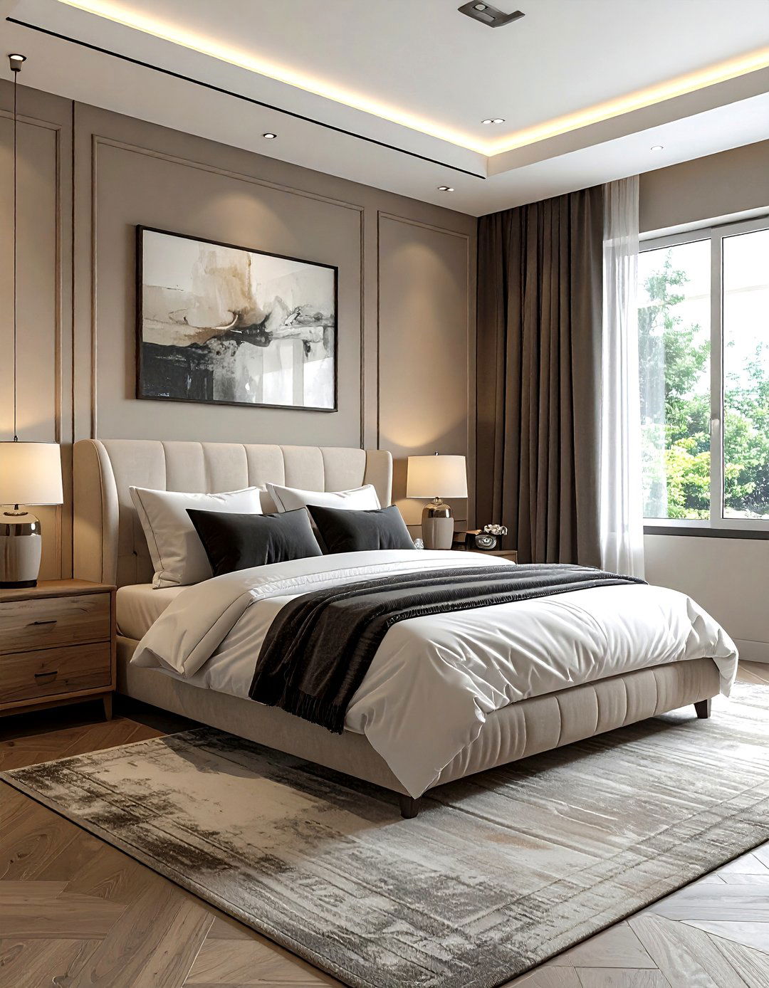
The modern greige bedroom is the perfect solution for those who cannot decide between gray and beige. This hybrid color offers the coolness of gray with the inviting warmth of beige, making it an ideal choice for a restful sleeping environment. To execute this design, pair greige walls with crisp white bedding and charcoal gray accent pillows. Natural wood nightstands add an organic element that prevents the room from feeling too industrial. Using various textures, such as a chunky knit throw or a plush velvet headboard, ensures the monochromatic look remains interesting and tactile. It is a versatile scheme that promotes better sleep and relaxation.
3. Cream And Oak Kitchen
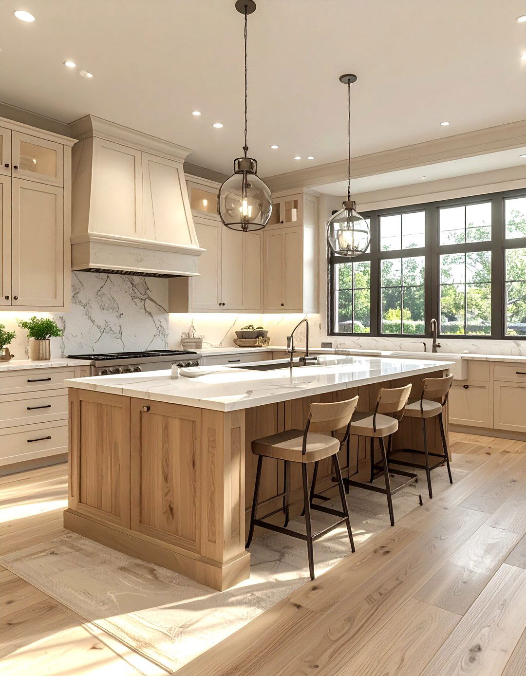
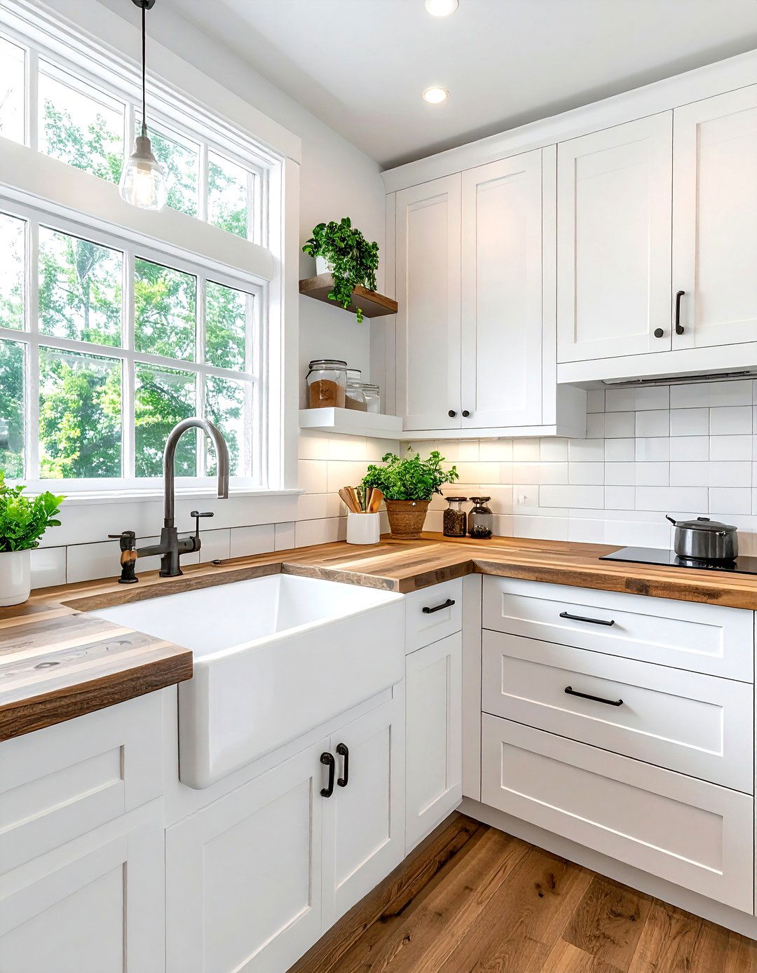
A cream and oak kitchen offers a timeless look that feels much warmer than a standard all-white cooking space. Using creamy off-white for the cabinetry provides a soft glow that pairs beautifully with the natural grain of light oak islands or open shelving. This combination brings a sense of farmhouse charm into a contemporary setting without feeling dated. To finish the design, consider adding white marble countertops with subtle gray veining and polished nickel faucets. The light colors make the kitchen feel larger and more airy, while the wood elements provide the necessary grounding. It is a classic choice for a bright, functional, and beautiful heart of the home.
4. Taupe And White Bathroom
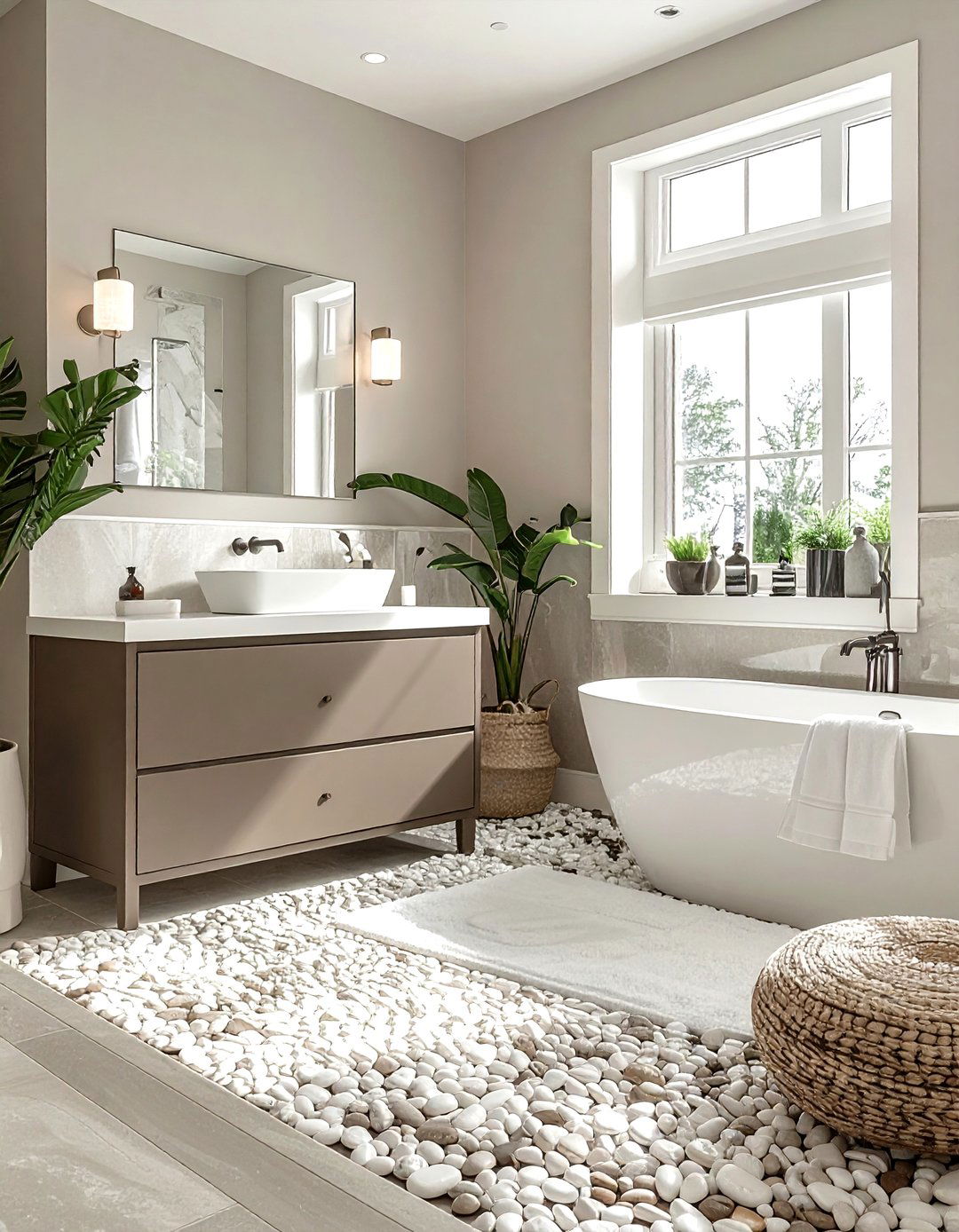
Creating a taupe and white bathroom is a fantastic way to achieve a spa-like retreat within your own home. Taupe provides a sophisticated, earthy base that feels more substantial than traditional gray, especially when used for floor tiles or vanity cabinets. When paired with bright white porcelain fixtures and crisp white towels, the taupe tones stand out as elegant and refined. Adding natural stone elements, such as a pebble shower floor or a quartz countertop, enhances the organic feel of the space. This color combination is incredibly calming, helping you to decompress after a long day in a clean, bright, and visually balanced environment.
5. Ivory Minimalist Lounge
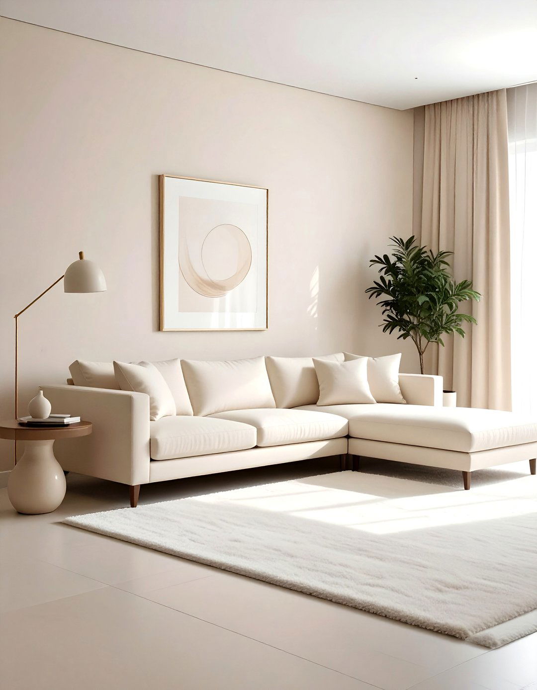
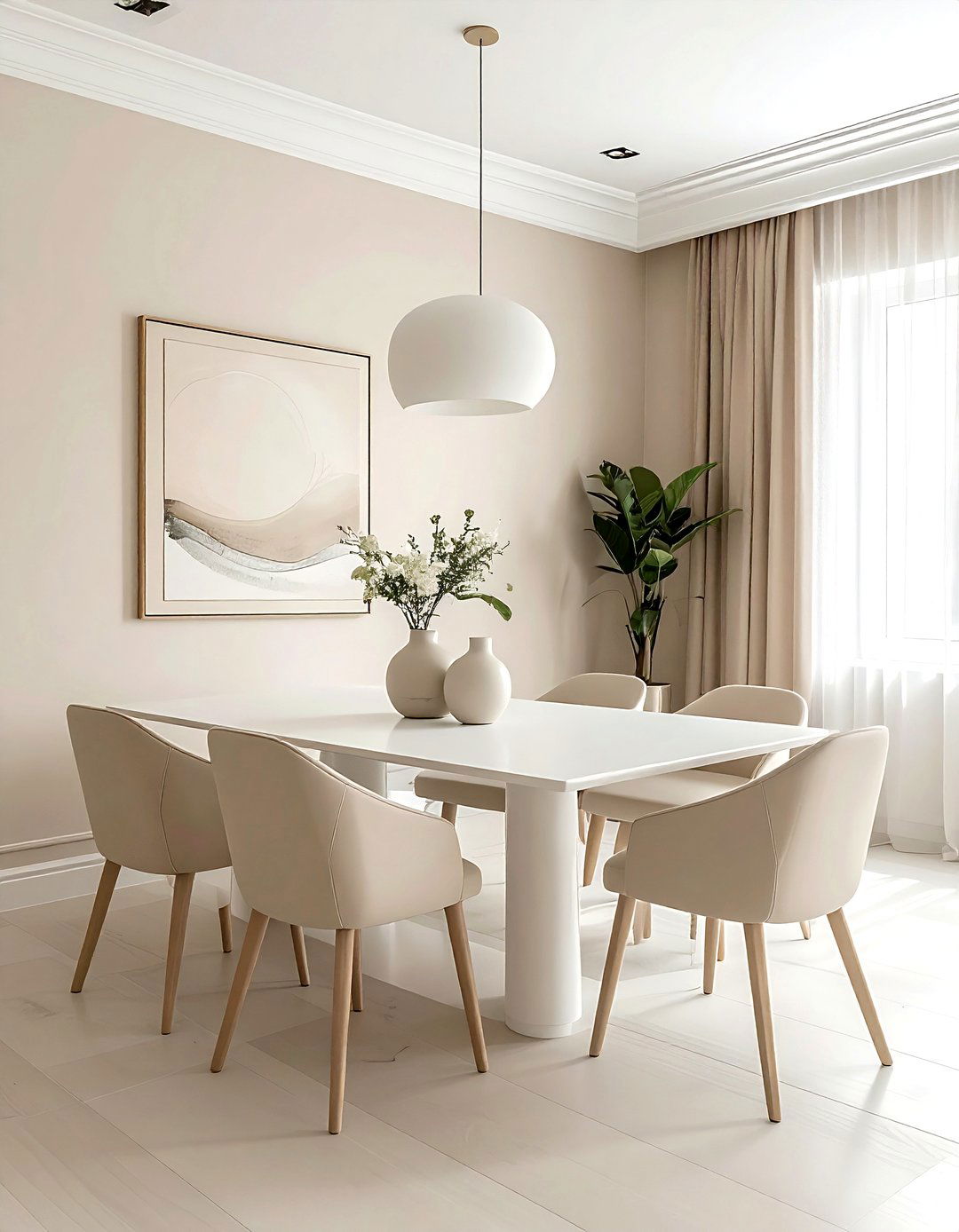
An ivory minimalist lounge focuses on the beauty of simplicity and high-quality materials. By using various shades of ivory and eggshell, you can create a high-end look that feels incredibly expansive and bright. The key to this design is layering different textures, such as a bouclé sofa, a silk rug, and matte ceramic vases, to prevent the room from looking flat. Minimalist furniture with clean lines allows the subtle shifts in white tones to take center stage. This palette is perfect for smaller apartments where you want to maximize light and create an open, airy feeling that feels luxurious and intentional.
6. Soft Gray Nursery
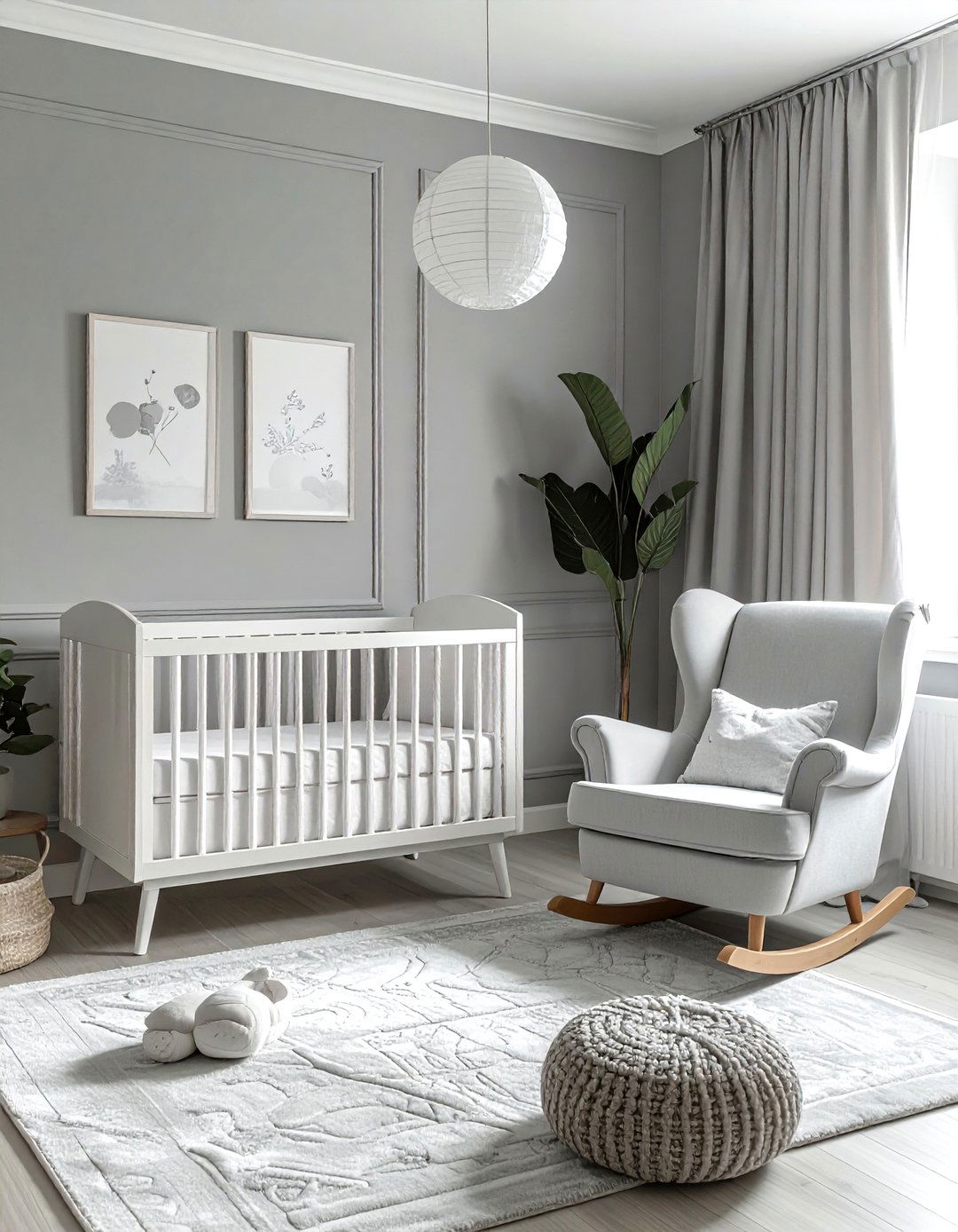
A soft gray nursery provides a gender-neutral and calming environment for a new baby. Using a pale, misty gray on the walls creates a quiet backdrop that can easily be updated as the child grows. Pair this with white nursery furniture and light wood accents to keep the room feeling bright and fresh. Soft textures are essential here, so consider a plush gray rug and cotton muslin curtains. You can add subtle interest through patterned wallpaper or wall decals in slightly darker shades of gray. This sophisticated approach to a child's room ensures a peaceful atmosphere for both the infant and the parents.
7. Sand Colored Dining Room
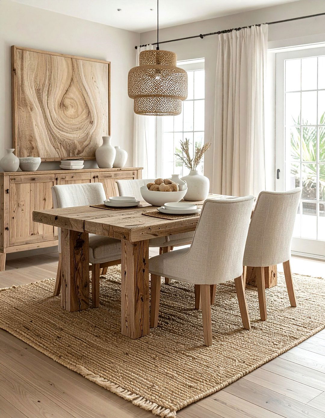
A sand colored dining room brings a touch of coastal elegance to your mealtime gatherings. This palette uses warm, sandy tones for the walls and upholstery, paired with weathered wood dining tables and jute area rugs. The result is a space that feels grounded and connected to nature. To elevate the look, incorporate white ceramic dinnerware and clear glass light fixtures that allow the warmth of the sand tones to shine through. This color scheme is perfect for creating a relaxed, conversational atmosphere where guests feel comfortable and at ease. It works beautifully in both open-plan homes and formal, enclosed dining spaces.
8. Mushroom Brown Home Office
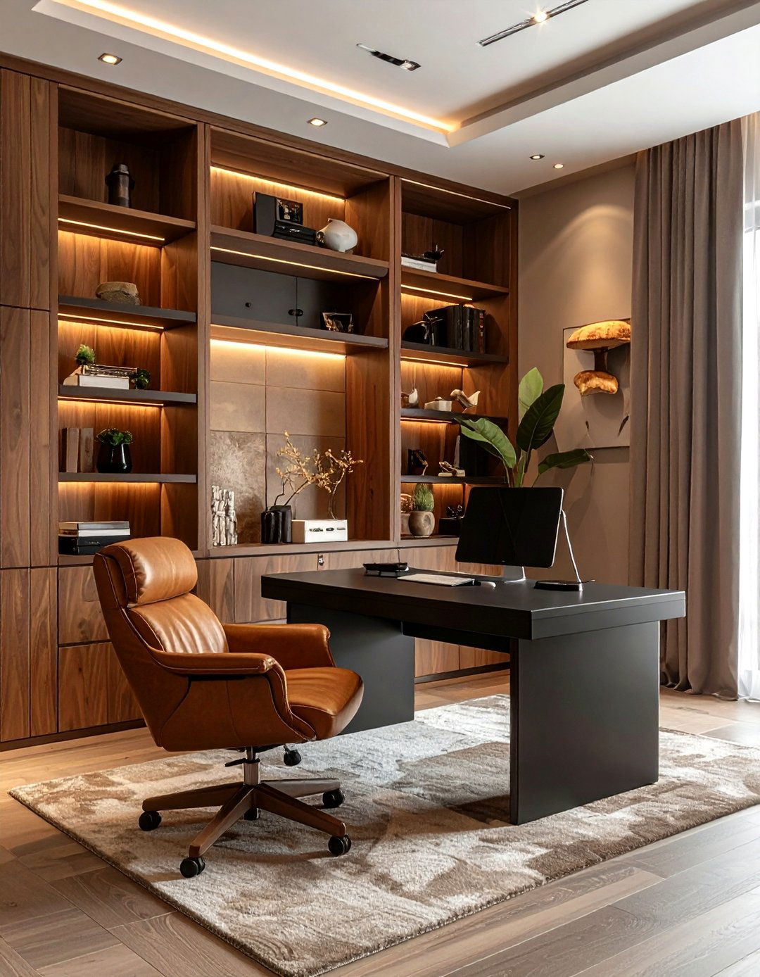
The mushroom brown home office is an excellent choice for those seeking a productive and focused workspace. Mushroom is a unique neutral that sits between brown and gray, offering a moody yet professional vibe. Use this color on the walls or for built-in shelving to create a sense of enclosure and concentration. Pair it with a sleek black desk and a leather office chair to add a touch of executive luxury. To keep the room from feeling too dark, use a large cream-colored rug and plenty of task lighting. This sophisticated palette encourages deep work while maintaining a stylish, modern aesthetic that fits perfectly.
9. White On White Interior
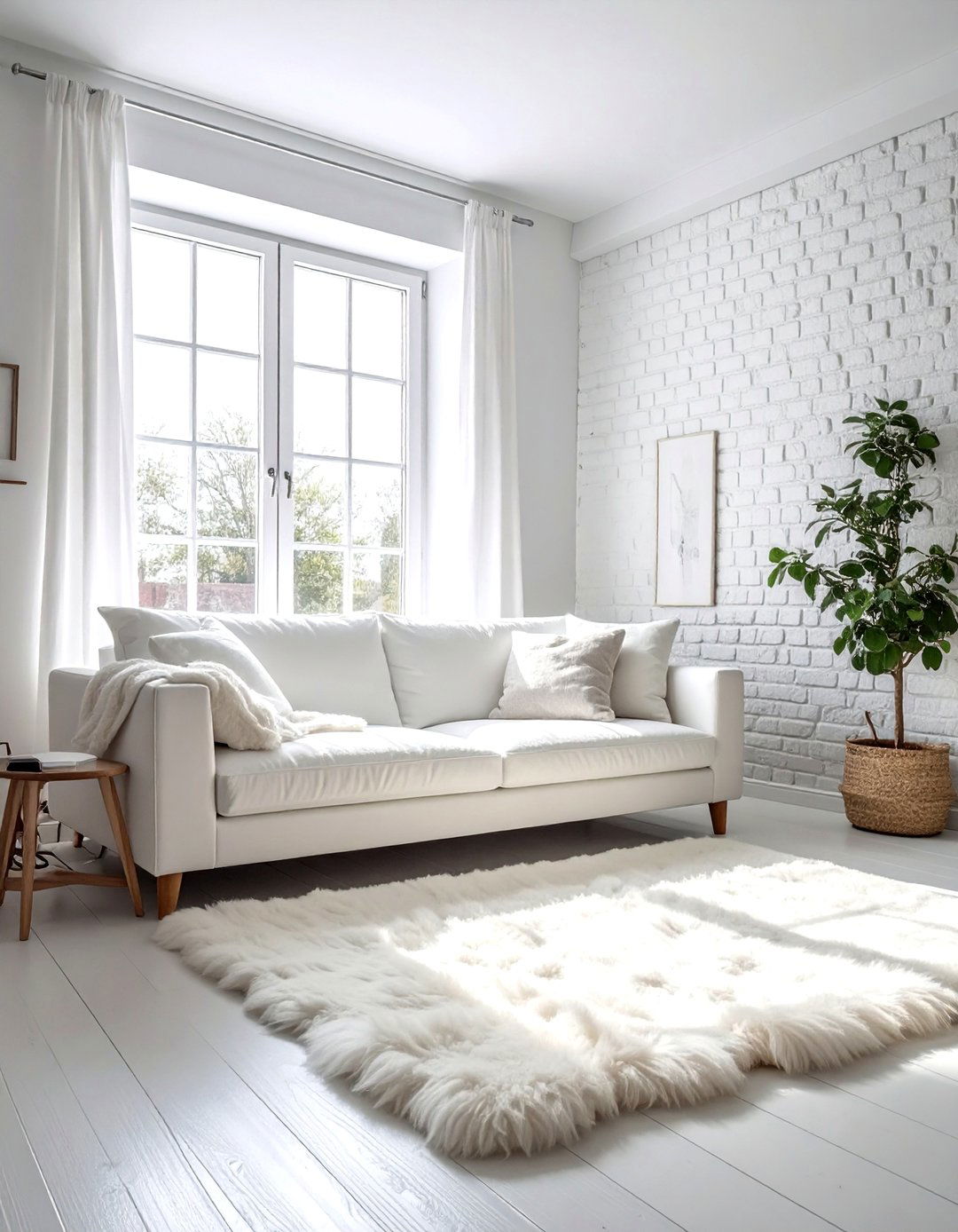
A white on white interior is the ultimate expression of clean, modern design. This look relies on using multiple shades of white, from brilliant snow to warm milk, to create a space that feels ethereal and bright. The secret to success is the heavy use of texture; think sheepskin rugs, linen sofas, and whitewashed brick walls. By removing all bold colors, the focus shifts entirely to the architectural lines of the home and the quality of the light. This design style is perfect for those who crave a clutter-free, serene living environment that feels like a fresh start every time you walk inside.
10. Stone Gray Entryway
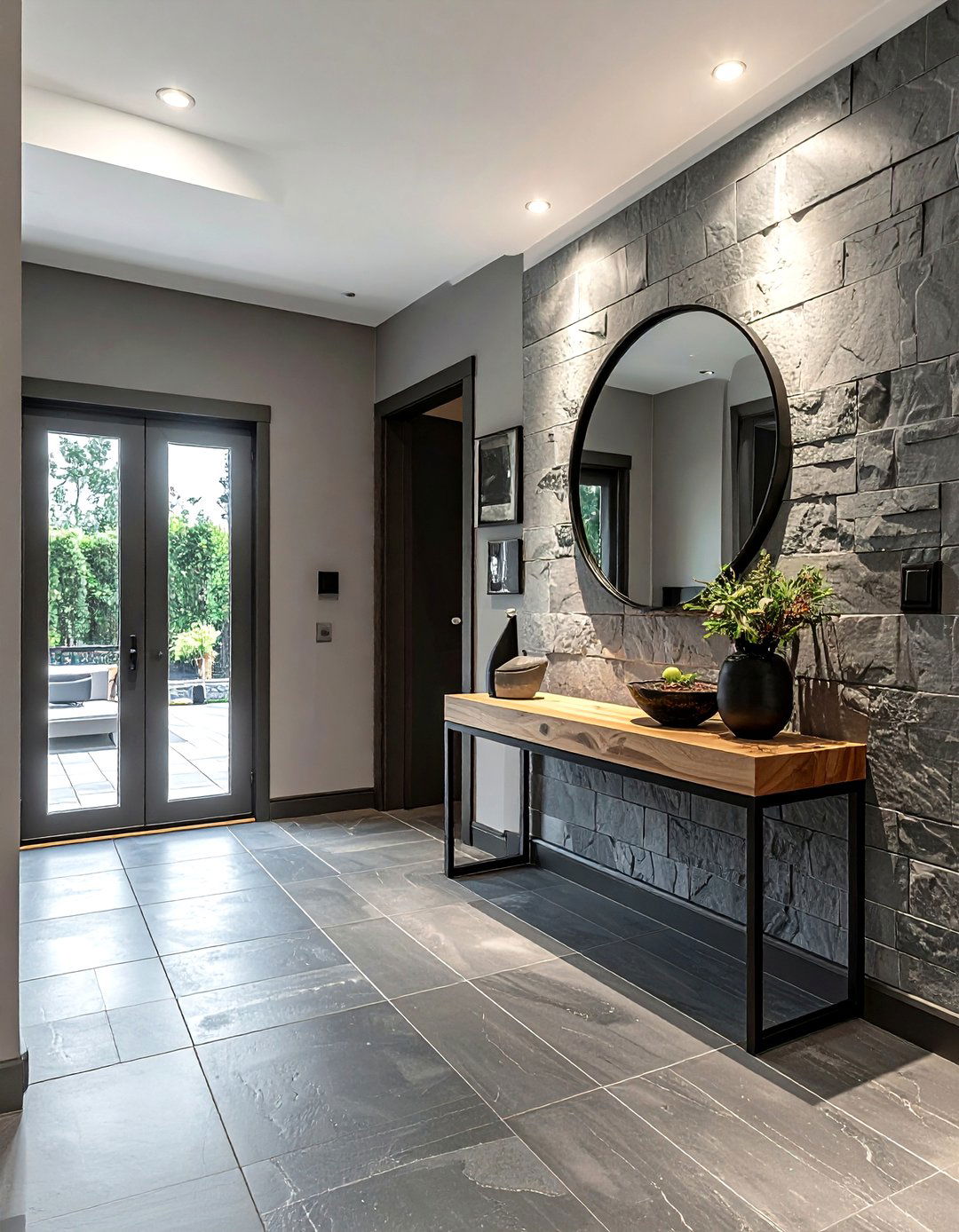
A stone gray entryway sets a sophisticated tone for the rest of your home. Using a mid-tone gray on the walls or as a slate floor tile provides a durable and stylish introduction to your living space. This color is excellent at hiding minor scuffs and dirt, making it practical for a high-traffic area. Complement the stone tones with a light wood console table and a large mirror with a thin black frame. Adding a few green plants in terracotta pots provides a natural pop of color that breathes life into the neutral setting. It creates a transition that feels solid, permanent, and very welcoming.
11. Oatmeal Fabric Living Space
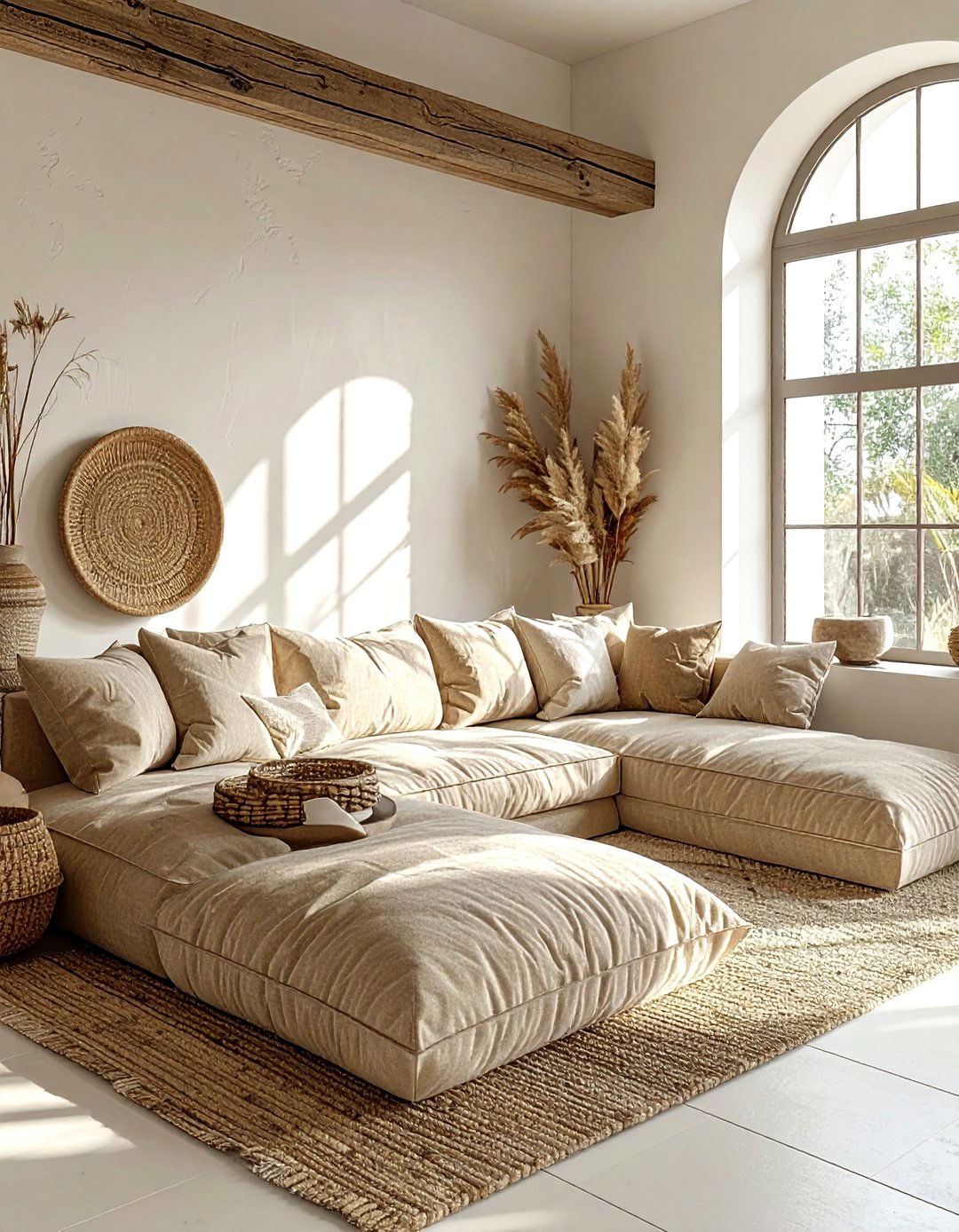
An oatmeal fabric living space is all about the tactile experience of home. This palette centers around the soft, flecked appearance of oatmeal-colored textiles used on large sectional sofas and oversized floor cushions. The walls should be kept in a very light off-white to allow the texture of the fabric to remain the focal point. Incorporating light wood accents and woven baskets adds to the organic, cozy feel of the room. This scheme is particularly effective for families who want a comfortable place to gather that still looks curated and high-end. It is a durable, forgiving, and incredibly inviting neutral choice.
12. Charcoal And Light Gray Basement
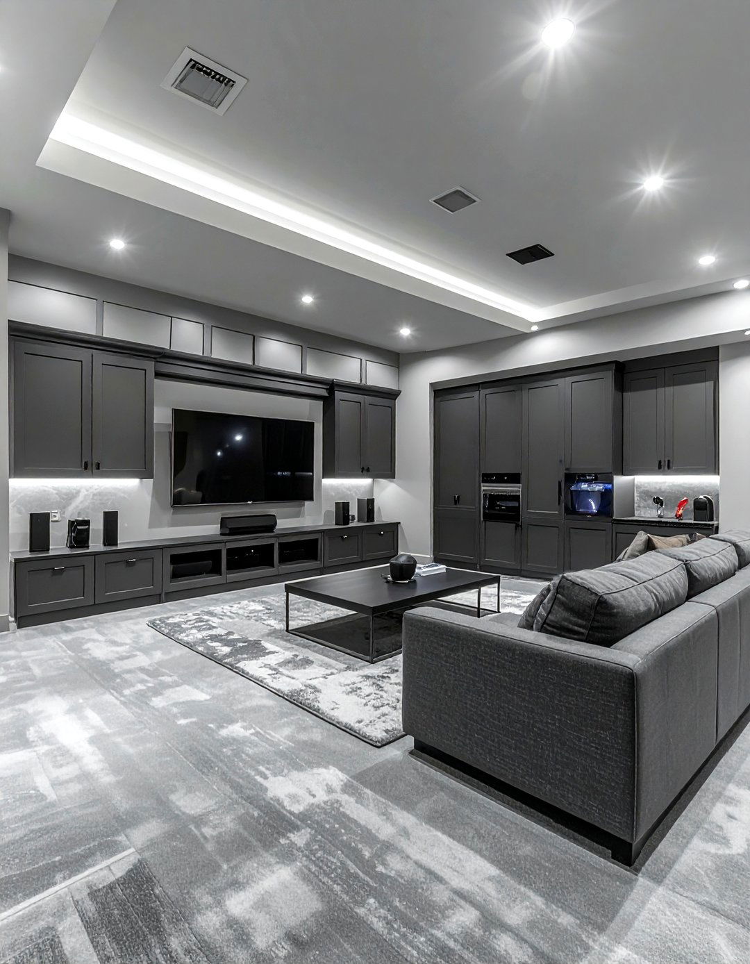
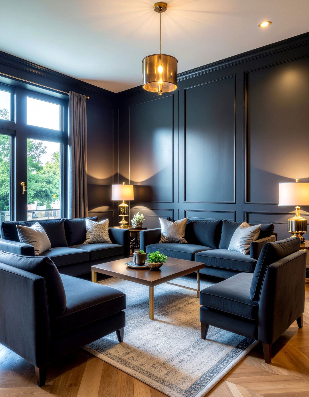
Designing a charcoal and light gray basement transforms a typically dark space into a moody and modern entertainment hub. Use deep charcoal for a focal wall or the media cabinetry to create a theater-like atmosphere. Balance this with light gray carpeting and pale walls in the rest of the room to prevent it from feeling subterranean. This high-contrast neutral pairing adds a sense of sophistication and architectural interest to the lower level of a home. Use recessed LED lighting to highlight the different gray tones and keep the space feeling energetic and ready for hosting movie nights or social gatherings.
13. Putty Colored Laundry Room
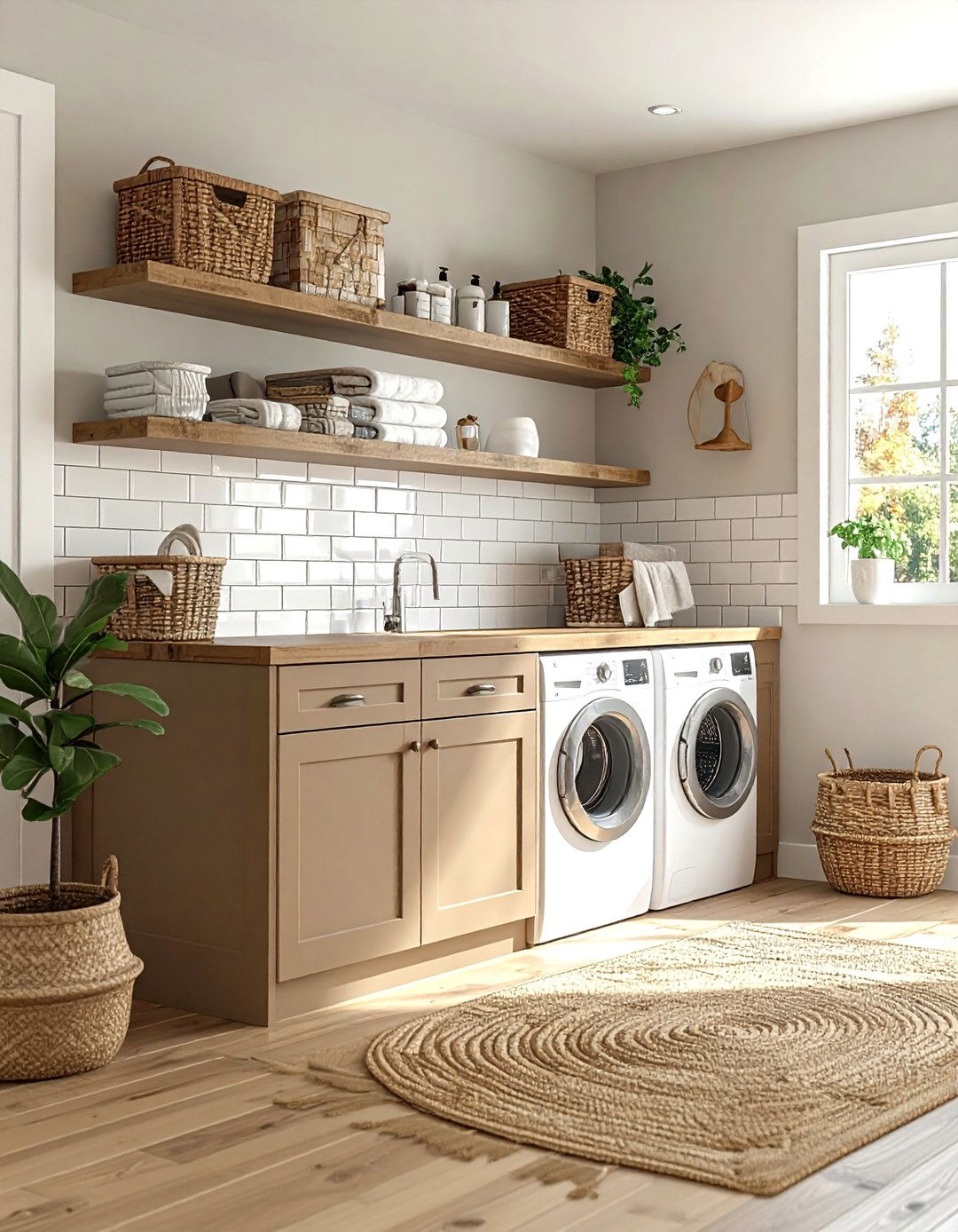
A putty colored laundry room elevates a functional space into something beautiful and serene. Putty is a warm, earthy neutral that feels much more intentional than standard white. Use this shade for the cabinetry and pair it with a white subway tile backsplash for a clean, classic look. Natural wood countertops or a wicker hamper add warmth and texture to the room. Because laundry rooms are often small, this light neutral palette helps the space feel more open and less cramped. It creates a calm environment for performing daily chores, making the task feel much more pleasant and organized in a stylish setting.
14. Linen Textured Master Suite
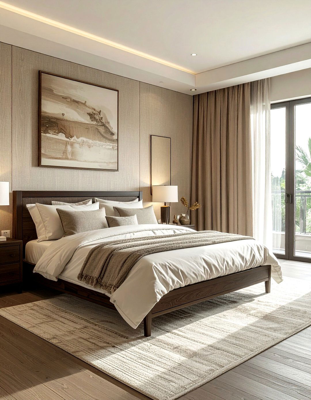
The linen textured master suite focuses on creating a bedroom that feels like a high-end luxury hotel. This design uses a palette of soft creams, tans, and light grays, with a heavy emphasis on linen fabrics for bedding, curtains, and even wall coverings. The natural wrinkles and weave of the linen add an effortless elegance to the room. Pair these textiles with a dark wood bed frame to provide a strong visual anchor. The overall effect is one of quiet luxury and extreme comfort. This neutral scheme is timeless and adapts perfectly to both traditional and very modern architectural styles.
15. Bone White Sunroom
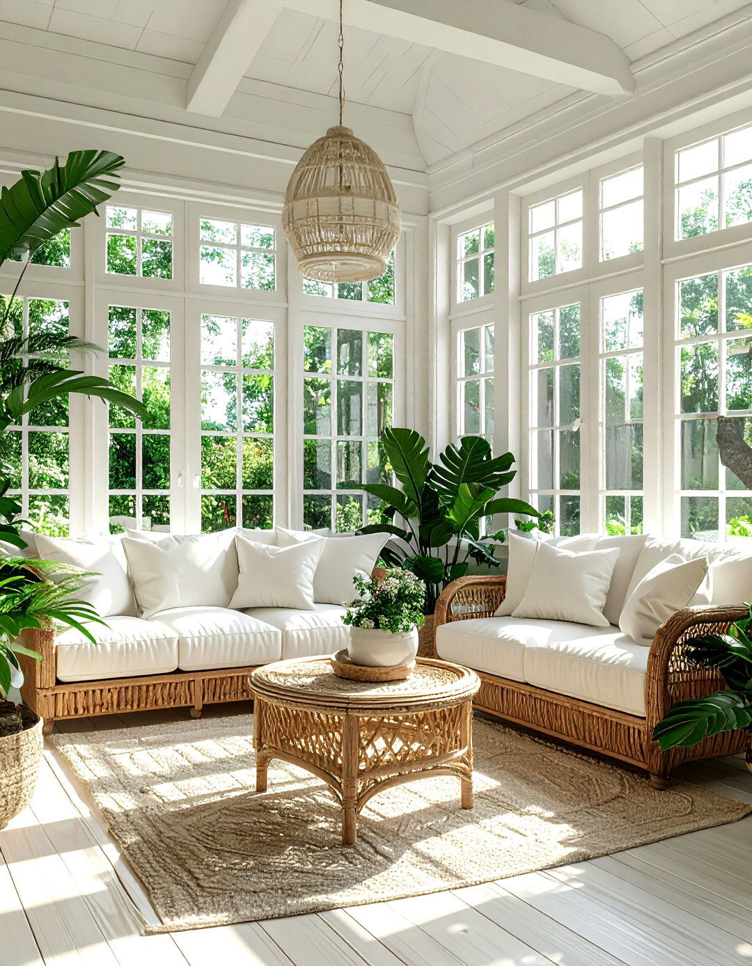
A bone white sunroom is designed to maximize the impact of natural light. Bone white has a very slight yellow or gray undertone that prevents it from feeling as harsh as pure white under direct sun. Use this color for the window frames, walls, and ceiling to create a seamless, glowing box. Furnish the space with light-colored wicker or rattan pieces and cushions in soft ivory outdoor fabrics. The addition of large green leafy plants creates a vibrant contrast that makes the room feel like an indoor garden. It is the perfect spot for morning coffee or afternoon reading in a bright, peaceful atmosphere.
16. Khaki And Cream Guest Room
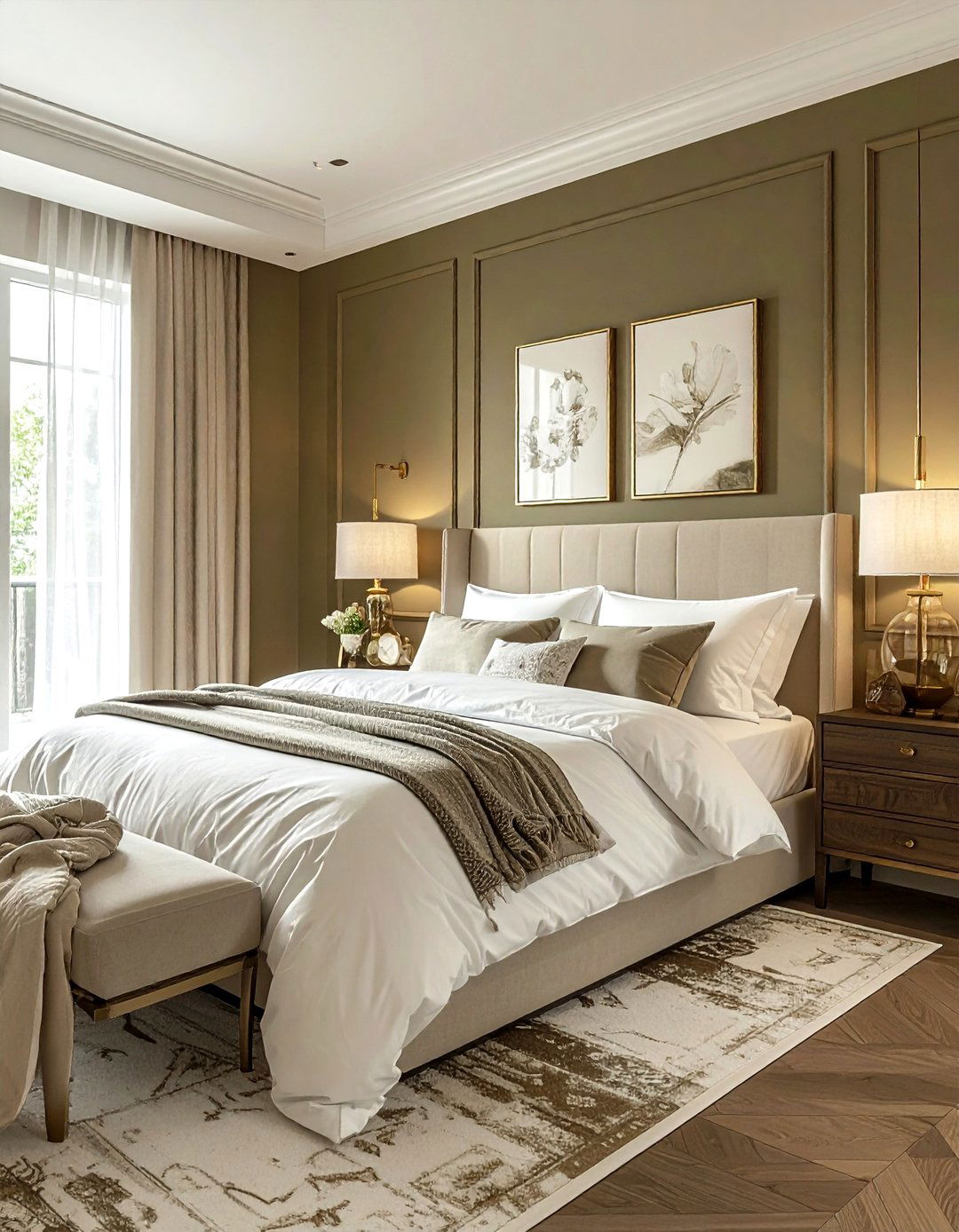
A khaki and cream guest room offers a classic, tailored look that makes visitors feel instantly at home. Khaki provides a solid, dependable base color for an accent wall or window treatments, while cream keeps the rest of the space feeling light and airy. This combination is reminiscent of traditional library or study aesthetics but feels refreshed for a modern bedroom. Use brass bedside lamps and white cotton bedding to complete the look. The warmth of the khaki makes the room feel cozy and private, ensuring your guests have a comfortable and stylish place to rest during their stay at your home.
17. Pebble Gray Mudroom
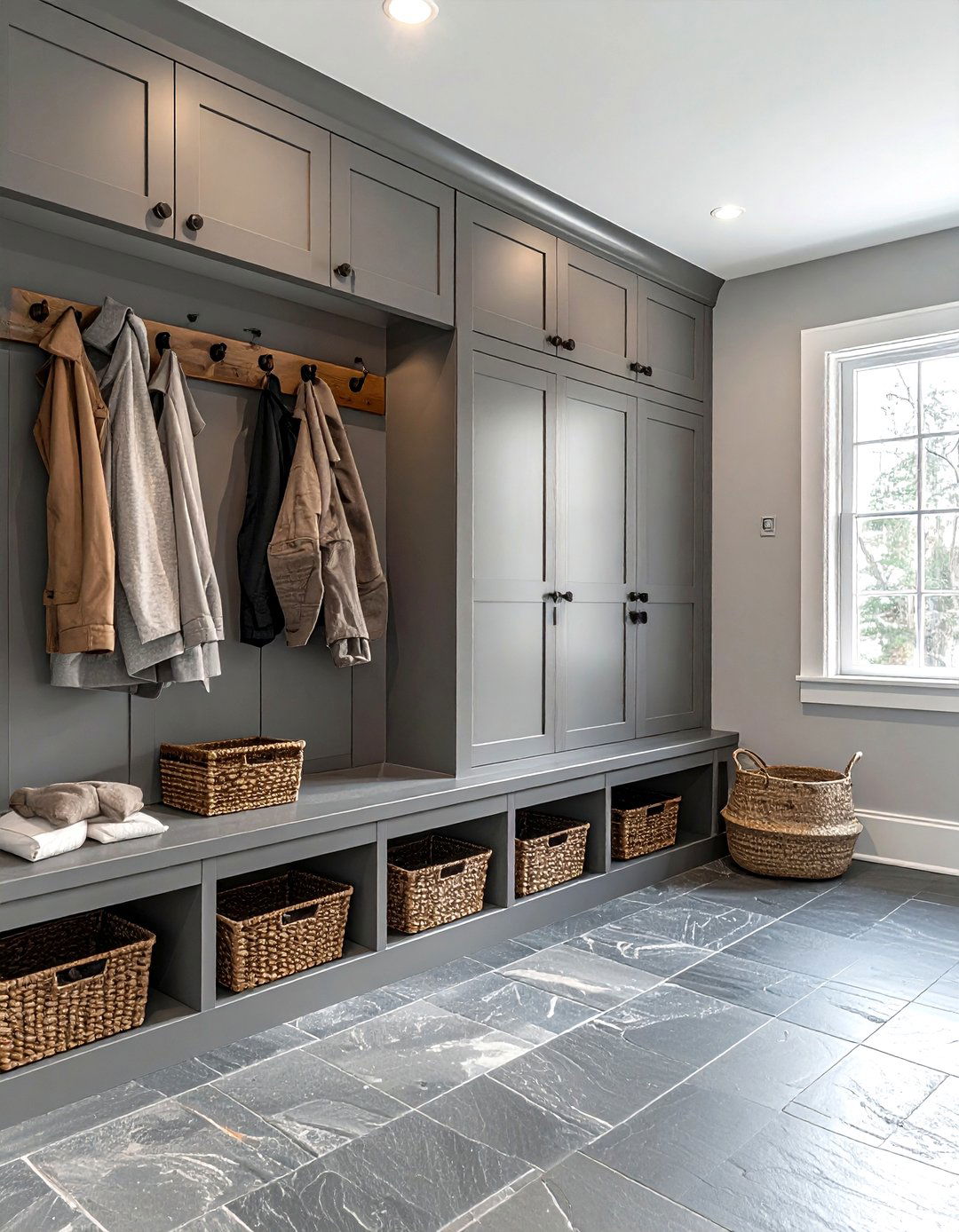
A pebble gray mudroom is the height of functional neutral design. Pebble gray is a soft, natural shade that mimics the look of river stones, making it a perfect match for slate or tile flooring. Use this color for built-in lockers, benches, and cubbies to create a unified and organized look. The cool tones of the gray are balanced by the warmth of wooden coat hooks and woven storage baskets. This palette is excellent for managing the transition from the outdoors to the indoors, as it feels clean and sturdy. It provides a calm, clutter-free start and end to every day.
18. Biscuit Colored Reading Nook
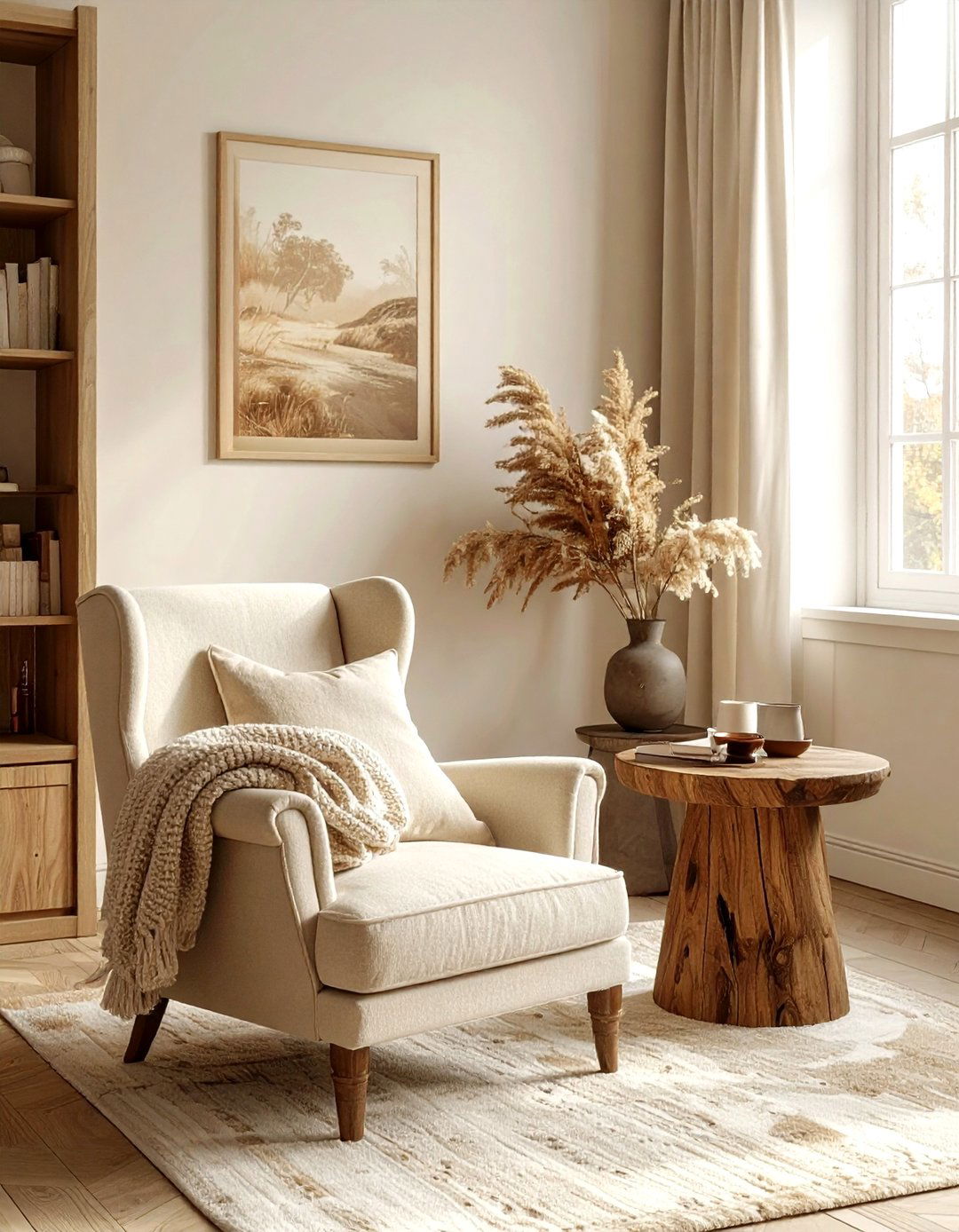
A biscuit colored reading nook is a small, cozy corner designed for ultimate relaxation. Biscuit is a warm, golden-toned neutral that feels incredibly soft and inviting. Use this color for a plush armchair or a built-in window seat, and surround it with walls in a slightly lighter cream shade. A small wooden side table and a soft wool throw in a matching tone complete the monochromatic look. The warmth of the biscuit color creates a sense of safety and quiet, making it the ideal spot to get lost in a book. It adds a layer of charm to any unused corner.
19. Dove Gray Open Plan
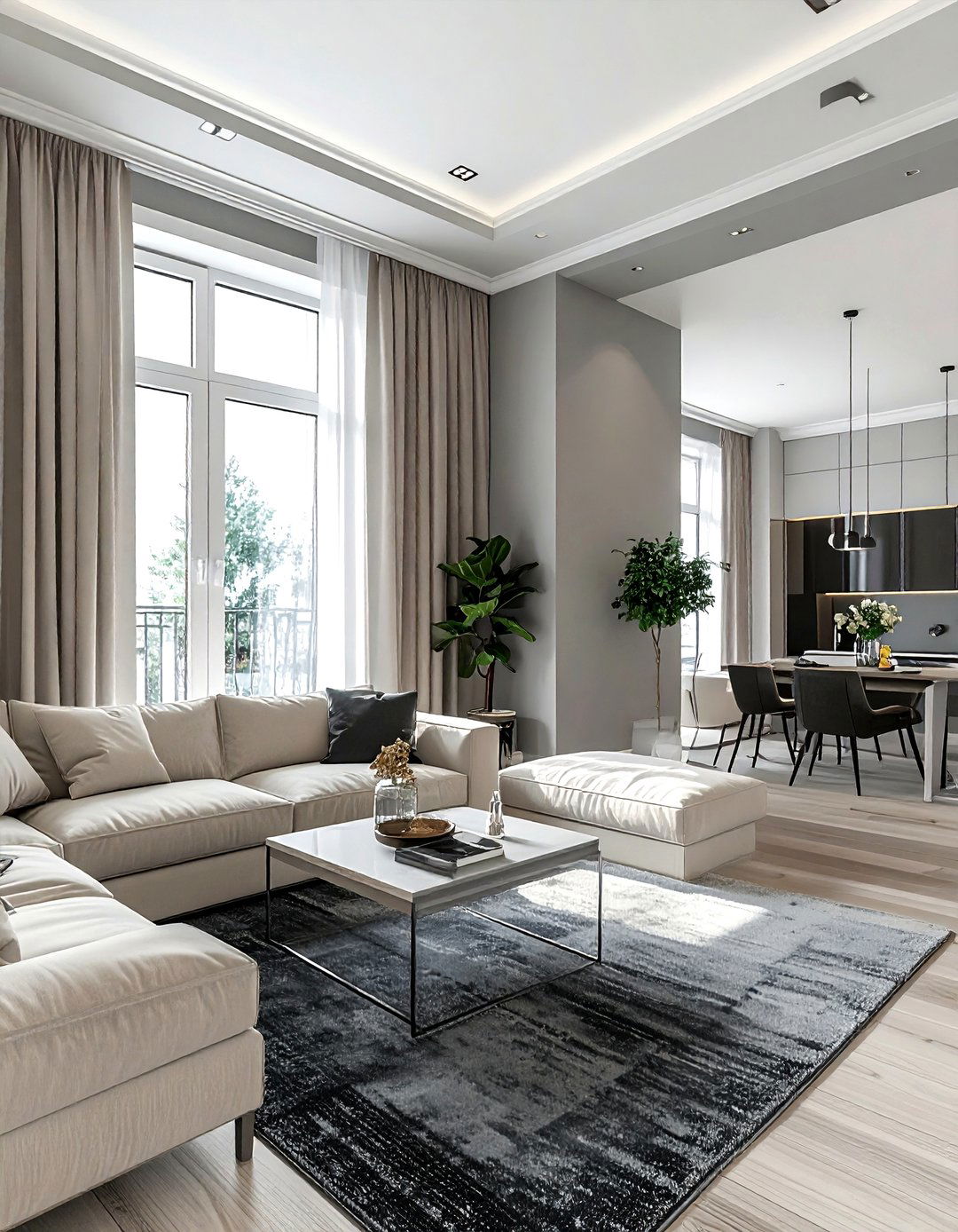
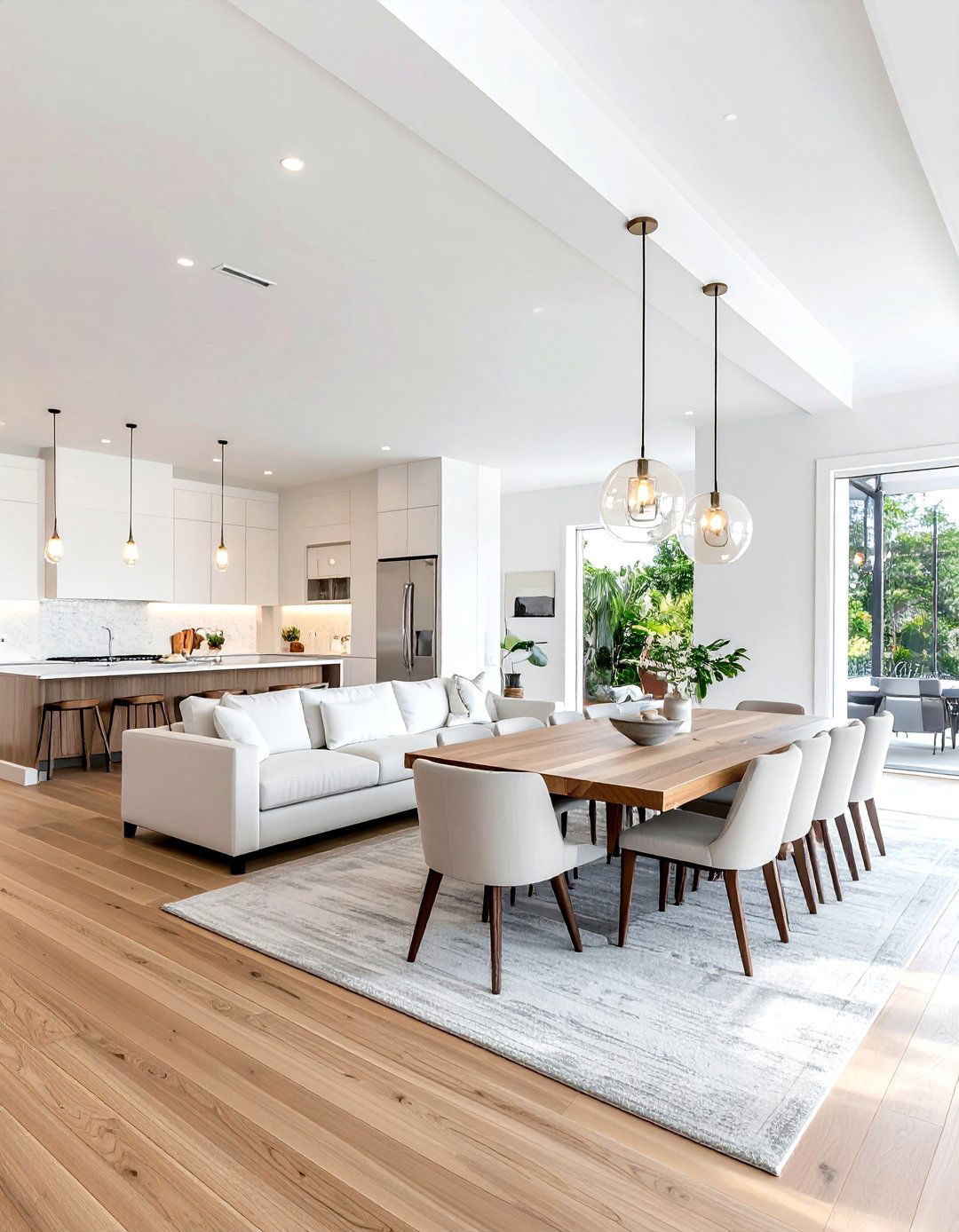
A dove gray open plan living area is a popular choice for modern homes because of its ability to unify different functional zones. Using a consistent dove gray on the walls helps the kitchen, dining, and living areas flow together seamlessly. This light, airy shade of gray reflects light well, making the entire floor feel more spacious. To define the different areas, use area rugs in varying shades of charcoal or light beige. This neutral backdrop allows you to change your decor easily over time without needing to repaint. It provides a sophisticated and cohesive foundation for contemporary family living.
20. Camel Leather Accent Room
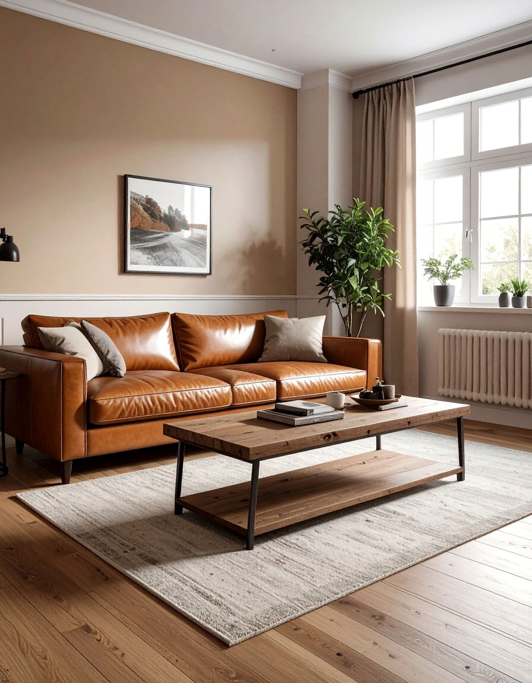
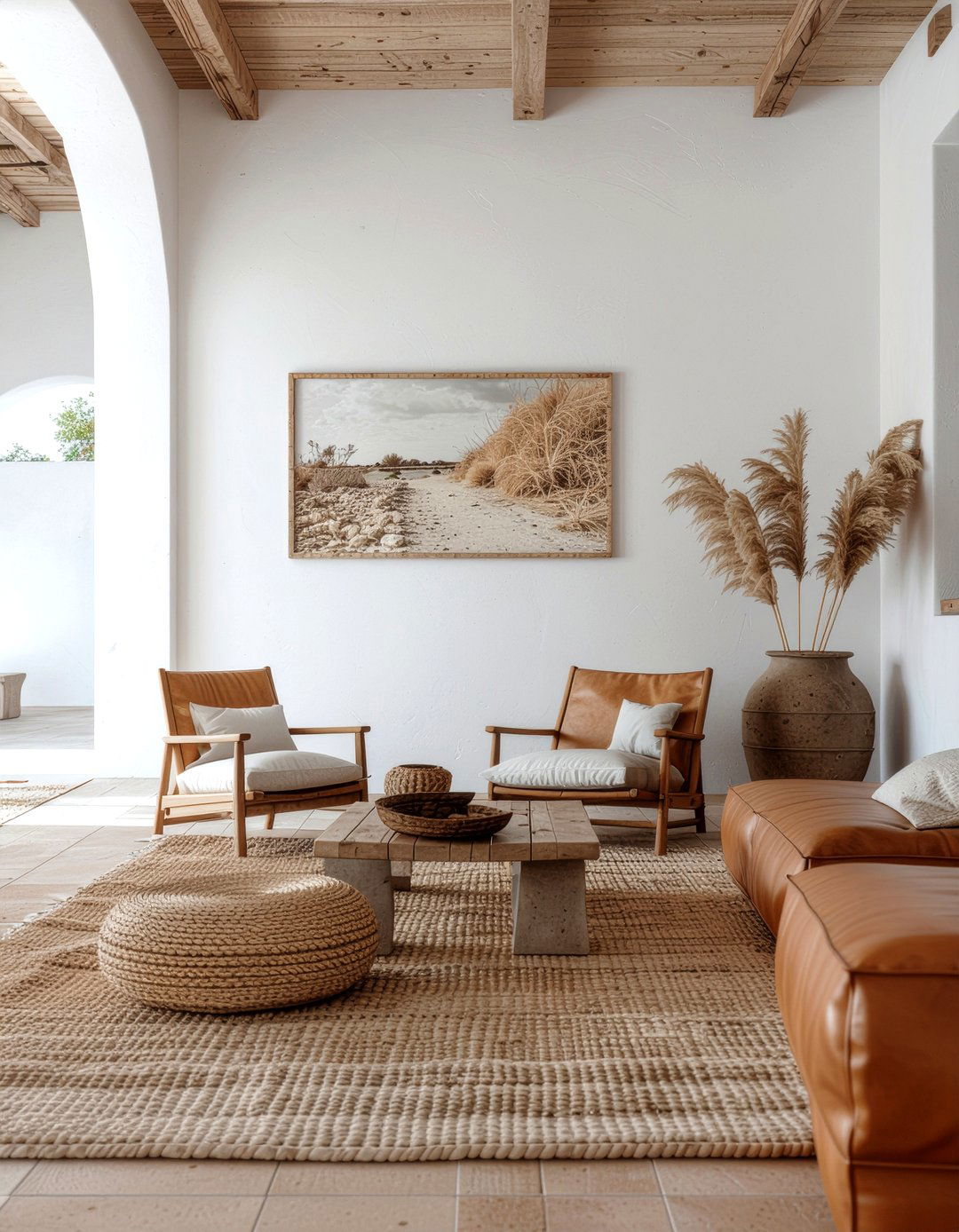
A camel leather accent room uses the rich, warm tones of natural leather as the primary neutral element. A large camel-colored leather sofa or a pair of club chairs serves as the focal point against a backdrop of off-white walls. This specific shade of tan brings an immediate sense of luxury and warmth to the space. Complement the leather with reclaimed wood coffee tables and black metal accents for an industrial-chic vibe. The natural patina of the leather adds character and history to the room, making it feel curated and high-end. It is a timeless look that only gets better.
21. Ash Wood Kitchen Cabinets
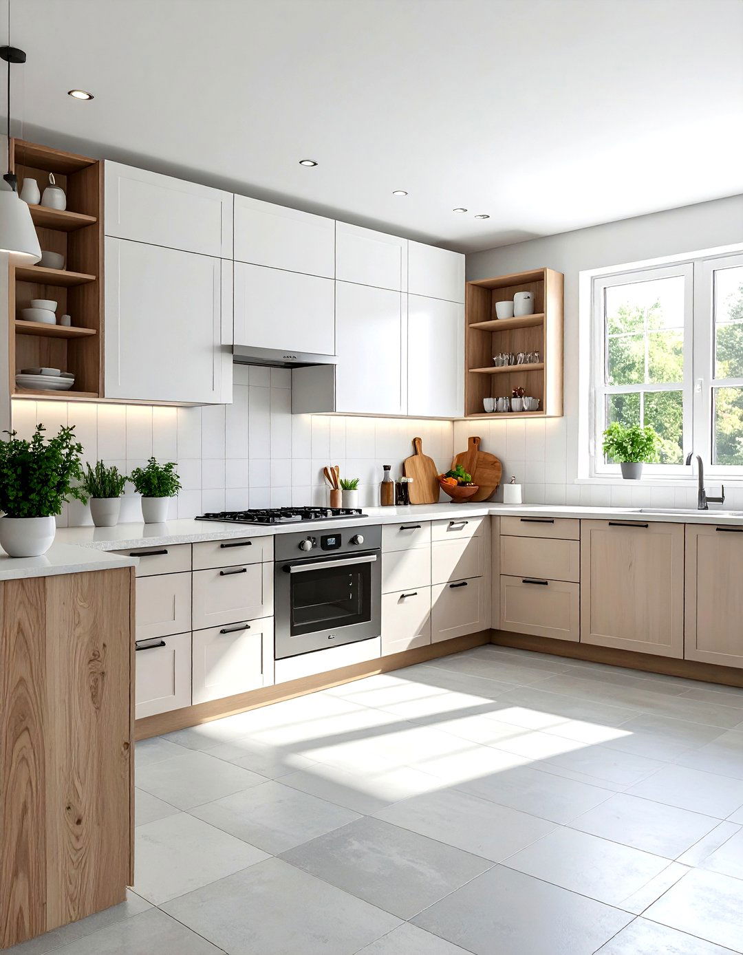
Ash wood kitchen cabinets offer a beautiful, pale neutral alternative to painted surfaces. The light, cool-toned grain of ash wood provides a natural texture that feels modern and organic. Pair these cabinets with white quartz countertops and a light gray tiled floor for a clean, Scandinavian-inspired look. The neutrality of the wood allows you to play with different hardware finishes, such as matte black or brushed gold. This kitchen design feels bright and airy but retains the tactile warmth that only natural wood can provide. It is an excellent choice for a contemporary home that values sustainable and beautiful materials.
22. Slate And Cream Patio
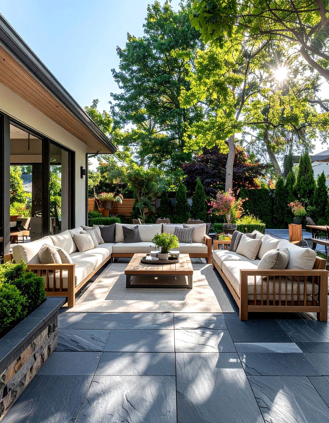
A slate and cream patio extends your neutral color scheme into the great outdoors. Using dark slate pavers for the flooring provides a sophisticated and durable base that contrasts beautifully with cream-colored outdoor sofas and umbrellas. This high-contrast neutral palette looks stunning against the green of a lawn or the blue of a pool. Incorporate natural wood elements like a teak dining table or cedar privacy screens to add warmth to the cool slate tones. The result is an outdoor living space that feels like a true extension of your interior design, offering a stylish place for relaxation and entertaining.
23. Vanilla And Gold Bathroom
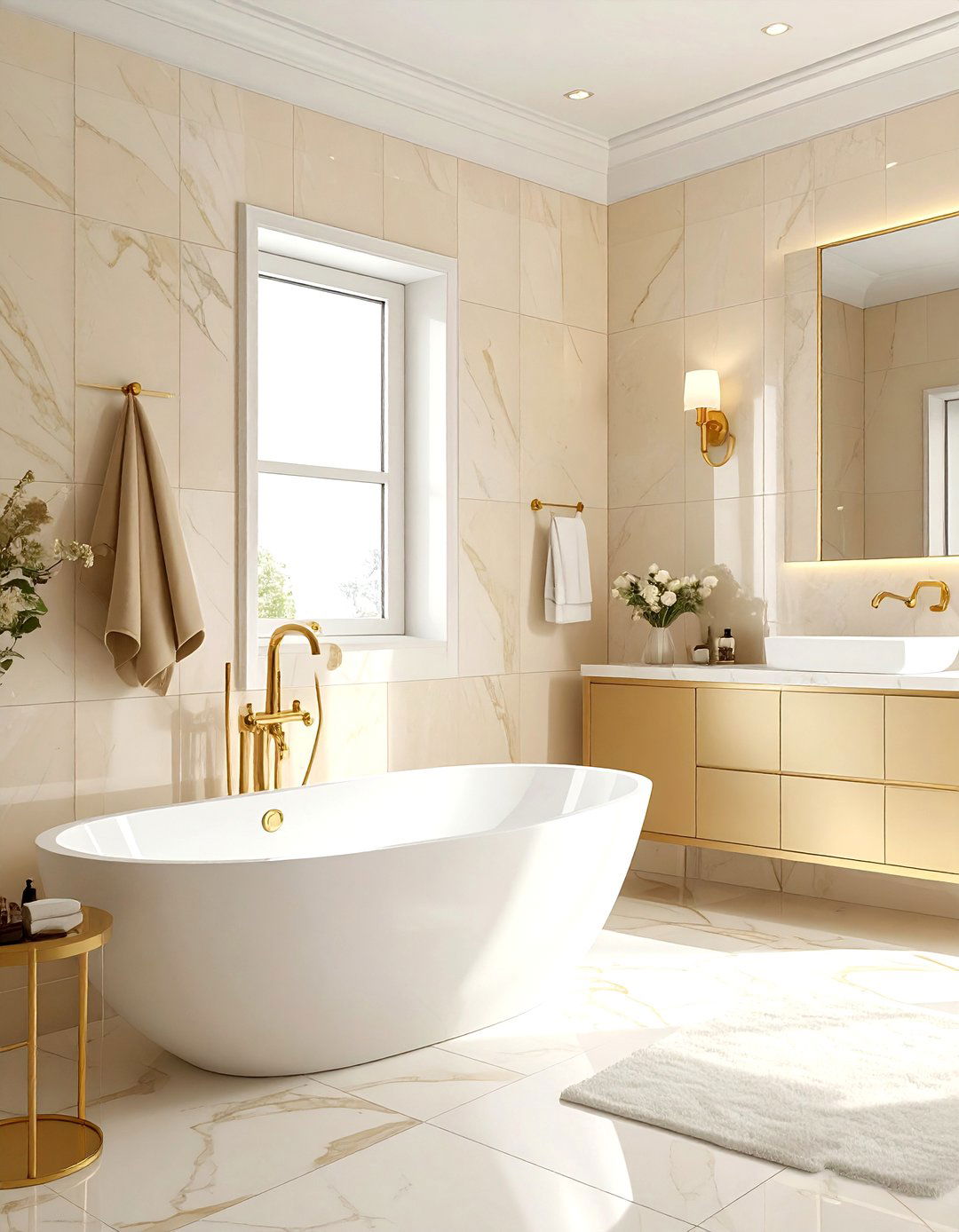
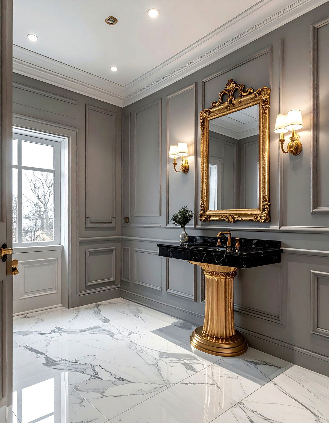
A vanilla and gold bathroom combines soft, creamy tones with glamorous metallic accents. Vanilla is a warmer, richer version of off-white that feels incredibly luxurious when used for wall tiles or a freestanding tub. Adding gold or brass faucets, mirror frames, and light fixtures elevates the neutral palette into something truly special. This combination creates a warm, glowing atmosphere that is perfect for a master ensuite. Use white marble with gold veining for the vanity top to tie the whole look together. It is a sophisticated approach to neutral design that feels both classic and very much on-trend.
24. Clay Colored Studio
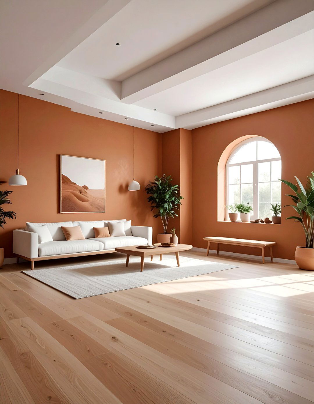
A clay colored studio provides a grounded and creative environment for artistic pursuits or a home gym. Clay is a deep, earthy neutral that brings a sense of the outdoors inside. Use this color on the walls to create a warm, enveloping feel that encourages focus and calm. Pair it with light-colored wood flooring and simple, functional furniture in shades of white or black. The organic nature of the clay tone works well with natural light, changing subtly throughout the day. This palette is perfect for a space where you want to feel connected to the earth while staying productive.
25. Pearl White Hallway
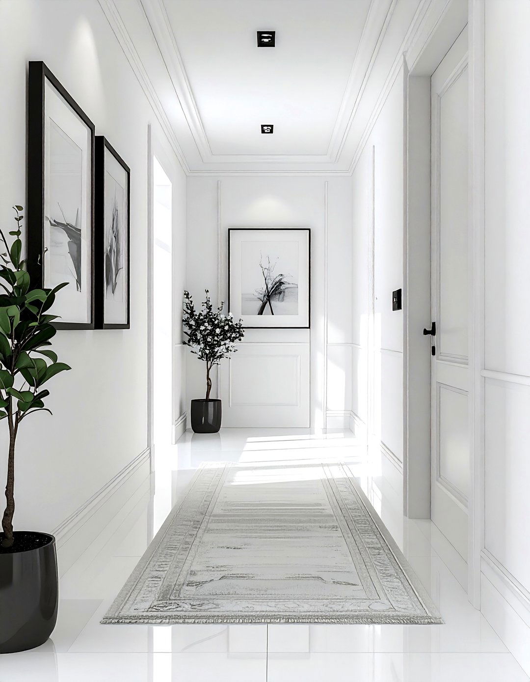
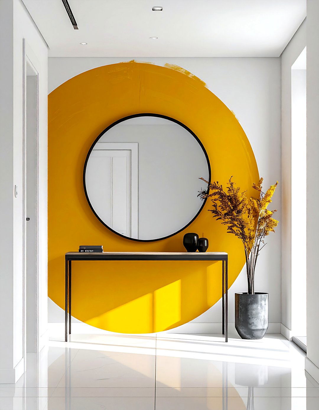
A pearl white hallway is a brilliant way to brighten up the often-neglected transitional spaces in your home. Pearl white has a subtle iridescence and a cool undertone that makes walls seem to recede, making narrow corridors feel much wider. Use a high-gloss finish on the trim and doors to reflect even more light. To add interest without clutter, hang a series of black and white photographs in simple frames. A light-colored runner rug can provide a soft path through the space. This clean, minimalist approach ensures that every inch of your home feels intentional, bright, and perfectly styled for guests.
26. Driftwood Gray Coastal Room
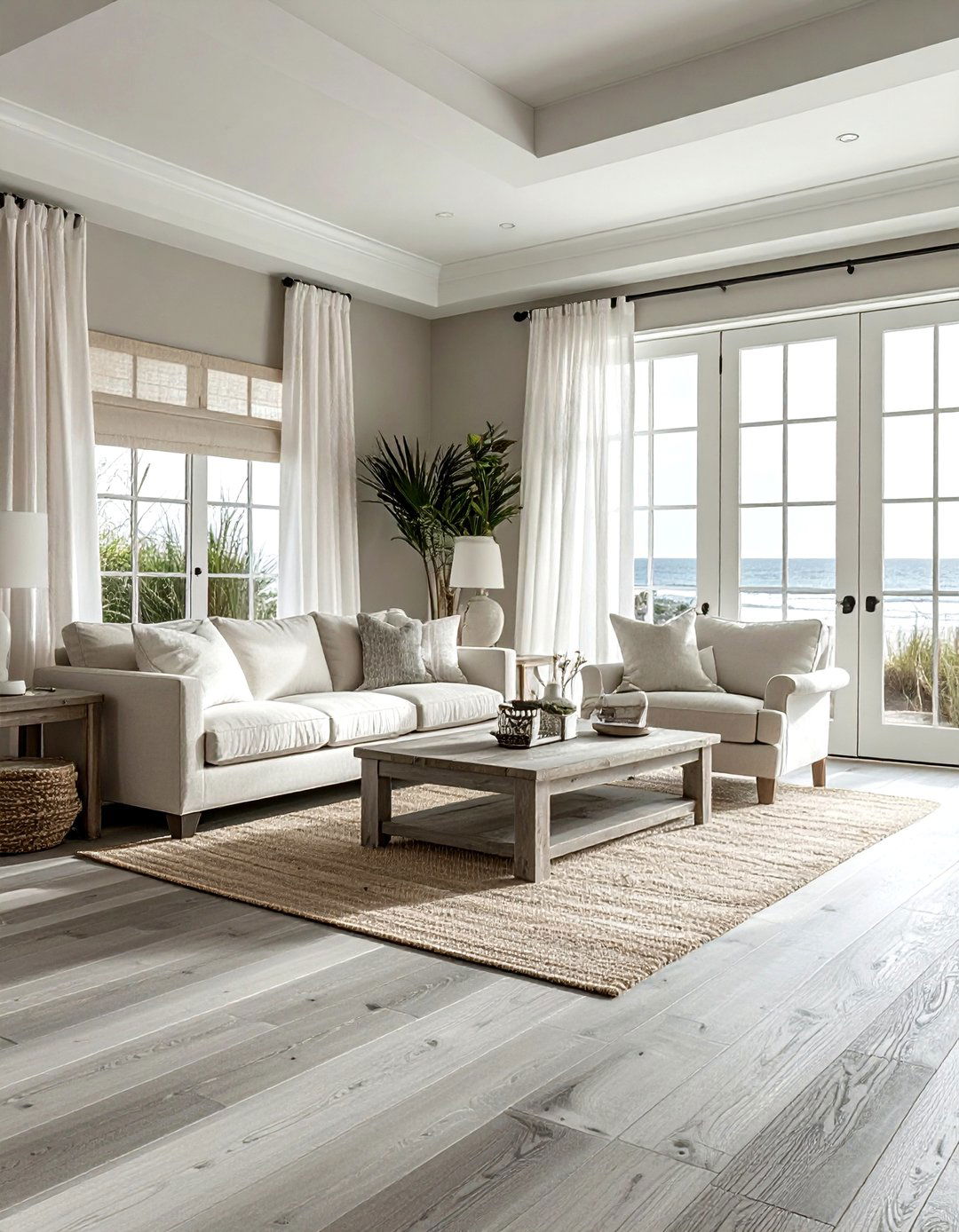
A driftwood gray coastal room captures the essence of the beach without the typical blue and white cliches. Driftwood gray is a weathered, natural shade that looks beautiful on wide-plank flooring or shiplap walls. Combine this with sandy beige upholstery and white linen curtains to create a relaxed, airy atmosphere. Use natural elements like sea glass vases, woven seagrass baskets, and coral accents to enhance the maritime feel. This neutral palette is incredibly soothing and works well in any room where you want to evoke a sense of vacation and peace. It is a sophisticated take on coastal living.
27. Sepia Toned Library
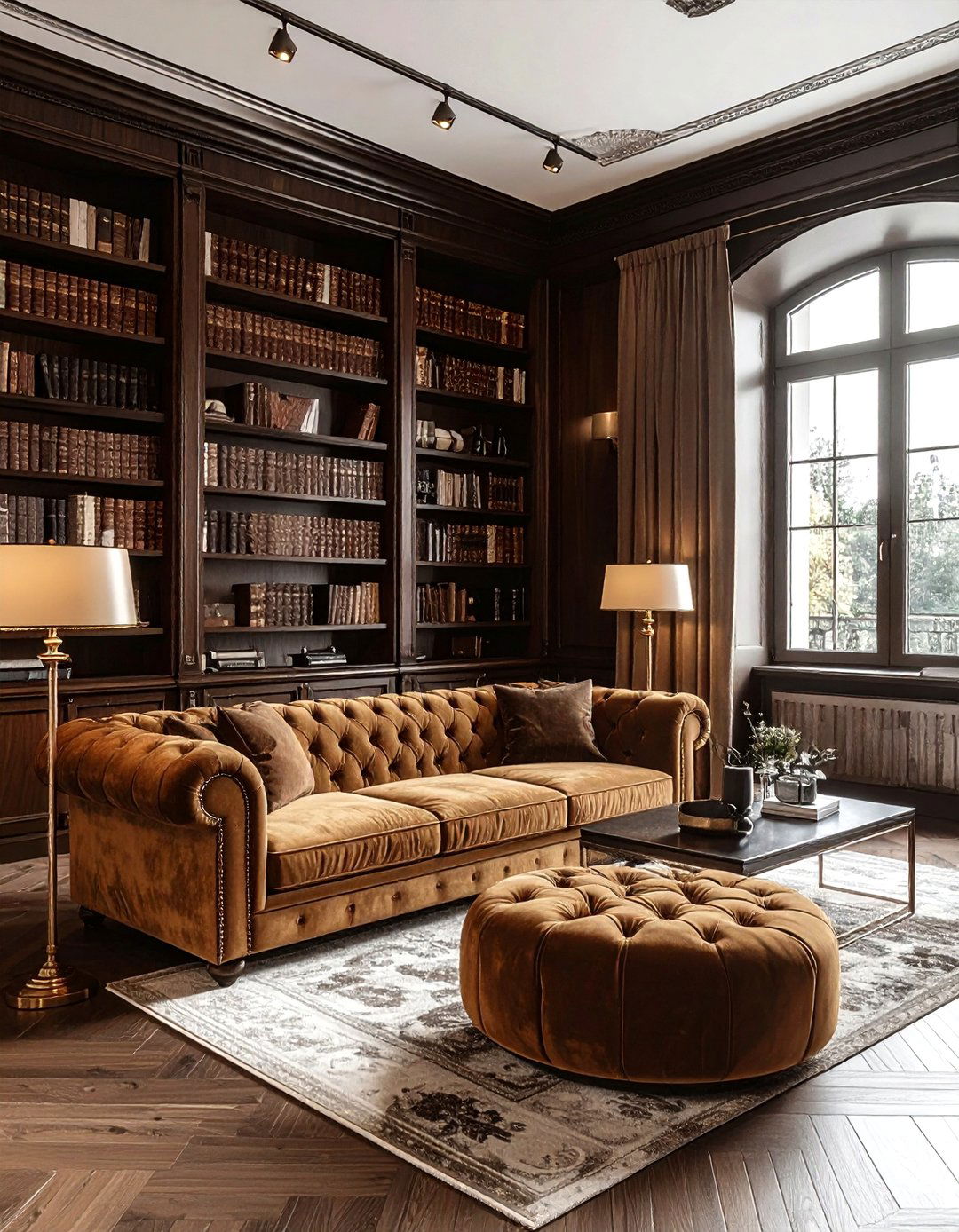
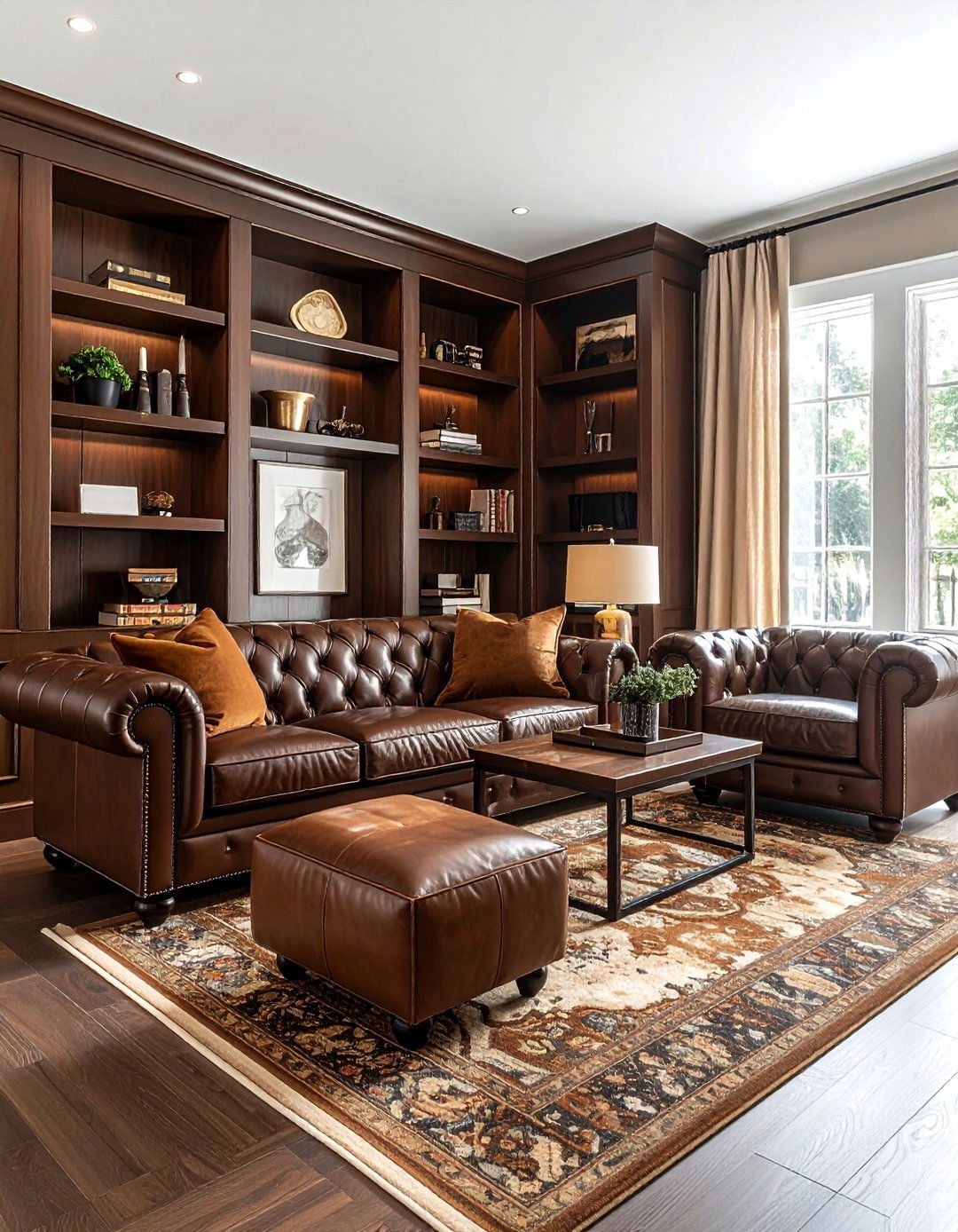
A sepia toned library uses a range of warm browns and tans to create a vintage-inspired, cozy reading room. Think of the colors found in old photographs; rich mahogany, aged parchment, and soft leather. Use dark wood bookshelves to line the walls and fill them with books in varying neutral covers. A comfortable tan velvet sofa and a brass floor lamp provide the perfect spot for long hours of study. This palette feels intellectual and timeless, offering a quiet retreat from the modern world. It is a space that values history and comfort in a very stylish and neutral way.
28. Alabaster Walls Living Area
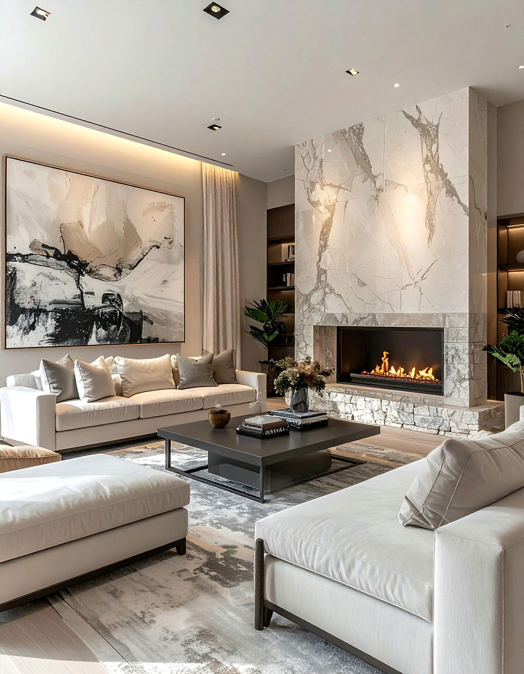
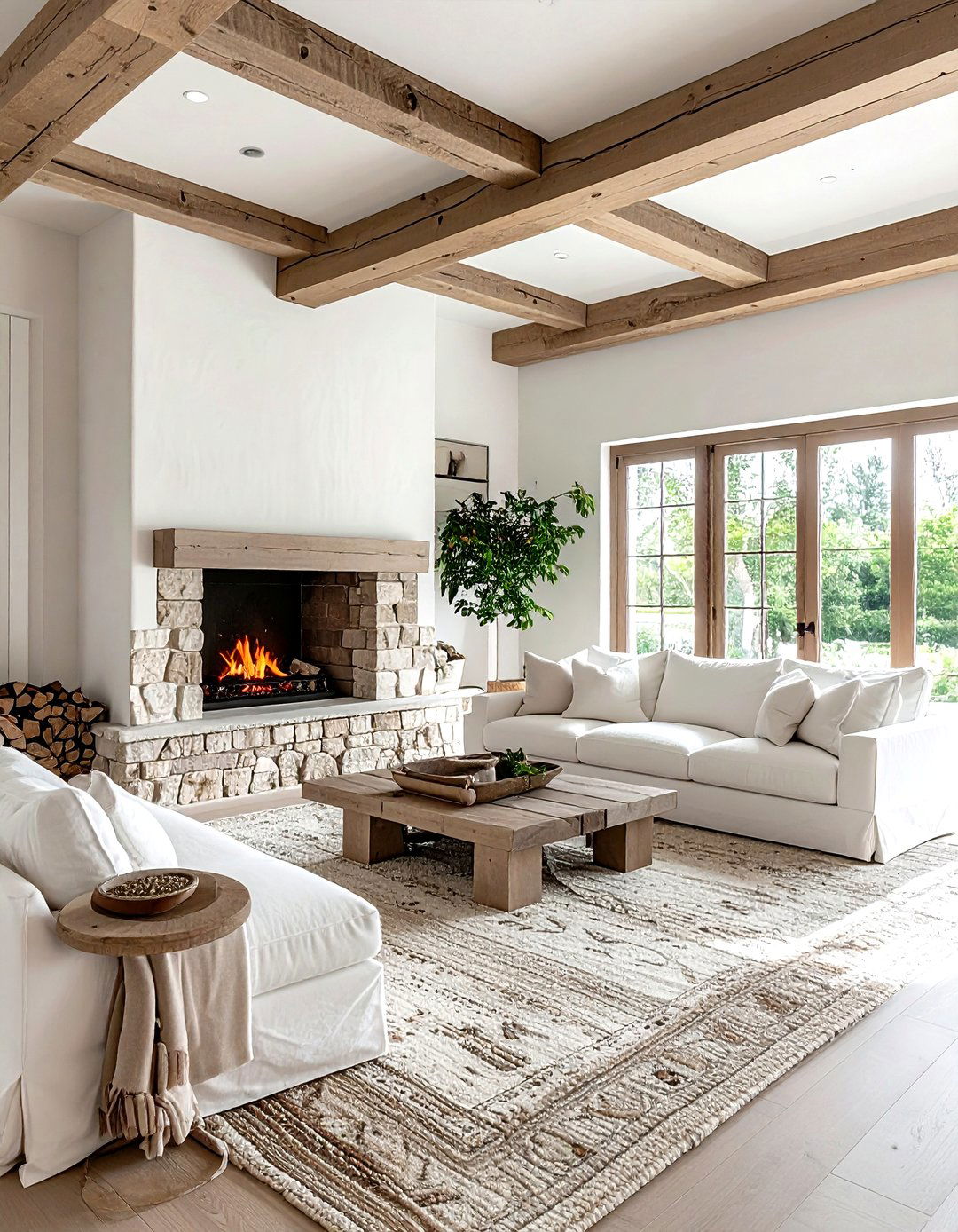
Alabaster walls in a living area provide a soft, museum-like quality to your home. Alabaster is a popular off-white because it lacks the harsh blue undertones of pure white, offering a gentle warmth instead. This color serves as the perfect backdrop for large-scale artwork or architectural features like a stone fireplace. Furnish the room with a mix of light gray and beige pieces to maintain the neutral theme. The simplicity of the walls allows the textures of your furniture and the colors of your view to stand out. It is a sophisticated, high-end choice for a modern and open living space.
29. Greige And Black Modern Home
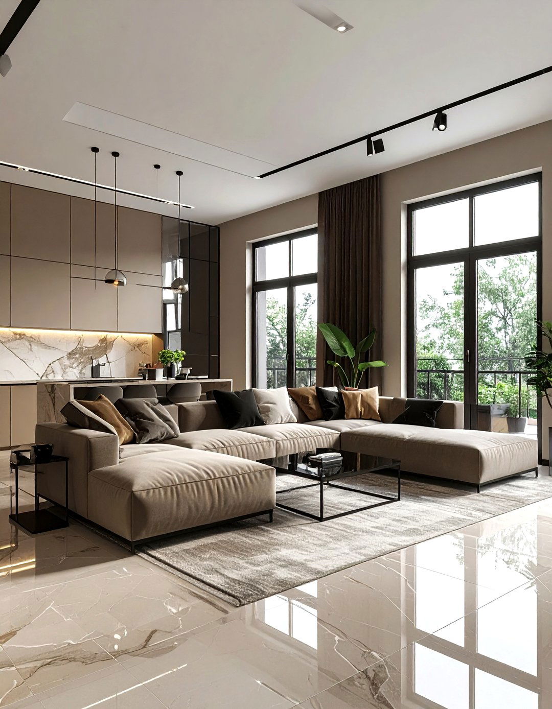
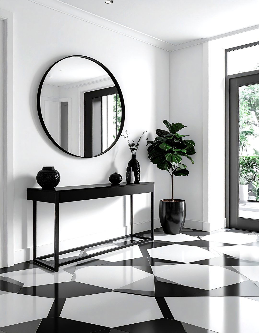
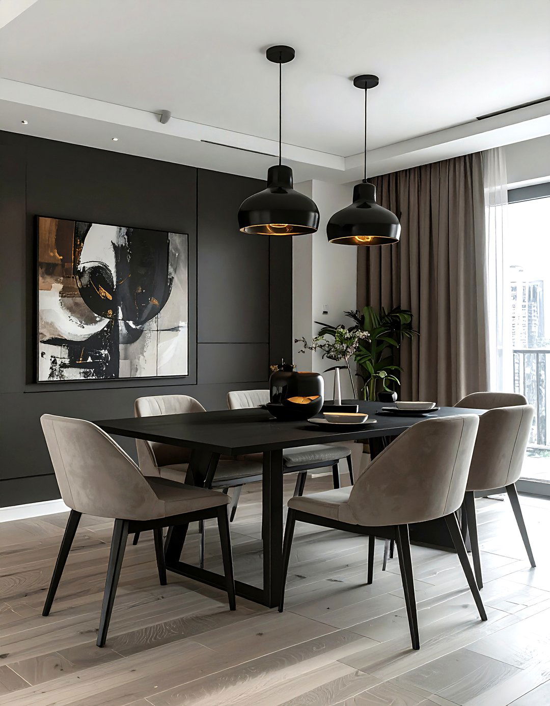
A greige and black modern home uses a bold neutral contrast to create a high-impact look. Using greige for the majority of the walls and flooring provides a soft, versatile base, while sharp black accents on window frames, light fixtures, and furniture legs provide a graphic edge. this combination is very popular in contemporary architecture because it feels clean and masculine yet still inviting. Use white marble and glass to add layers of transparency and shine. This palette is perfect for those who want a neutral home that still feels edgy, powerful, and very much in line with current trends.
30. Wheat Colored Breakfast Nook

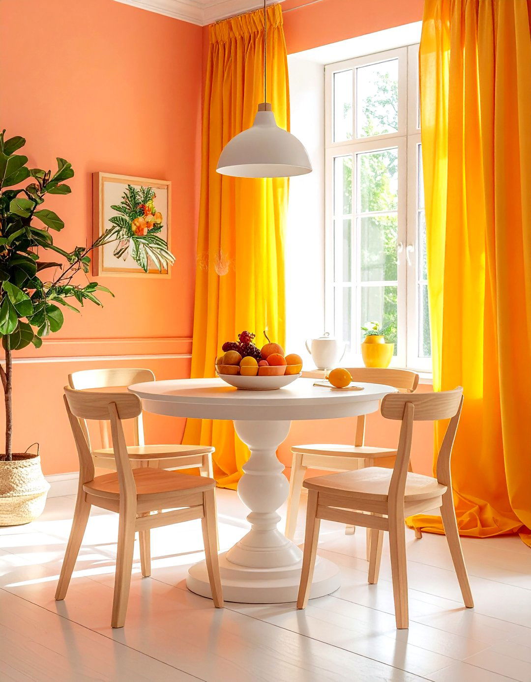
A wheat colored breakfast nook is a charming and sunny spot to start your day. Wheat is a light, golden-brown neutral that mimics the color of dried grain, bringing a touch of the countryside to your kitchen. Use this color for built-in bench cushions or a textured wallpaper. Pair it with a white pedestal table and simple wooden chairs for a clean, functional look. Plenty of windows and light sheer curtains will make the wheat tones glow in the morning sun. This color scheme is cheerful and warm, creating a perfect little sanctuary for enjoying a quiet meal or a morning coffee.
Conclusion:
Selecting the right neutral color scheme is about more than just picking a paint color; it is about creating a cohesive atmosphere that reflects your lifestyle. Whether you prefer the cool sophistication of stone gray or the enveloping warmth of biscuit and beige, neutrals provide a foundation that never goes out of style. By focusing on texture, light, and subtle shifts in tone, you can transform any room into a sanctuary that feels both expansive and deeply personal. These thirty ideas demonstrate that neutral design is a versatile and powerful tool for building a home that is truly timeless and beautiful.

Leave a Reply