Mastering the art of pattern mixing can transform your home into a vibrant, professionally designed sanctuary that reflects your unique personality. Many homeowners feel intimidated by the prospect of combining different prints, fearing that their space might look cluttered or chaotic. However, when done with intention, mixing patterns adds a sophisticated layer of visual interest and depth that solid colors simply cannot achieve. This guide explores creative ways to blend textures, scales, and motifs across various rooms. By following a few simple principles regarding color palettes and scale variation, you can confidently curate a stylish environment that feels both cohesive and energetic. It is about creating a personalized narrative through fabrics and finishes.
1. Floral and stripe living room
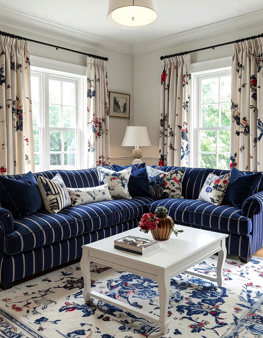
Combining romantic florals with crisp stripes creates a timeless balance in a living room setting. The organic, flowing lines of a botanical print soften the rigid, architectural feel of vertical or horizontal stripes. To make this work, ensure both patterns share at least one common color to maintain a sense of harmony. You might choose a large-scale floral sofa and accent it with smaller pinstripe cushions for a classic look. This juxtaposition keeps the eye moving without feeling overwhelmed. It is a foolproof method for achieving a curated, designer aesthetic that feels inviting and thoughtfully composed for everyday living and entertaining guests in your home.
2. Geometric rug and organic wallpaper
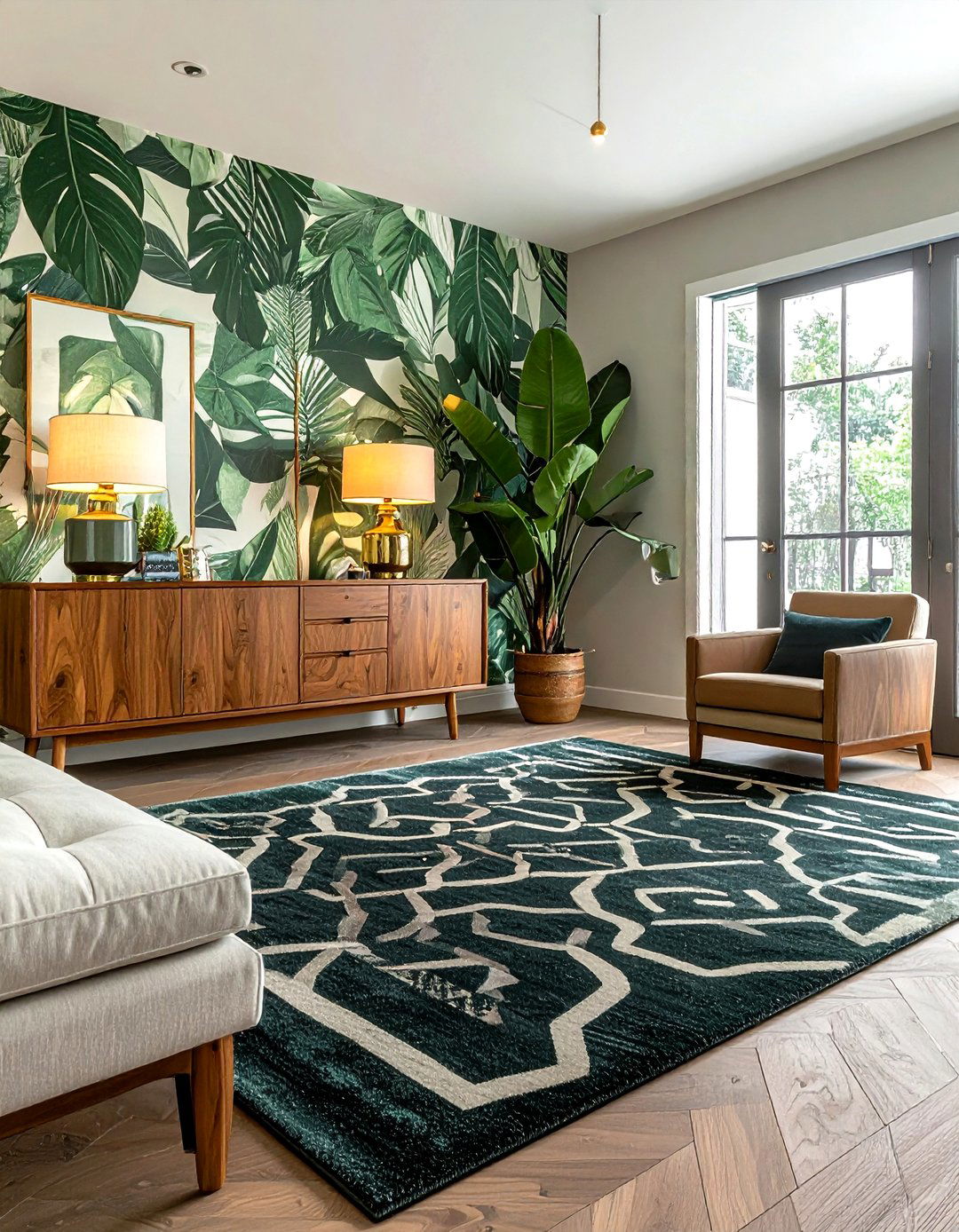
Pairing a bold geometric rug with organic, nature-inspired wallpaper offers a stunning contrast between mathematical precision and fluid shapes. The sharp angles of a trellis or Greek key rug provide a stable foundation, while the swirling vines or leaf motifs on the walls add a touch of whimsy. This combination works best when you vary the scale; try a large-scale geometric pattern on the floor with a more intricate, smaller organic print on the walls. By keeping the color palette tight, such as using shades of blue and cream, you create a sophisticated space that feels balanced, modern, and high-end.
3. Polka dot and plaid bedding
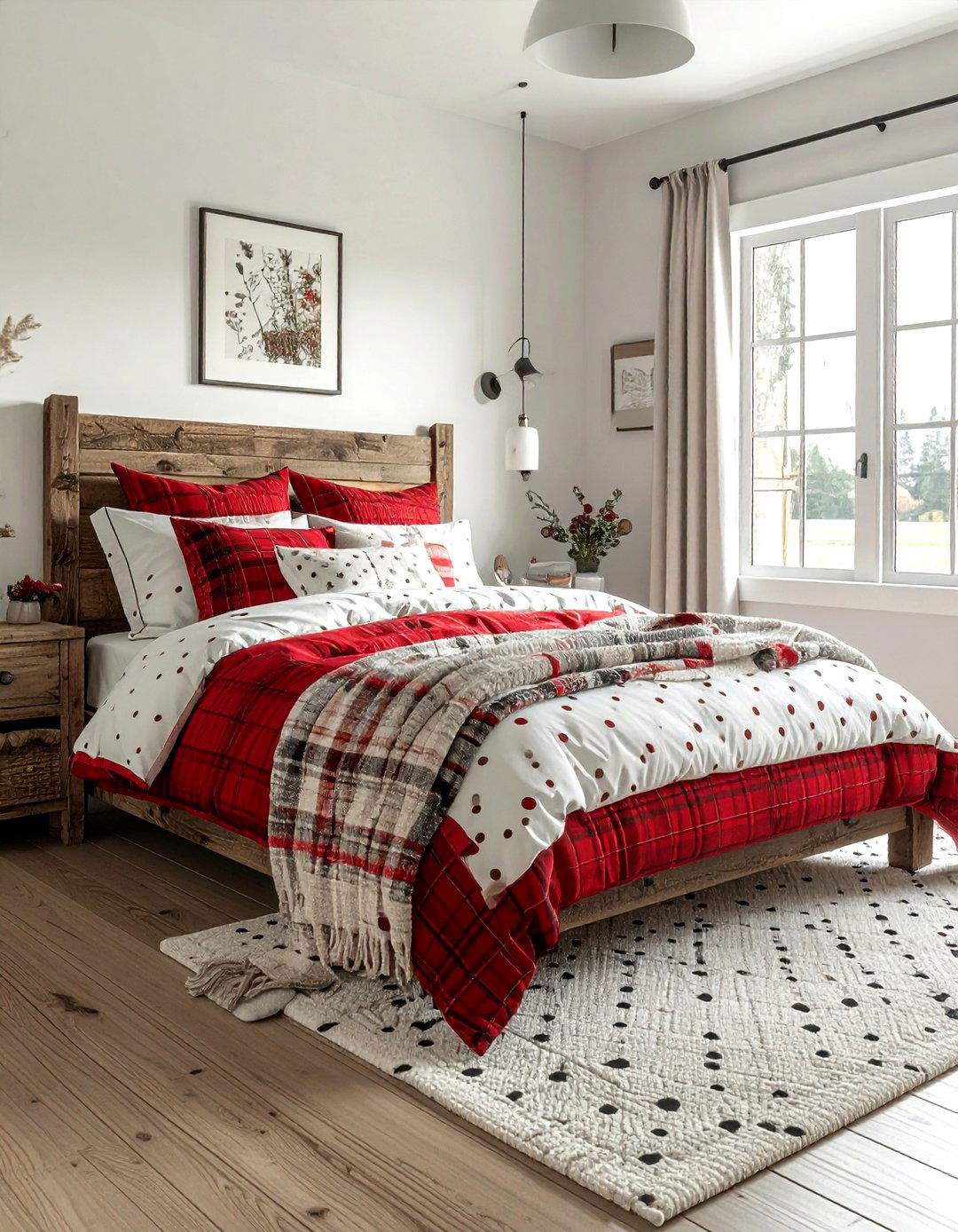
Mixing polka dots with plaid in the bedroom creates a playful yet grounded atmosphere. The whimsical nature of dots provides a lighthearted counterpoint to the traditional, structured feel of plaid. For a successful mix, choose one dominant pattern, like a large-scale plaid duvet, and layer in smaller polka dot sheets or pillowcases. This approach ensures that the patterns complement rather than compete with each other. Using a monochromatic color scheme can help unify these seemingly disparate styles, resulting in a bedroom that feels cozy, curated, and full of personality. It is an excellent way to update a guest room or nursery.
4. Animal print and botanical wallpaper
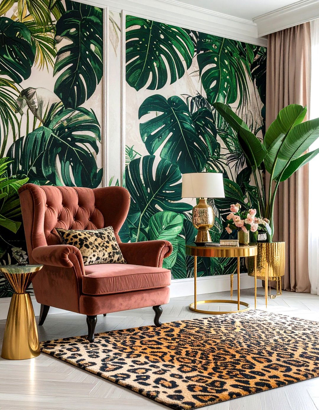
Embracing the maximalist trend by pairing animal prints with botanical wallpaper can result in a daring and luxurious interior. A leopard or zebra print rug acts as a neutral base when paired with lush, green leafy wallpaper. The key to pulling off this bold look is to treat the animal print as a texture rather than a competing pattern. Ensure the botanical print has enough white space to prevent the room from feeling too dark. This combination evokes a sense of global travel and exotic elegance, making it perfect for a home office or a sophisticated powder room that needs energy.
5. Toile and buffalo check upholstery
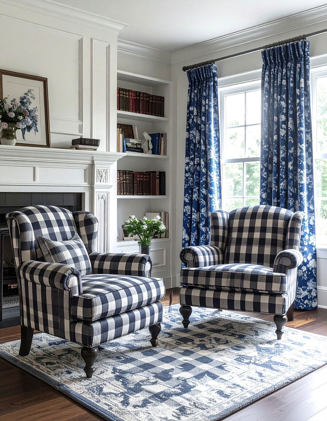
Toile and buffalo check are two classic patterns that work beautifully together to create a charming farmhouse or traditional aesthetic. The intricate, storytelling nature of toile is perfectly balanced by the simple, bold grid of buffalo check. Try using toile for your main drapery and buffalo check for a pair of accent chairs. To keep the look modern, stick to a two-tone color palette like navy and white or charcoal and cream. This pairing feels nostalgic yet fresh, offering a comfortable and stylish environment that celebrates traditional design while remaining approachable for a busy, modern family home.
6. Ikat and damask pillows
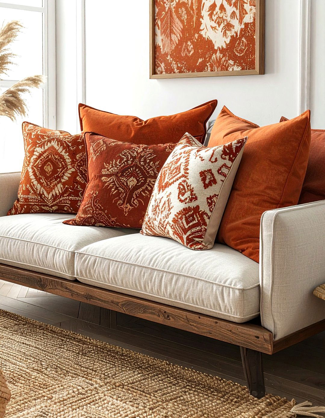
Blending the blurred, global feel of ikat with the formal, symmetrical elegance of damask results in a rich and textured pillow arrangement. Ikat brings a handmade, bohemian vibe that relaxes the sometimes stiff nature of traditional damask. When styling these on a sofa, mix the scales by choosing a large-scale damask and a medium-scale ikat. This variety creates visual depth and makes the seating area feel more curated and less like a showroom set. Stick to a cohesive color story, such as warm spice tones, to ensure the different cultural origins of these patterns feel harmonious and intentional.
7. Herringbone floor and marble tile
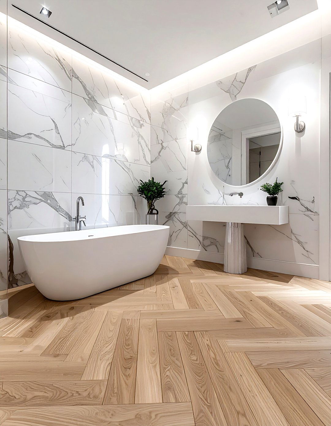
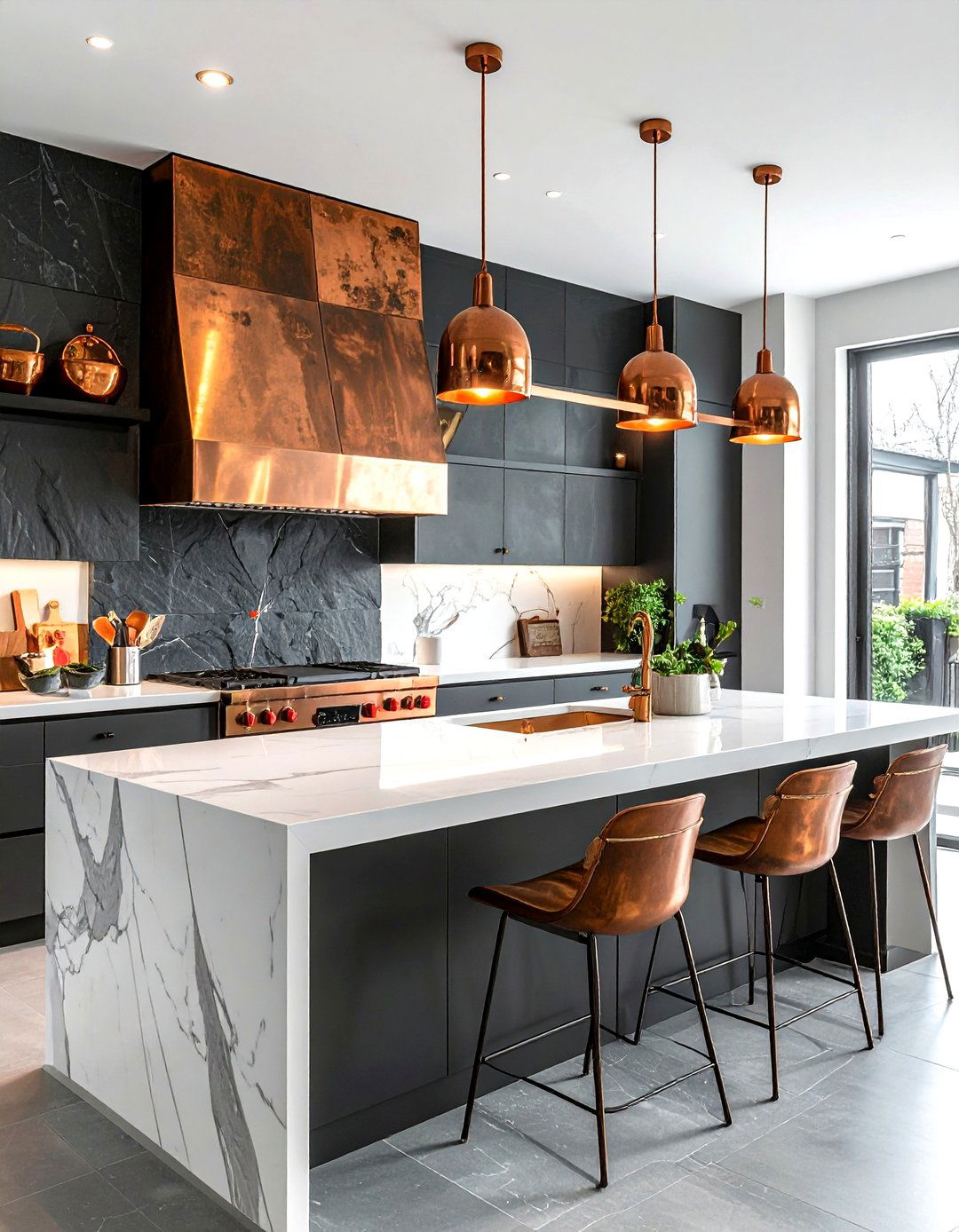
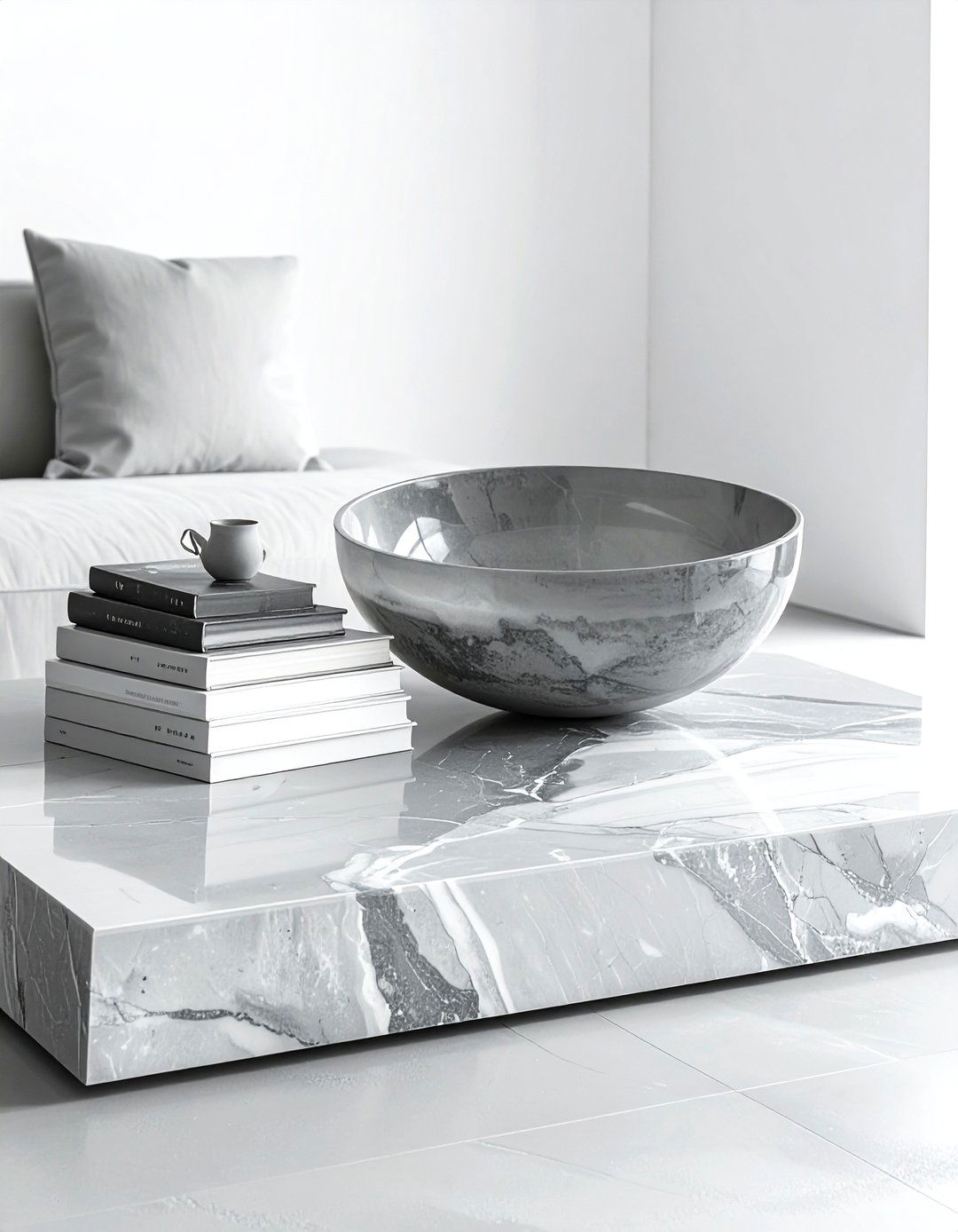
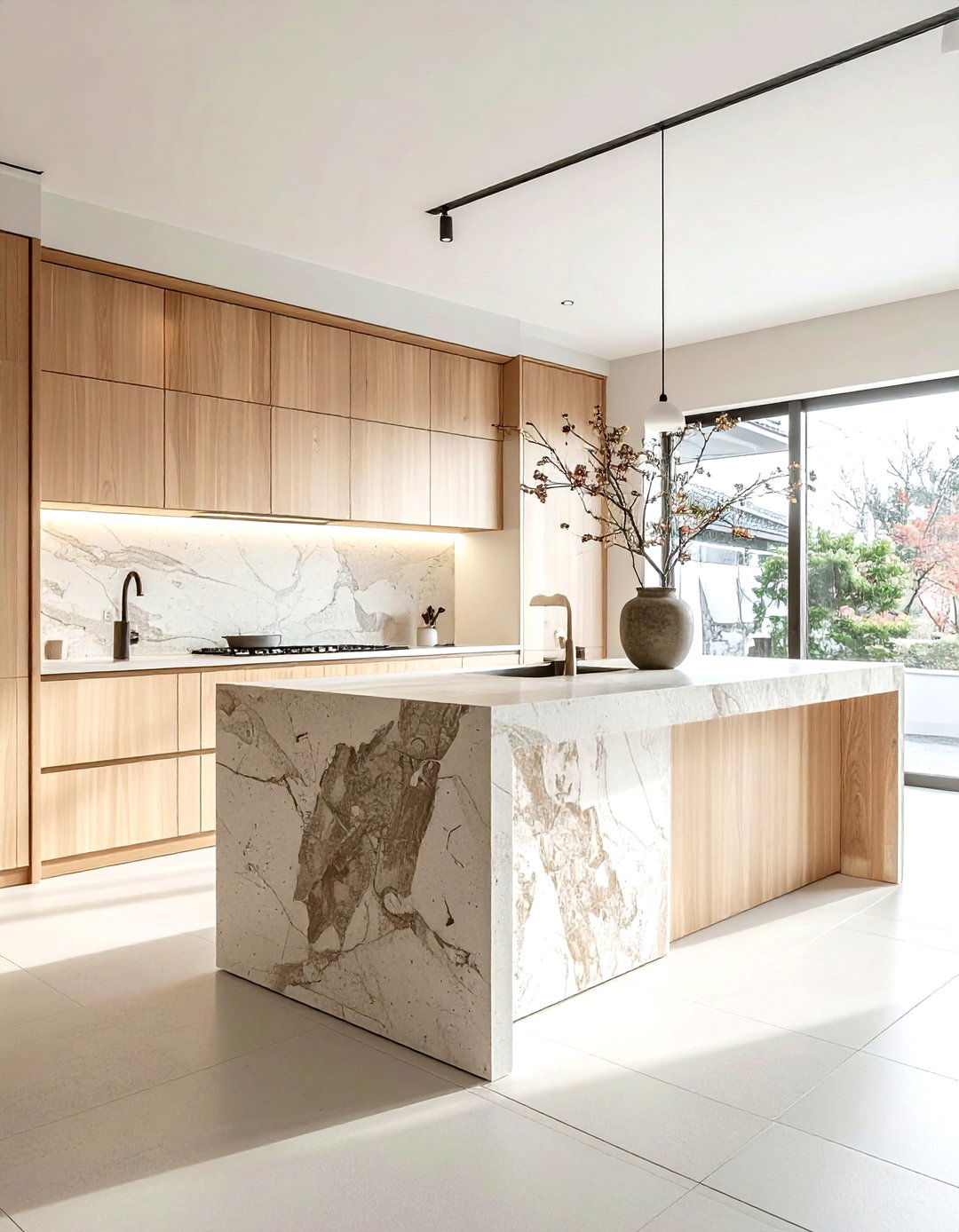
In a kitchen or bathroom, mixing a herringbone wood floor with marble wall tile adds architectural interest and luxury. The repetitive, V-shaped pattern of the herringbone provides a sense of movement and direction, while the natural, unpredictable veining of marble offers an organic contrast. This combination relies on the materials' textures rather than bright colors to create a pattern-mixed look. The structured lines of the floor ground the space, allowing the elegance of the marble to shine. It is a sophisticated way to add character to functional rooms without relying on fleeting trends, ensuring your home remains stylish for years.
8. Block print and pinstripe curtains
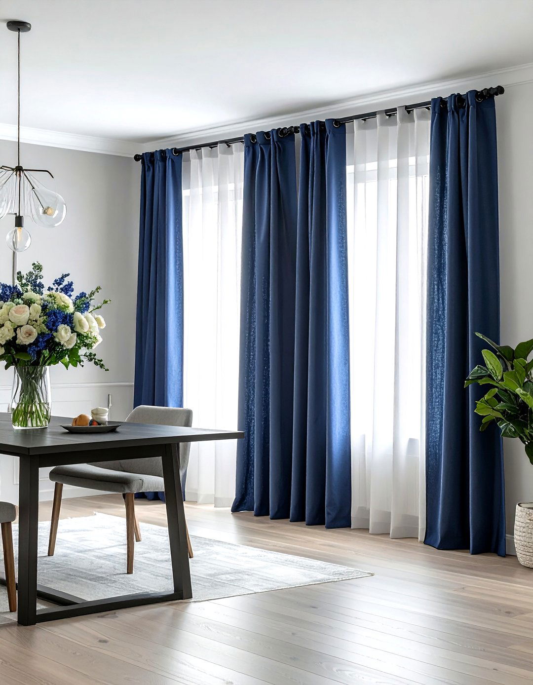
Layering block print and pinstripe curtains is a sophisticated way to dress your windows with depth and character. The artisan, slightly irregular look of hand-stamped block prints adds a soulful touch that contrasts beautifully with the precise, thin lines of pinstripes. You can achieve this by using a block print fabric for the main curtain panels and a pinstripe for the sheer under-layers or a fabric border. This pairing works exceptionally well in dining rooms or bedrooms where you want a soft, layered look. It creates a relaxed, lived-in feel that is both elegant and unpretentious, perfect for cozy afternoons.
9. Chevron and paisley textiles
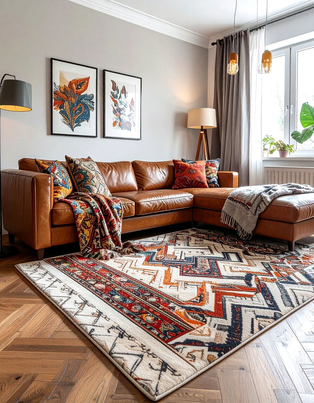
Chevron and paisley are dynamic patterns that, when combined, create a high-energy and visually stimulating space. The sharp, rhythmic zig-zags of chevron provide a modern, graphic backdrop for the intricate, teardrop-shaped motifs of traditional paisley. To prevent visual fatigue, use chevron in a neutral tone on a rug or large piece of furniture, and reserve the colorful paisley for smaller accents like throws or decorative boxes. This balance allows the paisley to act as the focal point while the chevron provides a structured frame. It is a bold choice that works well in eclectic living areas or creative home studios.
10. Moroccan tile and linear wood
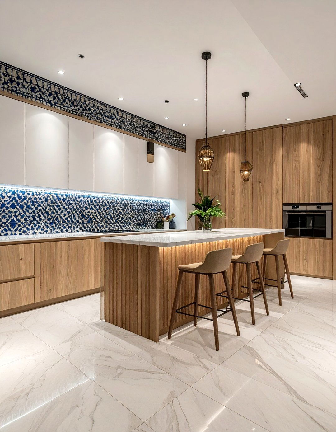
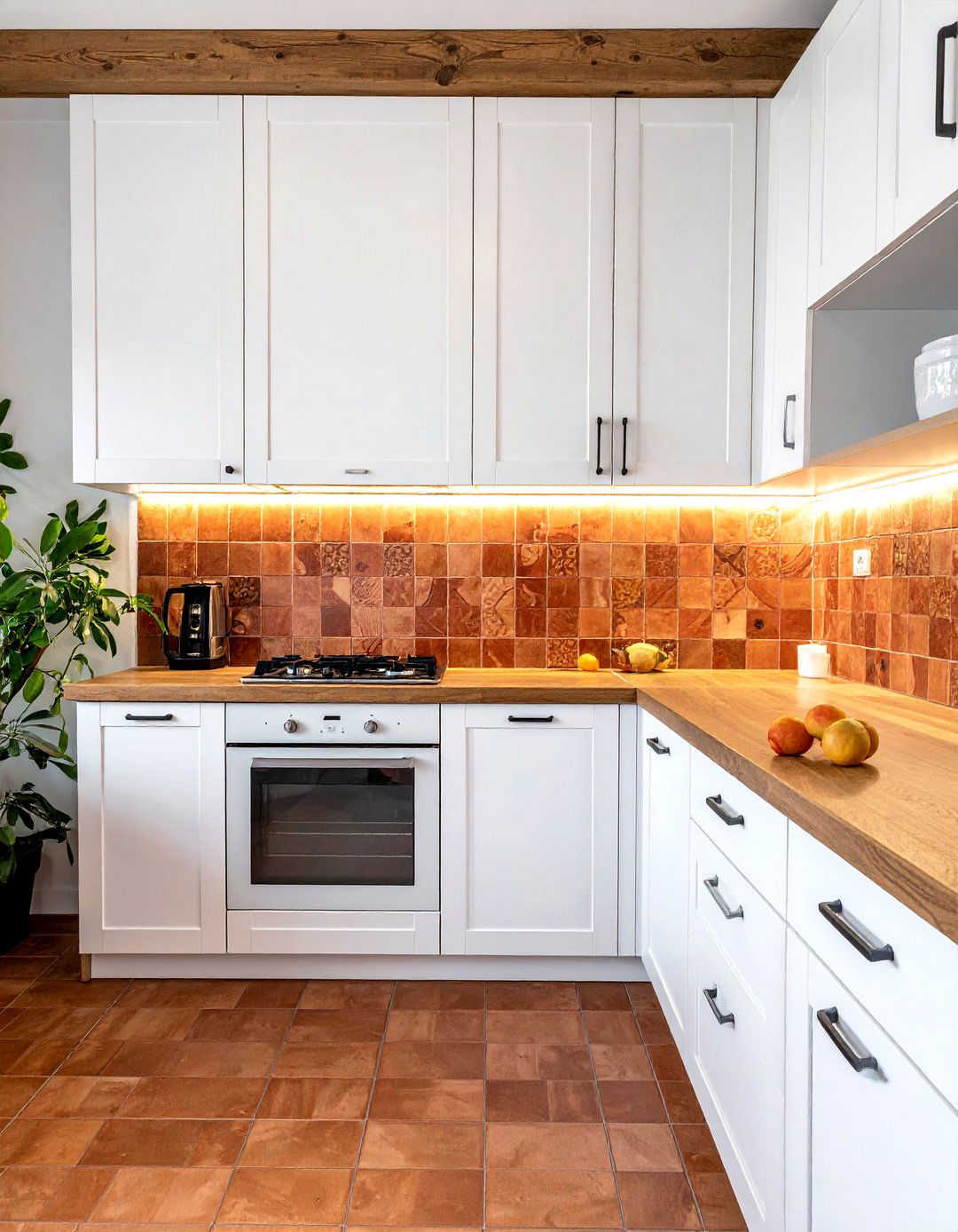
Creating a focal point with Moroccan tile against a backdrop of linear wood paneling is a masterclass in pattern mixing. The complex, geometric stars and floral shapes of the tile offer a stunning contrast to the simple, vertical lines of wood slats. This combination is particularly effective in entryways or as a kitchen backsplash. The warmth of the wood softens the cool, hard surface of the tile, making the space feel more inviting. By choosing tiles with colors that echo the natural tones of the wood, you create a seamless transition between the two patterns, resulting in a balanced and artistic design.
11. Abstract art and geometric rug
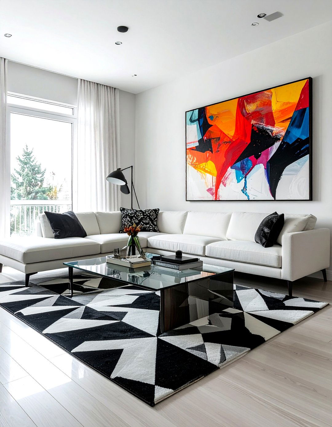
Displaying bold abstract art above a geometric rug is a modern way to mix patterns through different mediums. The fluid, often unpredictable strokes of abstract painting provide a beautiful counterpoint to the rigid, repeating shapes of a geometric floor covering. To make this work, look for a common color thread that appears in both the artwork and the rug. This visual link ties the vertical and horizontal planes of the room together. This approach is perfect for contemporary living rooms where you want to showcase your personality and love for modern design without making the space feel overly cluttered or messy.
12. Tartan and floral armchair
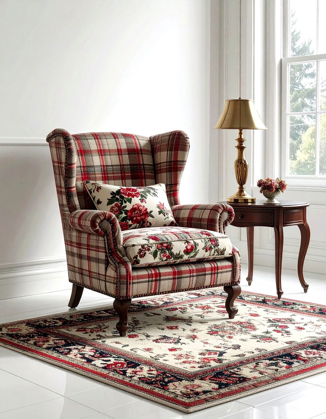
An armchair upholstered in a mix of tartan and floral fabrics can become the ultimate statement piece in a cozy library or den. The masculine, structured feel of tartan plaid provides a sturdy foundation for the feminine, delicate lines of a floral print. You might use tartan for the back and sides of the chair and a matching floral for the seat cushion. This unexpected combination feels like a modern take on English country style. It adds a sense of history and comfort to the room, making it the perfect spot for reading. Keep the colors rich and moody for a sophisticated finish.
13. Polka dot and stripe nursery
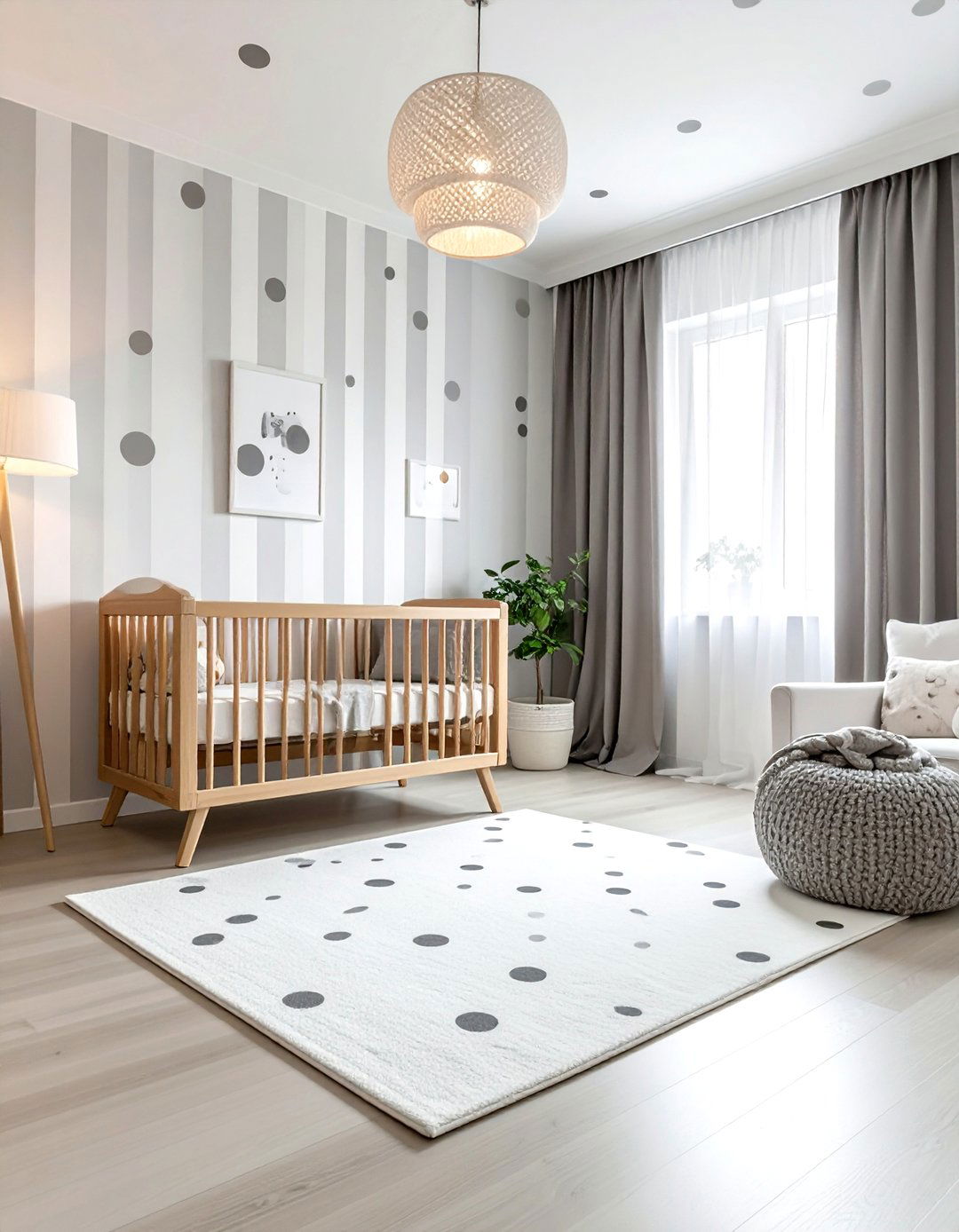
Designing a nursery with polka dots and stripes creates a space that is both stimulating and organized for a little one. The soft, rounded shapes of dots feel gentle and friendly, while stripes provide a sense of order and height to the room. Use a wide cabana stripe on the walls and incorporate polka dots through bedding, rugs, or storage bins. Sticking to a soft pastel or neutral palette ensures the room remains a calm environment for sleep. This classic pattern pairing is gender-neutral and can easily grow with your child by simply updating the accessories as their tastes change.
14. Toile and stripe dining chair
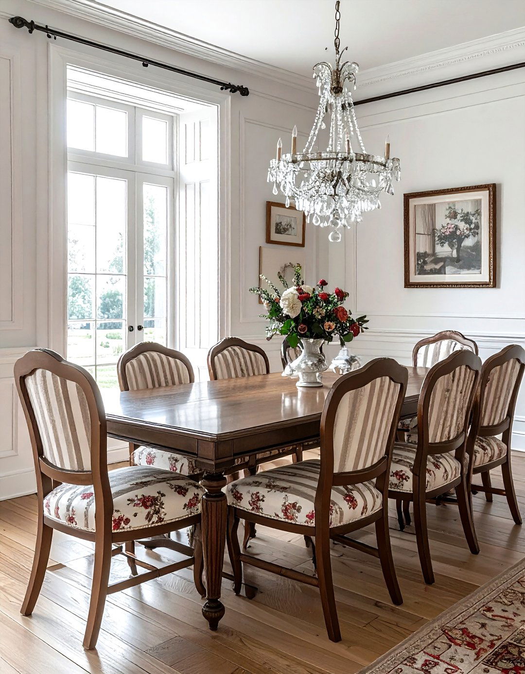
Upholstering dining chairs in a combination of toile and stripes adds an air of French-inspired elegance to your dining room. Toile fabrics often feature pastoral scenes that are visually busy, so pairing them with a simple vertical stripe on the chair back or seat helps to ground the design. This mix prevents the dining set from looking too formal or dated. For a cohesive look, choose a stripe that matches the primary color of the toile print. This thoughtful detail makes each chair feel like a custom piece of furniture, elevating the entire room and creating a beautiful setting for hosting dinner parties.
15. Leopard print and plaid rug
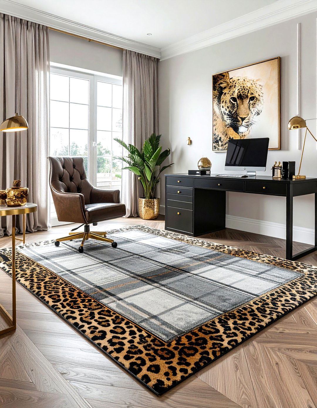
Layering a small leopard print rug over a larger plaid carpet is a bold move that adds instant designer flair to a hallway or home office. The organic, irregular spots of the leopard print break up the rigid grid of the plaid, creating a stylish and high-contrast look. This technique works best when both patterns share a similar color family, such as tans, blacks, and creams. The plaid provides a traditional base, while the leopard print adds a touch of modern glamor. It is an easy way to experiment with pattern mixing without committing to permanent changes like wallpaper or large furniture.
16. Chinoiserie and geometric wallpaper
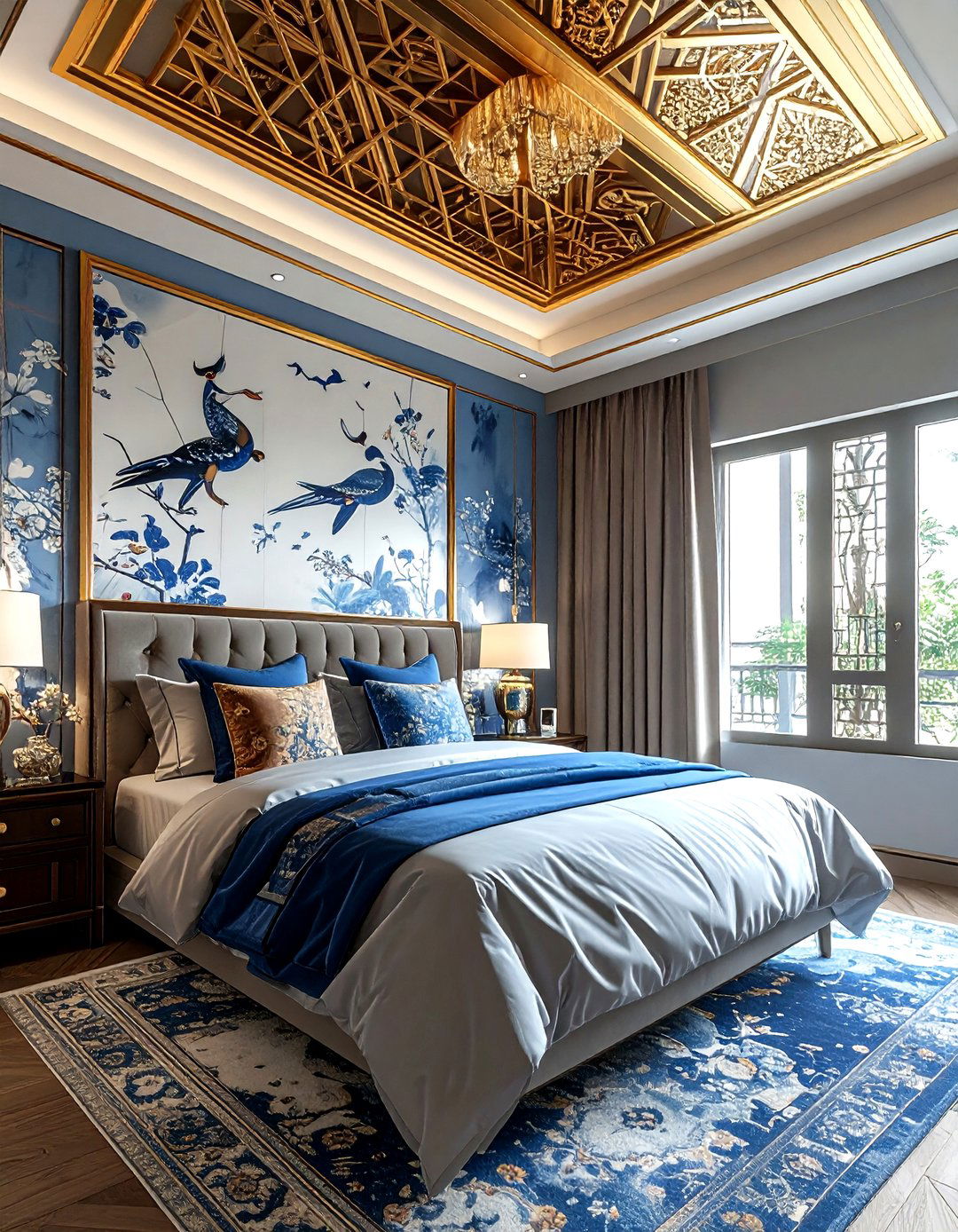
Combining the intricate, hand-painted look of Chinoiserie wallpaper with a subtle geometric border or ceiling pattern creates a room full of sophisticated detail. Chinoiserie often features birds, flowers, and landscapes, which can be balanced by the repetitive, clean lines of a geometric print. This pairing is ideal for formal dining rooms or primary bedrooms where you want to create a luxurious, garden-like atmosphere. By using a geometric pattern in a metallic finish, you can add a touch of modern shine that complements the traditional beauty of the Chinoiserie. This mix feels curated, expensive, and timelessly elegant for any luxury home.
17. Gingham and floral kitchen decor
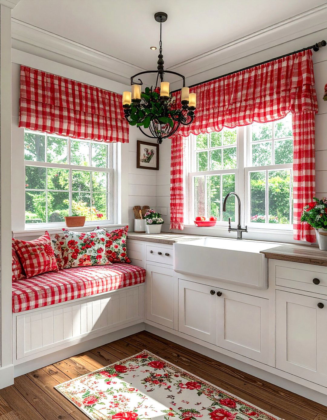
Gingham and florals are a match made in heaven for a cozy, cottage-style kitchen. The simple, nostalgic check of gingham provides a perfect backdrop for the colorful, busy patterns of summer flowers. You can easily incorporate this mix through tea towels, cafe curtains, and seat cushions. Try a red and white gingham for the window treatments and a multi-colored floral for the chair pads. This combination feels cheerful and welcoming, making the kitchen the heart of the home. It is an affordable way to add pattern and color to a space that is often dominated by hard, plain surfaces like cabinets.
18. Marble and geometric tile bathroom
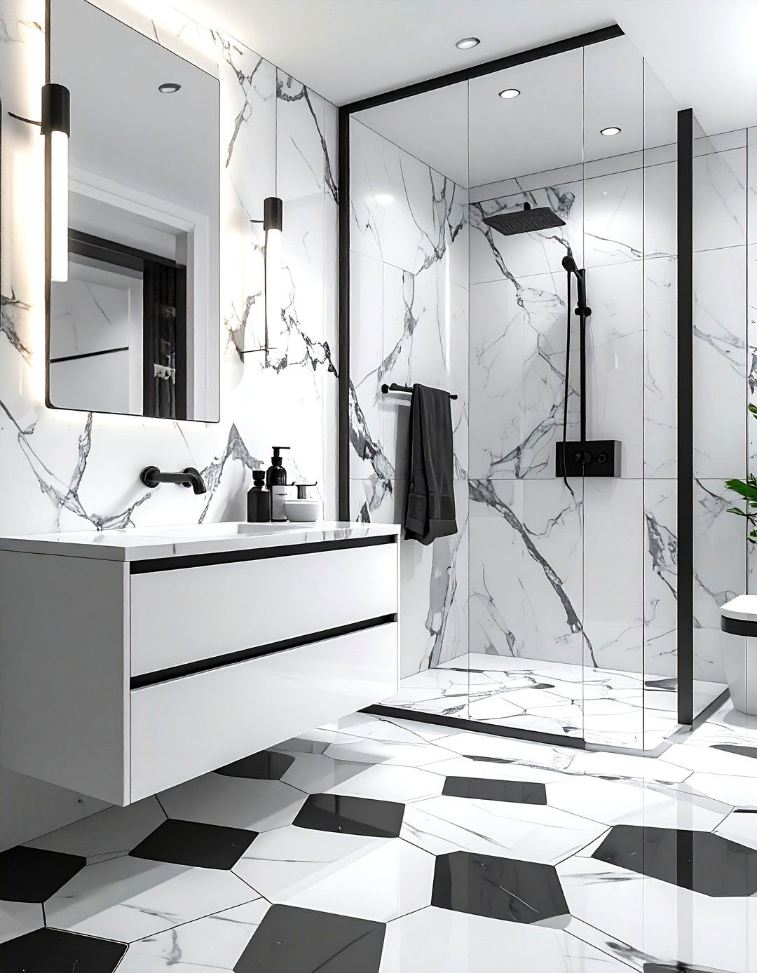
In a modern bathroom, mixing marble surfaces with a bold geometric floor tile creates a high-contrast, spa-like environment. The natural, soft veining of marble on the vanity or walls provides a neutral canvas for a black and white hexagonal or chevron floor. This pattern mix relies on the classic contrast of light and dark to create visual impact. The geometric tile adds a modern, energetic feel, while the marble keeps the space feeling grounded and luxurious. It is a sophisticated design choice that feels both clean and architectural, perfect for a master bath that serves as a private retreat.
19. Ikat and stripe outdoor patio
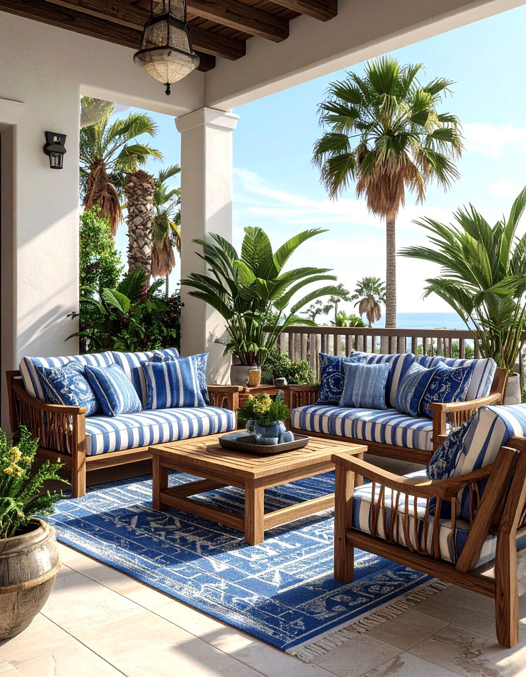
Bringing pattern mixing to your outdoor patio with ikat and stripe cushions creates a stylish and inviting space for lounging. The global, bohemian vibe of ikat feels perfect for an outdoor setting, while classic stripes add a touch of nautical or preppy style. To make this work, choose outdoor fabrics in durable, fade-resistant materials. Use large striped cushions for the main seating and add ikat lumbar pillows for a pop of pattern. Sticking to a palette of blues and whites keeps the look fresh and coastal, making your backyard feel like a high-end resort for summer entertaining and relaxation.
20. Paisley and polka dot bedding
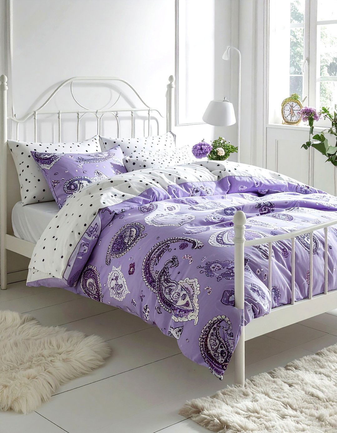
Mixing paisley and polka dots in your bedding layers offers a unique and eclectic look that feels deeply personal. Paisley is a complex, historic pattern that can sometimes feel heavy, but pairing it with light, airy polka dots instantly modernizes the aesthetic. Try a paisley duvet cover with small-scale polka dot sheets peeking out from underneath. This combination works best when the colors are soft and muted, such as lavender or sage green. It creates a bedroom environment that is visually interesting but still peaceful enough for rest. This mix is perfect for those who love vintage-inspired decor with a modern twist.
21. Herringbone and floral backsplash
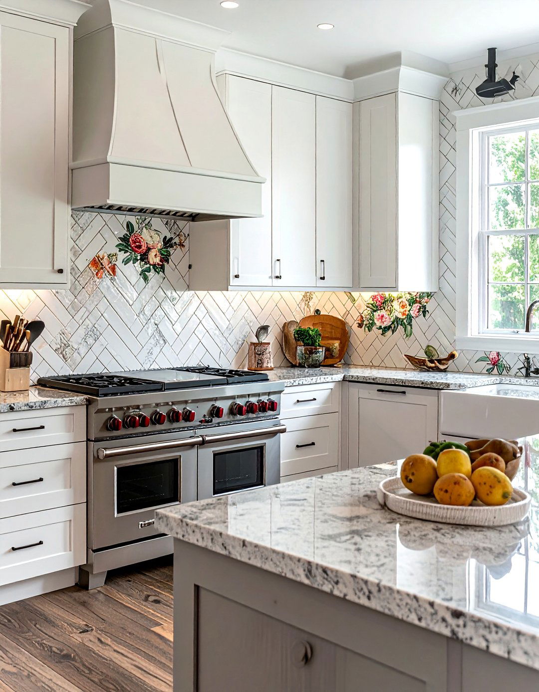
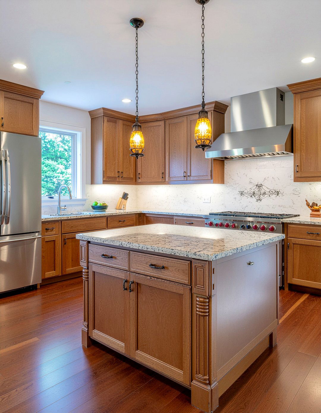
A kitchen backsplash that combines herringbone tile with a floral-patterned accent area is a beautiful way to add character to your cooking space. The structured, rhythmic nature of the herringbone tile provides a sophisticated frame for a more decorative, floral tile mural behind the stove. This pattern mix adds a custom, artisanal feel to the kitchen without being overwhelming. By choosing tiles in the same material, such as white ceramic, you can keep the look cohesive while still playing with different shapes and motifs. It is a subtle but effective way to make your kitchen design feel unique and thoughtfully planned.
22. Plaid and botanical print sofa
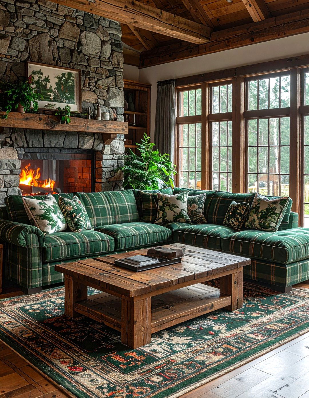
Upholstering a sofa in a mix of plaid and botanical prints creates a cozy, nature-inspired focal point in a den or sunroom. Plaid provides a sense of warmth and tradition, while botanical prints bring the beauty of the outdoors inside. You might use a large-scale plaid for the sofa body and a matching botanical print for the back cushions. This combination feels like a modern cabin or a sophisticated garden room. To keep the look balanced, ensure the colors in the botanical print are reflected in the plaid's lines. This creates a harmonious and inviting piece of furniture that anchors the entire room.
23. Geometric and animal print pillow
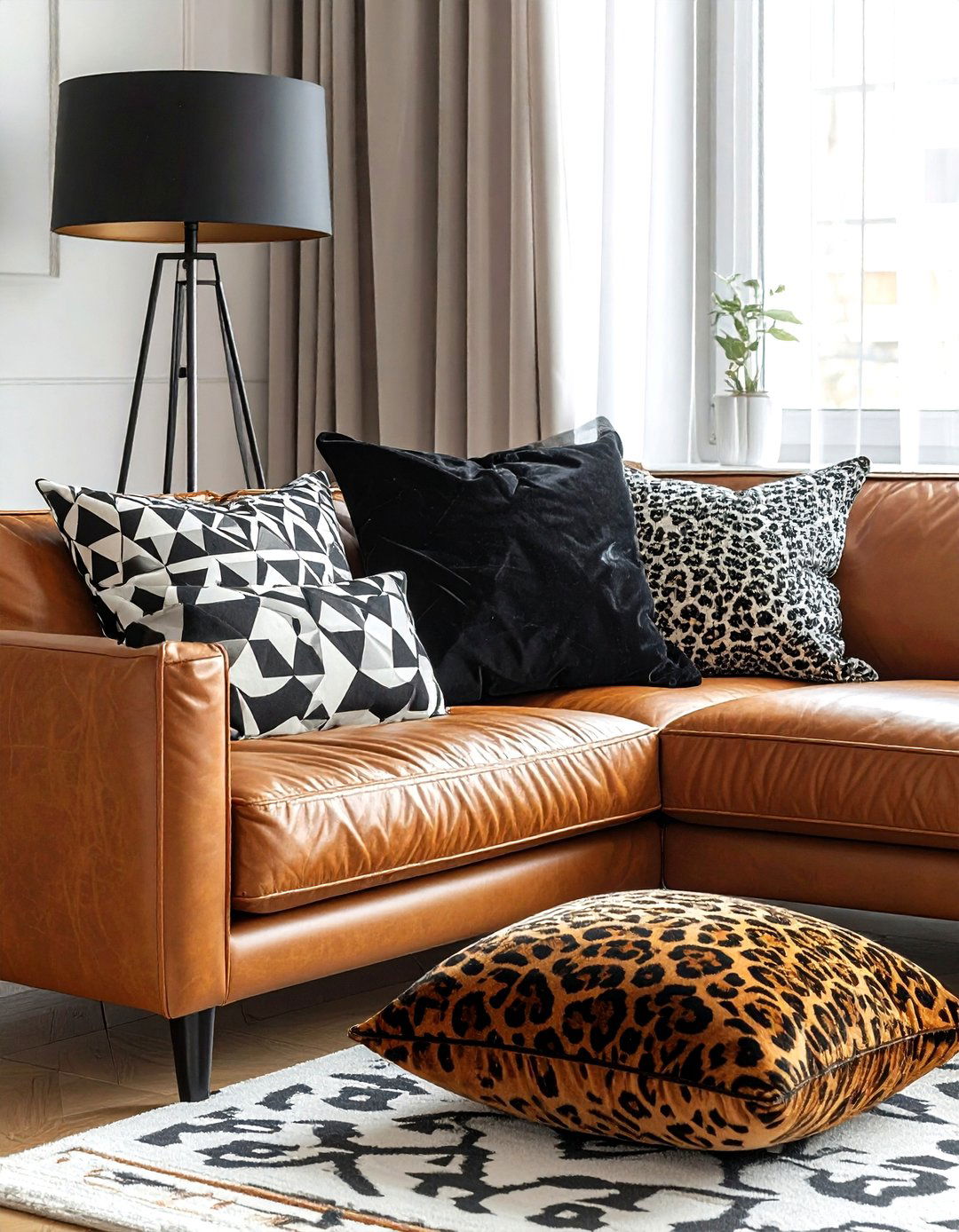
Styling geometric and animal print pillows together on a neutral sofa is a quick way to achieve a high-fashion, maximalist look. The sharp, repeating lines of a geometric print provide a modern contrast to the organic, irregular spots of a leopard or cheetah print. This pairing works best when you stick to a limited color palette, such as black, gold, and cream. The geometric pillow acts as a structured anchor, allowing the animal print to feel like a bold, stylish accent. It is a great way to experiment with daring patterns in a small, low-risk way that can be easily updated.
24. Toile and damask wall covering
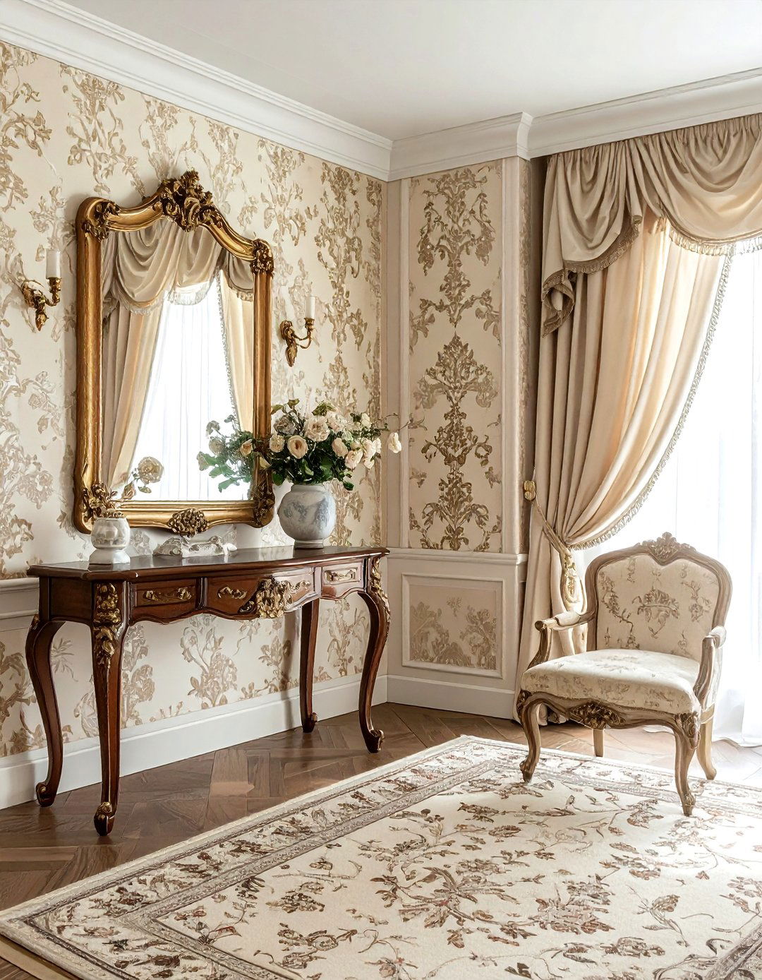
For a truly opulent and traditional room, consider mixing toile and damask wall coverings. This can be achieved by using a damask wallpaper on the main walls and a coordinating toile fabric for the window treatments or a small accent wall. Both patterns have historical roots, so they naturally feel like they belong together. To prevent the room from feeling too busy, choose patterns that share a very similar color value. This creates a subtle, layered effect that feels rich and sophisticated. It is a classic approach to design that works exceptionally well in formal living rooms or grand entryways.
25. Block print and ikat throw
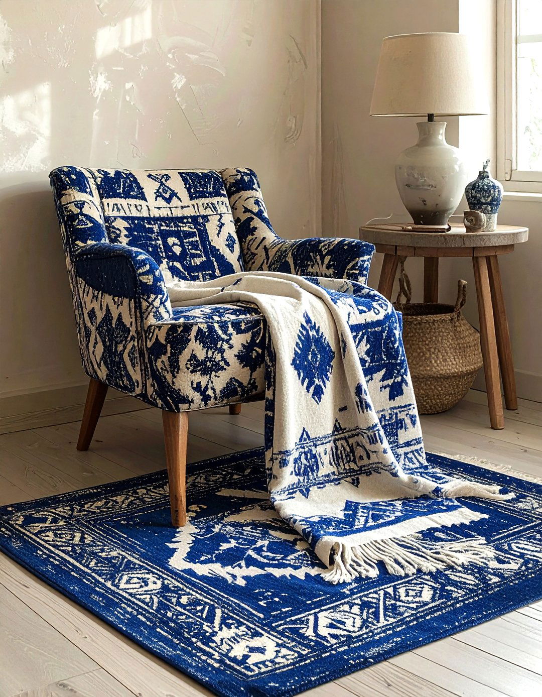
Draping a block print throw over an ikat-patterned chair adds a layer of global, artisanal charm to your living space. Both patterns have a handmade feel that celebrates craftsmanship and cultural heritage. The repetitive, stamped look of the block print complements the blurred, dyed edges of the ikat. This mix is perfect for a bohemian or eclectic home where comfort and personality are the priorities. Choose throws in natural fibers like cotton or wool to enhance the tactile quality of the patterns. This combination makes any corner of your home feel cozy, well-traveled, and thoughtfully curated for daily comfort.
26. Stripe and floral window treatment

Creating a custom window treatment with both stripe and floral fabrics adds a professional, designer touch to any room. You might use a wide-stripe fabric for the main drapery panels and a delicate floral for a decorative valance or tie-backs. This pairing balances the masculine and feminine elements of design, making the room feel well-rounded. To ensure success, pick one color from the floral print and use it as the primary color for the stripes. This visual connection ties the two patterns together seamlessly, resulting in a window display that is both elegant and eye-catching without being too distracting.
27. Chevron and organic print rug
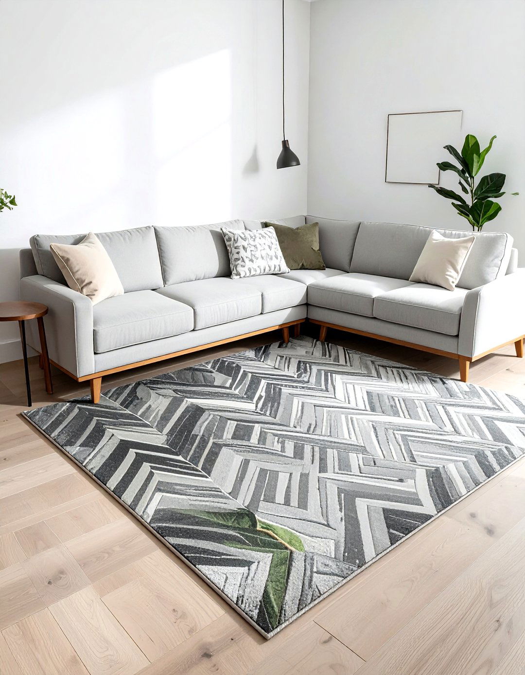
Layering a small organic-patterned rug over a larger chevron carpet is a smart way to add visual interest to a large floor space. The sharp, graphic V-shape of the chevron provides a modern foundation, while the fluid, nature-inspired shapes of the organic rug add a touch of softness. This mix works particularly well in open-concept living areas where you want to define different zones. By keeping the rugs in similar tonal shades, you can create a sophisticated, layered look that feels intentional and high-end. It is a practical way to protect your floors while also showcasing your unique design style.
28. Polka dot and geometric accent
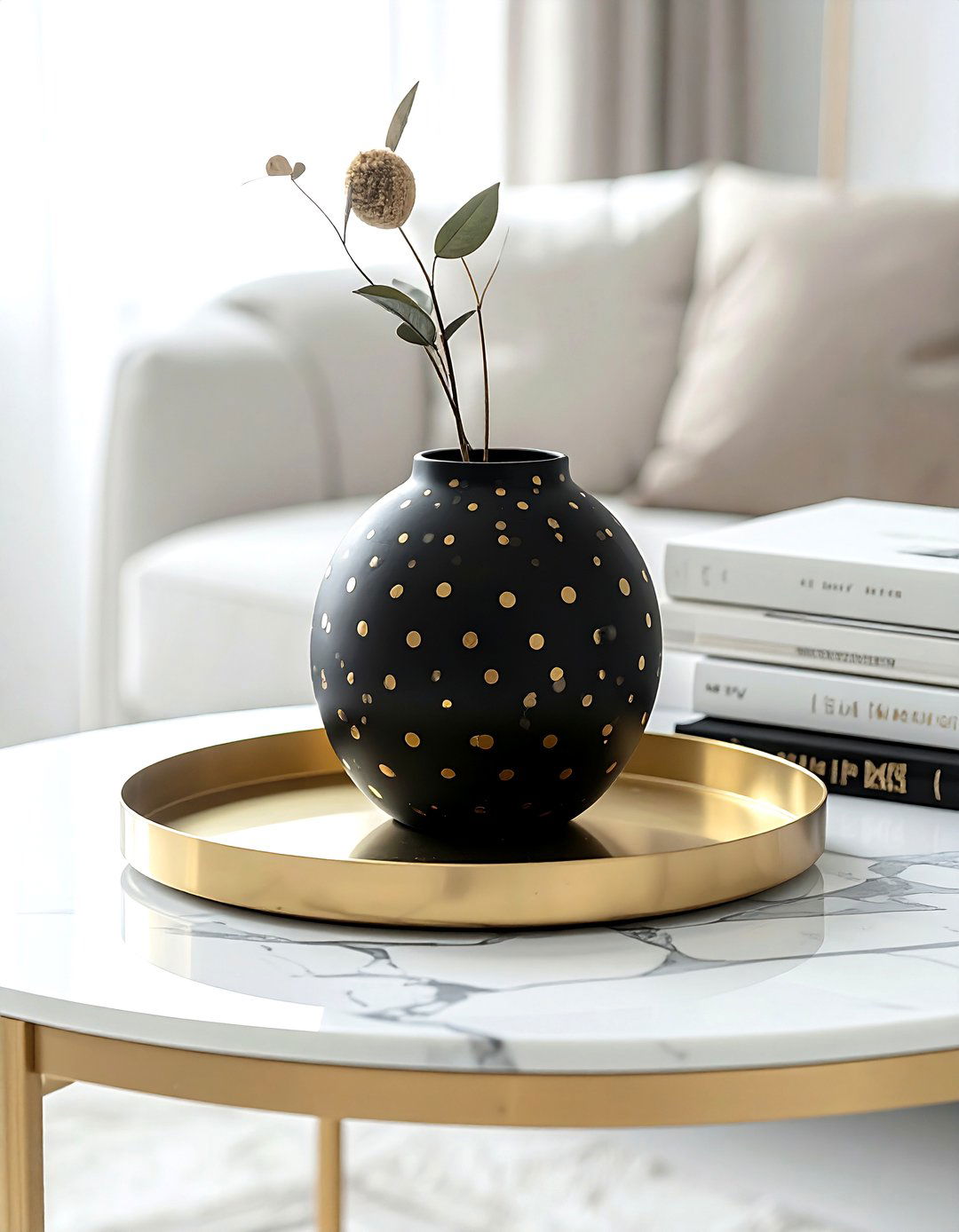
Incorporating polka dots and geometric accents through small decor items like vases, trays, and frames is an easy way to play with pattern. The round, soft shape of a dot provides a playful contrast to the sharp angles of a triangle or hexagon. You might place a polka dot vase on a geometric-patterned tray to create a stylish vignette on a coffee table. This approach allows you to experiment with pattern mixing without making a large financial or permanent commitment. It is a fun and low-pressure way to add personality and a modern edge to your home's styling.
29. Plaid and toile bedroom set
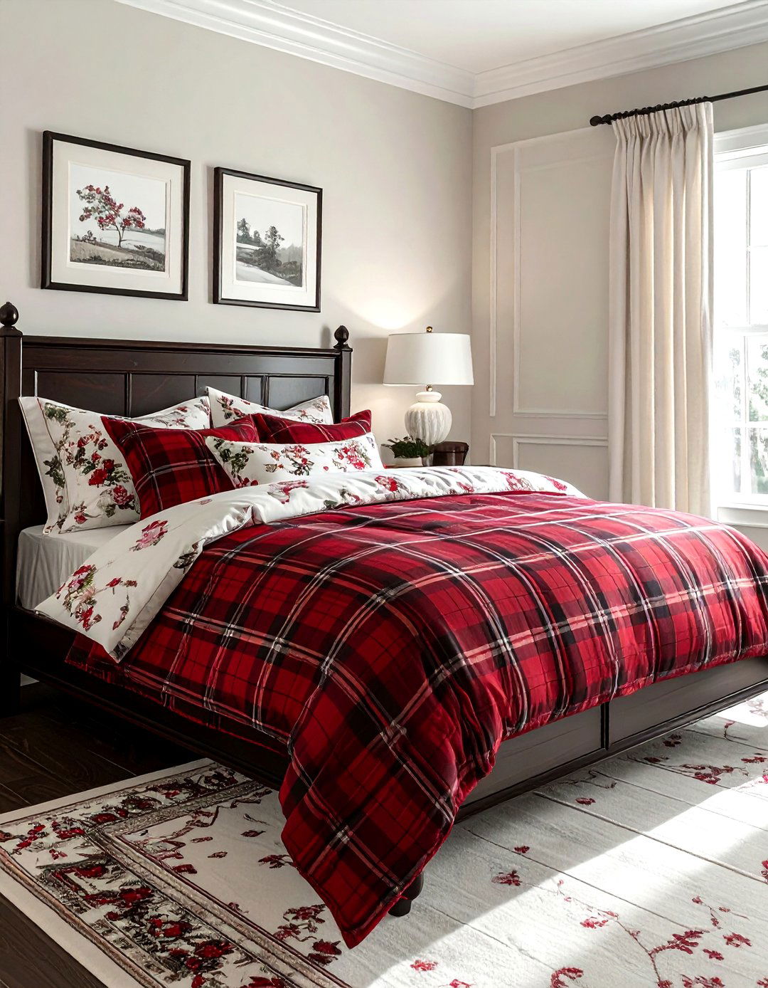
A bedroom set that mixes plaid bedding with toile pillows creates a cozy and sophisticated retreat that feels like a high-end bed and breakfast. The structured, warm feel of plaid is the perfect partner for the romantic, detailed scenes found in toile. Try a large plaid comforter as the base and layer in toile shams and a decorative neck roll. This combination offers a beautiful balance of textures and styles that feels both traditional and fresh. Using a classic color palette like red and white or blue and cream ensures the room remains a timeless and peaceful sanctuary for rest.
30. Animal print and stripe hallway
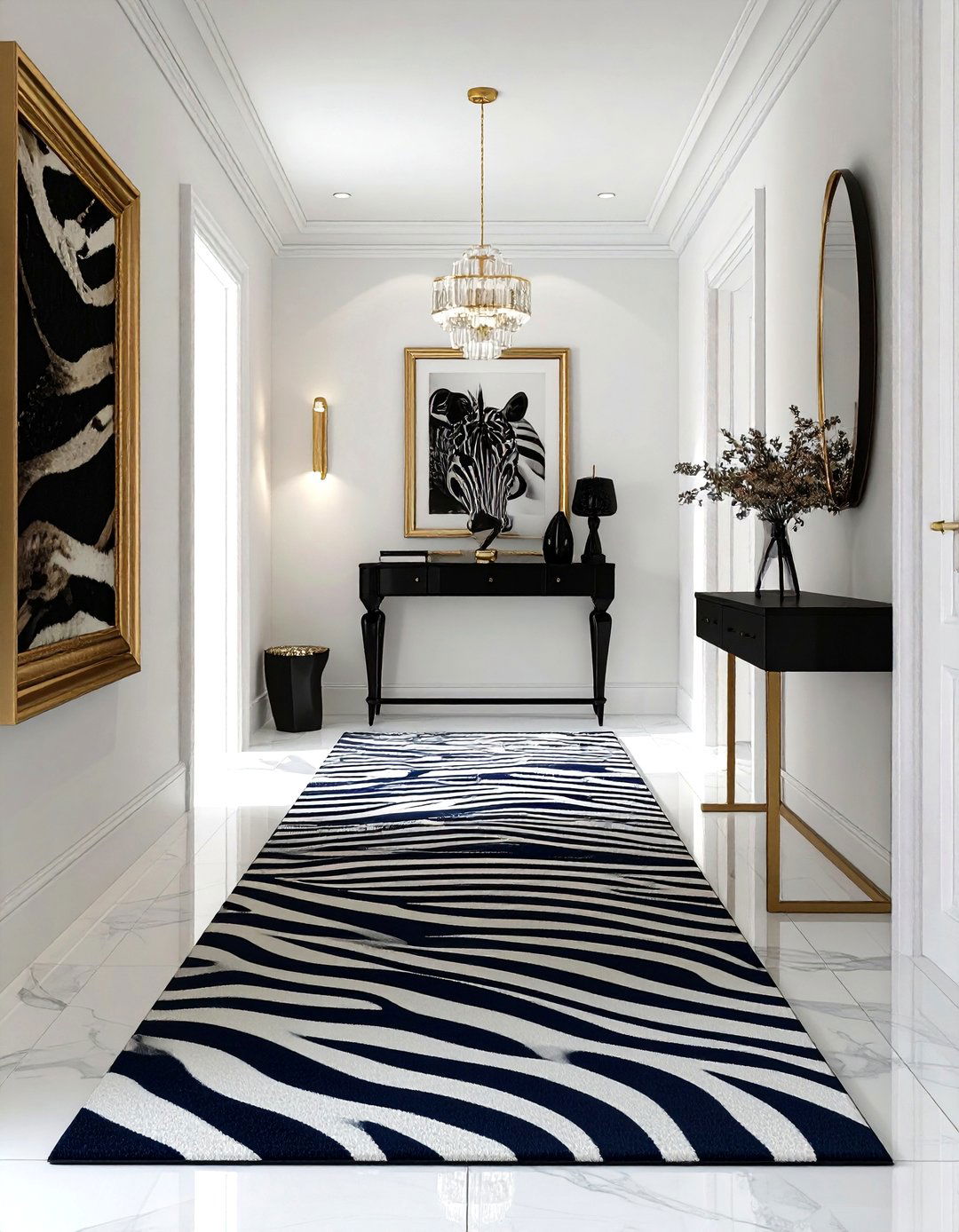
Transforming a narrow hallway with animal print wallpaper and a striped runner is a bold way to make a great first impression. The long, vertical lines of a striped rug help to elongate the space, while the exotic, organic pattern of animal print wallpaper adds a sense of drama and luxury. This high-contrast pairing turns a functional transition area into a stylish destination in its own right. To keep the look from being too overwhelming, ensure the hallway has adequate lighting and a few solid-colored accents, like a black console table or white picture frames, to provide visual breathing room.
Conclusion:
Successfully mixing patterns in your home decor is a journey of creativity and self-expression that rewards those who are willing to experiment. By understanding the foundational rules of scale, color, and contrast, you can move beyond the safety of solid colors and embrace a more dynamic, layered aesthetic. Whether you prefer the classic elegance of toile and stripes or the bold energy of animal prints and geometrics, the key is to find a common thread that unifies the space. Remember that your home should be a reflection of your story, so do not be afraid to break the rules and follow your eye.





Leave a Reply